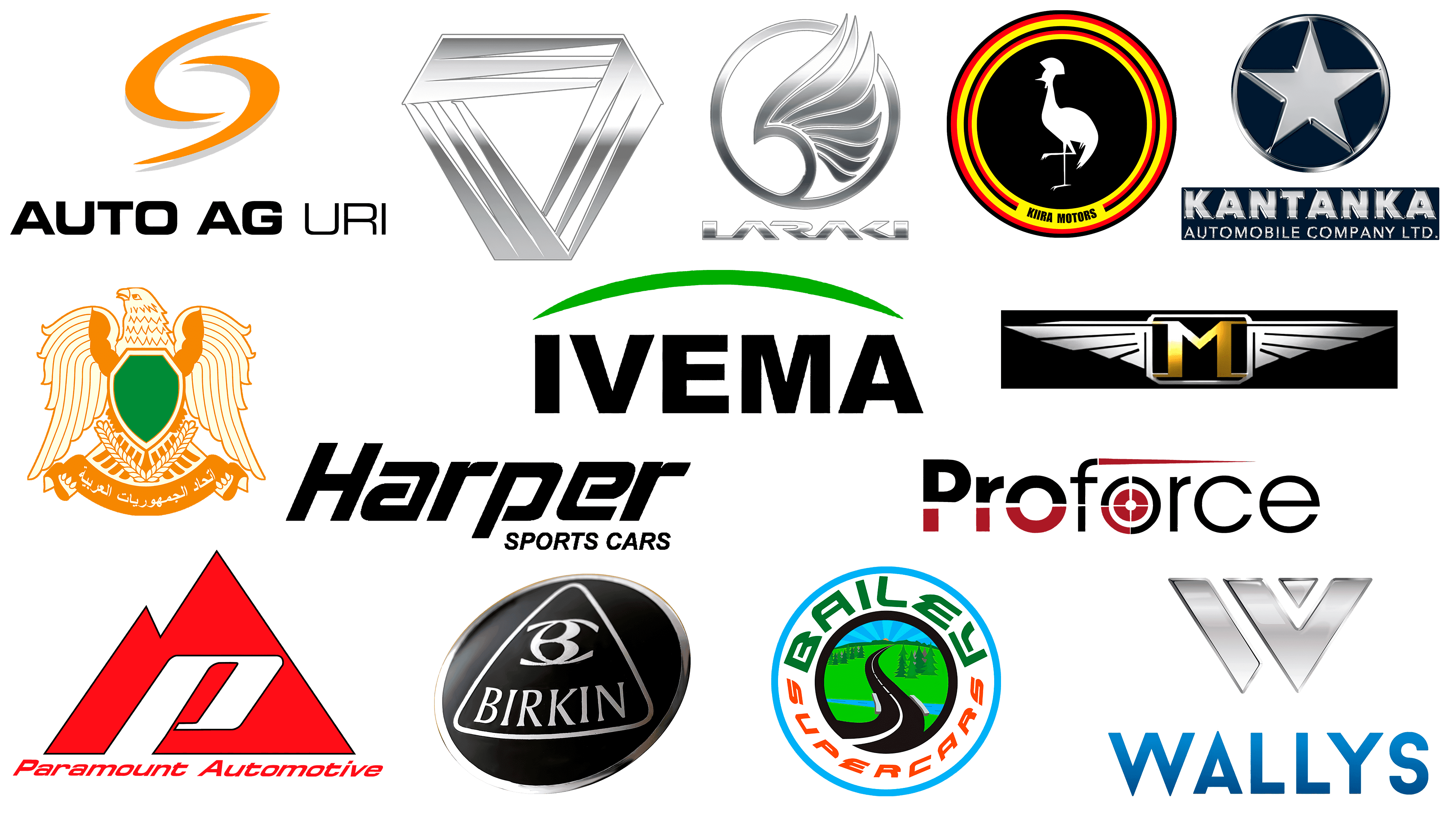
African automotive brands are not present in huge numbers in the world, but it cannot be said that there is no automotive industry on the continent. Indeed, there is little experience in designing cars in Africa. However, this does not mean that all African automakers are subsidiaries or inconspicuous small businesses. The following one-and-a-half dozen companies and their logos are clear examples that the car industry on the African continent nevertheless has its own interesting history and modernity.
Mobius Motors
![]()
This car manufacturer produces two models of SUVs. These vehicles are what is needed for Africa and its off-road terrain. However, these vehicles are quite expensive. We can say that for the local population, they are a real luxury.
If we analyze the logo of the brand, we will see the Mobius strip. It is depicted with three corners, and a dark gray color is used. This emblem looks laconic and effective. Its outlines convey the rigor, cogency, and solidity characteristic of these SUVs.
The company itself is quite young. It has been present in the market since 2010. However, the confident position of the company today makes us see good prospects in it. At least, the vehicles offered by the African manufacturer to its customers are well adapted to the landscape of the continent.
Saroukh El-Jamahiriya
![]()
Here, we are talking about a prototype Libyan car that was introduced in 2009. The car was planned as a luxury limousine. It was to decorate an event such as the celebration of the 30th anniversary of the Libyan revolution.
The color scheme of the car was not chosen accidentally, as green is associated with the mentioned revolutionary events. However, the production was not a success. It simply failed, as it was not well thought out.
At the same time, the crest-like logo was included here because it is a part of history. The eagle on the logo looks very confident. The presence of a large concentration of the gold hue in the emblem suggests that this was supposed to be a prestige product aimed at status buyers. It’s a pity that all this remained only at the level of grandiose ideas.
Proforce
![]()
The story of this manufacturer is much more optimistic, as it is still operating in its industry today. Founded in 2008, the company has significantly increased its turnover and is able to provide its target audience with a product that is really in demand.
Proforce specializes in the production of protected and armored vehicles. The range includes both civilian and military vehicles. In short, the range is extensive and interesting so that buyers have the opportunity to choose what they need.
The company’s logo uses a combination of burgundy and gray colors. Such a color solution looks contrasting but, at the same time, quite restrained.
The stylization of the second letter, “o,” reminds something of a target. This may hint that the company managed to hit the request of its target audience and offers such cars, for which there is a high demand.
Kantanka
![]()
The company with such a sound and recognizable name is located in Ghana. It was founded in 1994. Consequently, its path in the industry is somewhat more solid than that of the competitors discussed above.
Despite the fact that the company cannot boast of any impressive in-house developments, its stability and sustainability in the market are achieved due to one quite conscious factor. So, the company specializes in assembling cars that are designed by other brands. Basically, we are talking about Chinese enterprises.
Such a system of cooperation has provided “Kantanka” with a steady and consistent development. And there is nothing strange in this since the company does not risk testing developments and takes into production what has already been tested.
The model range of produced cars is quite wide. It includes both luxury SUVs, practical trucks, and base sedans popular in the mass segment of the market. In short, the model range is extensive, interesting, and diverse.
By the way, engineers of the brand “Kantanka” have developed a worthy car on their own. This is an SUV Otumfuo.
The company logo has an image of a star in a round frame and the brand name on a blue background. For the main elements of the composition, the color metallic is used. The use of this shade in the visual appearance of automotive brands is a fairly common technique. In principle, such a color solution is associated with the automotive industry. The star can hint at the high quality and prestige of manufactured cars; besides, it looks organically blue on the background. In addition, the blue color evokes certain associations with the seriousness and thoughtfulness of the business approach.
Wallyscar (or Wallys)
![]()
This manufacturer, registered in Tunisia, entered its market segment in 2006. It specializes in off-road vehicles. If we analyze this fact and compare it with the description of several companies discussed above, we can notice a certain trend. African automakers are trying to produce vehicles that will be practical and applicable to the real landscape of this continent.
The Wallys manufacturer is a small-scale manufacturer. Simply put, this means that this company only produces a few hundred cars per year. Nevertheless, its stable position in the market shows that the company knows and takes into account the needs of its target audience.
As in the previous case, on the emblem of the brand, we see a combination of metallic color and blue shade. The metallic color is chosen for the emblem itself, and blue is chosen for the name of the company under it. The emblem itself is quite laconic, clear, and, at the same time, relevant. We see a big letter “W,” which is capitalized in the brand name.
Menara (or CANAM)
![]()
If we look at the “age” of this company in terms of the global automotive industry, it is quite young. But if we compare it with the previous examples, Menara can be called a real veteran of its industry, as it was founded in 1972.
Most of the model range of this manufacturer consists of retro cars. The company’s model range is quite modest. As for the flagship cars in the brand’s production lineup, it is only the Menara WSC. Nevertheless, this Casablanca-inspired car is luxurious and prestigious.
The company’s logo uses a stylish combination of metallic hue and gold color. Much has already been said about the former in the above examples. Let’s analyze in more detail its combination with gold color. Here, the typical automotive color scheme is supplemented with notes of luxury and chic. This fills the visual image of the brand with more authenticity and evokes associations with prestige.
The gold letter “M” is in a square silver frame with embossed corners. The wings diverge to both sides from the center of the composition, hinting at how fast and dynamic the car is on the road. In a word, the logo looks luxurious, solid, and convincing.
Kiira
![]()
This automobile brand comes from Uganda. Its history began relatively recently – in 2014. The company was created at the government’s initiative. Its specialization is the production of buses. However, in the range of the manufacturer, there are also several standard models of cars.
The history of the company and its origin explain the stylistics of the logo quite well. The colors of Uganda are used in the emblem, and the national bird of this state is depicted inside the logo.
Let’s assume that you will move away from such a deep analysis and evaluate the logo only from a visual point of view. In this case, it looks bright enough, which makes it memorable, recognizable, and expressive.
Laraki
![]()
This car manufacturer was founded in 1999 – the homeland of this brand is Morocco. Despite the fact that the company’s model range is quite modest in variety, the quality of the cars produced is reliable enough for the company to feel confident in the automobile market of its continent.
The basis of the company’s model range is made up of fast sports cars. If we talk about the peculiarities of the production process, it is worth noting that it almost always uses foreign-made engines.
The emblem of the company is a wing located inside a round frame. One sharp end of the wing extends to the border of the frame. As for the color scheme, it combines a metallic shade and black. The emblem looks traditional for its industry. It is credible, concrete, and clear in its symbolism, which is important for a company that uses its logo to communicate with its customers.
Birkin
![]()
The South African company specializing in the production of sports cars was founded in 1982. The manufacturer is a small-scale manufacturer. Nevertheless, the small scale of production does not prevent the company from confidently working in its niche and producing quality cars.
The model range is based on variations of old Lotus models. Modifications of such cars are few, but they are in demand among their buyers. For most of these cars, the basis was Lotus Super 7.
It is worth noting that since the 1980s, the company has been gradually expanding. Therefore, it produces cars that are not only sold on the African continent but also exported to other countries. For example, these cars are sold through dealers in Japan, the United States, and European countries.
In July 2013, the brand’s lineup received a wide-body version. The car became 3 inches longer and 4 inches wider.
The company logo combines metallic and black colors. Inside the round emblem on a black background, you can see a triangle with rounded corners. Inside it is a stylized capital letter of the name of this company. These are traditional motifs in the stylistics of the logo, as evidenced by the color scheme involved in the logo from the above examples. This visual decision is justified because it is readable in what field the logo belongs to.
Harper
![]()
This South African company was established in Botswana. This event took place in 2004. Subsequently, the production facilities were moved to South Africa. Despite the fact that the cars of this brand can be used in urban conditions, they were originally created for racing. The model range is based on sports racing cars.
Such specificity of the model range is reflected in the logo. Despite the fact that it is made in minimalist motifs, the slanted font suggests an association with speed, which is relevant for sports cars. At the same time, the black font looks solid, convincing, and laconic. This is a good solution for a company that wants to hint at a serious approach to its business.
Paramount
![]()
Speaking about this company, it is worth noting that it refers to the history of the African automotive industry but not to the modernity of this sphere. The peak of production came in the 50s of the last century. It produced small 2-seater roadsters.
The company did not manage to stand out with the scale of production. In the product line, there were only two models of cars, and they produced less than 100 pieces.
The logo combines white, red, and black colors. The latter is barely visible and is used as an outline for the main composition. Inside the image of mountains with two peaks, there is a slanted capital letter from the brand name. And in the lower part – the full name of the company. The emblem looks quite bright and spectacular. It is only a pity that it can be analyzed only in the context of history, not the present of the automotive industry in Africa.
Bailey
![]()
This South African OEM has a more optimistic history than the previous company in this selection. Bailey was founded in 2003. The peculiarity of the production is that this company does not manufacture its own cars. It is focused on creating replicas of classic racing cars. For example, these are Rover P4 and Ford GT40. By the way, the company produces both cars and spare parts for them.
The logo of this company stands out among other emblems of automobile companies. It looks bright and cheerful. Inside the round emblem, you can see a whole composition for which many colors are used.
Around the perimeter, on a white background, is the name of the company. In the central part, the image of the road is in the background of a picturesque natural landscape. This combination visually distinguishes this logo from others. And although it is far from minimalism, the composition does not look cluttered or overloaded with visual accents. It looks quite stylish and harmonious.
IVEMA
![]()
This South American company, specializing in military equipment, was founded in the 90s of the last century. The production line includes both combat vehicles and armored tactical vehicles. The manufacturer refers to small-scale production. Every year, it produces literally hundreds of vehicles. Nevertheless, the company is stable in its field and produces vehicles that are in moderate demand.
The company’s logo is made in a minimalist style. The straight black font gives it concreteness. The light green element at the top of the logo somewhat smooths out the overall composition, making it fresher in color scheme.
URI Purposely Built Vehicles
![]()
In this case, we are also talking about a South African company. The company was founded in 1995. The production line is based on practical off-road vehicles applicable to local conditions. In the company’s model range, there are also pickup trucks.
The symmetrical visual composition of bright yellow color forms the basis of the logo. Below it is the company name, for which a straight black font is used.
Such was the selection of logos of African automobile manufacturers. Despite the fact that some of them have already ceased to exist, their emblems have become part of history. And many of the companies, despite their small production volumes, have a strong foothold in their industry.