Canada’s airspace, from which airplanes depart in different directions, is encoded in the symbols of the Air Canada emblem. The emblem demonstrates the love for one’s country and the desire to expand the borders for its citizens.
Air Canada: Brand overview
Air Canada is Canada’s flagship airline, the largest in passenger numbers and fleet size. It was founded in 1937 and has since operated scheduled and charter flights to 207 international destinations. Hubs are in several overseas cities, including Vancouver, Montreal, Toronto, and Toronto Pearson. The airline’s head office is in Montreal, in the St. Laurent district of the province of Quebec. The company also operates a major regional service, the domestic branch of Air Canada Express.
Air Canada was founded as Trans-Canada Air Lines on April 10, 1937, by an act of the Canadian Parliament. The goal was to provide air connections across Canada. The airline’s inaugural flight was from Vancouver to Seattle on September 1, 1937, in a Lockheed L-10A Electra. By 1939, it expanded its services to include transcontinental flights linking Vancouver and Montreal.
During the 1940s, Air Canada added the larger Douglas DC-3 to its fleet. It introduced jet technology in 1947 with the Avro Jetliner. The airline expanded its jet fleet in the 1950s with the Vickers Viscount, Douglas DC-8, and the Boeing 707.
On January 1, 1965, Trans-Canada Air Lines was renamed Air Canada. This change marked a shift to include international routes. The introduction of Boeing 747s in the 1970s enabled the airline to operate longer international and transcontinental flights.
The 1980s were significant for Air Canada. It began its journey toward privatization by offering 43.7% of its shares to the public in 1988, achieving full privatization in 1989. The early 2000s saw its fleet modernization with newer Airbus and Boeing models and a merger with Canadian Airlines in 2000, establishing it as a top national carrier.
Air Canada operates over 300 aircraft, serving over 50 million passengers annually across more than 200 destinations in 50 countries. It is headquartered in Saint-Laurent, Montreal, and employs about 30,000 people. As a member of the Star Alliance with several regional partners, Air Canada continues to be a strong presence in the international aviation market. Celebrating over 85 years, Air Canada is recognized as a symbol of Canadian pride and global aviation success.
Meaning and History
Air Canada underwent several transformations before becoming a world-renowned transportation organization. It was created by the federal government of Canada in 1937 and was called Trans-Canada Air Lines until 1965. TCA began its first intercontinental flights in 1938; until then, it was known only domestically. It carried mail on the Vancouver-Seattle route, taking only two passengers there and back.
However, with the expansion of the transportation fleet, the situation changed dramatically: the company received its first long-distance flights and was authorized for large-scale air transportation. In addition, TCA became the first airline in the world to test a computerized reservation network at remote terminals. In 1953, it switched to the large-scale ReserVec system.
In 1965, TCA was given a new name, Air Canada, approved at the government level. In 1988, the air carrier was privatized and passed into private hands. The most significant stage in its activity was acquiring a direct competitor—Canadian Airlines. From that moment, it became a monopolist in Canada’s airspace. In 2004, the company became a holding company and was transformed into ACE Aviation Holdings Inc.
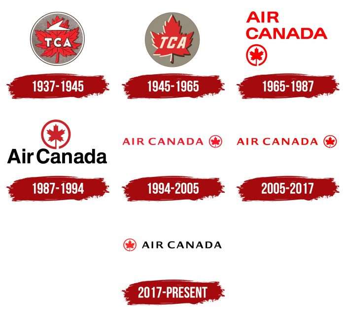
Each important step in the air transport organization’s activities was reflected in its symbolism. Therefore, the identity changed simultaneously with key events—from renaming to consolidation into a holding company. At the same time, the management has always adhered to the originally selected design and accepted only adjusted variants without fundamental changes. In total, there are seven emblems in the airline’s history.
What is Air Canada?
It is a Canadian airline that was called Trans-Canada Airlines until 1964. It is one of the five founding members of the Star Alliance partnership.
1937 – 1945
The first emblem was a circle with a white-gray border around the edge and a red maple leaf inside. The symbol of Canada could not but be present on the emblem of the air carrier, which sought to gain high status as a key figure in the Canadian Air Force. In the center of the leaf were three letters – “TCA.” This is an abbreviation for the full name Trans-Canada Air Lines. Above them was a white paper airplane, symbolizing the field of operations.
1945 – 1965
The designers removed the trim lines and painted the right edge of the maple leaf black and the left edge white. They also removed the ribbed pattern and letter shadows.
1965 – 1987
After the renaming, a redesign was carried out, resulting in a new name in the logo. It was arranged in two lines: the word “Air” at the top, “Canada” at the bottom, and a miniature icon in the form of a maple leaf outlined in a circle below. All the elements were red.
1987 – 1994
During this period, the logo was dominated by red and black colors. The circle with a leaf in the center was painted in red (or rather, light maroon) color, and the name of the air carrier – in black. In addition, the designers reconfigured the lettering and placed it in one row below the badge. Instead of capital letters, lowercase letters were used.
1994 – 2005
The leaf in this version was redrawn to resemble a real maple leaf as much as possible – wide, with shaped cutouts. For the name of Air Canada, the developers again chose capital letters but added miniature extensions at the ends, resembling serifs. In addition, both words have widely spaced symbols.
2005 – 2017
In this version of the logo, the authors adjusted the font. For this purpose, they made the letters narrow and smooth, removing the serifs. The designers also added color, choosing bright scarlet to attract as much attention as possible.
2017 – today
The modern emblem is not as rich in color as before: light maroon replaced scarlet in the leaf color, and dusty black replaced the bright red letters. Otherwise, everything remains the same as in the previous version.
Air Canada: Interesting Facts
Air Canada is Canada’s biggest airline and has been around since 1937, starting as Trans-Canada Air Lines before changing its name in 1965.
- Start: It began as Trans-Canada Air Lines in 1937, making its first flight from Vancouver to Seattle with just two passengers.
- Name Change: In 1965, it changed its name to Air Canada to reflect its growing reach, including international flights.
- Black Box: Air Canada was crucial in developing the flight data recorder or “black box” in 1965, improving aviation safety worldwide.
- No Smoking: In 1987, it was the first big airline to ban smoking on all flights, leading to healthier travel.
- Electronic Ticketing: In the late 1990s, Air Canada was one of the first to use electronic tickets, making travel easier.
- Star Alliance: In 1997, it helped start the Star Alliance, helping passengers connect globally.
- Bilingual Service: The airline offers services in English and French, embracing Canada’s bilingual nature.
- Modern Fleet: Air Canada uses fuel-efficient planes like the Boeing 787 Dreamliner to cut carbon emissions.
- Supporting Culture: It sponsors cultural and sports events, promoting Canadian culture and sports.
- Facing Challenges: Air Canada has continued to grow despite tough times, including bankruptcy in the early 2000s and the COVID-19 pandemic.
Air Canada’s history of innovation, safety, and commitment to sustainability and customer service shows its role in global aviation.
Font and Colors
Since the airline is in Canada, the management chose the maple leaf logo, a key symbol of this country. During the redesign process, only its outline changed, but it never disappeared from the logo. Also unchanged was the circle with the leaf in the center. By the way, this image also includes the action of flight, as the leaves fly, are picked up by the wind, and smoothly fall to the ground.
At different times, the Air Canada lettering was in different fonts. While in the beginning, they were wide white letters, in the end, they became narrow black letters. The fonts used are reminiscent of Sweet Gothic Medium, Indecisive Expanded Medium, and Lucida Sans Bold. The latter version was developed by designers Chris Holmes and Charles Bigelow. Its closest free analog is the DoppioOne font.
FAQ
What does the Air Canada logo mean?
The Air Canada logo uses a red maple leaf against a black background. This logo is full of meaning and closely tied to Canadian culture and history.
The maple leaf is a famous Canadian national flag symbol throughout the country’s culture and government. It stands for unity, tolerance, and peace—key values in Canadian society. Air Canada uses the maple leaf in its logo to show its connection to these values and Canadian roots. The black background in the logo represents Canada’s vast and rugged wilderness. This color choice ties back to the history of Canada’s indigenous people, showing the importance of nature in their culture and daily life.
The logo suggests freedom and the ability to soar, reflecting qualities that Air Canada wants to embody. It symbolizes the airline’s status as the national carrier and Canadian identity and pride.
What font does Air Canada use?
Air Canada uses the Lucida font in its logo. This font helps make the logo clear and easily recognizable, which is essential for the airline. Lucida is a font family designed in 1985 by Charles Bigelow and Kris Holmes. It is known for being clear and easily read in various sizes, making it suitable for print and digital use. The family includes styles like Lucida Sans and Lucida Console, each designed for specific needs.
Air Canada chose Lucida because it has a clean and simple look that keeps the logo readable in many different settings, such as airplane tails, airport signs, and digital screens. This readability is vital for the logo to be effective everywhere. Using Lucida supports Air Canada’s modern and efficient image. The font’s simplicity fits well with the airline’s focus on straightforward service. It enhances the logo’s design without overshadowing key elements like the maple leaf and color choices.
What are the colors of Air Canada?
Air Canada Rouge uses a specific color scheme to make its brand stand out, especially appealing to leisure travelers. This color scheme includes primary and secondary colors that shape its visual identity.
Primary Colors
- White: Used for its clean and classic look, it makes other colors pop.
- Slate Grey: Adds a modern and professional feel to the branding.
- Bright Red: A lively color that signals energy and passion, making it a standout feature in Air Canada’s branding.
- Burgundy: Offers a sense of luxury and high quality, helping to set Air Canada apart from other airlines.
These colors work together to create a memorable and appealing brand identity for Air Canada Rouge. The strong primary and lively secondary colors ensure the airline’s visibility and attractiveness in a competitive market.
What is the logo of Air Canada?
Air Canada’s logo features a red maple leaf, which holds deep significance for Canada. This logo connects to Canadian heritage, emphasizing resilience, beauty, and diversity.
The maple leaf has been a symbol of Canada since the 18th century and became central to its identity in 1965 when it was placed on the national flag. It represents growth, strength, and endurance. Incorporating this symbol into its logo, Air Canada highlights its roots and dedication to representing Canada worldwide. The red maple leaf makes its branding easily recognizable and shows Air Canada’s leadership in aviation. The red color adds to the logo’s impact, which is linked to strength and passion, helping the airline stand out globally while expressing Canadian pride.
How many planes does Air Canada have?
As of July 2021, Air Canada has 159 aircraft. This makes it a large, well-established airline capable of covering short and long distances. The fleet includes narrow-body aircraft for short, regional flights and wide-body planes for longer international routes. With this variety, Air Canada connects many destinations across North America and other continents.
Who is the owner of Air Canada?
Many shareholders own Air Canada and do not have a single owner. Its shares are available on the Toronto Stock Exchange for anyone to buy. Both individuals and large investors can own these shares. However, a rule prevents non-Canadian residents from owning more than 25% of the voting shares. This rule helps keep the control of the airline mainly in Canadian hands. This kind of ownership rule is typical in the aviation industry to protect the interests of a country and keep important transportation assets under national control.
Where is Air Canada’s head office?
Air Canada’s head office is in Montreal, Canada’s second-largest city. Montreal is important for both culture and the economy, making it a great place for the headquarters of Canada’s biggest airline. The city’s lively and bilingual environment helps Air Canada manage its flights within Canada and to other countries, helping the airline serve as a link between Canada and the world.
