The Always logo shows stability and protection. The emblem promises women impeccable cleanliness even with a lot of moisture. The company’s products keep dry under any circumstances. And this is the main quality of all brand products.
Always: Brand overview
| Founded: | 1983 |
| Founder: | Procter & Gamble |
| Headquarters: | United States |
| Website: | always.com |
Meaning and History
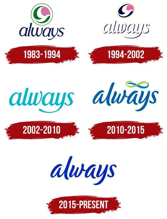
The Always brand acquired its logo right away – in the year of foundation. During its entire existence, it has gone through four updates.
What is Always?
Always is an American company that specializes in the production of feminine pads of all types. This subsidiary of Procter & Gamble was launched in 1983. Gradually, it expanded its product range to include vaginal wipes and disposable underwear.
1983 – 1994
The debut emblem consists of an imitation of a flower in delicate pastel colors. It has one pink petal and two elongated leaves. They are located to the right and left, pointed with sharp ends in different directions. A thin green ring surrounds all elements. Below is the title of the series in italics.
1994 – 2002
After the redesign, which took place in the second half of 1994, the trademark received a new design. The developers replaced the circle with an oval, which was placed diagonally. They made the green leaves blue and the letters white, adding dark shadows for contrast. The style of the lettering was also corrected by lengthening the tail of the letter “y.”
2002 – 2010
During this period, a completely different emblem was in use – a more minimalistic one. The manufacturer ditched the graphic element and focused on the brand name. The word “always” was written in thin calligraphic handwriting, tilted slightly to the right. Above “y,” the designers placed a miniature bluebird – a symbol of dreams.
2010 – 2015
The current version of the logo is radically different from all previous ones. It uses a custom typeface that mimics sloppy handwriting. The sign of infinity took the place of the bird.
2015 – today
Keeping the same writing style, the designers have reduced the thickness of the letters, so the word “Always” looks more elegant. Handwritten cursive text is semi-connected: only the first four characters are connected in pairs. These are “Al” and “wa.” The remaining characters are located separately from each other. Due to the decrease in fat content, the “s” at the ends appeared thickened like dots. The figured element at the top, reminiscent of an infinity sign, was removed by the developers.
Always: Interesting Facts
It is always a well-known company that makes products for women, like pads and liners.
- Starting Out: In 1983, pads were always made thinner and easier to wear with wings for better protection. This was a big deal because it made things more comfortable for women.
- Worldwide Reach: Women in over 50 countries use Always products. They offer a variety of items, including pads, liners, and products for bladder leaks.
- #LikeAGirl Campaign: I always wanted to show that doing things “like a girl” is something to be proud of. Their campaign got many people talking about how girls are strong and capable.
- Helping Out: Always teaches and supports girls and women about health, especially when getting this information and products is hard.
- Fighting Period Poverty: The organization always ensures that insufficient money doesn’t stop anyone from getting the products they need during their period. They’ve given away millions of pads.
- Eco-Friendly Products: Always is also making products that can be reused, like washable period underwear, which is better for the planet.
- Everyone’s Included: Always include everyone, including transgender and non-binary people, in their conversations about periods.
- Keeping Comfortable: They keep improving their products to be effective and comfortable using the latest technology.
- Working Together: I always collaborate with athletes and activists to spread the word about menstrual health and equality.
- Learning More: Their website always offers information about periods and growing up, helping girls feel more confident.
Always has done a lot to improve how we think about and deal with periods, making things better for women and girls everywhere.
Font and Colors
Although the word “always” is the main element of the logo, there is also a graphic representation. At first, it was a stylized flower in a circle, then in an ellipse. In 2002, a bird appeared in its place, and then it was changed to an infinity sign, consisting of two ribbons.
The brand name is in italics. At first, it was a classic font, and then the developers suggested an individual one. The logo’s color scheme consists of pastel shades of blue and green.
In the modern emblem, the letters are thinner than in earlier versions. In addition, a bright cornflower blue color appeared instead of neutral blue.
Always color codes
| International Klein Blue | Hex color: | #002abb |
|---|---|---|
| RGB: | 0 42 187 | |
| CMYK: | 100 78 0 27 | |
| Pantone: | PMS Blue 072 C |
