The oldest brewery in the Netherlands is renowned for its product, whose Amstel logo is symbolic and straightforward. The geometry, color palette, and certain graphic elements of the modern emblem symbolize the brand’s commitment to its rich history.
Amstel: Brand overview
| Founded: | 1870 |
| Founder: | Heineken International |
| Headquarters: | Zoeterwoude, Netherlands |
| Website: | amstel.com |
Meaning and History
The brand’s trademark is symbolic but straightforward. The inscription “Amstel,” located inside a white semicircle, immediately catches the eye. The name is rendered in classic bold font with small serifs. The company’s founders chose this title. Johannes and Charles decided to immortalize the Amstel River on the banks of which the first beer factory was located.
The famous red and white circle is positioned in the center. It also appears on old brewery logos. The bicolor geometric figure represents a billiard ball. This association is not accidental, as the company’s founders enjoyed playing billiards together. Many years have passed, but the circle, as before, symbolizes their strong friendship and commitment to traditions.
Over the century, the emblem has changed. For instance, the owners proudly noted their hometown on the trademark when the Amstel factories were in Amsterdam. Later, the production was relocated, and the inscription disappeared.
Designers updated the logo after each rebranding, as the company changed its name several times. From 1870 to 1947, the company was called Beiersch Bierbrouwerij De Amstel, and from 1947 to 1968, Amstel Brouwerij. All this was reflected in the company’s visual style (logo).
What is Amstel?
Amstel is a Dutch beer brand that has been produced at the Heineken factory since 1968. The history of this alcoholic beverage dates back to 1870, when the first stone was laid in the foundation of the Amstel Brewery. The lineup includes several types of beer, including light, dark, and non-alcoholic.
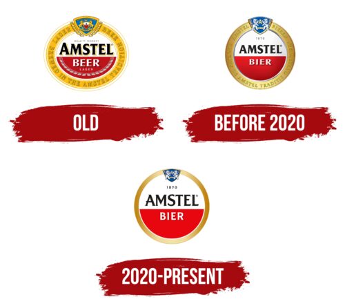
Old
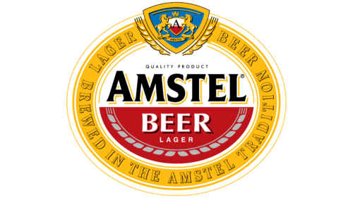
Amstel beer was named after the river of the same name flowing through Amsterdam. This name, written in black, became the central element of the logo. It is written in bold font with short black serifs. Each letter casts a golden shadow on the white semicircle in which the word is located. Just above it, but slightly higher, is the phrase “QUALITY PRODUCT.”
The white word “BEER” with black outlines is written in a red semicircle. It is framed by a pattern resembling a stylized ear. The emblem is placed in a wide golden ring with the inscription “LAGER BEER BREWED IN THE AMSTEL TRADITION.” At the top is a triangular shield decorated with two ears of corn, hinting at the beer’s ingredients. Inside it, on a blue background, are depicted:
- a small red and white shield with the black letter “A”;
- a ribbon with the word “AMSTEL”;
- two golden horses;
- a stylized crown with three peaks.
This is a nod to the coat of arms of Amsterdam. The city received the right to decorate its official symbol with the crown of the Austrian Empire with the personal permission of the king. Of course, this element looks different than the beer brand’s logo. The Amstel emblem features not heraldic lions, like on Amsterdam’s coat of arms, but proud horses associated with agriculture.
before 2020
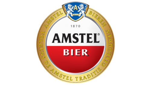
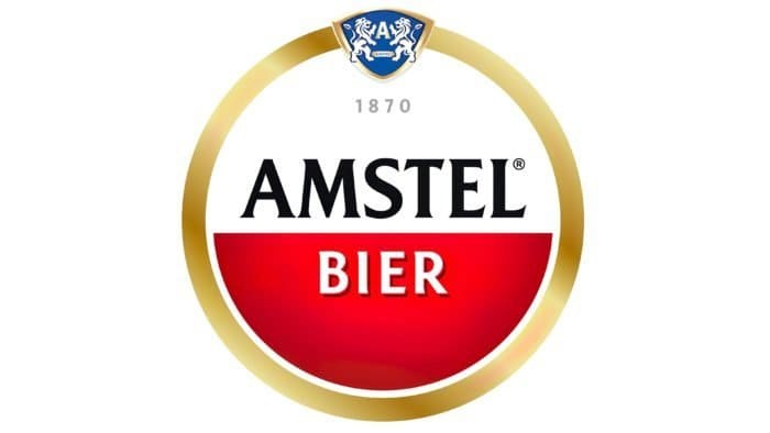
This version differs from a three-dimensional design. Designers used gradients to make the logo look shiny, resembling an award medal. The inner red and white circle has a thin silver rim that creates a convex effect. The number of inscriptions inside the circle has been reduced: besides the black word “AMSTEL” and the white “BIER,” only the number “1870” remains – the year Johannes van Marwijk Kooy and Charles de Pesters created the new beer brewed using Bavarian technologies.
On the golden ring are written the phrases “AMSTEL BIEREN” and “VOLGENS DE AMSTEL TRADITIE GEBROUWEN.” A thin black line surrounds each letter. As for the composition of the upper shield, it has noticeably changed compared to the original version. Instead of two golden horses, there are white heraldic lions with blue outlines. They hold a large letter “A,” denoting the brand’s name. The lions were taken from the coat of arms of Amsterdam.
2020 – today
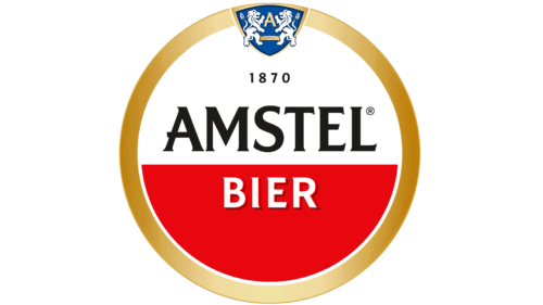
The round red and white logo became Amstel’s main symbol, so the company decided not to make significant changes. But in 2020, the brand had to slightly rework its visual identity to adapt it to the global market. London-based design studio Elmwood took on this task. The main challenge was that Amstel beer is sold in more than 115 countries – and everywhere under different logos adapted for local consumers. On one hand, this is good because flexible branding can adapt to a specific audience. On the other hand, the identity lacked consistency.
Elmwood decided to make the trademark unified and comprehensive, maintaining its red and white base. Two different-colored semicircles symbolize the partnership of Johannes van Marwijk Kooy and Charles de Pesters – the people who founded the Amstel brewery. And the circle they formed represents a billiard ball because the friends loved spending time playing billiards.
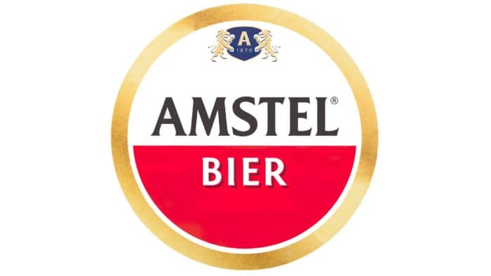
Designers considered about 30 emblem options, experimenting with shapes and palettes. Ancient medals, the architecture of the first brewery, and the personal signatures of the founders served as sources of inspiration. The resulting logo combines classic and modern elements. In the center is a red and white circle with the black word “AMSTEL” and the white “BIER.” The brand name features triangular serifs, and the letter “A” is adorned with a small protrusion that looks like an extension of the horizontal stroke.
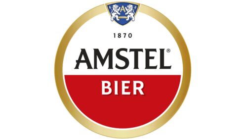
The company’s founding year is extended to emphasize the importance of history and traditions. Meanwhile, the blue shield with white lions has been reduced – it no longer extends beyond the emblem’s boundaries. The golden frame has become narrower. Along with this, it has lost all inscriptions and decorative rings. The only thing that makes it special is the gradient.
Amstel: Interesting Facts
Amstel is a beer from the Netherlands that started in 1870.
- How It Started: Charles de Pesters and Johannes van Marwijk Kooy made the first Amstel beer in Amsterdam. They named it after the Amstel River because they used ice from the river to keep the beer cold before we had fridges.
- Growing Fast: Shortly after its founding, Amstel started selling its beer in other countries, like Great Britain and the Dutch East Indies, which helped it become known worldwide.
- Cooling the Beer: Amstel kept its beer cold with ice from the Amstel River before electric fridges. It was a smart way to solve a big problem back then.
- Joining With Heineken: In 1968, Heineken, another big beer company, bought Amstel. This helped Amstel reach even more countries with Heineken’s help.
- Drank Everywhere: People in over 90 countries enjoy Amstel beer today, but it still keeps its special Dutch way of making beer.
- Bike Race: Since 1966, Amstel has sponsored a big bike race called the Amstel Gold Race in the Netherlands. It’s a big deal in bike racing.
- More Than Just Beer: Amstel has made different kinds of beers over time, like Amstel Light and Amstel Radler, which is beer mixed with lemon juice, plus other special beers for different tastes.
- Helping the Planet: Amstel works on projects to use less water, reduce pollution, and use better packaging to protect the environment.
- The Brewer’s Nose: The old Amstel brewery in Amsterdam had a unique smell of hops and barley that people living nearby loved. It was a big part of the area until the brewery moved.
- A Part of Culture: Amstel sponsors events and festivals in the Netherlands and talks about friendship in its ads, which people worldwide like.
These facts show how Amstel went from a small Dutch brewery to a big name worldwide, focusing on making good beer, solving problems smartly, and caring about the planet.
Font and Colors
The current logo is original. In the center is a red and white circle with the inscriptions “1870,” “Amstel,” and “Bier.” The latter word has an unusual font: the letters cast a double black and red shadow. The inner circle is enclosed in a silver ring and a wide golden frame. At the top is a blue heraldic shield with two white lions and the letter “A.”
Amstel color codes
| Medium Sapphire | Hex color: | #015aad |
|---|---|---|
| RGB: | 1 90 173 | |
| CMYK: | 99 48 0 32 | |
| Pantone: | PMS 2935 C |
| Venetian Red | Hex color: | #cf080f |
|---|---|---|
| RGB: | 207 8 15 | |
| CMYK: | 0 96 93 19 | |
| Pantone: | PMS Bright Red C |
| Bronze | Hex color: | #cb842a |
|---|---|---|
| RGB: | 203 132 42 | |
| CMYK: | 0 35 79 20 | |
| Pantone: | PMS 145 C |
| Vanilla | Hex color: | #ffeba3 |
|---|---|---|
| RGB: | 255 235 163 | |
| CMYK: | 0 8 36 0 | |
| Pantone: | PMS 1205 C |
| Black | Hex color: | #000000 |
|---|---|---|
| RGB: | 0 0 0 | |
| CMYK: | 0 0 0 100 | |
| Pantone: | PMS Process Black C |
