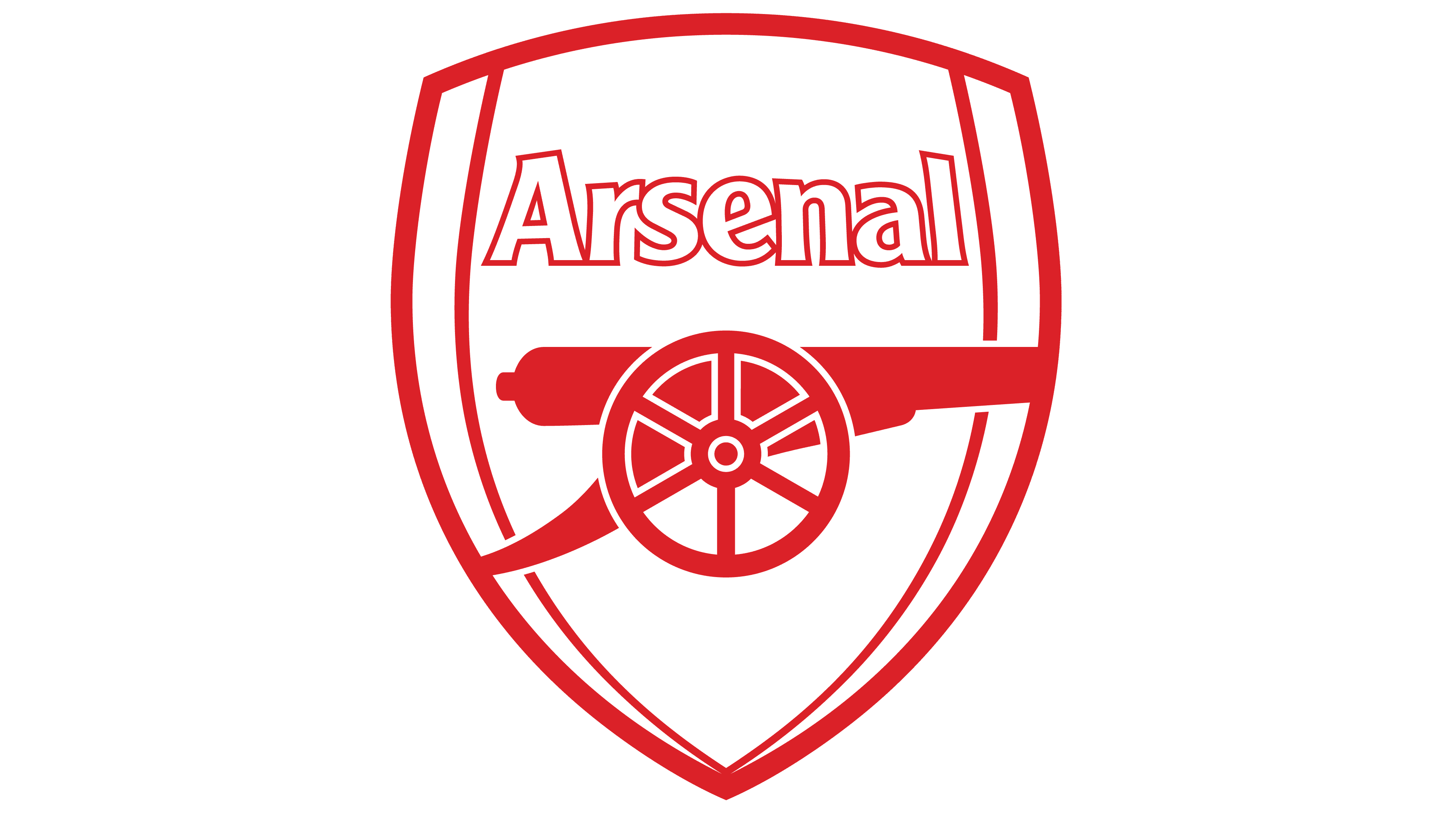
![]() Arsenal Logo PNG
Arsenal Logo PNG
The Arsenal logo is symbolic in every aspect; even its colors reflect the football club’s history, not to mention the elements of the emblem that are directly related to the name and origin of the brand. However, the modern design indicates that the team strives to keep pace with the times.
Arsenal: Brand overview
| Founded: | October 1886 |
| Founder: | Kroenke Sports & Entertainment |
| Headquarters: | Islington, London, England |
| Website: | arsenal.com |
Meaning and History
![]()
The club was founded in the London borough of Woolwich in 1886, home to the Royal Arsenal, the Royal Artillery Regiment, and numerous military hospitals. Arsenal played for two years without an emblem, then adopted the Woolwich coat of arms, which featured cannons. When the club moved to Highbury in 1913, the cannons remained on the logo as a hallmark. Initially, the barrel depicted on Arsenal’s logo pointed east, then it was turned west. Today, the barrel is again pointed east. Why? Nobody knows.
The image of this weapon remained the club’s main symbol for the next 17 seasons when the “western barrel” was slightly altered and formed into a new emblem with the Latin phrase “Victoria Concordia Crescit.” The image has existed in this form since 1949 and is still in the present day.
![]()
The club’s first name, Dial Square, was linked to the eponymous park nearby. It was then called Royal Arsenal, and upon moving to the fashionable Highbury, the leaders decided to retain just Arsenal as a tribute to the area where the club originated.
The crest of Victoria Concordia Crescit became the official image of the club from the first match of the 1949-50 season when the public saw it on the pre-match program.
Two years later, the club’s leadership decided to incorporate the relevant Latin phrase, which became Arsenal’s official motto in the 1949/50 season. Arsenal’s new logo also included the inscription “Arsenal” in Gothic style, turned west, and the coat of arms of the London borough of Islington.
For the next 53 years, the first crest of Victoria Concordia Crescit remained unchanged, undergoing several cosmetic repairs. Initially, more colors were added to the emblem, and the decorative motif of the Victoria Concordia Crescit motto was replaced with a more modern one. Also, various gold colors were added to the crest after some time.
Thus, for over half a century, the Arsenal football club has hardly changed its traditions in accordance with the reverence of the official coat of arms. Yet, in 2002, the management decided on a real revolution of the main symbolism. The decision to almost completely modernize Arsenal’s emblem was made for two reasons. Firstly, the Victoria Concordia Crescit crest includes several elements over which there are some disagreements, preventing the club’s management from fully taking responsibility for the copyright. Secondly, the promotion of the club into the future has always been a fundamental idea of leadership. In connection with the construction of a new stadium and the change of millennia, it was decided to create a new Arsenal logo.
![]()
The team’s 2011/12 season shirts were released with a new crest to celebrate the club’s 125th anniversary. The new Arsenal logo was a combination of the modern and the first version from 1888. Fifteen oak leaves symbolize the 15 founders of the club, who first met at the Royal Oak pub. Another 15 laurel leaves were depicted on the six penny coins that the 15 founders put into the common treasury in 1886. Forward – a motto related to armament and battles. This military call was previously used in the army.
In Arsenal Football Club’s symbolism, the historical heritage is traced. Most logos feature cannons, which, for unclear reasons, are pointed either east or west. The only exception is the club’s badge from the 1930s: the AFC acronym in art-deco style.
What is Arsenal?
Arsenal is a football club with a history of over 130 years. It is based in London and participates in the Premier League Limited football association. The club has dozens of cups and championships to its name. In 2020, Arsenal was included in the list of the world’s most valuable football organizations.
1888 – 1922
![]()
Two years after its debut, the club began using a logo inspired by the coat of arms of the London borough of Woolwich. Three pillars adorned with lion heads represent cannons. They are associated with the fact that workers from the Royal Arsenal founded the team.
1922 – 1925
![]()
After the name change in 1913, it took nine years for the club to develop a new logo. This time, there’s only one logo – in the form of a cannon. The cannon stands on large wheels inside an inverted oval. The barrel of the cannon points to the right. To the left is the team’s nickname, The Gunners, which was earned thanks to its connection with the Royal Arsenal factory.
1925 – 1930
![]()
The 1925 emblem has the cannon turned to the left. This version was used for the next five years.
1930 – 1936
![]()
Designers placed artillery on a white shield with a red outline. The bottom is occupied by the inscription “A. F. C., 1930”.
1936 – 1949
![]()
In 1936, manager Herbert Chapman proposed a new logo in the art-deco style: a hexagon monogram. The letters C and A intersect together with a football, forming the club’s initials AFC. This same sign adorned the Highbury stadium for several decades.
1949 – 1994
![]()
At the end of the 1940s, the cannon reappeared on the logo. The cannon is in the center of a heraldic shield. Above is the inscription “Arsenal,” executed in Gothic font. Below the horizontal line is the coat of arms of the Islington district with the Latin sentence “Deus Per Omnia.” Even lower is a ribbon with the motto “Victoria Concordia Crescit.” Use this phrase proposed by pre-match program editor Harry Homer.
1994 – 1996
![]()
Designers colored the logo and placed it inside a blue quadrilateral shield with a rounded base. At the top is the club’s nickname: “The Gunners”.
1996 – 2001
![]()
Minor details of the logo changed: the thin frame in the middle disappeared, and a wide golden outline appeared around the large shield.
2001 – 2002
![]()
The 1949 emblem returned. The symbol is drawn the same way as the small shield on the 1996 emblem.
2011 – 2012
![]()
The team celebrated its 125th anniversary with a new logo used in the 2011/2012 season. Designers supplemented the shield with elements taken from the 1888 emblem. Fifteen oak leaves symbolize the club’s creators. Fifteen laurel leaves represent the coins that the founders pooled together in a gesture of unity.
2002 – today
![]()
Arsenal FC was unable to patent its club symbolism, so it was forced to replace it. The cannon remained, but now it points to the right. Above it is the word “Arsenal”. The crest seems convex due to the specific coloring. The palette includes five colors: red, maroon, white, blue, and taupe.
Arsenal: Interesting Facts
The Arsenal Football Club is a big deal in English football, famous for its long history and many wins.
- How It Started: In 1886, workers from the Woolwich Arsenal Armament Factory in London started their football club. They first called it “Dial Square” because of a sundial at the factory.
- A Trailblazer in the South: Arsenal was the first team from the southern part of England to play in the Football League, starting in 1893. Before that, most teams were from the north.
- Winning the FA Cup: Arsenal is good at winning the FA Cup, a big football competition. They’ve won it 14 times, more than any other team.
- The Invincibles: In the 2003-2004 season, Arsenal did something amazing by not losing a single game all season. People started calling them “The Invincibles.”
- Moving Stadiums: Arsenal used to play at Highbury but moved to the Emirates Stadium in 2006. The Emirates is big, with space for over 60,000 fans.
- Champions League Final: In 2006, Arsenal made it to the final of the Champions League, a huge deal in European football, but they lost to Barcelona.
- A Smart Manager: Arsène Wenger managed Arsenal from 1996 to 2018 and brought in new ideas about eating right and staying fit, which greatly helped.
- Fans Everywhere: Arsenal has fans worldwide, which shows just how popular the team is. They love the team’s style of play and its famous players.
- Women’s Team: Arsenal’s team is also very successful, winning many trophies, including the UEFA Women’s Champions League.
- Helping Others: Arsenal does many good things for people, like charity work, through The Arsenal Foundation. They help their local area and more.
These points show how Arsenal is more than just a football team; they’ve made a big impact in the sport and the community, with many fans cheering them on from everywhere.
Font and Colors
The main element of Arsenal Football Club’s emblem has been and remains an artillery cannon. It first appeared on the logo in 1888 when the club decided to use the Woolwich coat of arms as a graphic sign. But then the weapon looked different than now: it was pointed upwards, and its lower part was decorated with lion heads. Over time, artists modernized the design, making the cannon two-dimensional and turning it sideways to the viewer.
The military theme reflected in the name and emblem of the football team is due to the proximity of two strategically important sites – the Royal Artillery Regiment and the Royal Arsenal, located in the same area where the club was based. Another traditional part of the emblem is the heraldic shield in the form of a triangle with rounded sides.
Arsenal FC’s logo is written in a sans-serif font, reminiscent of Clearface Gothic Roman. Designers adapted the original font created in 1984 by Morris Fuller Benton and changed the design of individual characters.
The developers paid no less attention to the graphic part. The club’s sign seems voluminous thanks to a successful combination of colors. In the middle of the shield, burgundy and red combine, while the edges are white and blue. The word “ARSENAL” is also white. The contours of the letters, the cannon, and the frame around the shield are grey-brown.
Arsenal color codes
| Red | Hex color: | #ef0107 |
|---|---|---|
| RGB: | 239 1 7 | |
| CMYK: | 0 100 97 6 | |
| Pantone: | PMS 2347 C |
| Dark Red | Hex color: | #db0007 |
|---|---|---|
| RGB: | 219 0 7 | |
| CMYK: | 0 100 97 14 | |
| Pantone: | PMS 2035 C |
| Blue | Hex color: | #063672 |
|---|---|---|
| RGB: | 6 54 114 | |
| CMYK: | 95 53 0 55 | |
| Pantone: | PMS 294 C |
| Gold | Hex color: | #9c824a |
|---|---|---|
| RGB: | 156 130 74 | |
| CMYK: | 0 17 53 | |
| Pantone: | PMS 4505 C |