![]() Baskin Robbins Logo PNG
Baskin Robbins Logo PNG
The accepted letter symbols and a brief reflection of the two words—Baskin and Robbins—form the basis of the Baskin-Robbins logo, which represents a network of ice cream and confectionery stores. The logo and its color scheme reflect the brand’s history, the assortment’s variety of types and flavors, and its features.
Baskin Robbins: Brand overview
Baskin Robbins is a chain of cafeterias that sells ice cream and pastries. Burt Baskin and Irv Robbins founded it. Dunkin’ Brands currently owns the franchise, which has its headquarters in Canton, Massachusetts.
In 1945, Irv Robbins opened Snowbird Ice Cream in Glendale, California, bringing out 21 ice cream flavors, a big deal. The next year, Burt Baskin, Robbins’s brother-in-law, started Burton’s Ice Cream Shop in Pasadena, which also has many flavors. By 1948, they merged their shops to create Baskin-Robbins, aiming to have a flavor for every day of the month, reaching 31 flavors.
The 1950s saw the brand start franchising, quickly expanding to over 400 U.S. locations. The growth continued internationally in the 1960s and 1970s with stores in Canada, Japan, Saudi Arabia, and Korea. In 1967, United Fruit Company, later United Brands, bought Baskin-Robbins, helping it grow even more. The 1980s and 1990s brought new flavors and products, like frozen yogurts, sugar-free options, and partnerships with Dunkin’ Donuts and Togo’s.
Now part of Inspire Brands, Baskin-Robbins operates over 8,000 stores in 54 countries. It is famous for its “31 flavors” and constantly adds new ones. For over 75 years, it’s been a beloved American brand known for fun, variety, and delicious ice cream. Despite more competition, Baskin-Robbins stays ahead, always innovating and meeting changing consumer tastes. With a long history and dedication to fun and variety, Baskin-Robbins will likely remain a top ice cream choice for years.
Meaning and History
![]()
The brand was created in 1945 when Burt Baskin opened his ice cream store in Glendale, California. A year later, his brother-in-law, Irv Robbins, opened his cafe in Pasadena but in a different location. In 1948, they became business partners, combining their efforts. Despite close cooperation, they worked under their brand for several years until they were advised to create a joint team and take one name for both.
![]()
This significant event occurred in 1953. Then, the entrepreneurs founded a unified brand and chose the current name, which was formed by merging two names—Baskin and Robbins. The local advertising agency Carson-Roberts recommended them. It developed the slogan “31 flavors” for them and presented the very first logo.
What is Baskin Robbins?
Baskin Robbins is an international chain of store restaurants where branded ice cream with different flavors and sweet pastries are sold. The company is registered in the USA and belongs to Inspire Brands.
1947 – 1991
![]()
The debut version was immediately built on the motto that promised a unique daily ice cream. Since “31 flavors” was a unique motto and a tempting offer, the brand creators naturally decided to make it the basis of the trademark, placing stylized numbers on the company’s logo. As a result, the first logo looked like the number “31” with dark shadows. It was located in a pink circle, and the inscription “Baskin-Robbins Ice Cream” was added below it.
Another version featured small pink and brown peas surrounding “31.” The iconic pink spoons then appeared, allowing customers to try any ice cream for free before making the final choice.
1991 – 2006
![]()
With the advent of the millennium, the company’s management thought about modernizing the old logo. Designers took the number “31” as a basis. They placed it in the center—between the words “Baskin” (on the left) and “Robbins” (on the right). The solid circle was removed and replaced by a semi-circle. The figures are depicted slightly tilted, stretching the bottom part of the three.
2006 – 2020
![]()
The new logo became part of the company’s rebranding. Although there were already more than a thousand flavors of original ice cream by this time, the administration decided to keep the number “31”. It retained it as a cult brand style and a legendary sign marking the beginning of great success.
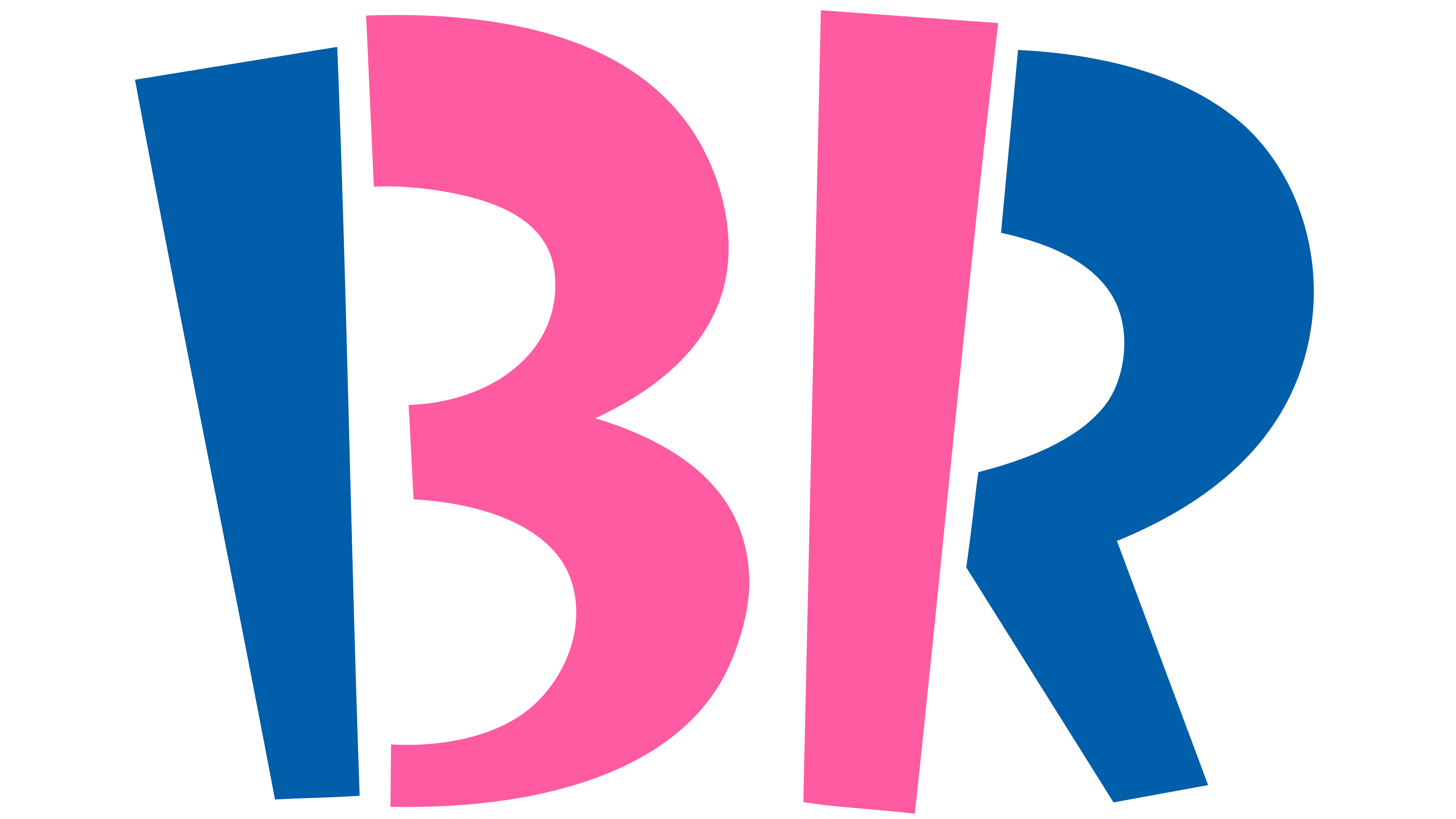
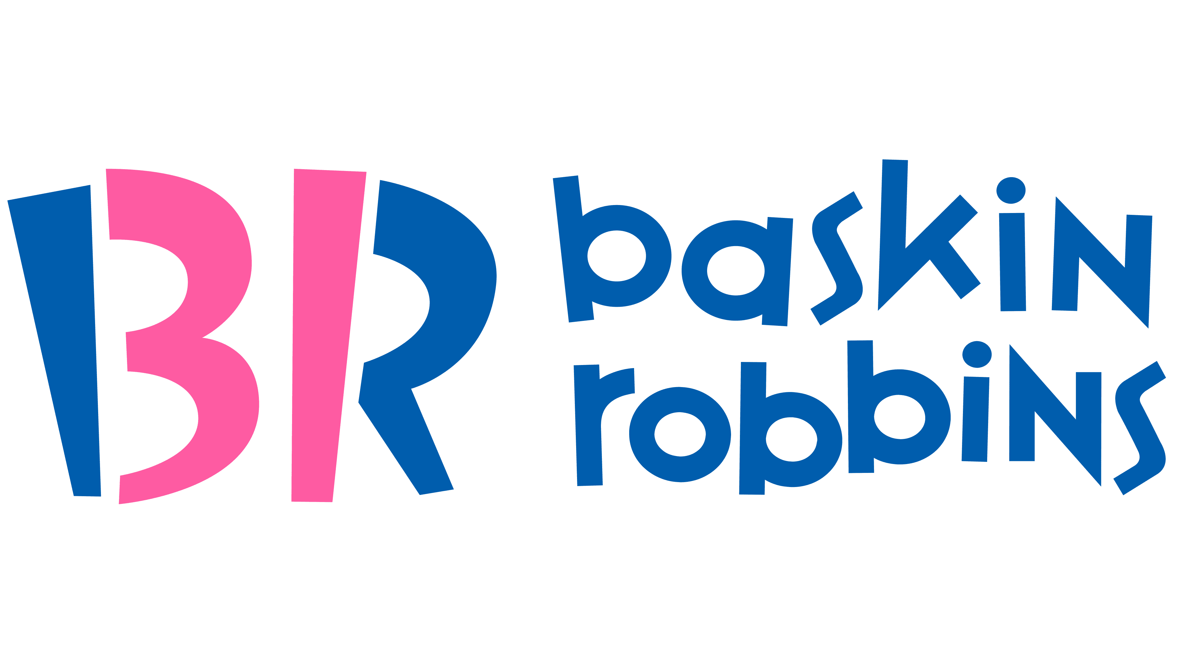
The numbers are still in the center, but separately: three and one are uniquely encrypted in the first letters of the founders’ names. Now “3” is the right part of “B,” and “1” is the long left leg of “R.” To make this more apparent, the developers highlighted them in color. Under them were the full names of the company’s founders, composed of “jumping” lowercase letters.
The latest version of the logo turned out to be the most successful, so we developed a complete package of corporate symbols based on it and presented it in various versions. Thus, there are versions of stamps, signs, labels, and trademarks. They are based on a combination of the capital letters “BR,” the number “31,” and the extended name of the network.
In the updated Baskin Robbins logo from 2006, a commercial font reminiscent of Variex Regular is used. Playful lowercase zigzag letters maintain a cheerful mood associated with sweets and delicious ice cream.
From the beginning (from 1953), the dominant shade of the emblem was a pink lollipop. It merged with the brand’s visual identity and became an integral part. After the redesign of the emblem in 1991, blue was added and maintained in the same pastel palette.
2020 – 2022
![]()
On the one hand, the coffee shop logo remained the same, but on the other hand, minor corrections were made, which are almost invisible. This is due to delicate interference in the emblem to not disrupt its good structure since the combination of central letters “BR” perfectly conveys the number “31”. Therefore, everything was left as it was. Small changes affected the font (the words became slightly more wavy) and the color of the inscription (the pink turned into a lighter shade and looks cleaner).
The wavy text style is preserved. Designers added a curved shape to the jumping letters, so the inscription “BASKIN ROBBINS” turned out to be dynamic. The color palette has shifted towards a lighter spectrum: the pink has become brighter by a couple of tones.
2022 – today
![]()
In 2022, “Baskin Robbins” changed the font and color of the logo for the first time in a long time. If it limited itself to a simple rearrangement of elements two years ago, then this time, the experiments went too far. The iconic pink-blue inscription with non-standard glyphs has gone into the past, giving way to a word sign containing strict brown sans-serif letters. At the same time, the designers retained the cherished number 31 at the junction of “BR.” They even highlighted this division by adding a characteristic protrusion with a semi-circular indentation behind the “R.” Both numbers are still pink, but their shade has become darker. To the right and left of the abbreviation are the words “BASKIN” and “ROBBINS.” Their strict style contrasts with the casual atmosphere of ice cream restaurants.
Baskin Robbins: Interesting Facts
Baskin-Robbins is a big ice cream shop that many people like because it has many different flavors.
- Lots of Flavors: They started with the idea of having 31 flavors so that you could have a new one every day of the month. Now, they have over 1,300 flavors!
- How It Started: Two family members, Burt Baskin and Irv Robbins, combined their ice cream shops in 1945. They wanted to offer many flavors, which was a new idea then.
- Growing Big: They began selling franchises in 1948, meaning other people could open Baskin-Robbins stores. Now, you can find them in over 50 countries.
- New and Fun Flavors: They were the first to make ice cream cakes and created cool flavors for special events, like “Lunar Cheesecake” for the moon landing and “Beatle Nut” for The Beatles.
- Pink Spoon: They have a pink spoon, so you can try flavors before you decide which one you want. It shows they want you to find a flavor you love.
- Soft Serve: They were among the first to offer soft-serve ice cream in the late 1950s, making even more ways to enjoy it.
- The Logo: Their logo cleverly includes “31” to remind everyone of the original 31 flavors idea.
- Part of Dunkin’ Brands: In 2005, they joined up with Dunkin’ Brands, the same company that owns Dunkin’. This helps them come up with fun products together.
- Celebrity Flavors: They’ve worked with famous people to make new flavors, like “Jackie’s Chocolate Mint” for Jacqueline Kennedy Onassis in the 1970s.
- Helping the Planet: They’re trying to be better for the environment by using recycled paper cups and saving energy in their stores.
Baskin-Robbins is known for always coming up with new ice cream ideas and being a place where everyone can find a flavor they like.
Font and Colors
In the new Baskin Robbins logo, there is not even a hint of the bold, playful font used in previous versions. The inscription consists of bold sans-serif letters and looks proportional despite the asymmetry. The letter “K” stands out the most: apparently, the designers adapted this glyph to the style of the restaurant chain. The other characters resemble the font Gentona SemiBold by Rene Bieder, and only the letter “S” is similar to the corresponding letter from Acronym Bold by AE Type Inc. The inscription is fully translated into uppercase.
![]()
As for the abbreviation “BR,” it has an individual design. “B” has the shape of an eight with two rectangular protrusions on the left side. The letter “R” also has one rectangular serif. It is located at the top so that the back of the letter is as similar as possible to a unit. As before, the number “31” is highlighted in a dark shade of pink. The rest of the logo is brown. The chocolate-pink palette matches the concept of one of the world’s most famous ice cream brands.
![]()
FAQ
What are some facts about Baskin-Robbins?
Founded in 1945 by Burt Baskin and Irv Robbins in Glendale, California, Baskin-Robbins has become a major name in the ice cream world. Known for its innovative flavors, the brand later moved its headquarters to Canton, Massachusetts, where it joined forces with Dunkin’ Donuts, showing the strength of its parent company’s range in the food and drink industry.
Today, Baskin-Robbins is the world’s largest chain of ice cream specialty stores, with over 8,000 locations globally. This extensive network allows it to serve millions of customers of all ages, offering a wide range of flavors and products. Its success is not just about the number of stores but also its commitment to quality, innovation, and its ability to cater to diverse tastes and cultures worldwide.
Why 31 flavors at Baskin-Robbins?
Baskin-Robbins’ idea of offering 31 flavors was founded on the belief that ice cream should be a daily pleasure, with a new flavor to enjoy every day. The founders, Burt Baskin and Irv Robbins aimed to add variety and happiness to people’s lives with their ice cream. Introducing 31 flavors meant customers could have a new taste experience every day of the month. This unique strategy distinguished Baskin-Robbins and highlighted their dedication to variety and creativity. Today, the concept of 31 flavors is a key part of the brand’s identity, showing its commitment to giving ice cream enthusiasts a wide and exciting selection from which to choose.
How to get free ice cream from Baskin-Robbins?
Joining Baskin-Robbins’ Birthday Club lets you get a free small scoop of ice cream on your birthday. When you sign up, you can include your family members’ birthdays in your account. Baskin-Robbins will then send you coupons for a free 2.5-oz. scoop of ice cream to enjoy on these special days. These coupons are emailed to you based on the birthday information you provide. This way, you can enjoy a tasty treat and share the joy with your family, making everyone’s birthday a little sweeter with free ice cream from Baskin-Robbins.
Why is Baskin-Robbins ice cream so expensive?
Baskin-Robbins ice cream might cost more than you’d find in a grocery store, mainly because of its quality and the variety of flavors. Making high-quality ice cream like theirs requires spending more on premium ingredients and creating a broad selection of unique and tasty flavors. Baskin-Robbins stands out by offering a wide range of flavors, providing customers with many more options than the usual selection at grocery stores. This commitment to variety and continuously creating new flavors add to the cost. Running an ice cream shop also involves other expenses, such as paying employees, maintaining the store, and utilities, which are higher than distributing pre-packaged ice cream. These factors mean Baskin-Robbins needs to charge a bit more, but in return, customers enjoy a high-quality product and unique flavors they likely won’t find anywhere else.
What is the significance of the Baskin Robbins logo?
The Baskin-Robbins logo cleverly uses the initials “B” and “R” to stand for its name while weaving in a deeper meaning with its design. The number “31” is creatively included within these letters, symbolizing the brand’s unique offering of a different ice cream flavor for each day of the month. This idea, introduced by founders Burt Baskin and Irv Robbins, showcases their dedication to offering various flavors. The “31” is more than just a number; it represents the brand’s commitment to flavor diversity, promising customers a new taste experience on any day they visit. This thoughtful design mirrors Baskin-Robbins’ identity and its goal to give customers a wide and delightful range of flavor choices.
Why is the “Baskin Robbins” logo pink and blue?
The Baskin-Robbins logo uses pink and blue for specific reasons that reflect the brand’s personality. Pink was chosen for its association with cherry, symbolizing their ice cream’s playful and tasty nature. This color highlights the happiness and sweetness of ice cream. Blue was added later to complement the pink, introducing a sense of coolness and refreshment that ice cream is known for. The combination of pink and blue in the logo balances warmth and coolness, making it visually attractive and perfectly capturing the essence of Baskin-Robbins, providing a joyful, fun, and cool ice cream experience.
Why does the “Baskin Robbins” logo include the number 31?
The number “31” in the Baskin-Robbins logo is more than just a number; it has a significant meaning that goes back to the early 1950s. At that time, the advertising firm Carson-Roberts recommended that Baskin-Robbins include “31” in its logo to emphasize its unique offering: a different ice cream flavor for each day of the month. This idea sets Baskin-Robbins apart by showcasing its wide range of flavors and its daily commitment to offering new experiences.
Even as Baskin-Robbins grew and added more than the original 31 flavors, the brand kept the “31” in its logo. This wasn’t just about keeping a part of its history; it was a way to keep showing the brand’s commitment to offering various flavors. The “31” reminds customers of Baskin-Robbins’ dedication to innovation and its long-standing promise to cater to all taste preferences. Keeping this number in the logo reminds everyone of where Baskin-Robbins came from and its ongoing promise to bring flavor and joy.
What are 31 flavors in “Baskin Robbins”?
Baskin-Robbins’ “31 flavors” slogan is well-known and was originally meant to show off the brand’s wide range of ice cream flavors, suggesting a new flavor for each day of the month. Yet, this number barely scratches the surface of Baskin-Robbins’ true variety, as the brand has created over 13,000 flavors over time, vastly outstripping the initial 31. The slogan, more than a count of flavors, reflects the brand’s dedication to offering a diverse and innovative selection. This strategy has enabled Baskin-Robbins to keep introducing new and unique flavors, keeping the brand vibrant and appealing to customers globally. It highlights Baskin-Robbins’ ongoing role as a pioneer in creating diverse and innovative flavors in the ice cream world.
What does the Baskin Robbins Logo symbolize?
The Baskin Robbins logo, with its deep symbolism, captures the joy of ice cream. Created by the Carson-Roberts agency, the logo incorporates the number “31” to represent the idea that you can enjoy a new ice cream flavor every day of the month. This design choice highlights Baskin Robbins’ belief that ice cream is more than just a treat; it celebrates joyful moments every day. By linking their ice cream to daily happiness, the logo showcases the brand’s wide variety of flavors, promising customers that with Baskin Robbins, each day brings a reason to celebrate. This commitment to joy and diversity in flavors is at the heart of what the logo represents.
Has Baskin-Robbins changed its logo?
Baskin-Robbins, a well-known ice cream brand, has changed its logo four times. The latest change in 2022 brought back the original colors of brown and pink. Brown stands for chocolate, and pink for cherry, honoring the brand’s history and celebrating two favorite flavors. The logo’s font also changed, and it now looks more professional to show the brand’s growth and maturity. This update suggests Baskin-Robbins is evolving, respecting its past while moving forward. Along with the logo change, Baskin-Robbins introduced new flavors, showing its commitment to innovation and offering a variety of tastes. This mix of traditional colors and new styles and flavors shows Baskin-Robbins’ aim to stay loved by customers while adapting to new trends and preferences.
Who created the Baskin-Robbins logo?
The Carson-Roberts advertising agency designed the first Baskin-Robbins logo, which was pivotal in uniting the ice cream shops of Burt Baskin and Irv Robbins from Glendale and Pasadena, respectively. Carson-Roberts didn’t just merge the businesses; they were key in shaping the brand’s identity, creating a memorable slogan, and designing the emblem that brought the brand to life. The unique design combining the “BR” initials with the number “31” – representing their famous 31 flavors, one for each day of the month – was an idea from Baskin-Robbins. Introduced in 2006, this logo design cleverly showcases Baskin-Robbins’ commitment to offering various flavors, embodying the brand’s essence of variety and innovation in ice cream.
How did Baskin-Robbins get its logo?
The Baskin-Robbins logo, known for its “31” embedded, originated from a partnership with the advertising agency Carson-Roberts. The agency suggested offering 31 different ice cream flavors, one for each day of the month, to blend the ventures of Burt Baskin and Irv Robbins into one brand. Adopting this concept, the logo cleverly incorporates the number “31” into the “BR” initials of Baskin-Robbins. This design not only showcases the brand’s wide range of flavors but also links the logo directly with the brand’s unique feature of providing a diverse flavor selection. This strategic design has made the logo a meaningful representation of Baskin-Robbins’ commitment to offering a variety of innovative ice cream flavors.
Why did Baskin-Robbins change its logo?
In 2022, Baskin-Robbins updated its logo to reflect its ongoing growth, innovation, and the introduction of new flavors. Jerid Grandinetti, Vice President of Marketing and Culinary, emphasized that this new design represents the brand’s commitment to change and highlights ice cream’s important role in creating joyful moments. This redesign wasn’t just about changing the look but was a declaration of Baskin-Robbins’ dedication to constantly evolving ahead in the competitive market. The logo is meant to show Baskin-Robbins as a forward-thinking brand, eager to offer its customers a variety of delightful flavors and experiences, all while celebrating the happiness that ice cream brings to people’s lives.