 Battle for Dream Island Logo PNG
The Battle for Dream Island logo is as bright and fun as the characters of the popular animated series. It conveys the atmosphere of entertainment and humor that form the foundation of this project. The emblem embodies the very spirit of the show, as the series is created in a comic style, which is felt in every detail. Every line of the visual symbol is filled with life and energy, evoking associations with the unique creative signature of talented animators. The entire style of the logo seems to emphasize the lightness and playfulness of the cartoon, bringing a smile and a sense of nostalgia for childhood comics where anything is possible.
Battle for Dream Island: Brand Overview
Cary and Michael Huang, brothers, created the animated web series Battle for Dream Island. The series began when the two, still teenagers, started experimenting with animation and making short films in 2008. This marked the early stages of their creative journey.
The first episode was posted on the YouTube channel “jacknjellify” on January 1, 2010, officially launching the franchise. Viewers were drawn to the show’s unique animation style and unusual plot, featuring anthropomorphic objects competing for the coveted “Dream Island.” The first season ran for 25 episodes and garnered a significant following.
After the success of the initial run, the Huang brothers decided to continue with a second season titled Battle for Dream Island Again, which premiered in 2012. This season featured more complex storylines and improved animation. However, after only five episodes, production was halted. The brothers took a break to focus on school and other projects, though they stayed connected with their fanbase through social media.
In 2016, the series briefly returned with a new season titled IDFB (Island Dream for Battle), though only one episode was released.
The true revival came on November 3, 2017, with the launch of Battle for BFB, the fourth season. This season became the largest and most ambitious in the show’s history, featuring eight teams and 64 characters. It stood out for its improved animation and sound design.
Throughout the production of BFB, the Huang brothers actively engaged with the fan community, often hosting livestreams and answering questions about the production process. This interaction strengthened the connection between creators and their audience, increasing the show’s popularity.
In 2019, while working on the main series, the brothers announced a spin-off titled The Power of Two (TPOT), which occurred in the same universe as the original.
2020 was a milestone year for the series. The fourth season concluded on January 30 with its final episode, and shortly after, TPOT began airing, with its first episode premiering on February 10.
In the following years, through 2021 and 2022, the Huangs continued to release more episodes and further expanded the universe. They also began producing additional content and merchandise related to the franchise.
By 2023, the series had evolved from a small side project into a globally recognized animated show with millions of fans. Its distinctive art style and engaging storylines continue to attract new viewers while keeping longtime fans engaged. Over a decade, the brothers’ creation has grown into a complex project with a fully developed universe and a large, dedicated fanbase, all while maintaining its original charm.
Meaning and History
What is Battle for Dream Island?
This is an animated web series centered around a competition where various anthropomorphic objects compete in tasks to win a coveted prize — Dream Island. Characters like tennis balls, pencils, and leafy plants have unique personalities and eccentric traits. The competition involves completing strange tasks, forming alliances, and risking being eliminated during the season. Fans vote to decide which characters should leave the show. Created by brothers Cary and Michael Huang, the series is known for its wit, unique yet simple animation style, and thrilling plot twists.
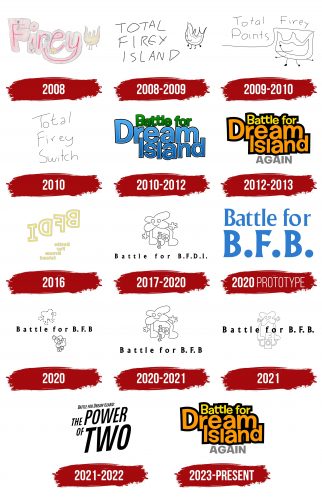
2008
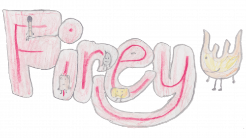
The emblem was created specifically for the comic’s character that preceded the series. At the center of the logo, the name Firey, the main character from whom all the adventures began, is written in large letters. The name is drawn with a red colored pencil, and each letter has shading around it, giving the effect of symbols burning like dry kindling. This technique makes the letters “come alive,” implying they are ablaze. The outline of each letter is sketched with a simple pencil, giving the entire logo a deliberately amateurish look, as if it were drawn by a child, which adds a special charm to it.
Inside each letter, other characters from the story come to life, comfortably settled within the letters:
- Match is sitting inside the letter “F”;
- Eraser has found a spot in the letter “I”;
- Leafy confidently stands inside the letter “R”;
- Spongy is positioned within the letter “E.”
To the right of the name is Firey himself, illuminating his friends with orange flames as if emphasizing his leading role in the story.
This logo became the foundation of future animation, visually representing the fun and amusing characters who later won viewers’ hearts with their charm and restless spirit of adventure.
2008 – 2009
In 2008, the first issue of the comic Total Firey Island was released, and the logo for this edition perfectly matches its spirit. It is handwritten, creating a sense of ease as if it were spontaneous notes in the margins. The uneven lines, drawn with a thin black pen, give the logo a lively and informal look. Each word of the title is placed on a new line, adding dynamism to the logo and reflecting the unpredictable nature of the story.
The comic character, designed similarly stylistically, is depicted to the right of the inscription as if watching over his name. This technique connects the character and the logo, making them part of a unified visual narrative.
The entire emblem is hand-drawn, emphasizing the comic’s lightness and effortlessness. The logo seems so airy and fleeting that it is about to rise with the flames and dissolve into the air, highlighting the main character’s fiery nature and restless personality.
2009 – 2010
The emblem was created to continue the comic titled Total Firey Points. The logo is again done in a hand-drawn style, giving it the same sense of ease and lightness as in previous issues. Simple, thin pencil lines create the feeling of an unfinished drawing as if it’s a sketch from one of the episodes that are about to shift into something new. This visual choice conveys an atmosphere of constant motion and change, as if each page is ready to turn.
In the logo, Firey is separated from the title by a smooth, curved line that intentionally resembles a barrier or obstacle the hero must overcome. This element can also be interpreted as a finish line, symbolizing the challenges awaiting the hero on the path to victory. The curve of the line emphasizes the dynamism and activity as if inviting the reader to join Firey on new, exciting adventures.
2010
Total Firey Switch is the second season of the comics, which preceded Total Firey Points. Only one issue was released before the series was canceled. The emblem for this season maintained a connection to the first part but introduced some distinctive features. The title, as before, was written in three levels, but now the letters appeared neater and calligraphic. The lines begin with capital letters, giving the logo more structure and order.
Despite these changes, the logo retains simplicity and lightness, reminiscent of something a schoolkids could have drawn. This stylistic choice creates a sense of childlike spontaneity, preserving the atmosphere of ease and casualness that has always been present in the Firey comics.
2010 – 2012
The first emblem of the animated series on YouTube, created by the authors of the original comic, is designed in three levels and reflects the main idea of the plot. The series’ title conveys the essence of the story, where the characters fight for the right to own a magical island full of servants, hotels, and restaurants.
The logo is visually divided into two parts through clever use of colors. The phrase “Battle for” is done in green tones, symbolizing the island’s nature and emphasizing the game’s constructive aspect, where growth and progress take center stage. The green color conveys a sense of growth and vitality, fitting into the idea of the development of events.
The letters in “Dream Island” are colored blue with a soft gradient, associated with clear skies and the vast waters of the ocean surrounding the island. The blue color symbolizes the dream, and the gentle glow from the letters highlights the desirable and beautiful grand prize for the contestants.
The font is done in a cartoonish style, where the letters seem to bounce with excitement and anticipation, expressing the thrill and eagerness of the characters to begin the competition for the coveted island.
2012 – 2013
The emblem of the second season of the series Battle for Dream Island Again retained its bright and dynamic style, but now the title is in a yellow-orange color scheme. These shades symbolize teamwork, the introduction of new characters, and a more relaxed yet exciting pace of the competition. The design and arrangement of the words remain faithful to the first season, creating a sense of continuity and connection to the original series.
An interesting detail is that during moments when one of the contestants concludes that winning and getting the prize is impossible, the season’s title changes to Battle for Nothing. This adds humor and absurdity to the storyline, highlighting the show’s quirky nature.
One standout character is Yellow Face, who finished in 15th place and delivers the key phrase reflected in the title. His character became a link to the logo — the yellow and orange shades of the letters symbolize his role. At the same time, the black background introduces an element of dark humor that runs through the series, emphasizing the contrast and making the vibrant colors of the title even more striking.
2016
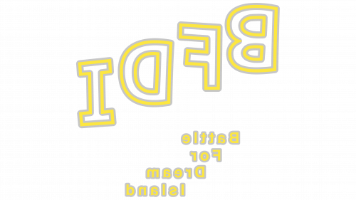
The mirrored emblem of the third season of Battle for Dream Island resembles ripples on the water as if it shifts with every movement. At the top of the logo, the abbreviation BFDI is prominently displayed, while below, cascading down, is the full title — Battle for Dream Island. This design reflects the lighthearted and humorous nature of the series. The letters are drawn as golden outlines as if the inscription were written in the sand of the dream island itself. A light gust of wind or a misstep — dreams could vanish like sand swept away by the wind.
The emblem was designed for the third season, titled IDFB—an abbreviation that mirrors BFDI. This season’s main feature is its unusual voting process: viewers decide not whom to keep but whom to eliminate from the game, adding originality and intrigue.
Though the series consists of only one episode titled Welcome Back, the action takes place three years after the end of the fifth season. This creates the feeling that the story could continue in the future, leaving viewers with a sense of anticipation and mystery.
2017 – 2020
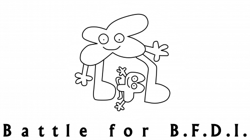
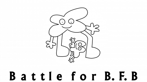
The logo for the fourth season, Battle for BFDI, is designed using thin black lines in the style of the original comics. This minimalist approach highlights the simplified animation introduced in the series to speed up the release of new episodes. This style brings viewers back to the project’s roots and adds a nostalgic atmosphere to the logo.
The logo features two main characters — Flower and Four. Flower is depicted in a large size, clearly dominating over Four, who appears small and seems to be falling to the ground at her feet. This scene symbolically reflects the season’s outcome, where Flower wins. The image emphasizes her significance and superiority, making the logo a prelude to the finale.
The contrast between the characters and their positioning on the emblem adds depth to the logo, tying the visual representation to the season’s storyline. This simple yet expressive design fits seamlessly into the series’ overall style and highlights its originality and creative approach.
2020 (Prototype)
The emblem, created as a prototype for the fourth season “B” of —Battle for BFB, retains the spirit of the original series while adding new elements. The design is done in blue ocean shades, emphasizing the freshness and dynamism of the season and symbolizing dreams and the pursuit of victory. Special emphasis is placed on the capital letters “BFB,” which stand out from the rest of the text, drawing attention to the season’s main prize.
BFB is an object created by Four, for which the characters will compete. The emblem’s design echoes the theme of dreams and the coveted trophy, bringing viewers back to the atmosphere of the first season. The style maintains continuity yet also feels refreshed — the logo in the ocean color scheme symbolizes the journey toward victory, evoking associations with sailing in search of a dream and the final goal.
2020
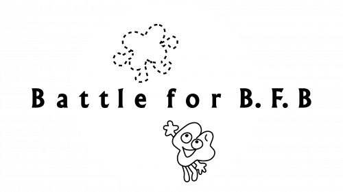
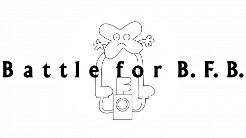
The actual emblem for the fourth season is completely different from the original prototype. The logo is designed in a minimalist style — a clean black font and a thin pencil sketch give the emblem a sense of simplicity and seriousness while maintaining the show’s distinct style. The main focus is on the image of Four, positioned above the title, with Four depicted below, desperately trying to return to the past when he was the host.
However, as in the series, Four cannot achieve his goal on the emblem. This adds an element of drama to the logo, conveying the character’s struggle and inner turmoil. The thin lines and simplicity of the design emphasize his helplessness in the face of circumstances, making the emblem a symbolic reflection of the storyline, where Four’s aspirations remain unfulfilled.
2020 – 2021
The Battle for BFB “B” logo transformed as new episodes were released. The emblem returned to the style of Battle for BFDI “A,” where the final moment shows Flower defeating Four. The main difference now lies in the altered title, but the scene itself — the battle between the characters — remains familiar and central to the plot.
This transformation symbolizes continuity between the seasons, adding a new twist to the story’s development while staying true to the original concept. The logo emphasizes the essence of rivalry, where one character triumphs over another, and the changes in the title highlight the new events unfolding in this season.
2021
Another variation of the Battle for BFB “B” logo presents an interesting interpretation, where the winner’s image — Flower — is integrated into the title. In the emblem, you can see the Announcer holding Flower up triumphantly, emphasizing the importance of Flower’s victory.
This scene conveys the hero’s triumph, symbolizing the conclusion of an intense battle where every participant fought for the prize. Integrating the image into the title gives the logo a sense of motion, transforming it from text into a lively reflection of the season’s finale. This logo variation highlights the significance of the final event, where the winner reaches the top, and the others must acknowledge their success.
2021 – 2022
The fifth season’s emblem stands out with its bright and dynamic style. The logo comprises words of varying sizes, giving it a sense of motion and speed. The font is slanted forward, creating an impression of energy and momentum. The main focus is on the phrase “Power of Two,” which represents the season’s main prize. This prize symbolizes unlimited power, capable of altering reality, reflected in the play with text sizes on the emblem.
The host of the fifth season, Two, holds this power, emphasizing his role as the character controlling the events. Overall, the logo captures the essence of the season, where the battle for limitless possibilities becomes the central theme, and the dynamic design highlights the thrilling atmosphere of the competition.
2023 – today
The logo for “Battle for Dream Island Again” continues the design approach of the original emblem created for the first part of the series. The text’s bright orange and yellow colors on a black background create a vibrant and energetic image associated with the fun yet intense competition between the characters. The font is large and bold, symbolizing each episode’s significance and the events’ scale.
The orange color of the word “Dream” dominates the logo, emphasizing the central theme of the fight for a dream and the characters’ desire to win the island. The yellow color of the word “Battle” highlights the situation’s essence — a game that turns into a real battle. The black outline around the letters adds clarity and drama, reminding viewers of the participants’ challenges and obstacles.
The logo’s bright and slightly cartoonish style fits the show’s format. The characters are animated objects, each with a unique personality. This helps maintain the balance between humor and tension accompanying each challenge in the show.
The emblem has remained nearly unchanged since the first season, demonstrating a commitment to the original style and preserving a sense of nostalgia for viewers who have followed the project from the beginning.
