The Big Idea Entertainment logo appears lively and energetic, creating a sense of immediacy and warmth. Using mascots adds brightness to the emblem, making it recognizable and memorable. Each character expresses different emotions, giving the impression of a real conversation between the company and its young viewers as if the brand engages in dialogue with the audience.
Through this approach, the company has transformed animation beyond mere entertainment. The logo symbolizes fun and joy, emphasizing the importance of communication and reflecting the company’s mission to create projects that resonate with the audience’s hearts.
Big Idea: Brand overview
The story of Big Idea began in 1989 when Mike Nawrocki and Phil Vischer met at St. Paul’s College in Illinois. Both shared a strong passion for Christian values and animation. After graduating, Phil started experimenting with computer animation using his Amiga home computer.
In 1993, Phil officially founded the production company. The business started in Phil’s bedroom at his parents’ house in Chicago, and soon after, Mike Nawrocki joined him. Their first project was a prototype for what would later become the VeggieTales series, called “Mr. Cuke’s Screen Test.”
1993 marked a turning point with the release of the first full-length VeggieTales episode, “Where’s God When I’m S-Scared?” Written by Vischer and Nawrocki, the 30-minute animated episode used advanced 3D animation technology for its time. Despite a low budget and some technical limitations, the episode was well-received by audiences.
The success of the first VeggieTales episode allowed the company to grow. Over the next few years, more episodes were produced, continuing with the concept of using animated vegetables to teach children Bible stories and moral lessons.
In 1995, the business moved into its first official office in Chicago. By 1996, it employed ten people. The episode “Dave and the Giant Pickle” gained widespread popularity that year, increasing the brand’s recognition.
The first full-length movie, Jonah: A VeggieTales Movie, was released in 1998. Production took several years and cost a substantial amount of money. With a budget of $14 million, the film was a modest success, grossing over $25 million when it hit theaters in 2002.
By the early 2000s, the studio had grown into one of the largest independent animation companies in the U.S. In addition to videos, the product line expanded to include books, toys, and other merchandise featuring VeggieTales characters.
Despite its success, the company faced financial difficulties. Poor distribution decisions, high production and marketing costs, and other factors led to bankruptcy in 2003.
Later that year, the assets were sold to Classic Media (now part of DreamWorks Animation). Despite this, Phil Vischer and Mike Nawrocki continued working on Veggie Tales under contract with the new owners.
The production company released new VeggieTales episodes and projects in the following years. In 2005, the second feature film, The Pirates Who Don’t Do Anything: A VeggieTales Movie, was released. After DreamWorks Animation acquired Classic Media in 2012, further changes occurred. In 2014, a new Netflix series, VeggieTales in the House, debuted with updated character designs and a fresh storytelling approach.
Universal Pictures’ acquisition of DreamWorks Animation in 2016 further impacted the studio’s direction. In 2017, Netflix launched another series, VeggieTales in the City.
In 2019, it was announced that VeggieTales would return to its original format, airing new episodes on Trinity Broadcasting Network (TBN).
Between 2020 and 2023, the company continued working on new projects, including reviving the beloved VeggieTales series. The business also expanded its online presence with interactive content and new web-based initiatives. Despite financial challenges and changes in ownership, the company has remained true to its mission of producing quality family entertainment rooted in Christian values. Its influence on Christian education and entertainment for children continues to be significant.
Meaning and History
At the beginning of its journey, Big Idea was known as a creator of high-quality content with Christian values, and the VeggieTales characters became symbols of kindness, humor, and morality for children. However, by the time the latest version of the logo appeared, the company was already facing financial problems and the closure of its main projects. This is reflected in the slightly sad yet still good-natured expressions on the faces of the characters, who had always been symbols of optimism and joy.
What is Big Idea?
This American entertainment company gained recognition in the children’s media industry through its creative storytelling methods. It is best known for creating the animated series “VeggieTales, “where anthropomorphic vegetables teach children Christian morals and values in an entertaining and accessible way. The show stands out for its unique blend of educational content, humor, and memorable musical numbers, making it popular among children and parents. The company also created projects like “3-2-1 Penguins!” and “LarryBoy Adventures,” which continue to showcase their talent for creating charming characters and engaging stories that entertain and educate.
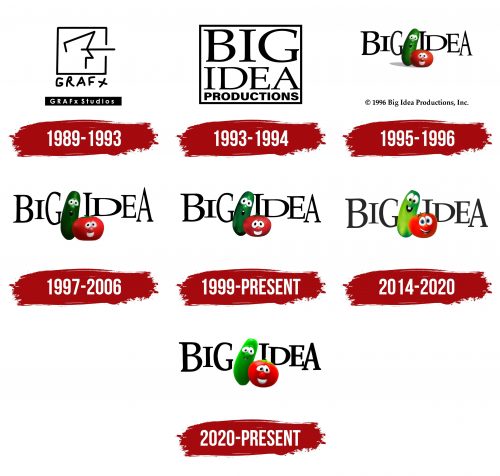
1989 – 1993
The studio’s emblem fully aligns with its original name, reflecting a spirit of creativity and originality. The logo comprises a graphic image with a signature and a plaque featuring the official name, giving the emblem a stylish and memorable look. The image is drawn in black lines, resembling pencil or marker strokes, which creates a feeling of ease and a handmade touch.
The focus is a square symbolizing a screen or canvas with an unfinished human profile inside. A straight beam of light emanates from this character’s eye, combining two important processes: filming, where the operator closely follows the action through the camera, and projection, where the projector beam is directed at the screen, displaying the recorded frames.
Below the square, the name “GRAF X” is written in black marker in what looks like amateur handwriting. This play on pronouncing the letter “X” strengthens the connection to the word “graphics,” making the name original and abbreviated, giving the brand a light and fresh dynamic.
Below that, on a black rectangular plaque, the full name “GRAFх Studios” is printed in white uppercase letters. A distinctive feature is using the “х” symbol as a multiplication sign, not a letter, symbolizing expansion and the multitude of graphic elements that ultimately come together into a film strip. This technique emphasizes the company’s original goal of creating advertising graphics, which is reflected in the choice of the studio’s name.
1993 – 1994
In 1993, the company was renamed Big Idea Productions, marking an important step in its development. This name change was associated with the decision to produce children’s videos and the launch of the VeggieTales project. The name implied the main idea about God and salvation, as the content of the cartoons became biblical.
The studio’s new logo still consists of a square, but that’s where its similarity with the previous emblem ends. Inside the perfectly measured geometric figure with clear, straight edges, the brand name is placed and divided into three levels. “Big Idea” is written in a large, refined font with elegant serifs, while “Productions” is written in smaller, bold characters with smooth glyphs.
This play of fonts and sizes gives the logo dynamism and makes it visually interesting and appealing. The light gray color complements the composition, emphasizing the spiritual and profound meaning of the products the company began to create.
1995 – 1996
The 1995 emblem more accurately reflected the company’s focus on children and introduced the characters from the brand’s main franchise, VeggieTales, for the first time. The logo became livelier and more colorful, attracting attention with its brightness and memorable characters.
In the foreground are animated vegetables — Bob the Tomato and Larry the Cucumber, the central figures of the cartoon. These cheerful, lively vegetables symbolize the very spirit of children’s cartoons, capturing kids’ attention with their friendly appearance and funny personalities.
In the background, the inscription “Big Idea” is written in black letters with serifs that seem to “bounce,” adding dynamism and playfulness to the overall image of the emblem. The logo turned out bright, colorful, and symbolic, as the company’s name proved to be prophetic — their main and most successful product became the VeggieTales project.
1997 – 2006
In 1997, there were changes in how viewers perceived the emblem. If the vegetables appeared miniature in the previous version, and the observer seemed to be looking at them from above, the logo was now raised to eye level. This technique made the characters feel closer and more friendly to young viewers, as if Bob the Tomato and Larry the Cucumber had become real friends with children.
The figures look larger, and their color palette has become richer, making the characters even more expressive. This visual effect highlights the importance of their roles, and their advice and lessons have become more significant for the audience. The emblem has become brighter and deeper, reflecting the important ideas and meanings embedded in the cartoon, stepping beyond the bounds of ordinary entertainment.
1999 – today
The Big Idea company logo looks bright and kind, reflecting its main goal—to create entertaining and educational content for children. The central elements are the characters—cucumber and Tomato—who attract and appeal to the young audience thanks to their cute and slightly naive facial expressions. Their large, expressive eyes, full of wonder and joy, make the image more lively and emotional, helping children easily engage with the characters.
The font is bold and slightly casual, giving it a sense of ease and friendliness. It’s especially noticeable how the letters “I” and “G” have become “homes” for the Cucumber and Tomato. This font serves as a platform for the characters, where they “live,” highlighting their important role in the project. The bright colors of the characters contrast with the black text, enhancing their visual prominence and creating an atmosphere of fun.
The cucumber and tomato represent simplicity and straightforwardness and are close to nature. This also reflects the company’s philosophy—to convey important messages through simple images. This is especially crucial for children, who perceive information through images and emotions.
2014 – 2020
The emblem was created for the VeggieTales series on Netflix. It appeared after the parent company, Classic Media, was acquired by DreamWorks Animation, and the brand was renamed Big Idea Entertainment. With this update, the characters in the logo underwent significant changes—they became much lighter, brighter, and more cheerful, giving the emblem a friendlier and more joyful look.
Previously, the characters’ images showed elements of surprise and confusion, but now, these emotions have given way to playful fun. Larry the Cucumber smiles wider, showing his two upper teeth, which gives him a special childlike spontaneity. This look makes Larry closer to young viewers, turning him into a funny companion with whom it’s easy and fun to spend time.
2020 – today
The Big Idea logo, featuring the characters Cucumber and Tomato, became a symbol of the company, and it has been known for many years for its animated series VeggieTales. In the new version of the emblem, the characters appear more confused, reflecting challenging times for the company. Their slightly sad expressions, unlike the usual cheerful faces, suggest that they are aware of the problems the company has faced in recent years.
Cucumber and Tomato are placed against the background of the company name, written in bold font. The letters are large and clear, and their visual “weight” creates a sense of stability and significance for the brand, as if saying that despite all the difficulties, the company has left a significant mark in the history of children’s animation. This bold lettering can be interpreted as a symbol of determination to leave its mark in the industry despite financial and creative challenges.
The vegetable characters still occupy a central place in the logo. They are both a design element and the true “faces” of the brand, which have always been its soul. The characters’ green and red colors emphasize natural freshness and simplicity, symbolizing sincerity and closeness to the audience, especially to children.
