![]() Brooklyn Nets Logo PNG
Brooklyn Nets Logo PNG
Dedication to American basketball and focus on the game are the main ideas of these athletes. Therefore, the “Brooklyn Nets” club chose a heraldic logo, although today, the triangle looks a little like the classic shield it used to be. However, the spirit of competition and the will to win are forever etched in it.
Brooklyn Nets: Brand overview
| Founded: | 1967 |
| Founder: | Joseph Tsai |
| Headquarters: | Brooklyn, New York, U.S. |
| Website: | nba.com |
The Brooklyn Nets is an American professional basketball team based in the Brooklyn borough of New York City. The Nets began playing in the National Basketball Association (NBA) as a member of the Atlantic Division of the Eastern Conference in 1976. The team was founded in 1967.
The club was established in 1967 as a charter franchise of the NBA’s competing league, the American Basketball Association (ABA). During the first season, the team played in New Jersey as the “New Jersey Americans,” and in 1968, they moved to Long Island and changed their name to the “New York Nets.” They played under this name until 1977. Then, they returned to New Jersey and played as the “New Jersey Nets” from 1977 to 2012. In 2012, the team moved to Brooklyn and was renamed the “Brooklyn Nets.”
The name “Nets” was chosen because it rhymes with “Mets” and “Jets” – two other New York teams. The former is from Major League Baseball, and the latter is from the American Football League. Additionally, the word “nets” directly relates to basketball.
The franchise’s first owner was Arthur Brown. After the debut season, he sold it to Roy Boe, who owned the club for almost ten years until he made a deal with Secaucus Seven in 1978. The new owner rebranded and chose another logo. Ten years later, the team was transferred to Raymond Chambers and Lewis Katz, and then in 1999, it went to Yankee Nets.
Bruce Ratner became the next owner. On September 23, 2009, Russian magnate Mikhail Prokhorov agreed with Ratner to buy 80% of the Nets’ shares for 200 million dollars, provided that Ratner received funding for the arena project.
Meaning and History
![]()
In September 2011, it was announced that at the end of the 2011/12 season, the “New Jersey Nets” would be renamed the “Brooklyn Nets” in connection with the move to a new arena in Brooklyn. The team changed its logo and primary colors, which became black and white. It’s known that rapper Shawn Carter, better known as Jay-Z, is one of the “Brooklyn” owners. It’s also no secret that he participated in creating the new Brooklyn Nets logo.
Jay-Z admitted that he was inspired to create a similar logo by the old symbolism of the New York subway. He used the black-and-white color scheme of the old system of signs from the New York subway, paying tribute to the city’s heritage. The graphic elements for the Brooklyn Nets logo were taken from the sign system that existed until 1957, when a professional team last appeared in Brooklyn.
The Brooklyn Nets logo was presented in its debut year and directly reflected basketball themes. Its main components are the ball and the name, reproduced in different variants. In total, during the club’s existence, there have been eight different versions of its symbolism—the earliest emblem dates back to 1968 and the latest to 2012.
What is Brooklyn Nets?
The Brooklyn Nets is the first major sports franchise in Brooklyn since the Brooklyn Dodgers moved to Los Angeles. It has been a member of the NBA’s Atlantic Division since 1976. Before that, the team was the backbone of the American Basketball Association. For two years from its foundation, the basketball club was known as the “New Jersey Americans.” After moving to New York, it was nicknamed the “Nets.”
1968
![]()
The New Jersey Americans logo from this period features a blue shield with white and red stripes of the American flag at the bottom. In the center is a basketball, and on both sides of it are three stars. Above them, the word “N. J. AMERICAN” is printed in white.
1968 – 1972
![]()
After moving to Long Island, New York, the team became known as the “New York Nets.” After redesigning, abandoning the shield but retaining the colors – red, blue, and white – the emblem became known as “Nets” against the backdrop of the red word “NY” written in block letters, with an image of a typical player next to it in black.
1972 – 1977
![]()
In 1972, the “Nets” decided to continue with the previous logo with the red-white-blue basketball and removed the athlete. However, they kept the previous primary logo – the blue word “nets” against the red block “NY.” The top of the basketball is red, and the bottom is blue. These two colors on the logo are the colors of the U.S. national flag.
1977 – 1978
![]()
This version dates to when the team renamed itself the New Jersey Nets due to its move to New Jersey. The designers reworked the previous New York Nets logo, preserving the previous basketball color scheme and adding a dark outline. They placed the word “NEW JERSEY” in the upper field and “BASKETBALL” in the tail field. The central element received a different font and color. The word “Nets” sign is black, handcrafted, with a truncated tilde in the letter “s.”
1978 – 1990
![]()
The logo from this period moved away from standard inscriptions, the basketball size increased, and the color scheme partially changed (the shades became lighter). The New Jersey Nets logo lost the sports-related meaning: the designers added a white map of New Jersey state and the inscription “New Jersey” on the left. The word “Nets” became larger and lower.
1990 – 1997
![]()
The New Jersey Nets logo features a gradient mix of primary colors: first blue, then white, followed by red-white, and finally blue again. On the cut-off basketball, the word “NETS” is written in large letters. The basketball is divided into fragments by white stripes with a black outline. The word sign also has a dark outline. The front fragment of the letter “N” has an elongated shape.
1997 – 2012
![]()
The Brooklyn Nets returned to the concept of a shield from their first logo. The logo features a stylized inscription “NETS” and a gray basketball with white and blue stripes. The central element was moved inside a circle, which consists of three thin lines of different colors – white, red, and blue. This symbolizes a basketball hoop and a reference to a separate basketball planet with its orbit. The shield is blue with a dark gray outline and slightly turned to the left. In the Brooklyn Nets logo version, the color palette became deeper.
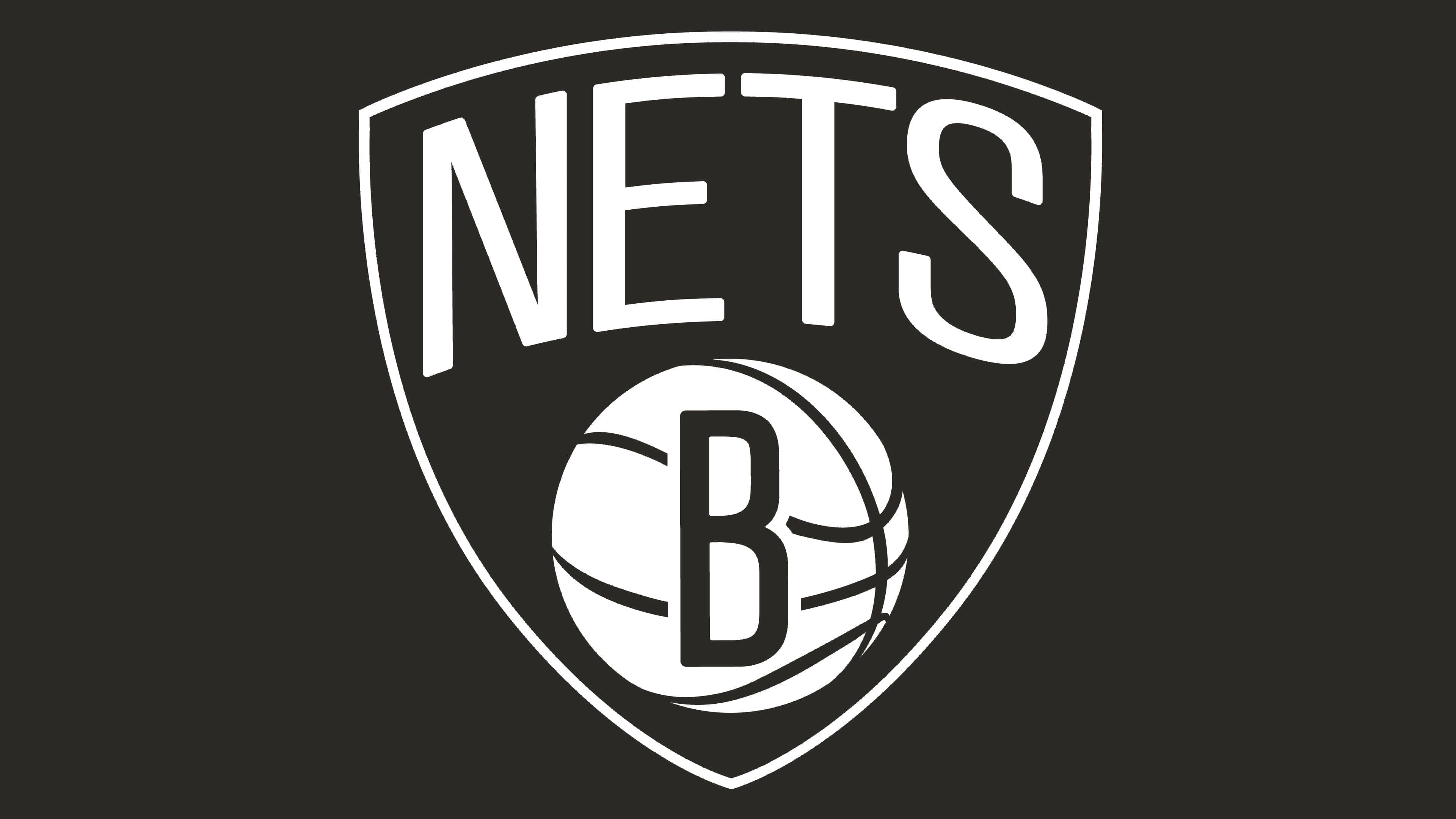
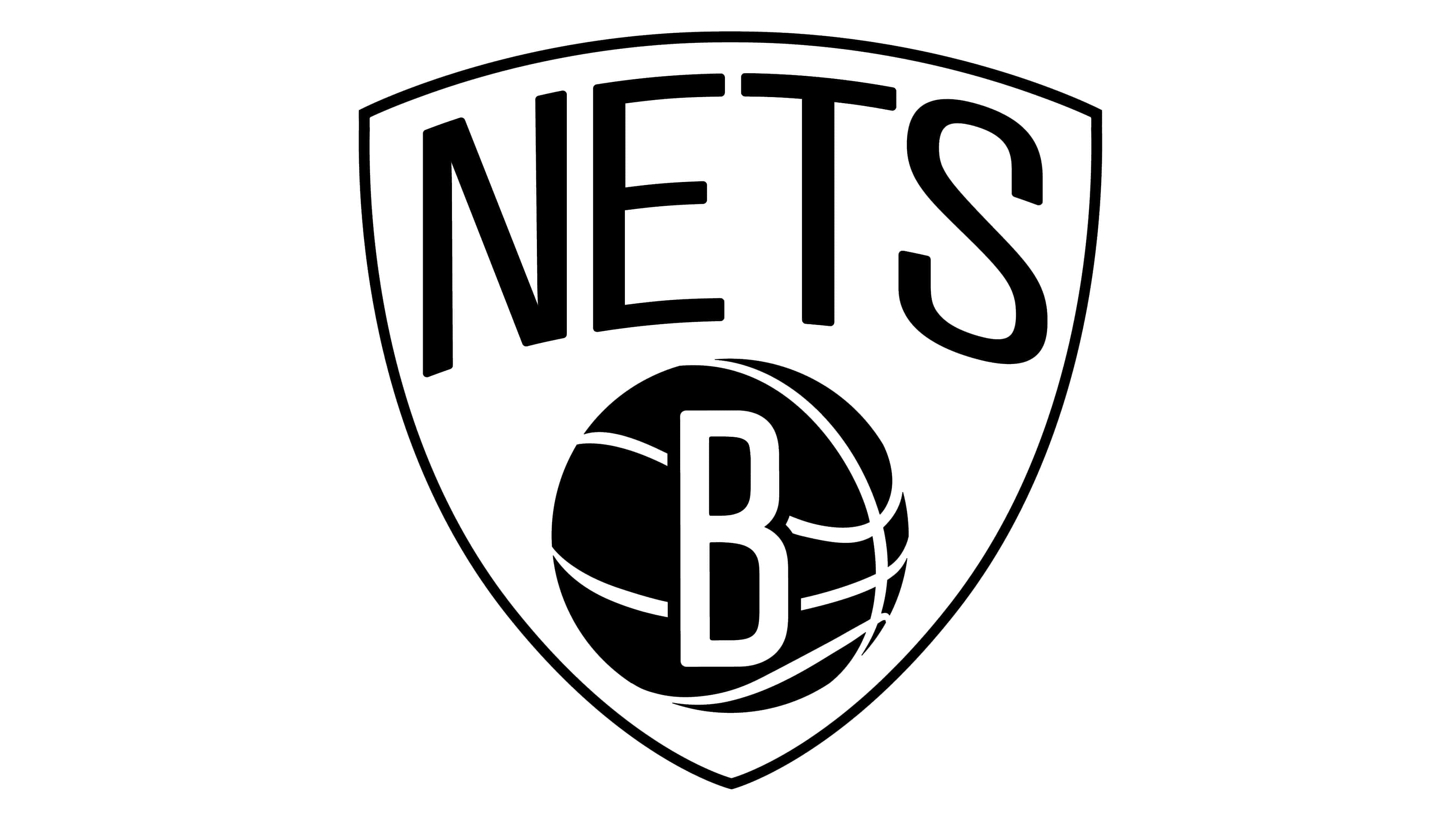
2012 – today
![]()
The new Nets logo combines two unrelated cultures – hipster and gangsta rap. According to this subculture, you must be “in the know.” The distinctive hip-hop is associated with black skin color, an owner who raps, the city of Brooklyn, and its unique life.
After the basketball players moved to Barclays Center (to the team’s co-owner), a redesign of the visual identity was conducted. Rapper Jay-Z authored the logo. The updated version is presented in the same style as before – a shield with a large letter “B” placed in the center of the ball. But the type of drawing has changed, so the logo looks much simpler: a dark background, a white inscription, a light ball, and a black letter. The letter “B” indicates the club’s location – Brooklyn.
Despite significant changes in the Nets’ style, one thing has migrated from the past – the shield on the emblem. However, unlike the last version of the “New Jersey” logo, the Brooklyn shield is depicted on a plane, not in a three-dimensional image, as was popular in the 90s. In creating the new emblem of the Brooklyn Nets, the designers abandoned the blue, red, and silver colors previously used. Currently, no NBA club operates in black-and-white monochrome, which makes the Brooklyn Nets unique and different from others.
Brooklyn Nets : Interesting Facts
- Starting Out: They began in 1967 as part of a different league and were first called the New Jersey Americans. They moved to New York and changed their name to the Nets to match the local baseball and football teams, the Mets and Jets.
- Winning Big Early: In the early days, they won two championships thanks to a superstar player, Julius “Dr. J” Erving.
- Joining the NBA: In 1976, the Nets joined the NBA but had to sell Dr. J because of the money it cost to join and to make peace with the New York Knicks, another NBA team.
- Moving Around: The Nets have moved a few times. They spent much time as the New Jersey Nets before moving to Brooklyn in 2012 and getting a new arena.
- A New Home: Their move to Brooklyn and the Barclays Center was a big deal, giving them a modern place to play.
- Becoming Cool: When they moved to Brooklyn, Jay-Z, a famous rapper, helped redesign the team’s image, making the Nets a symbol of Brooklyn.
- New Ownership: In 2010, a Russian billionaire bought the Nets, becoming the first non-North American owner in the NBA. He tried hard to make the team win by getting famous players.
- Big Moves: The Nets have tried to get good players to win championships, including trading for stars like Kevin Garnett and signing others like Kevin Durant.
- Coaches: They’ve had several coaches, including Jason Kidd, a famous player before becoming a coach.
- Helping Out: The Nets also do much for the community, working on projects for kids, health, and fairness through the Brooklyn Nets Foundation.
The Brooklyn Nets have a cool story, from their early days to becoming a big part of Brooklyn’s culture and trying hard to win in basketball.
Font and Colors
The main components of the logo are two elements: a basketball (separately, in the hands of an athlete or as a background) and the word “Nets” (the second part of the team’s name). All versions are built on their unique combination.
In the early versions of the logo, handwritten text predominated. It was the main one and was placed against the background of classic letters with serifs: in the foreground were “nets” with curves, and in the background – the elongated “NY” from the word “New York.” After changing the location to New Jersey, the name of the new city replaced the previous one. Then, the textual part of the logo changed: instead of long characters with serifs, there appeared squat block signs. After the recent redesign, the club chose the RollSign font.
The palette precisely replicates the national flag of the USA: the emblem features red, blue, and white colors in different proportions. The exception is the current version, done in monochrome – black and white.
Brooklyn Nets color codes
| Black | Hex color: | #000000 |
|---|---|---|
| RGB: | 6 25 34 | |
| CMYK: | 30 0 0 100 | |
| Pantone: | PMS Black C |
FAQ
Have the “Brooklyn Nets” changed their logo?
Yes, this basketball team changed its logo in 2012 when it moved to Brooklyn from New Jersey. It kept the shape of the shield, though it made it two-dimensional. The ball at the bottom remained, but it now features the letter B. The font for the inscription NETS became more traditional, and the word BROOKLYN appeared under the shield. Instead of a colorful palette, a classic black-and-white color scheme was used.
Who designed the Brooklyn Nets logo?
The logo adopted by the Brooklyn Nets in 2012 was designed by Timothy Morris. He is one of the designers responsible for the visual style of American rapper Jay-Z. The fact is that Jay-Z acquired the rights to the Brooklyn sports franchise.
What does the Brooklyn Nets logo mean?
The shield is a traditional element of any logo, including sports ones, so its appearance can be explained by an attempt to create a symbol close to heraldry’s canons. The basketball has special significance, being the main attribute of the Brooklyn Nets: it appears in almost all team emblems except for one. The letter “B” on the ball symbolizes the city’s name.
What does the inscription Bed Stuy on the Brooklyn Nets’ uniform mean?
The inscription “Bed-Stuy” on the athletes’ jerseys is a tribute to the Bedford-Stuyvesant district and the people born there. First and foremost, it is dedicated to rapper Christopher George Latore, known as Wallace Notorious B.I.G.