The original visualization of “Chupa-Chups,” whose logo was created by Salvador Dali, provided brand recognition and was founded in 1958. Bright and attractive graphics for children were supported by clear information. The word “chupar” in Spanish means “to suck.”
Chupa Chups: Brand overview
Chupa Chups is a confectionery company from Spain known for its round candies. It emerged in 1958 when Enric Bernat acquired the company Granja Asturias, which produced apple jam. After watching the children, the businessman came up with the idea to stick candies on a stick. The businessman noticed that his main consumers were dissatisfied with regular candies: their hands became sticky, causing parents to scold them often. Now, the brand is owned by the Italo-Dutch corporation Perfetti Van Melle and offers over a hundred varieties of candies.
In 1958, Enrique Bernat, a confectioner from Barcelona, started Chupa Chups to make candies that wouldn’t sticky hands. He put a lollipop on a stick and called it “Chups,” after the Spanish word for “to suck.” Initially made by hand and sold nearby, the candies became so popular that Bernat soon automated the making process.
In the 1960s, Chupa Chups reached international markets like France, the UK, Japan, and the USA with its eye-catching wrappers and diverse flavors. The brand made a bold move in 1969 by having Salvador Dali design its logo, which featured a daisy and became iconic.
Over the 1980s and 1990s, the brand expanded worldwide, opening factories in Russia, China, and Mexico and teaming up with popular brands and franchises for unique editions.
In 2006, Chupa Chups was bought by Perfetti Van Melle, a major confectionery company, helping it expand globally and diversify its products. By 2018, the brand celebrated its 60th anniversary, offering over 100 flavors in more than 150 countries.
Today, Chupa Chups is seen as a symbol of fun and creativity, cherished by kids and adults and associated with happy, nostalgic memories. Its journey from a simple lollipop to a worldwide favorite demonstrates the impact of innovation, effective marketing, and strategic collaborations. Chupa Chups is a testament to creativity and quality, ready to delight future generations with its colorful and imaginative treats.
Meaning and History
The prototype of the famous Chupa Chups logo only appeared in 1969. Before that, developers experimented with style, making the design understandable and attractive to the target audience.
What is Chupa Chups?
Chupa Chups is a Spanish brand owned by the Italian company Perfetti Van Melle. Its most famous product is a lollipop. Under the Chupa Chups brand, chewing gum, toys, and soft drinks are also sold.
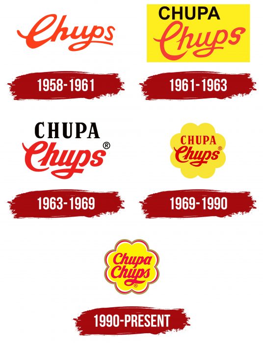
1958 – 1961
The first emblem is simple: it contains a stylized red inscription, “Chups,” executed in a handwritten font. This word comes from the Spanish verb chupar, which means “to suck.”
1961 – 1963
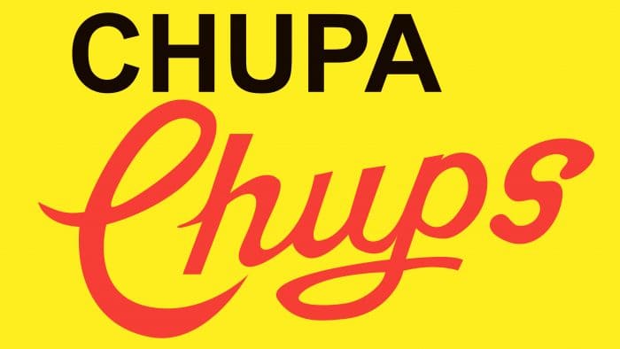
The new logo with the slogan “Es rodo i dura molt, Chupa Chups” became part of the marketing campaign. The phrase translates from Catalan as “It’s round and very long.” The original word “Chups” hardly changed: designers placed it diagonally and made the lines thinner. The background is a bright yellow rectangle.
1963 – 1969
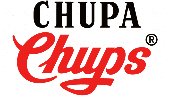
In 1963, a two-color trademark appeared on the labels. On top is the black inscription “Chupa,” executed in a standard serif font. Below is the red inscription “Chups,” stylized as handwritten text.
1969 – 1990
Spanish artist Salvador Dali created the 1969 logo. The owners of the confectionery company invited the famous artist to develop his version of the “Chupa-Chups” symbol. Dali placed the brand name inside a daisy. The shape of the daisy seems very simple, but at the same time, it is unique. By the way, the famous surrealist advised placing the emblem on the top part of the lollipops, not on the side, to be immediately noticeable to customers.
1990 – today
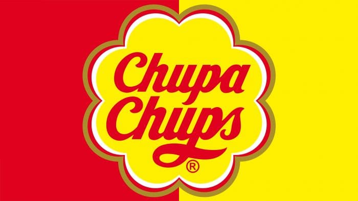
Despite the enormous popularity of the logo created by Salvador Dali, it was decided to change it. Designers modernized the corporate style, repainting the neon-yellow flower and surrounding it with three outlines: gray-green, red, and white. They also updated the font, changing the lettering of “C” and “S” in the word “Chups” and depicting “Chupa” in a handwritten font.
Chupa Chups: Interesting Facts
Chupa Chups are those tasty lollipop candies that have been around since 1958, starting in Spain. They’re famous for lots of flavors and having a stick so you don’t get sticky hands.
- How It Started: Enric Bernat made them because he thought candies on a stick would be easier and cleaner to eat. The name comes from the Spanish word for “to suck.”
- Cool Logo: The famous artist Salvador Dalí designed their logo, which looks like a flower. He did it super fast, using a newspaper.
- First Tastes: They started with apple, orange, and strawberry flavors. Now, they have all sorts of flavors, even cola and some out-there ones like chili.
- Around the World: Chupa Chups are available in over 150 countries. They went international pretty early, which helped them become a well-known candy everywhere.
- In Space: Yep, Chupa Chups went to space in 1995 with Russian cosmonauts, making it the first candy to float in space.
- Smart Ads: They’ve done clever things to sell more candies, like putting vending machines right where kids can see and reach them.
- The Beatles Liked Them: In the 1960s, The Beatles were seen with Chupa Chups, which made them even more popular in places like the UK.
- Biggest Lollipop: They made a giant lollipop for their 45th birthday, weighing over 4,700 pounds!
- More Than Lollipops: Now, they also make things like gum, cotton candy, and chocolate-covered lollipops.
- A Big Deal: Chupa Chups isn’t just candy; it’s a big part of pop culture. They’ve worked with fashion brands and appeared in movies and TV shows.
Chupa Chups has a cool story: from an idea to a candy known worldwide, they keep coming up with fun new flavors and ways to enjoy them, making them a favorite for many people.
Font and Colors
The modern Chupa Chups logo resembles a flower with eight rounded petals. This was Salvador Dali’s idea, although the overall style is noticeably different from what the Spanish artist proposed. Designers moved away from restrained minimalism and added many small details and arch-like lines. They also changed the inscription in the daisy’s center, making the words symmetrical.
The first advertising slogan, which was supposed to attract the attention of Spanish consumers, said: “Chupa-Chups.” The advertisement became so viral that it was decided to change the name of the candies, and so they were called “Chupa-Chups.” From that moment, sales began to grow and expand in countries close to Spain. The first slogan also included és rodó i dura molt, Chupa Chups, which translates from Catalan as “it’s round and long-lasting.” One of the most important decisions was replacing the wooden stick with a plastic one, which was much cheaper. After some time, it was decided to make a new logo, and then Enrique turned to his friend and great artist, the famous surrealist Salvador Dali.
In one version, the genius created the logo in only an hour; in another, the artist spent hours drawing on newspapers, which became the hallmark of “Chupa-Chups.” Either way, Dali’s idea was extremely simple: to place red letters on a yellow daisy flower. The logo was only rebranded once, in 1988.
Until 1990, the logo combined two fonts: an antiqua with short serifs and a handwritten one with curls. The modern trademark is not so diverse in terms of typography. The phrase “Chupa-Chups” is kept uniformly, and the letter “c,” which was previously printed, became handwritten.
To make the candy wrapper attractive and interest the child audience, designers used several colors as the main ones – red and yellow, as additional – gray-green and white. The bright palette is combined with the shape of the daisy, balancing the emblem’s illusory simplicity.
FAQ
What does the Chupa Chups logo represent?
In 1969, Salvador Dalí, a renowned surrealist artist, designed the Chupa Chups logo, blending art with commercial branding in an innovative way. This logo, featuring a daisy-like shape, highlights the lollipop’s round and durable nature. It aligns with the brand’s original slogan, “Es redondo y dura mucho, Chupa Chups,” translating to “It’s round and long-lasting.” This design and slogan capture the appealing and enduring experience Chupa Chups offers. Choosing Dalí for the logo design emphasized the brand’s commitment to creativity and setting itself apart in the candy market. Over time, Chupa Chups has built on this unique identity by involving celebrities like Madonna in promotions, reinforcing its global recognition and connection to joy, creativity, and lasting appeal.
What is special about Chupa Chups?
Chupa Chups is much more than a lollipop brand; it symbolizes joy and creativity that has won over millions worldwide. Its unique character and the bright colors of its products create a “Forever Fun” vibe that goes beyond candy to include a wide variety of items. The brand stands out by promoting a fun-loving lifestyle, breaking through the typical image of candy brands. With its innovative flavors, eye-catching packaging, and clever marketing, Chupa Chups delivers more than just sweets—it brings back childhood’s playful, carefree feelings. This mix of delicious flavors, striking looks, and strong brand identity makes Chupa Chups a beloved name among people of all ages.
Does Chupa Chups come from Spain?
Yes, Chupa Chups comes from Spain. It was created in 1958 by Enrique Bernat, a confectioner who wanted to make a candy that wouldn’t make hands sticky, hence the idea of a lollipop on a stick. This concept started in Barcelona and turned Chupa Chups into a famous brand worldwide. Although it has reached international markets, its origins and heart are in Spain.
Why are Chupa Chups so hard to open?
Chupa Chups lollipops are known for being hard to open because of their packaging. The wrapper has two layers twisted together and then sealed with heat at the bottom. This sealing keeps the candy fresh and stops it from sticking to the wrapper. However, this tight twist and strong seal make it harder to open. The heat seal protects the lollipop from outside elements, ensuring it stays in good condition. But you might need extra effort to open it and get to the treat inside. This packaging choice helps keep the candy fresh and adds to the challenge of opening it.
How many flavors does Chupa Chups have?
Chupa Chups has a vast selection of over 100 flavors, appealing to various tastes. This collection goes beyond the usual fruit and cola varieties, including unique and intriguing options like Matcha Latte, Tea & Lemon, and Ramune. Popular drinks and classic tastes from different cultures inspire these flavors. Matcha Latte combines matcha green tea’s rich, creamy taste with milk, while Tea & Lemon offers a refreshing mix of tea flavor with a hint of lemon. Ramune, inspired by Japanese soda, provides a bubbly, sweet taste. Chupa Chups aims to offer something for everyone, always looking to introduce new and exciting flavors that surprise and please customers worldwide.
Why did Dali create the “Chupa-Chups” logo?
Salvador Dalí created the Chupa Chups logo after Enric Bernat, the brand’s founder, mentioned he needed a unique logo for his brand. Dalí, famous for his surreal art and open to profitable ventures, quickly accepted the challenge. He used his innovative vision and artistic flair to design the logo, seeing it as more than just a commercial job but an opportunity to blend his creative vision with branding. Dalí’s passion for the project led to the iconic Chupa Chups logo we know today, making it a fundamental part of the brand’s image. His work on the logo shows how art and business can come together in creative and lasting ways, making his contribution to Chupa Chups unforgettable.
Who invented “Chupa-Chups”?
Enric Bernat Fontlladosa, a Spanish businessman, invented Chupa Chups by putting a lollipop on a stick, making it easier and cleaner to eat without sticky hands. The catchy name “Chupa Chups” came from the advertising agency he hired, inspired by the Spanish word “chupar,” meaning “to suck.” This innovation and clever branding made Chupa Chups a worldwide favorite in candy.
What font is used in the Chupa Chups logo?
The Chupa Chups logo features unique handwriting by Salvador Dalí, not a specific font. This handwritten design comprises individual glyphs crafted for the brand, giving it a distinct look. Fonts like Vitrina, Creampuff, and Home Run Script-roman resemble Dalí’s playful and whimsical style for designs seeking a similar vibe. These fonts match the fun and lively spirit of Chupa Chups well.
Who owns “Chupa-Chups”?
Perfetti Van Melle, an Italian company with a global presence, owns the Chupa Chups brand. This company is a major player in the confectionery industry, making candies and chewing gum. By acquiring Chupa Chups, Perfetti Van Melle added one of the world’s most famous lollipop brands to its portfolio. This move strengthened its market position and enriched various popular confectionery products. Chupa Chups, known for its history and popularity, fits well with Perfetti Van Melle’s high-quality sweets loved worldwide collection.
What is the significance of the Chupa Chups logo?
The Chupa Chups logo is more than just a design on a candy wrapper; it’s a crucial part of the brand’s identity. Created by the famous artist Salvador Dalí in 1969, the logo’s colorful and playful design is a hit with kids and young adults. What sets Chupa Chups apart is placing the logo on the lollipop wrapper. This clever decision makes the logo stand out, avoiding any wrinkles and keeping it easy to see, which helps catch the eye of shoppers.
The logo plays a big part in building customer trust, too. Seeing the well-known Chupa Chups logo, customers feel confident they’re buying something they’ll enjoy. This feeling of trust keeps people coming back for more. The logo’s design is simple and welcoming, making it recognizable worldwide, regardless of language. This global appeal has helped Chupa Chups expand its market, selling candies across the globe.
In short, the Chupa Chups logo isn’t just about aesthetics. It builds brand recognition, fosters customer trust, and supports the brand’s global presence. Chupa Chups shows its commitment to being a beloved brand for candy lovers everywhere by placing the logo prominently on top of the wrapper.
What does the Chupa Chups Logo symbolize?
The Chupa Chups logo is famous worldwide, representing fun and appeal for all ages and backgrounds. Its round shape mirrors the candy itself, making it easy to recognize. Salvador Dali added petal shapes to the design, which makes the logo stand out and adds an artistic flair.
Dali’s contribution turned the logo into a brand symbol and a piece of art. His creative use of petals injects innovation into the logo. The brand name, “Chupa Chups,” comes from “chupar,” the Spanish word for “to suck,” highlighting how the candy is enjoyed and connecting with the joy of eating sweets.
Overall, the Chupa Chups logo is more than a candy brand symbol; it blends visual appeal, artistic input from Dali, and a playful name. This combination makes the logo memorable, symbolizing creativity, happiness, and the simple pleasures enjoyed by people everywhere.
Did Salvador Dali create the Chupa Chup logo?
Yes, Salvador Dali, a famous artist, created the Chupa-Chups logo. Enric Bernat, who started Chupa Chups, asked Dali to design it. In 1969, Dali showed his design, which is now known worldwide. The logo resembles a flower with petals, capturing the brand’s fun side. It has barely changed since then, showing how well-loved it is.
In 1990, the logo got a small update with three colored arcs added to keep it fresh, like Dali’s original idea. Dali also suggested putting the logo on the lollipop wrapper instead of the side. This way, it’s always visible, no matter how the lollipops are placed, which was a smart marketing idea.
Dali’s work on the Chupa-Chups logo shows how art can blend with business. The logo isn’t just a symbol for the brand; it’s also a piece of art that brings joy and creativity. This makes enjoying a Chupa-Chups lollipop feel like experiencing a piece of art history.
Who developed the Chupa Chups lollipop logo?
Salvador Dali, a famous surrealist artist, designed the Chupa Chups logo in 1969. Before Dali, Chupa Chups simply used its name in a handwritten style for branding. Dali brought a fresh and impactful design to help the brand stand out. He created a round logo with petal shapes resembling a flower, which made the logo beautiful and fun, matching the brand’s playful image. He chose bright red for the text against a yellow background, making the logo catch your eye.
Dali knew that where the logo was placed mattered much for people to notice. So, he suggested putting it on top of the lollipop wrapper instead of the side. This way, the logo would always be visible, no matter how the lollipop was placed. This smart move made Chupa Chups lollipops more noticeable in stores and ads.
Dali’s work on the Chupa Chups logo was a big deal because it showed how art and business could come together. He gave Chupa Chups a unique look that lasted for years. The logo proves how combining art with smart marketing can create something people love and remember.
What does the Chupa Chups slogan represent?
Chupa Chups has two main slogans that show what the brand is all about and how it has changed over time. The first slogan in 1958 was “És rodó i dura molt, Chupa Chups,” meaning “It’s round and long-lasting.” This clever slogan highlights the lollipop’s unique round shape and how it lasts long, making it different from other quick-to-finish sweets. It was a way to tell customers that Chupa Chups lollipops were fun and valuable.
The newer slogan, “Quit smoking, start sucking,” shifts the focus from just talking about the lollipop to addressing a bigger issue – quitting smoking. This slogan suggests using Chupa Chups lollipops as a healthier choice than smoking. It’s still fun and playful but tackles the serious topic of smoking cessation, showing Chupa Chups as more than just candy.
Even though these slogans aren’t part of the Chupa Chups logo, they’re crucial for the brand’s advertising. They neatly sum up what Chupa Chups stands for lasting fun and a positive choice. The change from highlighting the product’s features to promoting a healthier lifestyle mirrors how Chupa Chups has kept up with what people care about, blending product appeal with social awareness.
In short, Chupa Chups’ slogans are more than catchy lines. They reflect the brand’s journey from promoting a novel candy to embracing broader social issues, showing how Chupa Chups continues to resonate with consumers by staying relevant and true to its values.
