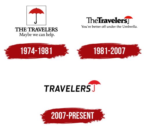
The Travelers logo is touching and unique. The emblem portrays the company as attentive and caring towards its depositors. Every insurance plan thoughtfully considers all the challenges a client might face and offers solutions.
Travelers: Brand overview
| Founded: | 1853 |
| Founder: | James G. Batterson |
| Headquarters: | New York City, New York, United States |
| Website: | travelers.com |
Meaning and History
The company was founded in 1864. Its early logos are little known. However, the red umbrella, now virtually synonymous with the insurer, has been featured on emblems since 1870. Travelers underwent lengthy mergers with other firms and name changes. The company received its final name only in 2007. However, the words “Travelers” and the umbrella have almost always accompanied the new names and emblems.
What is Travelers?
An American insurer specializing in protecting property from accidents. The company’s annual profit amounts to $37 billion. Every year, Travelers allocates more than $20 million to social programs. For the past 17 years, the company has consistently made the “World’s Most Admired Companies” list by Fortune.
1974 – 1981
The logo consists of a square frame at the forefront of the composition. Inside it is a red umbrella with a black handle. The square resembles a protective glass box; inside stands the umbrella-like in a showcase. Combining the open canopy and the box expresses the idea of dual protection against any adversities.
The image suggests making a safe contribution will await its time and protect the traveler, like a well-chosen umbrella, during the rain.
Below the square is the company’s name and its slogan: “Perhaps we can help.”
The name derives from the company’s original purpose. The company was founded by a mason named James G. Batterson to insure travelers against accidents. Train accidents in 19th-century America were quite common. Workers especially suffered during industrial transportation. In 1853, 11 crashes killed over 230 people, and in 1890, over 6,000 people were injured. Therefore, the insurance business in this area was considered profitable.
Even though the company’s policies have greatly expanded, the name has remained unchanged even 100 years after its founding.
The slogan under the larger name reflects the company’s dedication and desire to be of service.
1981 – 2007
When railway travel ceased to be as risky, the company shifted its focus to property insurance against accidents. The emblem also underwent minor changes.
The umbrella moved to the end of the inscription as if the last letters were ready to shield anyone nearby from the rain. The caption reinforced this impression: “You’re better under the umbrella.”
In 1993, the company was acquired by Primerica, resulting in the formation of The Travelers Group. In 1998, it merged with Citicorp.
2007 – today
Modern-day Travelers is the outcome of a merger between the divested Travelers Group from Citigroup and the oldest insurer in the US, St. Paul. Originally, the alliance was named St. Paul Travelers after both companies, but in 2007, the conglomerate’s name was changed to The Travelers Companies.
The new partnership adopted a succinct logo in a contemporary style, omitting the prefix “The.” The emblem features the word “Travelers” in uppercase black letters, with the well-known red umbrella covering the final “s.” The uppercase letters emphasize the global nature of the new corporation, which ranks second in the US.
Unlike previous designs, the umbrella’s handle is now red, highlighting the energy the company uses to empower its clients. The combined strength of the two insurance companies surges through Travelers, and it is more prepared than ever to care for its policyholders. Warmth and care emanate from the red object.
Interestingly, after spinning off from Citigroup, the company had to repurchase rights to its umbrella logo.
Font and Colors
Black and red make a winning combination for a logo. The pairing underscores style and lends elegance to the emblem. Black speaks to the corporation’s scale and steadfast position, while red is full of fire and vigor, highlighting the utmost protection under the company’s “umbrella.” Occasionally, the name appears in blue, a shade taken from the St. Paul logo, underscoring that firm’s role in the conglomerate.
Travelers color codes
| Black | Hex color: | #000000 |
|---|---|---|
| RGB: | 0 0 0 | |
| CMYK: | 0 0 0 100 | |
| Pantone: | PMS Process Black C |
| Cadmium Red | Hex color: | #e31b24 |
|---|---|---|
| RGB: | 227 27 36 | |
| CMYK: | 0 88 84 11 | |
| Pantone: | PMS Bright Red C |


