 Guardians of the Galaxy Logo PNG
The Guardians of the Galaxy logo radiates strength and unbreakable power. The golden tones symbolize the heroes’ physical resilience and moral qualities. The gold in the emblem evokes bravery and loyalty, which guide the characters in their fight for peace and justice in the universe. The logo reflects their readiness to protect the galaxy as guardians of order.
Each new story contributes to the unfolding of the heroes’ positive traits. The logo emphasizes the characters’ development and inner growth, strengthening them as a team. The visual design highlights the team spirit that helps them face any threats, enhancing the defense of space and strengthening their reputation as protectors.
Guardians of the Galaxy: Brand overview
The first version of the Guardians of the Galaxy appeared in Marvel Super-Heroes #18 in 1969. This original team, created by Arnold Drake and Gene Colan, consisted of heroes from a 31st-century alternate reality. However, these characters were very different from the lineup we know today.
A major shift came in 2008 when writers Dan Abnett and Andy Lanning reimagined the concept as part of the Annihilation: Conquest storyline. This new team included Star-Lord, Gamora, Drax the Destroyer, Rocket, and Groot, who would form the core of the now-familiar cosmic squad.
When the revamped comic book series launched in May 2008, it quickly attracted readers. The team’s distinctive lineup and spacefaring adventures made them stand out from other superhero groups, appealing to longtime Marvel fans and newcomers alike.
In 2012, Marvel Studios announced a movie adaptation as part of the Marvel Cinematic Universe (MCU). This was a surprising choice, as the team was not as well-known as other iconic heroes like Iron Man or Captain America.
James Gunn was chosen to direct the film, bringing his unique style and humor to the project. The cast featured Chris Pratt as Star-Lord, Zoe Saldana as Gamora, Dave Bautista as Drax, and the voices of Bradley Cooper and Vin Diesel as Rocket and Groot, respectively.
The film premiered on August 1, 2014, and became a massive success, grossing over $770 million worldwide and receiving widespread critical acclaim. Its success not only boosted the popularity of the characters but also increased sales of related comics and merchandise.
Following the first film’s success, a sequel was quickly announced. Guardians of the Galaxy Vol. 2, released in May 2017, was another box office hit, earning over $860 million globally. The sequel further developed the characters and expanded the cosmic side of the MCU.
Marvel Comics continued to publish related stories alongside the movie franchise, often adapting the comics to appeal to the growing fanbase. Solo series for individual team members were also released, further increasing their presence in the Marvel Universe. The team played a significant role in Avengers: Infinity War (2018) and Avengers: Endgame (2019), further integrating them into the MCU storyline.
In 2021, a holiday special gave fans more insight into the characters’ backgrounds and set up future projects.
By 2023, the franchise had become one of Marvel’s most popular. James Gunn’s trilogy concluded with Guardians of the Galaxy Vol. 3, released in May 2023, marking the end of an era for the team.
This group’s journey from a relatively unknown comic book squad to one of Marvel’s most beloved film and comic franchises illustrates the company’s ability to transform lesser-known characters into cultural icons through engaging storytelling that resonates with a broad audience.
Meaning and History
What is Guardians of the Galaxy?
This is the most popular superhero team, a colorful and unique group. It includes the charismatic outlaw Star-Lord, the deadly assassin Gamora, the literal-minded warrior Drax, the genetically modified raccoon Rocket who loves heavy weaponry, and the tree-like humanoid Groot, whose speech is limited to the phrase “I am Groot.” The team explores the universe, facing interstellar challenges and overcoming personal conflicts. Their unique mix of passion, humor, and action is often accompanied by beloved pop songs, with their feats ranging from cosmic battles to botched heists, delving into themes of friendship, redemption, and finding family in unexpected places.
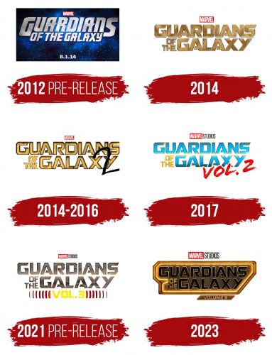
2012 (Pre-release)
The first emblem of the film franchise shines with a cold silver as if crafted from sturdy metal. The metallic, precisely carved letters resemble armor, perfectly aligning with the central theme of protection and battles. The large, solid three-dimensional symbols embody strength and resilience, evoking a sense of confidence in the forthcoming victory.
The sharp tips at the ends of the letters add a sense of dynamism to the logo, capturing the spirit of intense battles and chases. These details hint at the turbulent and challenging past of the Guardians of the Galaxy. The inscription is proudly placed against a deep blue cosmic backdrop sprinkled with stars, giving the impression that the emblem unfurls like a flag in the vastness of the universe. This version of the logo was presented during press releases, with numbers at the bottom indicating the film’s expected release date.
2014
The emblem of the first part of the film franchise is widely used on posters and other promotional materials. It features a massive gold inscription in large, meticulously crafted letters. Its impressive size draws attention, reflecting the thrilling plot and fully immersing the viewer in the action. The gold letters emphasize the theme of treasure and wealth, for which the heroes fight, a central element of the story.
The preposition and article are presented in small symbols stacked on each other, adding a touch of elegance to the logo. At the top of the emblem is the Marvel logo, reminding viewers that the story is part of the vast superhero universe, where every event plays a role in the bigger picture.
2014 – 2016
The emblem designed for the second part of the story, which was announced in 2014 before the premiere of the first installment, retained the core structure and gold color as the main design element. However, the letters became three-dimensional, as if cast from molten metal, adding strength and depth. Dark, shaded shadows emphasize that the heroes have gone through numerous trials and battles and are now enveloped in glory.
Particular attention is drawn to the black number “2,” as if repeatedly sketched in pencil, creating a sense of spontaneity or childlike mischief. This detail resembles street graffiti applied to a perfectly crafted poster, hinting that the second part is still in draft form, in preparation, and not yet realized on the screen.
2017
The emblem created to release the second part of the story retained key elements, but the letters have now changed to a rich blue with a golden outline and a slight glow. This is tied to the theme of the second film, where a Celestial named Ego, capable of manipulating matter and energy, plays a crucial role. The blue color symbolizes the heavens, while the glow of the letters evokes the bright light of the explosion that destroys the villain and his planet, making the world brighter and safer thanks to the Guardians’ efforts.
Instead of the black “2” from the previous version, the lower part of the logo now includes the phrase “part 2” in bright red, creating harmony with the red Marvel logo on the panel. The word “studios” has been added to the franchise name, highlighting the series’ producer and strengthening the connection to Marvel Studios.
2021 (Pre-release)
The emblem created to promote the third part of the franchise maintains visual harmony with the previous logos while introducing some changes. The letters of the title have become noticeably darker, giving them a more serious and grim appearance. This emphasizes the development of the heroes, hardened by endless battles. The golden halo on the edges of the symbols remains, giving the logo a sense of grandeur and resilience.
At the bottom center, a bright yellow “VOL. 3” has been added, standing out against the overall design. Waves radiate from this inscription, like the toll of a bell, drawing attention and creating the impression that the whole world is holding its breath in anticipation of the next chapter.
2023
The logo of the third volume of the Guardians of the Galaxy story is designed in the style of a massive metal plate, seemingly symbolizing the protection and strength the team has acquired by this point. The film’s title is in large black letters with a golden outline. This contrast emphasizes that even in the darkest moments, there is light, hope, and a purpose that the heroes follow.
The logo’s shape, resembling a unified monolith, hints at the team’s cohesion and unity, which have become like a wall standing against the threat. The metal edging around the logo adds a sense of solidity and steadfastness, like a barrier separating the world from the destructive actions of the antagonist, the High Evolutionary. This villain, conducting cruel experiments on living beings, seeks to create an alternative Earth, and the team stands as the only force capable of opposing him.
The black letters with a golden glow highlight the internal struggle of the characters—between darkness and light, fear and hope. The bright outline symbolizes friendship and their drive to save a close friend and, later, the genetically modified children who were experimented on.
The “Volume 3” inscription at the bottom looks like a miniature version of the main plate, completing the emblem’s integrity. This part of the trilogy indicates the conclusion, where the heroes finally find their purpose and become a unified whole.
The visual style of the emblem reflects both the film’s visual elements and the internal transformations the heroes have undergone.
