The company is a well-known software and hardware developer; its manufacturability and availability of products are reflected in the modern emblem. The IBM logo symbolizes efficiency, speed, and quality, which is the main asset of the brand’s products.
IBM: Brand overview
| Founded: | June 16, 1911 |
| Founder: | Charles Ranlett Flint |
| Headquarters: | Armonk, New York, U.S. |
| Website: | ibm.com |
Meaning and History
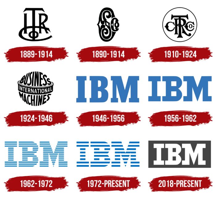
Since its inception, the digital corporation has had several names until it received the International Business Machines. It was this that formed the basis of the corporate identity and was played on the logo. There are eight modifications in total.
What is IBM?
IBM is a US company that is one of the world’s largest manufacturers of software and hardware. She is also engaged in consulting services and IT services. The time of its foundation is 1911. Founder – Charles Ranlett Flint.
1889 – 1914
The debut emblem is formed from the monogram, which consists of the capital letters of the company’s then name – International Time Recording Company. Each sign has a unique arrangement: “ITR” is in one row, and “Co” is below, forming an original platform. “T” is zoomed in and looks much larger than the adjacent characters. “C” is extended in breadth and serves as a support for it.
1890 – 1914
Almost in parallel with the first logo, a second appeared when the firm was renamed the Computing Scale Company. Management pondered the style and graphics briefly, using the monogramming technique to combine the capital letters from the company name. But CSC is played in a different design – streamlined, in the form of curls. The letter “C” has been made large: it contains “S” (center) and “Co” (side right). The abbreviation is decorated with original ornaments.
1910 – 1924
During the new status acquisition, the company underwent a major rebranding, which was reflected in the name and branding. The result was a structure called the Computing-Tabulating-Recording Company and an emblem based on the CTRCo monogram. They also received a specific arrangement: in the foreground, there is a large “T,” behind it is an “R,” on the left is “C,” and on the right is “Co.” And the leg “T” goes through the curl “R,” and the logo itself looks like a print.
1924 – 1946
In 1924, the era of International Business Machines kicked off. At first, the abbreviation was not used: the developers took the company’s full name as a basis, typing the words in the form of a globe with a wide equator encircling it. “Business” is written at the top, “Machines” below, and “International” in the middle, symbolizing the universal coverage of countries with new technologies.
1946 – 1956
This period brought a fundamental change in the company’s strategy, turning it into a promising giant. Naturally, the next rebranding affected the visual identity. Designers suggested leaving the florid ornaments to focus on manufacturability, simplicity, and accessibility. The result of this approach is a completely new logo, consisting of an abbreviated version of International Business Machines. The large blue letters are set apart from each other and are complemented by small serifs.
1956 – 1962
The version of this period has almost everything in common with the previous logo, with a few exceptions. So, the designers enlarged the serifs, making them more expressive, increased the in-letter gaps at “B,” and sharpened the central part of the “M.” The color and style were left the same.
1962 – 1972
1962 played a colossal role in the history of the IBM logo. It was then that the designer Paul Rand applied a “linear” approach to it, that is, he lined up the letters on stripes of equal width. At first, there were thirteen of them. Why exactly so many? Just as the author intended, such a width is ideal to understand that these are improvised wires. And the size of the letters contained exactly that many lines.
1972 – today
In 1972, a slight redesign was undertaken: the main developer replaced thirteen stripes with eight. They are assumed to represent the 8-bit system. But the author himself claims: the lines convey speed and dynamics in the emblem.
2018 – today
Simultaneously with the blue and white striped version, the strict gray and white version is in use. The company name abbreviation is enclosed in a lead rectangle. This visual interpretation reflects the stability and responsibility that the corporation provides to its customers.
IBM: Interesting Facts
IBM, short for International Business Machines, is a big tech and consulting company that has existed since 1911. It started as a mix of four companies and got its name, IBM, in 1924.
- The Start: IBM has been around since the 1880s. It began with simple inventions like the time clock and a machine to slice meat and cheese.
- Barcode: IBM engineers created the barcode we see on products. It was first used in 1974 on a pack of gum. Now, it’s everywhere, helping stores track what they sell.
- IBM Personal Computer: In 1981, IBM made its personal computer. It became super popular and set the standard for how PCs should work.
- Watson AI: IBM created Watson, a smart computer system that can understand human language. Watson became famous in 2011 when it won a quiz show against some smart people. Now, Watson helps in medicine and business.
- Space Race: IBM helped NASA with its space missions, including the Apollo moon landing. Their technology was key in getting astronauts to the moon and back.
- Floppy Disk: IBM invented the floppy disk in the 1960s. It was a big deal for storing and moving data around, helping people use computers more easily.
- Nobel Prizes: IBM workers have won five Nobel Prizes for their discoveries in physics and chemistry, showing how much IBM focuses on new ideas.
- WWII: During World War II, an IBM subsidiary worked with Nazi Germany, which is a controversial part of its history.
- Environment: IBM has been a leader in environmental care. They’ve worked on reducing pollution, saving energy, and fighting climate change, earning many awards for their efforts.
- Quantum Computing: IBM is working on quantum computing, a new way of making much faster computers than the ones we have now. They even have a quantum computer that people can use over the Internet.
IBM has been important in tech for over a hundred years, helping in business, society, and space exploration. They’re all about new ideas and making the future exciting.
Font and Colors
Until 1947, the style of monogram monograms with curls and graceful patterns prevailed in the corporate logo. Then a strict version appeared, which is still used today. The only thing that unites them is the abbreviation. All logos are based on the principle of abbreviated company names. Modern versions are practical, solid, and precise in geometry.
In 1947, they used Beton typeface. In 1956, Paul Rand replaced it with City. He also tweaked the shape of the capital letters by increasing the serifs. The logo’s color scheme has always been simple: at first, black and white prevailed, now blue and white.
IBM color codes
| Onyx | Hex color: | #444444 |
|---|---|---|
| RGB: | 68 68 68 | |
| CMYK: | 0 0 0 73 | |
| Pantone: | PMS 446 C |
What is the meaning of the IBM logo?
The logo of this service denotes the highest professionalism, power, reliability, and excellence. They are conveyed in the company’s name, executed in capital letters, lined with blue and white stripes. The font is bold with large serifs.
Why are there 8 bars in the IBM logo?
The IBM logo uses eight paired stripes because they make up multiple equal signs to indicate product availability. It is also a hidden dynamics mechanism and a “computerized” design as if it was created by software and not by hand.
How was the IBM logo created?
The IBM logo was created by hand, not using computer systems, although this was the idea behind the designer Paul Rand. He visually linked digital technology to the logo design of the firmware manufacturer.
Who made the IMB logo?
The debut City Medium logo, which became the prototype for the modern version, was created by graphic designer Paul Rand (in 1956). He also developed the iconic striped sign, which appeared in 1972 and has not changed since then.

