The football club, Leeds City logo, is distinguished by its elegant font and attractive color palette. Its symbolism lies in the desire to preserve important historical moments, paying tribute to past successes and the fans’ consistency.
Leeds United: Brand overview
| Founded: | 17 October 1919 |
| Founder: | Aser Group Holding, 49ers Enterprises |
| Headquarters: | Leeds, England |
| Website: | leedsunited.com |
FC “Leeds City,” formed in 1904, is the progenitor of the football club “Leeds United.” However, after World War I, financial troubles led to the team being expelled from the English Football League. Having lost their favorites, the “Leeds City” fans founded a new club called “Leeds United” in 1919.
In 1920, “Leeds United” joined the Football League and debuted in the Second Division in August. After spending four seasons in the Second Division, the club was promoted to the First Division in 1924.
The meaning of “The Whites,” one of the team’s nicknames, is quite clear – it was created based on the color of the uniform. But why does “Leeds” have a white uniform? In the 1960s, the great Don Revie decided to change the club’s traditional yellow-blue colors to an entirely white set. It is believed that the coach was a big fan of the game of Madrid’s “Real” of those years, which significantly inspired him. The new color was not taken seriously for a long time, but history has put everything in its place, and now we know “Leeds” by the nickname “The Whites,” not “Yellow-Blue.”
Another nickname, “The Peacocks,” appeared due to the old stadium “Old Peacock Ground.” Near Elland Road, there’s a pub, “The Old Peacock,” where “Leeds” fans traditionally gather.
Meaning and History
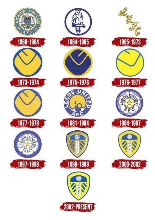
Over nearly a hundred years of existence, “United” has changed about ten different emblems. Fans of the Yorkshire club have seen everything: owls (a tribute to the city’s coat of arms), peacocks (referring to the club’s nickname), smileys (a nod to the minimalism of the 70s), roses (Yorkshire whites, of course!) and even just the inscription L.U.F.C, executed in an intricate font. Let’s consider each logo variation!
What is Leeds United?
“Leeds United” is a football club, also known as “The Whites” due to its uniform color. It was formed in 1919 and has since won many prestigious championships. One of the club’s most important achievements is its promotion to the Premier League.
1908 – 1964
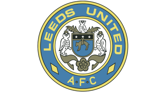
From 1919, the team “Leeds United” used the emblem of its “ancestor” – the football club “Leeds City.” It was the official coat of arms of the city of Leeds with the Latin inscription “PRO REGE ET LEGE” and three owls. This graphic sign became the basis for the next emblem in 1964. Designers removed the motto, leaving a golden lamb, three white five-pointed stars, a rectangular shield with a round base, and heraldic birds. The interpretation of the city’s coat of arms is placed in a light blue ring with a yellow border and the inscription “LEEDS UNITED A.F.C.”
Interestingly, in the first half of the 20th century, “Leeds,” along with “Sheffield Wednesday,” were commonly nicknamed “the owls,” though the team from Sheffield only adopted an emblem with this bird in 1956.
1964 – 1971
In the mid-1960s, the club abandoned the state symbols of Leeds but continued to develop the owl theme. As a result, the new emblem significantly differs from the previous one: it depicts a purple-white silhouette of a bird consisting of blurred spots. The abstract drawing is inside a ring.
This emblem coincided with the appearance of the white uniform for “Leeds” and lasted eight seasons. Later, it was removed at the request of Don Revie, who believed the bird brought bad luck to the team.
1971 – 1973
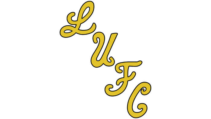
The football team often lost, so the superstitious manager, Don Revie, believed the owl brought misfortune. In 1971, designers developed a simple logo with the abbreviation “LUFC” (Leeds United Football Club) to improve the situation. Yellow letters with thin black outlines look as if they are handwritten. There are only four, but they take up a lot of space as they are arranged diagonally from top to bottom. This is one of the most beloved emblems among fans. The simple but striking inscription LUFC (Leeds United Football Club) is created in a diagonal style. This version of the logo lasted only two years.
1973 – 1976
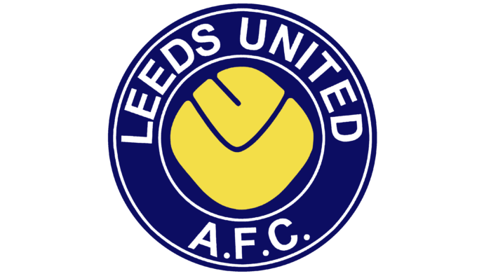
This logo embodies everything you need to know about the 70s. The search for its style ended with the club adopting an emblem with a smiley face. Although it’s not a smiling face, it’s a blue football with yellow letters “L” and “U,” representing the team’s abbreviated name. They are positioned in such a way that the “L” resembles a smile, and the “U” – two eyes. It’s worth noting that this is the most beloved emblem among experienced fans.
1976 – 1977
The designer of the original “Smiley” attempted to correct his mistake by rotating the previous logo by 45 degrees and repainting it in blue, which is considered less friendly. He failed, as this version lasted only one season.
1977 – 1980
After the unsuccessful fifth variant, it was decided to return to the classic yellow Smiley, which is the club’s favorite logo. Designers more clearly defined the club’s affiliation with an emblem with a blue outline and the club’s name.
1980 – 1984
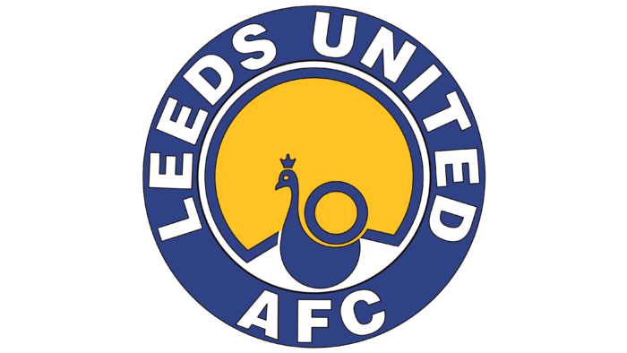
After Umbro became the primary supplier of equipment for footballers, the club’s leaders decided to redesign. This time, they did without “smileys,” although the circular shape and classic palette remained unchanged. The new logo depicts a peacock with a large fan-shaped tail. This image is associated with the original name of the Elland Road playing arena: Old Peacock Ground. The bird is placed in the center of a blue ring, which says “LEEDS UNITED AFC.”
Interestingly, throughout history, there have been ten versions of the peacock emblems, but only one of them featured the image of this proud bird. The emblem was meant to emphasize the nickname of the finally formed club. The main ideas of the emblem are a circular shape, a blue outline with the club’s name, and a yellow smiley in the center.
1984 – 1997
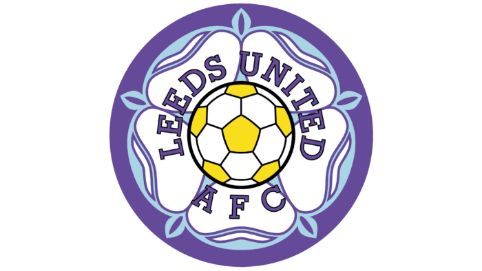
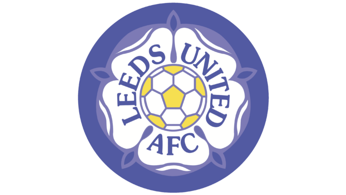
The graphic sign adopted in 1984 contains the famous emblem of the House of York – a five-petaled flower called the White Rose of York. In the center of the heraldic element is a white-yellow football with a black outline. Around the edges is a circular blue frame. The team’s name was moved closer to the center. This is the first club emblem where white is the dominant color.
1997 – 1998
The fan-favorite emblem with the rose and ball was changed by Peter Ridsdale, who aimed to create a more modern logo to take the club to the European football markets. This version lasted only one season and was then revised and updated.
1998 – 1999
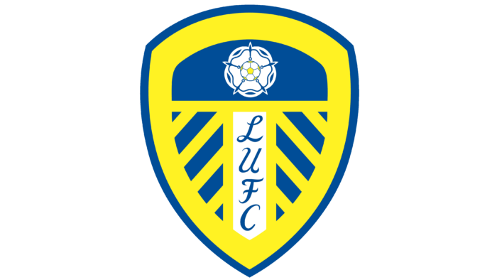
In the late 1990s, the football club adopted a logo in the form of a triangular shield with a rounded top. The space is divided into several parts, one of which contains a smaller York white rose with a ball in the middle. In the center is a vertical inscription “LUFC.” The font is handwritten, as in 1972-1973.
Currently, “Leeds” also performs with this emblem. However, rumors of another redesign periodically arise. For example, in 2015, it was said that Massimo Cellino had such plans. The new emblem (a blue shield with a large white Yorkshire rose and a horizontal LUFC inscription in a classic font) was supposedly ready. It was even registered on the internet and appeared on the official players’ uniforms, but with the change of club owner, these plans, apparently, were postponed.
2000 – 2002
Designers removed the gradient shadows from the shield. Dark contours framing the geometric elements also disappeared. The image became yellow-blue with white accents.
2002 – today
In 2002, another redesign occurred. The creators of the logo rounded the upper part of the shield, removing the angular protrusion. In addition, they slightly changed the design of the White Rose of York.
2018
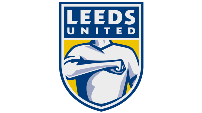
On January 24, 2018, “Leeds United,” competing in the championship, decided to please fans with a new club emblem. White, yellow, and blue – the club colors are observed, and no one is overlooked. The contour has a corresponding shape. The text “LEEDS UNITED” is located at the top of the emblem. Finally, the designers added a headless man who hits his chest with his right hand, showing a characteristic gesture. Who is he? It turned out to be a ridiculous idea for the club’s 100th anniversary, and the fans expected to see something else.
This is not a strange fantasy of the designer. This gesture has its own history. The movement of beating oneself in the chest is called the Leeds Salute and is quite popular among the club’s fans. Like much else that comes from the people, its origin is unknown; there are only hypotheses. Thus, until the late 80s, the chest-beating gesture remained exclusively the gimmick of “Leeds” fans. In this way, they could recognize their own in other cities on away match days. In 1987, this movement became public, and players began performing it while celebrating goals, emphasizing a special connection with the fans. Glynn Snodin, Vinnie Jones, and Chris Kamara were the first players to try this gesture during a game, and after that, it became a real gimmick for “Leeds” fans. It never became too kitschy and always symbolized a special Yorkshire unity of fans and team.
After the uproar over the new “Leeds” logo, the management decided to create a new logo in honor of the club’s 100th anniversary.
Leeds United: Interesting Facts
Leeds United Football Club, also known as “The Whites,” is a well-known soccer team with a lot of history and fans who care about the team.
- How It Started: Leeds United began in 1919 after Leeds City FC was closed down. They joined the Football League in 1920 and started playing official games.
- Home Games: They’ve played at Elland Road since they started. It’s an old and famous stadium with a great atmosphere.
- Best Times with Don Revie: In the 1960s and 1970s, manager Don Revie made Leeds one of the best teams, winning many important games and trophies.
- How They Played: Under Don Revie, Leeds played tough and organized, making them strong European opponents.
- Champions League Success: In the 2000-2001 season, Leeds made it to the semi-finals of the UEFA Champions League, which was a big deal.
- Money Problems and Dropping Down: In the early 2000s, Leeds had money issues, lost their best players, and had to leave the Premier League in 2004. They even played in the third level of English soccer before returning to the Premier League in 2020.
- Training Young Players: Leeds is proud of their academy for training young players who play for England, like Alan Smith, James Milner, and Fabian Delph.
- Big Rivalries: Their biggest rivalry is with Manchester United because of the old competition between Yorkshire and Lancashire.
- Top Players: Jack Charlton played the most games for Leeds, and Peter Lorimer scored the most goals.
- In Culture: Leeds United has influenced British football culture, leading to books, documentaries, and movies. Although the team has had ups and downs, its spirit and fans’ support are strong.
Leeds United’s story is about sticking together and keeping the team spirit alive through good and bad times.
Font and Colors
Each series of “Leeds United” graphic signs is dedicated to a specific theme. But most of all, fans remember the version with the so-called smiley, which was used in the 1970s. It competes with the most “football” logo with the ball and shield. In 2018, an unsuccessful attempt was made to update the design, but the proposed emblem lasted no more than a few hours.
Inside the shield, right in the center is the inscription “LUFC.” The letters are arranged from top to bottom inside a vertical rectangle. An elegant handwritten font is used to make the abbreviation look more striking. The primary colors of the emblem have never changed: the palette, as many years ago, includes yellow and light blue with the addition of white.
Leeds United color codes
| Yellow | Hex color: | #ffcd00 |
|---|---|---|
| RGB: | 255 205 0 | |
| CMYK: | 0 14 100 0 | |
| Pantone: | PMS 116 C |
| Blue | Hex color: | #1d428a |
|---|---|---|
| RGB: | 29 66 138 | |
| CMYK: | 100 78 0 18 | |
| Pantone: | PMS 7685 C |
