![]() Linkedin Logo PNG
Linkedin Logo PNG
The LinkedIn logo, another American social network, symbolically reflects the orientation and convenience of business communication. The graphic design accurately reflects the key developmental periods of the platform, emphasizing the service’s uniqueness.
Linkedin: Brand overview
LinkedIn is an American social network and business communication platform. It was created by a group of people: Reid Hoffman, Konstantin Guericke, Jean-Luc Vaillant, Allen Blue, and Eric Ly. The network has existed since 2002 and is based in Mountain View, California.
Meaning and History
![]()
Officially, the company’s career and logo began at the end of 2002, but the service actually started working in the spring of 2003. In the first half of 2011, it applied for an IPO and, by summer, was registered on the New York Stock Exchange. In January 2017, it became the property of Microsoft, which purchased it. All key development periods in the partner platform are reflected in its symbolism.
The company’s emblem appeared immediately after its opening and is contemporary. Over the years, it has changed twice, but very insignificantly, remaining the same as it was at the beginning. It consists of the word “Linked” and the preposition “In.” There is a barely noticeable space between them, allowing the elements to seem to merge.
What is Linkedin?
It’s a social network designed to find the necessary specialists and establish business cooperation. The platform has over 500 million registered individuals from 200 countries worldwide, covering 150 fields of activity.
2003 – 2011
![]()
The debut version was created in a business style – practical, without frills, immediately setting a serious tone. In the first half of the image – the word “Linked” is made in Source Sans font: Light and Semi-bold font. The letters are lowercase (except for the initial one), black, and sans-serif. The ends of the letters “k” and “d” have the same height as the dot above “i” and the capital “L.”
The “in” element is at the end. It is placed in a separate blue square with rounded corners. Unlike the rest, it is white, clearly standing out against the cobalt background. It is used as a separate emblem when it needs to be placed in a limited space.
2011 – 2019
![]()
After eight years of the logo’s existence, its owners decided to conduct a minor redesign. This was related to the site’s IPO registration on the New York Stock Exchange. To make the sign more readable, designers slightly elongated the letters – by almost a couple of millimeters, so the differences are not immediately noticeable. They also worked with the letter “e,” giving it an individual look: the bottom part is made slightly narrower and curved than the top.
2019 – 2021
![]()
Two years after Microsoft took over, the company received an updated logo. The changes affected the brand palette, so the sign looks monochromatic and, at the same time, contrasting. The designers transferred the primary color to the first part of the word, so it is now blue on a white background. The second segment, conversely, is made with white font on blue. Thus, the new owners emphasized the service’s individuality.
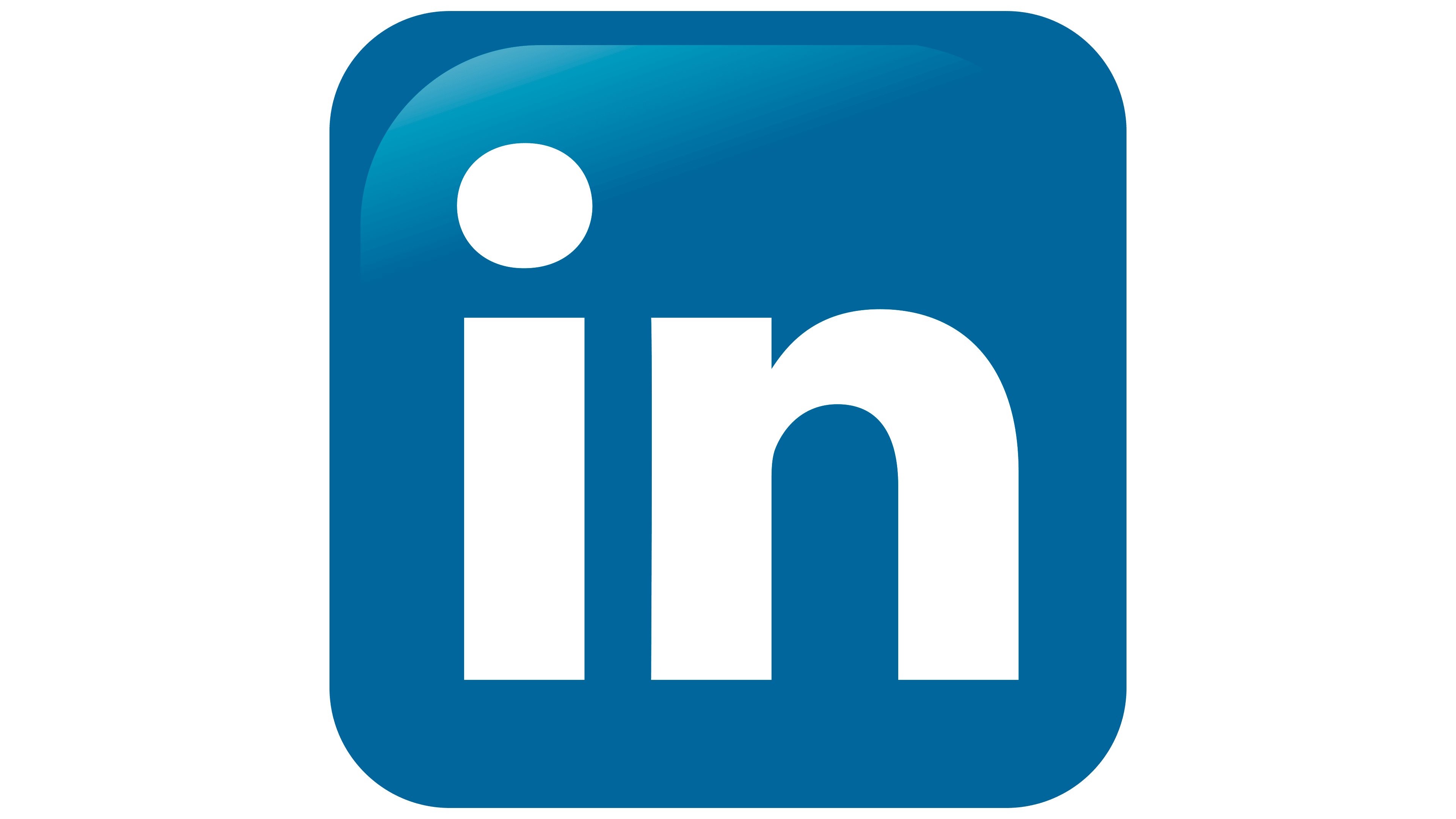
2021 – today
![]()
Like the previous one, the new LinkedIn logo contains only one color instead of three. But it became a couple of shades brighter than before. The blue has taken on a cobalt hue – rich and attention-grabbing. The inscription is made with a custom font called Community.
Linkedin: Interesting Facts
LinkedIn is a website where people and companies can connect, look for jobs, and share business ideas. It was started in 2003 by Reid Hoffman and some friends. Now, it’s the biggest place on the internet for professionals, with over 800 million people worldwide using it.
- Starting Small, Growing Big: Reid Hoffman started LinkedIn in his living room, and now it’s huge, with users in 200 countries.
- Microsoft Buys LinkedIn: In 2016, Microsoft bought LinkedIn for a lot of money. This helped LinkedIn get better and grow even more.
- All About Work: LinkedIn differs from other websites because it’s just for professional stuff, like finding jobs or making work connections.
- Learning New Things: LinkedIn has a learning section where you can find many courses to improve your job or learn new skills.
- Sharing Ideas: People can write articles on LinkedIn. This helps them share what they know and connect with others.
- Mapping the Economy: LinkedIn wants to map the world’s economy, helping people find jobs and companies find the right workers.
- Pictures and Videos Matter: LinkedIn gives much more attention to posts with pictures or videos, which means visual content is important for getting noticed.
- Recruiters Love LinkedIn: Almost every recruiter uses LinkedIn to find people for jobs. It makes it easier to see who and what they can do.
- Speaking Your Language: LinkedIn is available in 24 languages, so many people from different places can use it.
- Using LinkedIn on the Go: More than half of LinkedIn visits are on mobile phones, showing how important it is to use it anywhere.
LinkedIn keeps improving, making it easier for people to find jobs, learn new things, and connect with others in their field. It’s a big deal for anyone wanting to grow professionally.
Font and Colors
In all versions, the Source Sans font with Light and Semi-bold variations is used, indicating the stability of a professional site. Each is applied situationally and depends on the logo’s placement.
The main element of visual identification in the symbolism is color. Its basis is a blue shade that has received the name LinkedIn Blue. It is believed that such a choice was dictated by a trend since, at that time, Facebook started working with a similar palette. The next version of its origin is related to one of LinkedIn’s platform founders: he was a top manager at PayPal, so he chose approximately the same color of the emblem as the monetary system.
The LinkedIn logo inscription can be made with one of two fonts: Source Sans Pro-Light or Source Sans Pro-Semibold. They look roughly the same: sans-serif fonts with strict geometric letter shapes. Typographer Paul D. Hunt developed both fonts.
The color used in the logo is called LinkedIn Blue (#0077B5). It used to be combined with black, but in 2019, designers simplified the palette and left only the signature shade of blue. White is presented as an additional color.
Linkedin color codes
| Star Command Blue | Hex color: | #0966c2 |
|---|---|---|
| RGB: | 9 102 194 | |
| CMYK: | 100 72 1 0 | |
| Pantone: | PMS 7455 C |
FAQ
What does the LinkedIn logo represent?
The logo consists of the name of the service, divided into two segments. The last syllable is placed in a separate square with rounded corners.
What font does LinkedIn use?
Previously, the site used Helvetica (main) and Arial (additional) fonts. Now, a new font called Community is used with elements of handwritten font and rounded letters.
Can I use the LinkedIn logo on my website?
LinkedIn prohibits using the full logo on websites and business cards. The service allows only the icon – the last part of the name (in), divided by a square.
How do I place the LinkedIn logo on my resume?
To place the icon on your resume, you need to log into your account and click “Edit public profile.” Then scroll down the page and click “Create icon” on the right side of the field that opens.