![]() New York Islanders Logo PNG
New York Islanders Logo PNG
The “New York Islanders” logo is purely hockey-related as it incorporates the fundamental elements of the sport: a stick, ice, and a puck. It embodies the determination, focus, and high professionalism of the athletes. The emblem’s style is abstract, with the team name taking a central place.
New York Islanders: Brand overview
| Founded: | 1972 |
| Founder: | New York Islanders Hockey Club, L.P. |
| Headquarters: | Elmont, New York, U.S. |
| Website: | nhl.com |
The “Islanders” is the official nickname of the hockey team New York Islanders. The name and nickname seem logical, given that the club is primarily based on Long Island, an island in the state of New York.
In 1970, the National Hockey League approved a proposal by Roy Boe, owner of the basketball team New Jersey Nets, to create and include a new team based on Long Island in the NHL. In 1972, an alternative hockey league called the World Hockey Association was founded to challenge the NHL’s dominance. Fearing potential expansion by the WHA, the NHL approved two new franchises. The WHA planned to establish its New York Raiders team in the Big Apple and use the newly built Memorial Coliseum for training and games. Today, the Memorial Coliseum is the second oldest rink in the NHL. It’s not surprising that it’s often referred to as an outdated barn in need of replacement. But in the 1970s, the arena was a coveted asset, showered with praise and compliments by NHL President Clarence Campbell. Overall, without prizes, the WHA wanted to place the “Raiders” right here.
However, the Nassau County authorities (the arena’s owners) did not consider the WHA a major league and tried to block the “yet-to-be-born” Raiders. Therefore, they leased the Coliseum to an NHL club. In 1972, the old league hastily agreed to establish a new franchise called the “New York Islanders.” The Islanders’ first game and first defeat occurred on October 7, 1972, in a match against the Atlanta Flames (2:3).
The team was initially intended to be named the “Long Island Ducks,” but the owner later decided to name it the “New York Islanders.” Resembling a saddle, Long Island is located on the east coast of the USA. Impressed by its remarkable elongation, Dutch settlers in the 17th century named it Lange Eylandt. It stretches about 200 km from head to tail. The island is surrounded by water. Long Island is land situated among numerous lakes, ponds, and reservoirs.
The original emblem of the “New York Islanders” features the silhouette of Long Island without its extreme western part, as that’s where New York City’s boroughs are located. Thus, the emblem depicts only Nassau and Suffolk counties. However, this did not stop the team from calling themselves the “Islanders” and using “New York” in their name.
The team’s fans were few but incredibly loyal, and they despised the “New York Rangers,” their arch-rivals. In the 1980s and 1990s, one of the most popular fan chants in the NHL was “Nineteen-Forty!” reminding the Rangers of the last year they won the Stanley Cup. Alas, the “Curse of 1940” disappeared in 1994, so today, this chant seems silly.
In the 1990s, the Islanders remained competitive, but under Don Maloney as general manager, they began to face stiff competition from division rivals. Things went downhill from there.
The mid-90s are remembered as the years of fantastic, wild, and poor sports style. The new leadership of the Islanders went too far in chasing fashion, even by the standards of that time. This was the most destructive step in NHL uniform history. The team abandoned its royal blue and orange jerseys for dark blue, brighter orange, grey, and aquamarine. The names and numbers on the back of the jerseys were distorted to mimic the contours of the bottom stripes. Uneven, motley stripes around the groin area resembled humps more than waves. The shoulder patch featured the Montauk Lighthouse, located on the eastern part of Long Island. The main emblem depicted a rather creepy fisherman with a hockey stick in a raincoat and a sou’wester hat.
This was a gift to the Rangers’ fans. They immediately noted the striking resemblance of the new logo to Gorton’s emblem. Since the company produced fish sticks and other frozen seafood, the Islanders acquired a new nickname – “Fishsticks.” The teasing chant “Fishsticks!” can be heard at Madison Square Garden during “Big Derby” matches even today.
Both the players and fans of the Islanders widely criticized the fisherman emblem, and it was discontinued the following season. In 1996, to mend relations with fans, the Islanders placed old alternative logos on new shirts. In 1997, the fisherman was ceremoniously killed off, and the circle with the stick inside once again became the club’s main logo.
The jerseys introduced in 1988 had neither the lighthouse nor waves. The original “New York Islanders” logo was reinstated, with the only change being the colors. Since the team replaced its original royal blue with dark blue, the logo was repainted accordingly. Also, there were no stripes on the pants, but four white-orange stripes appeared on the right shoulder – symbols of the Islanders’ Stanley Cup championships in the early 1980s. This was a big justification for fans who had endured three years of horror watching their favorite team.
Sparky the Dragon is the mascot of the New York Islanders hockey team.
Meaning and History
![]()
The logo’s history began when advertising manager John Alogna from East Meadow hired Jacob Morris Strongin, a graphic designer from Syosset, California. He asked him to create a unique logo for the “New York Islanders.” The result of their collaboration was a version with the acronym “NY” and the inscription “Islanders” against the administrative map of Long Island, Nassau, and Suffolk.
What are New York Islanders?
The “New York Islanders” is a professional hockey team from Elmont. It is a member of the NHL, where it competes in the Eastern Conference and represents the Metropolitan Division. Founded in 1972, its home stadium is UBS Arena. The team has won the Stanley Cup four times and made the playoffs 19 times (1980-1984).
1973 – 1995
![]()
From 1973, the “New York Islanders” changed its logo four times. The primary color palette included blue, orange, and white. The first and last two logos did not differ much from each other, but the 1996-1997 season logo was a complete contrast; it was the worst move by the Islanders’ management in the club’s history.
1995 – 1997
![]()
Before the start of the new NHL season, the owners attempted to give the Islanders a fresh look. The previous logo was replaced with one depicting a fisherman in a coat and hat, holding a blue stick, standing in front of red-blue gates. The fisherman was topped by the word “Islanders,” written in white font outlined in orange and blue. The inscription was washed by orange and two blue waves. This “New York Islanders” logo became the worst in the team’s history, turning the “Islanders” into a complete laughingstock in the NHL.
1997 – 2010
![]()
The old logo was restored in the 1998 season. The owners realized they had made a huge mistake and did not understand the passion of the fans. In general, the Islanders were the first to realize that the Wild ’90s were a big mistake. They quickly “drowned” the fisherman and returned to the classic logo, changing the color scheme to a darker one. Thus, royal blue was replaced with dark blue. The logo was outlined in bright orange. The island drawing was also improved. The letters “NY,” the hockey stick, and the image of Long Island remained unchanged.
2010 – 2017
![]()
The penultimate logo of the Islanders was presented eight years ago, in 2011. It combined the features of the first and previous logos. It was again done in royal blue. Additionally, the letter “Y” now had four stripes instead of three. What’s the point? Of course, the four Stanley Cups were won by the Islanders.
2017 – today
![]()
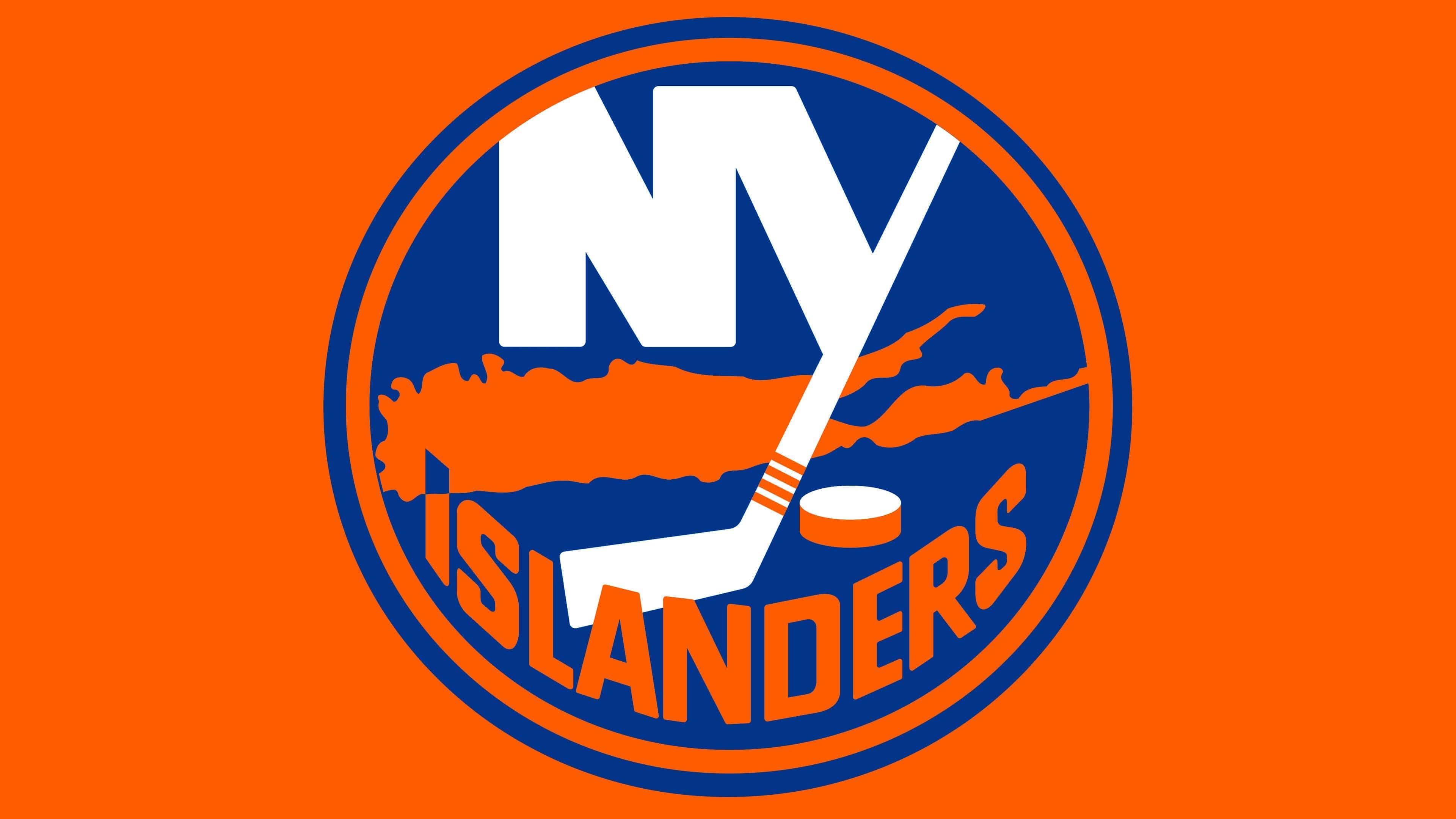
The modern variation is almost an exact copy of the previous logo. It retained the same structure. The arrangement of elements is identical: a map with capital letters with the name of New York in the background. Additionally, the letter “Y” is replaced by a stylized sports stick with four orange stripes – the number of Stanley Cup victories won in 1980. To the left of it is a hockey puck.
Below is the word “Islanders”. The top part of the letter “I” points to Uniondale in Nassau County, where the team’s home stadium is located. For this, the top quarter of the capital letter is painted in a contrasting blue color so the point is visible on the map. The only difference from the previous version is the color scheme, which has become a bit more subdued.
New York Islanders: Interesting Facts
The New York Islanders are an ice hockey team from the New York area. They play in the NHL, a big league, and are known for having a great history.
- Start: They were created in 1972 to stop a rival league from using a new stadium in Long Island.
- Winning Streak: In the early 1980s, they were amazing and won the Stanley Cup four times in a row, from 1980 to 1983. Not many teams have done that.
- Almost Five: They tried for a fifth win in 1984 but lost to the Edmonton Oilers, ending their top streak.
- Famous Players: Some of the best players from those times, like Mike Bossy and Denis Potvin, are in the Hockey Hall of Fame because they were good.
- Mike Bossy’s Goals: Mike Bossy was incredible at scoring. He got 50 or more goals in nine seasons, which is a big deal.
- A Long Game: In 1987, they played a super long game against the Washington Capitals that went into four extra periods. Pat LaFontaine scored the winning goal. It was the longest Game 7 ever at that time.
- Different Homes: They’ve played in different places, starting at the Nassau Coliseum, moving to the Barclays Center in Brooklyn for a bit, and then to a new place called UBS Arena in 2021.
- Fisherman Logo: In the 1990s, they changed their logo to a fisherman, but fans didn’t like it, so they returned to the original.
- Helping Kids: They do a lot for kids in the New York area with their Islanders Children’s Foundation, like helping with school and hockey.
- Getting Better: After a tough time, they’ve become strong again, making it to the playoffs and showing they’re still a great team.
The New York Islanders have shown great strength and talent over the years. They’ve had great wins and famous players, and even though they’ve had some tough times, they’re doing well again. They’re an important part of New York’s sports world.
Font and Colors
From the first year of its existence, the team adopted a round logo resembling a hockey puck from a top view. It contains detailed information about the club – that it is the New York Islanders hockey club, located on Long Island, with its own stadium in Uniondale, and has won the Stanley Cup four times. This is graphically conveyed using the “NY” acronym, a hockey stick, a puck, four stripes, a card, and the second word from the franchise name. A thin orange ring surrounds these iconic elements.
The team also has another emblem, drastically different from the others. Fans nicknamed it “The Fisherman” to depict a bearded fisherman in a cloak and hood holding a hockey stick. He is shown against a hockey goal background, with a two-tone wave in front. This version only lasted for two seasons before being discontinued.
The logo’s inscription is in a smooth font from the Sans Serif group – a standard grotesque. The letters have an elongated form, narrowing at the edges of the word “Islanders” and widening in the middle.
The emblem’s palette is tri-color, consisting of the club’s official shades: royal blue, orange, and white. When transforming the logo, shades varied from dark to light.
New York Islanders color codes
| Royal Blue | Hex color: | #003087 |
|---|---|---|
| RGB: | 0 48 135 | |
| CMYK: | 100 75 2 18 | |
| Pantone: | PMS 287 C |
| Orange | Hex color: | #fc4c02 |
|---|---|---|
| RGB: | 252 76 2 | |
| CMYK: | 0 73 98 0 | |
| Pantone: | PMS 1655 C |
FAQ
What does the “New York Islanders” emblem mean?
The team’s emblem consists of a round background resembling a puck. On it are stylized letters N and Y, denoting the city where the franchise is based, and a hockey stick with four stripes at the bottom – in honor of the four consecutive Stanley Cup victories. Below the acronym is Long Island, and even lower is the club’s name.
Did the “New York Islanders” change their logo?
No, the New York Islanders team has not radically changed its logo in recent years. Therefore, it looks the same as it did at its inception. The only significant change occurred in 1995-1997 when a Long Island resident – a fisherman in a boat – was added. The latest changes occurred in 2017, with another outlining ring added to the emblem.
Who designed the “New York Islanders” emblem?
The idea’s inspiration was John Alogna, an advertising manager at the East Meadow Club. He contacted designer Jacob Morris Strongin, who tasked him with developing the necessary logo. The result was the legendary sign with an island, puck, and stick, stylized as the letter “Y.”
Why are the “Islanders” blue and orange?
The Islanders franchise chose blue and orange because these colors symbolize the life and nature of Long Island. The first is the color of the sea (HEX # 00539B), and the second is the shade of the setting and rising sun (HEX # F47D30).