![]() Patagonia Logo PNG
Patagonia Logo PNG
Despite the simplicity of the Patagonia logo, it embodies high-quality standards. The bold letters lend it significance and considerable superiority, emphasizing the excellent characteristics of the products produced. The inscription, made in lowercase letters, also reflects the availability of the brand’s products to all population categories.
Patagonia: Brand overview
| Founded: | May 9, 1973 |
| Founder: | Yvon Chouinard |
| Headquarters: | Ventura, California, U.S. |
| Website: | patagonia.com |
Patagonia is a unique sportswear brand as it is the initiator of the so-called circular economy. The company’s history, like its logo, is very interesting and instructive and is a classic example of how one person’s hobby can create a new direction of global significance.
The official date of Patagonia’s establishment is considered to be 1973. Its founder is the American climber Yvon Chouinard. Initially, he was involved in the production of climbing equipment, but in 1970, he brought back several sports sets from a trip to Austria, which his friends and colleagues liked. Then, Yvon decided to switch to producing expensive, high-quality clothing made from natural materials for tourism and mountaineering. The founder chose the name for his eco-company in honor of his favorite mountains in South America.
Today, the brand is the largest in its industry; the company was one of the first to master the production of thermal underwear and began using new materials and bright colors in sportswear. Patagonia has its own philosophy, which is expressed in every detail of the products and unique types of services.
Meaning and History
![]()
The Patagonia logo fully corresponds to the name – it depicts the profile of the Cerro Fitz Roy mountains, located above the town of El Chaltén. Over the years of its existence, the trademark has undergone minor changes, but the idea has remained original and recognizable.
What is Patagonia?
Patagonia is an American brand of outer and sportswear that manufactures, sells, and distributes itself. It appeared in 1973, and its headquarters are located in Ventura, California. The brand’s founder is businessman Yvon Chouinard.
Old
![]()
Chouinard Equipment first used the Patagonia brand in 1973, introducing a line of outerwear. The famous logo appeared two years later. It was created by artists Jocelyn Slack and Yvon Chouinard. They depicted an element of the South American landscape – Mount Fitz Roy. This peak can be found on the map between Chile and Argentina.
The emblem features black and gray silhouettes of mountains that resemble frozen waves. They perfectly match the brand’s philosophy and symbolize its connection with the parent company (Chouinard Equipment started with the production of climbing tools). Against the backdrop of the uneven peaks, there are multicolored horizontal stripes: red, blue, and light blue of different shades. The picture is placed in a white ring with a cross line running in the middle. In the frame are inscriptions “BUILT TO ENDURE,” “patagonia,” and “SINCE 1973.”
New
![]()
The black wordmark of the brand contains its name in lowercase. Designers used a whimsical font with serifs, which looks exactly like Belwe Bold. Thanks to this, the textual logo looks creative and fully corresponds to the style of the Belwe Bold clothing.
Patagonia: Interesting Facts
Patagonia is a company that makes outdoor clothing and gear, and it’s really special because it cares a lot about nature and doing the right thing.
- How It Started: The guy who made Patagonia, Yvon Chouinard, began making climbing tools in his backyard in 1957. This is how Patagonia first cared about making tough products that are good for the planet.
- Helping the Environment: Since 1985, Patagonia has donated 1% of its sales to groups that protect nature. This shows that they want to help the Earth.
- Using Recycled Stuff: Patagonia was one of the first to use recycled materials and organic cotton in its clothes, which is very good for the planet.
- Fixing Instead of Buying New: They have a Worn Wear program that helps people fix their Patagonia stuff instead of throwing it away. This means less waste.
- Being Open About Where Stuff Comes From: Patagonia tells everyone where and how its products are made to ensure everything is done fairly.
- Fighting for the Planet: Patagonia doesn’t just sell clothes; it works hard to protect nature, like saving wild rivers and oceans.
- Smart Ads: They once had an ad that said, “Don’t Buy This Jacket,” to make people think before they buy more stuff. It was about not wasting resources.
- Supporting Employees Who Care: If an employee gets in trouble for peacefully protesting for the environment, Patagonia helps them out. They even give time off for climate strikes.
- Good Food, Too: In 2012, Patagonia started making food like salmon and grains grown in good ways for the Earth.
- Giving Back: The founder, Yvon Chouinard, did something amazing in 2022 by giving the company to a trust and nonprofit that works to solve environmental problems.
Patagonia isn’t just a company; it’s a leader in showing how businesses can be good for the world, making quality stuff while caring for our planet.
Font and Colors
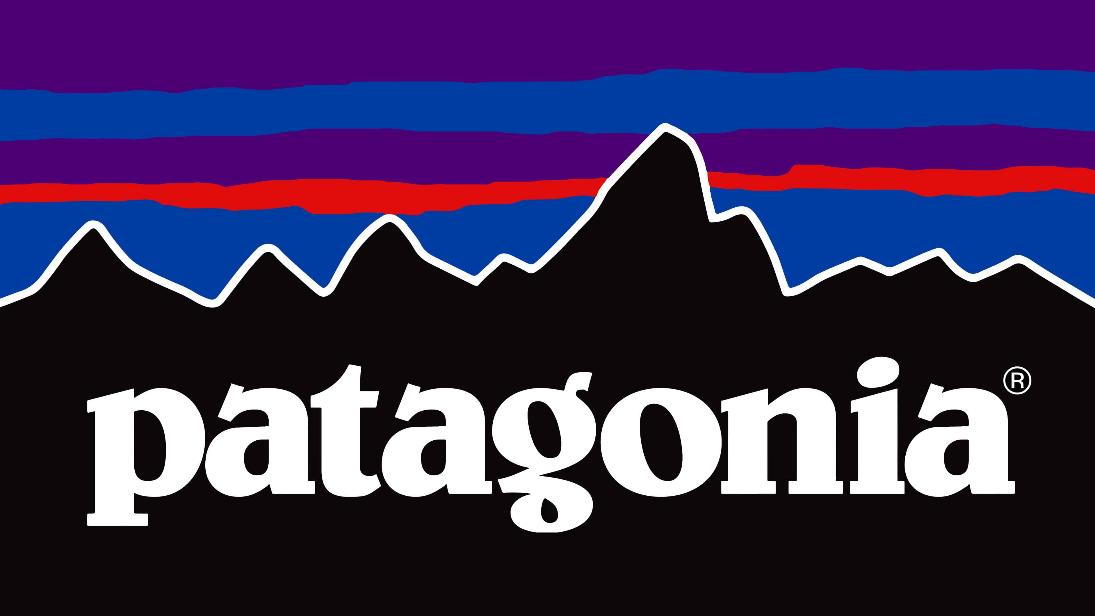
The logo was created in collaboration with Yvon Chouinard himself and designer-artist Jocelyn Slack. Yvon came up with the idea, and the artist brought it to life in a visual image. The girl admitted that she had never been to Patagonia, but Yvon’s colorful stories made her want to visit this amazing region. She tried to embody all these emotions in the emblem itself. The emblem first appeared on the branded product label in the spring collection of 1976.
![]()
The first emblem was colorful and memorable. It represented a rectangular plate with the profile of the Fitz Roy massif in black with a white border. Above it – the sky, painted in blue, purple, and orange stripes. On the black background is the brand name “ratagonia,” and below it on the right is the phrase “There at every step.”
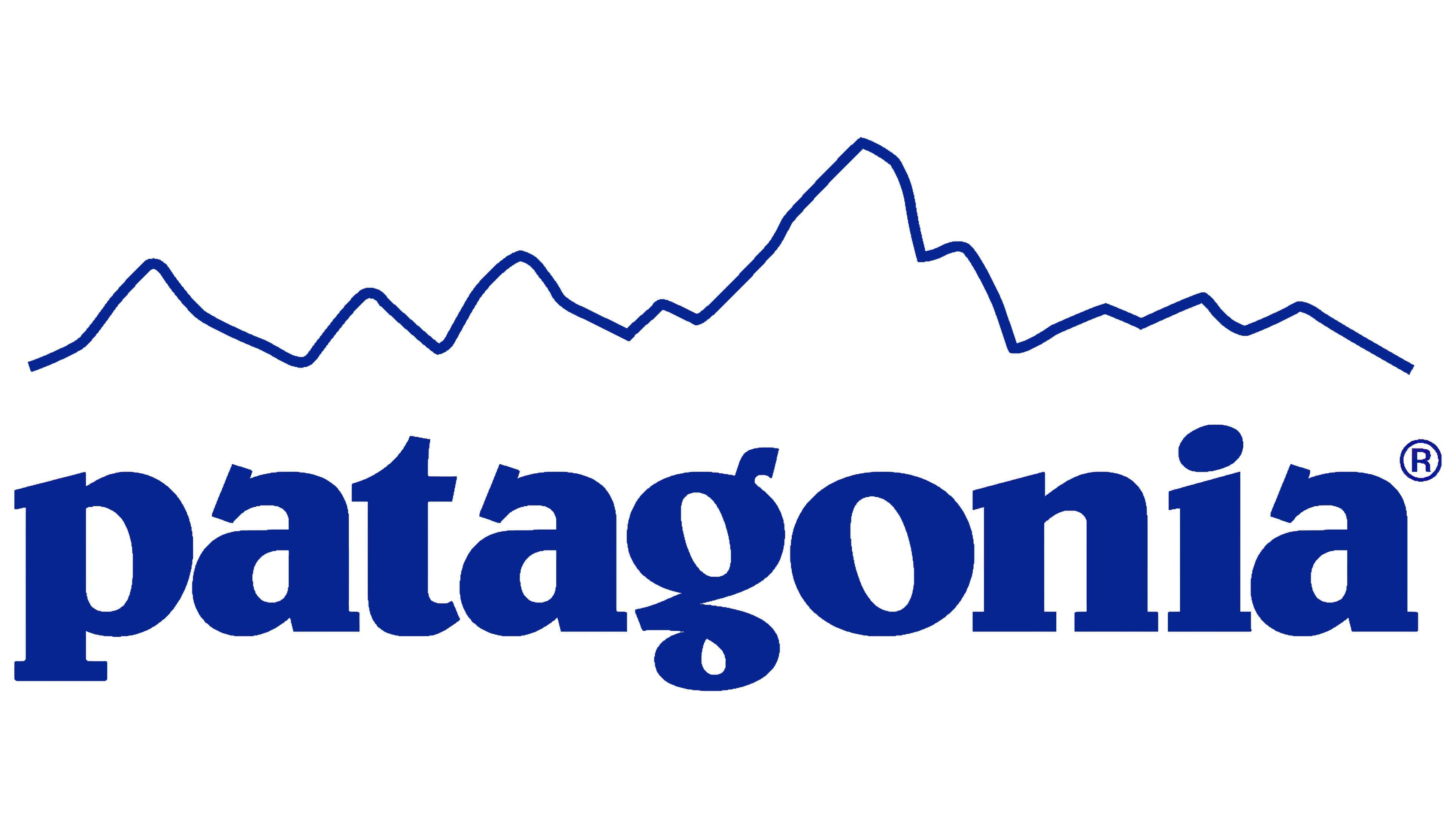
This version remains relevant to this day. In 2011, as new types of products appeared, two more logos were developed:
- One black and white (the mountain profile is black, the sky is white), on a black background, a white inscription “Patagonia” in a standard font, below it in large letters PREAMBLE.
- The second is made in white and blue tones (the background is white, and the mountain profile and inscription are blue). Below the word “Patagonia” is the phrase “On Thames Street” (the name of the hotel chain where climbers stay).
![]()
The Belwe Bold font was used for writing the brand name – something between printed and cursive letters, using serifs. The author of the font is Georg Belwe.
The color palette remained the same: white, black, blue, light orange, and purple shades. Bright saturated colors symbolize the color of the Patagonian sky at sunset.
Patagonia color codes
| Black | Hex color: | #000000 |
|---|---|---|
| RGB: | 0 0 0 | |
| CMYK: | 0 0 0 100 | |
| Pantone: | PMS Process Black C |
FAQ
What does the Patagonia logo mean?
The Patagonia logo denotes the name of mountains in South America: it’s the Cerro Fitz Roy range, part of the Fitz Roy massif, near the town of El Chaltén. In their honor, the trade name for sportswear from ecological materials was named. Thus, this word also represents the name of the company.
What font is used in the Patagonia logo?
The font used in the Patagonia logo is Belwe Bold, which designer Georg Belwe designed. All letters are typed in lowercase and adorned with slanting serifs at the top. Below, they are flat and wide.