![]() PayPal Logo PNG
PayPal Logo PNG
The PayPal logo, created in 1988 by the American payment system, is distinguished by its unique self-expression. The conservatism of its visualization emphasizes the system’s stability, its security, and the high level of trust it commands, ensuring its recognizability.
PayPal: Brand overview
| Founded: | December 1998 |
| Founder: | Max Levchin, Peter Thiel, Luke Nosek, Ken Howery, Yu Pan |
| Headquarters: | San Jose, California, U.S. |
| Website: | paypal.com |
Meaning and History
![]()
The PayPal logo is conditionally constant. Over the many years of the brand’s existence, it has been updated only a few times, maintaining a consistent style. Such conservatism is linked to the issue of brand succession. The designers could not radically change the appearance of the icon, which people search for daily on web pages or in application lists. They were restricted by the high level of consumer trust in the existing image of the payment system.
What is PayPal?
PayPal is one of the largest electronic payment services, established in the USA in 1998. It focuses on bill payments, making purchases, and transferring and receiving money transfers. The company’s headquarters are located in San Jose, California. Since 2002, the financial and debit service has been a subsidiary of eBay.
1999 – 2000
![]()
Of course, the monetary company PayPal was the first to experiment with the symbol of the dollar. For this, it took a round element resembling a coin and placed the “$” sign inside it. To directly link it with the brand name, designers based it on two “P” joined by their legs. They reversed one letter. Both had elongated top strokes. The line ends resemble brush strokes. The emblem’s primary color is blue.
1999 – 2007
![]()
The original version of the logo contains a simple inscription, “PayPal.” The white letters have spacing and are only delineated by wide blue outlines. The font is bold, italic, sans-serif.
2007 – 2014
![]()
In 2007, the first logo redesign was conducted. The company sought a recognizable symbol that would support its image. Therefore, the developers made the word colorful, dividing it into two parts: dark-blue “Pay” and light-blue “Pal.” They also increased the space between the characters, rounded the corners, and removed the familiar outlines.
2014 – 2022
![]()
In 2014, the global system decided to change the logo again and turned to Fuseproject for help. The main task was to adapt the icon for all display sizes – from mini-screens to large flat monitors. At the same time, great attention was paid to PayPal’s legacy – the inseparable connection of the old design with the new.
The previous trademark did not reflect the company’s technological achievements or its transition from the era of web payments to the era of money transfers on mobile devices. Under the leadership of Yves Behar, the team conducted a visual audit of the past logo to understand branding issues. Striving to avoid past mistakes, the developers focused on trust and innovation.
2022 – today
![]()
The 2022 PayPal logo is very similar to its predecessor, so many users did not notice the changes. The main goal of the designers was to embody the concept of “people first,” aimed at demonstrating openness to the millions of customers of the payment system.
To align the identity with the new brand strategy, PayPal employees collaborated with the independent studio Gretel. To make the emblem comply with the idea of inclusion, they adapted it to ADA standards, which consider the needs of people with disabilities.
Now, the colors in the logo are dark and pale, allowing its use on a bright gold background (for example, on a payment button). Thanks to a slight font change, the letters in the monogram and wordmark have become clearer, enhancing their readability.
PayPal: Interesting Facts
PayPal is a big deal in online payments, making it easier for people and businesses to buy and sell things online. It started in 1998 and has grown a lot since then.
- How It Started: PayPal was founded in 1998 as a company called Confinity, which focused on security for handheld devices. It changed its focus to payments and got its current name in 2001.
- Joining eBay: eBay, the online auction site, bought PayPal in 2002 for $1.5 billion. This made PayPal the main way to pay on eBay, which helped it grow big time.
- Becoming Its Own Thing: In 2015, PayPal split from eBay to become its own company. This allowed it to work on other payment services besides eBay.
- Smart Tech: PayPal has always used cool tech to make payments safe and easy, such as email and adding features like fingerprint checks and quick payments.
- Worldwide Work: PayPal is available in over 200 places and supports over 25 currencies so that you can use it almost anywhere.
- Lots of Users: Millions of people use PayPal, from buying coffee to paying for big business stuff.
- Buying Other Companies: PayPal has bought many other companies to do more things like Venmo to send money to friends and Honey to find deals when shopping.
- Venmo: PayPal got Venmo, which is popular with young people for splitting bills and paying each other back.
- Elon Musk Connection: Before it was PayPal, it was part of X.com, an online bank started by Elon Musk. Musk’s big plans for online payments helped shape PayPal’s future.
- Into Crypto: PayPal is getting into cryptocurrency, letting people buy and hold digital money like Bitcoin. This shows it’s keeping up with new money trends.
From its start as a security software company, PayPal has become a huge name in online payments. It always tries new things and makes sending and receiving money worldwide easier.
Font and Colors
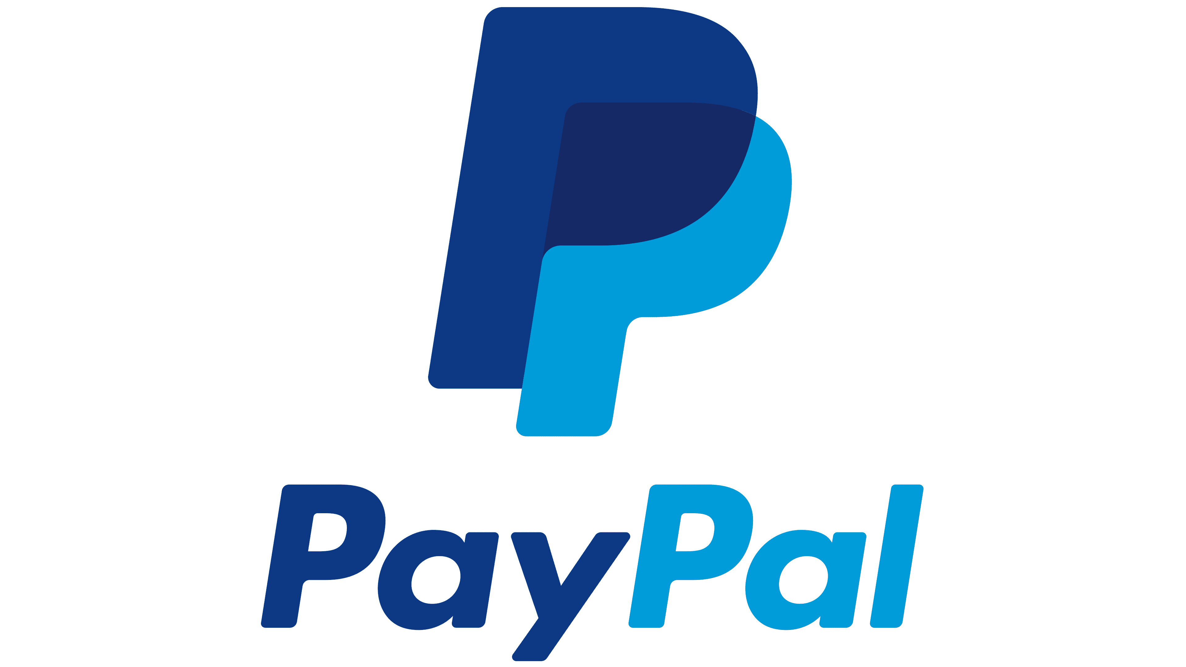
In 2014, designers at Fuseproject created PayPal’s first graphic symbol: a monogram consisting of the combination of the letters “PP.” Initially, the emblem had only one letter, “P,” but it was associated with a parking sign. Consequently, it was decided to add a second letter, placing it on top and using a semi-transparent effect. This led to the famous icon that highlights the concept of closeness and is a marketing feature of the online system.

In 2016, PayPal accused Pandora of copyright infringement. Lawyers claimed that the music streaming service stole their trademark image to outsmart competitors. The two logos are similar. According to internet reviews, people often confuse Pandora with the PayPal app.
The new emblem features a bright palette dominated by shades of blue. The chosen color allows PayPal to stand out from other companies in the financial sector. It symbolizes openness and communicability and inspires trust in users at a subconscious level.

Previously, the logo’s inscription was in the Verdana font. In 2014, designers began using a modified version of Futura with soft edges and rounded letters “a.” The italic style conveys progress, innovation, and forward movement, as dynamism is one of the company’s key principles. To make the icon more mobile, the letters are placed close enough. This makes the inscription look better on small screens of smartphones and tablets.
PayPal color codes
| Dark Cerulean | Hex color: | #1d3384 |
|---|---|---|
| RGB: | 29 51 132 | |
| CMYK: | 100 99 17 14 | |
| Pantone: | PMS 287 C |
| Ocean Boat Blue | Hex color: | #3f6fdc |
|---|---|---|
| RGB: | 63 111 220 | |
| CMYK: | 90 57 0 0 | |
| Pantone: | PMS 2727 C |
FAQ
Who Developed the PayPal Logo?
The modern PayPal logo was developed by the advertising and marketing agency Fuseproject. Specialists led by director Yves Behar created an icon that accurately reflects the concept of the electronic payment service: mutual assistance, trust, and transparency. For this, they combined two Ps from the name, overlaying them in the form of a semi-transparent monogram.
What Color is the PayPal Logo?
The PayPal logo uses two shades of blue – light and dark. Light blue codes: 2935 C (Pantone), 0, 121, 193 (RGB), #0079C1 (Hex). Dark blue color grid: 648 C (Pantone), 0, 69, 124 (RGB), #00457C (Hex).