Grace, strength, determination, and unyielding will – these are what the Puma logo with a representative of the feline family reflects. It’s also the visualization of the name of the fashionable brand that produces sports clothing and footwear. The black shadow overcoming any obstacle in a single leap is an allegory of brilliant physical abilities and high comfort.
Puma: Brand overview
Puma is one of the largest sports goods manufacturers, competing with Adidas. It appeared in 1948 when Rudolf Dassler founded his shoe factory. It became famous thanks to innovative products and a memorable logo depicting a puma.
Meaning and History
The company had several names. Initially, RUDA (a combination of the first two letters of the creator’s name and surname), then PUMA AG Rudolf Dassler Sport. Now, the company is simply called Puma, whose name and iconic emblem have remained the same.
What is Puma?
Puma is a transnational corporation producing sports accessories, footwear, and clothing, the second largest in the world. It was founded by entrepreneur Rudolf Dassler in 1948 based on the company Gebrüder Dassler Schuhfabrik, which, after a quarrel between the owners, was divided into two independent companies. One of them became Puma, and the other became Adidas. The company’s headquarters is located in Herzogenaurach, Bavaria.
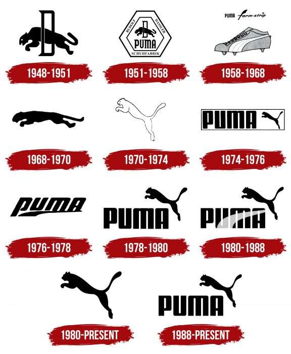
1948 – 1951
The debut logo featured a predatory cat jumping over the letter “D.” This is a direct reference to the Dassler surname.
1951 – 1958
In 1951, designers placed the drawing inside a hexagon. The original version used a simple black geometric figure. In 1957, a double black-and-white outline was added, and the word “Puma” appeared under the predatory cat. In 1958, the background became white. The wide frame was adorned with the inscription “Rudolf Dassler Schuhfabrik.”
1958 – 1968
In 1958, the manufacturer moved away from the classic concept. For the next ten years, its emblem was a soccer boot, complete with the phrase “Puma form-strip.” A dense sans-serif font was chosen for the first word and elegant italics for the second. This was the company’s way of celebrating the creation of the lateral support element (Formstrip) in the form of three stripes on sports shoes.
1968 – 1970
Rudolf Dassler believed that shoes did not fully reveal Puma’s character. After all, the predatory cat embodies agility, endurance, flexibility, speed, and strength. He wanted to change the existing logo and entrusted this to caricaturist Lutz Backes, where his son Gerd Dassler was studying.
The artist first drew the body of a black panther and then added the paws and head of a puma so that the image would best meet the customer’s requirements. The factory owner offered to pay a commission of 1 cent for each product sold with the Puma logo. But Lutz refused and asked for a one-time amount of 600 marks. Along with the money, he received a gift: a sports bag and a pair of shoes.
1970 – 1974
In 1970, the Puma silhouette changed slightly. Now, it was white with a black outline. The figure becomes more dynamic as the animal is depicted in mid-leap.
1974 – 1976
The 1974 emblem again featured the inscription “Puma”. The font resembles the 1958 version: bold quadrangular letters with rounded edges. The predatory cat was repainted black and placed to the right. This trademark had several modifications, with and without a rectangular frame.
1976 – 1978
In 1976, experiments with graphics continued. Developers got rid of the Puma, leaving only the company name. In addition, the font was completely changed: now the letters are slanted, and the letter “p” seems lowercase due to the long vertical stroke. The Formstripe is shown below.
1978 – 1980
The company returned to the classic logo design two years after the unsuccessful image change. The puma looms over the inscription as if trying to leap over it.
1980 – 1988
In 1980, the word Puma was again accompanied by the Formstripe – this time translucent.
1988 – today
Developers returned the 1978 emblem without the curved stripe. The primary palette includes black and white colors. But there is also an additional one – with a bright shade of red.
Puma: Interesting Facts
Puma is a big name in sports shoes, clothes, and accessories. They mix new technology with trendy designs.
- How It Started: Rudolf Dassler created Puma in 1948. Rudolf and his brother Adi, who started Adidas, first worked together but then decided to go their separate ways and started their own companies in Germany.
- Cool Soccer Shoes: In 1952, Puma made a soccer shoe called “Super Atom” with studs you could screw in. This was a big deal because players could change their studs to match the weather or the field.
- Olympic Fame: At the 1960 Olympics in Rome, a sprinter named Armin Hary from Germany won the 100 meters wearing Puma shoes. He chose Pumas even though Adidas wanted him to wear theirs.
- A Trick with Pelé: During the 1970 World Cup, Puma paid Pelé to show off his Puma shoes before a game. This got them a lot of attention all over the world.
- Inventing New Shoes: In 1991, Puma made the first sports shoe without laces. It had wires inside that could tighten for a perfect fit.
- Fashion Forward: Puma works with famous designers and stars like Rihanna and Jay-Z. They mix sports with fashion.
- Caring for the Planet: Puma cares about the environment and ensures its workers are treated well. It tries to produce less pollution and use better materials.
- Super Fast Brand: Puma calls itself “The Fastest Sports Brand in the World.” They focus on making products that help athletes move faster.
- Sponsoring Usain Bolt: The fastest man, Usain Bolt, wore Puma shoes when he broke world records, so he’s a big part of their ads.
- Eco-friendly Stuff: Puma is working on making better products for the planet, using recycled materials and organic cotton.
Puma is known for being innovative, working with celebrities, and caring about the environment. They’re a big deal in sports and keep challenging other brands.
Font and Colors
It’s quite logical that the Puma emblem represents the silhouette of this predatory animal. The creature is depicted leaping, indicating the manufacturer of sports clothing and footwear’s primary goal – promoting an active lifestyle. The trademark on tags and products reflects this idea perfectly, as the Puma is incredibly fast: it can reach record speeds when running. Artists paid attention to details, depicting ears, tails, paws, and smooth body contours.
The modern font presented on the Puma logo appeared in 1974. Designers specially developed it for this company, taking a strict, bold grotesque as a model. Later, this font formed the basis of the free sans-serif font family My Puma, created by Samuel Park.
The monochromatic palette enhances the logo’s minimalism. The standard color scheme contains only black and white colors, but there are versions with a bright red shade that effectively highlights the drawing and inscription.
Puma color codes
| Black | Hex color: | #000000 |
|---|---|---|
| RGB: | 0 0 0 | |
| CMYK: | 0 0 0 100 | |
| Pantone: | PMS Process Black C |
FAQ
Why did Puma choose its logo?
Rudolf Dassler chose such a name for his company because a real puma (wild cat) embodies all the main qualities necessary for athletes: agility, flexibility, speed, endurance, and strength.
Why is the Puma logo black?
The black color of the Puma logo has remained since the debut version when it was still black and white. Thanks to monochromaticity (dark on light), the silhouette of the wild cat leaping over the letter was clearly highlighted. Moreover, there’s an obvious parallel between two members of the feline family – the puma and the panther, which are usually colored black.


