The Qubo logo harmoniously combines entertainment and educational elements, creating an image that attracts attention and evokes a desire to touch its soft, smooth lines. Carefully crafted details enhance this effect, making the emblem visually appealing and friendly to a children’s audience.
The logo’s shape hints at the famous Rubik’s cube, yet its stylization is adapted for younger viewers. The simplified elements of the symbol emphasize the playful and educational nature of the content, which helps children develop logic and creativity.
Qubo: Brand overview
In 2006, Ion Media Networks, NBC Universal, Scholastic Corporation, Classic Media (now part of DreamWorks Classics), and Corus Entertainment teamed up to create a new children’s programming brand called Qubo. The goal was to provide high-quality, entertaining, and educational content for children between the ages of five and fourteen.
The brand officially launched on September 1, 2006, with a three-hour programming block airing on Telemundo and NBC and a five-hour block on Ion Television. In addition to its television presence, the brand introduced a website offering interactive games and additional content related to its shows.
On January 29, 2007, the network expanded by launching a 24-hour digital channel through Ion Television’s subchannel service, increasing its reach. In its early years, it aired several popular children’s shows, including Elliot Moose, Postcards from Buster, Jane and the Dragon, and Jacob Two-Two, many of which were produced by partners Nelvana and Scholastic.
The programming debuted in Canada in 2008 through a partnership with Canwest Media, allowing for international expansion. However, in 2009, following Comcast’s acquisition of NBCUniversal, some of its partnerships shifted. As a result, NBC and Telemundo discontinued airing blocks by 2012, although the channel continued to evolve. In 2010, a new logo and updated graphics were introduced to appeal to a modern audience and make the content more engaging for kids.
In 2012, the network began airing some Spanish-language content, catering to the growing Spanish-speaking population in the U.S., offering both original Spanish programming and dubbed versions of popular English-language shows. In 2013, the channel introduced a late-night block called “Night Owl,” featuring vintage TV shows and films for an adult audience.
In 2014, the offerings expanded with more original series and rights to well-known children’s shows. The network also experimented with interactive features, allowing viewers to vote for their favorite episodes and influence the schedule.
By 2017, the channel had undergone a major revitalization, including a refreshed visual identity and the launch of the tagline “Where Learning Is Fun!”—a shift toward balancing entertainment with education. In 2019, the channel celebrated its 13th anniversary by introducing new content and hosting marathons of fan-favorite series.
However, significant changes occurred in 2020 after its parent company, Ion Media, was acquired by E.W. Scripps Company. As part of the acquisition, Scripps decided to shut down the network, along with sister channels Ion Plus and Shop Ion. Broadcasting officially ceased on February 28, 2021, marking the end of a 15-year run.
Despite its closure, the legacy continues, with many popular shows still available on other networks and streaming platforms. The channel impacted children’s programming by emphasizing the importance of combining entertainment with education. Its influence can still be seen in the children’s television industry, where values like multicultural content, educational programming, and creating a safe environment for kids remain central.
Meaning and History
What is Qubo?
This children’s television network has established itself in children’s entertainment by focusing on educational programs with an entertaining twist. It offers a variety of live-action and animated series designed to capture the attention of young viewers. The network is known for its commitment to moral values and the integration of life lessons into its shows, skillfully embedding educational elements into engaging storylines. The educational content covers problem-solving, literacy, social skills, and cultural awareness. The network’s uniqueness lies in its dedication to providing children with safe, ad-free viewing, giving parents confidence in the content and quality of their children’s programs.
2006 – 2021
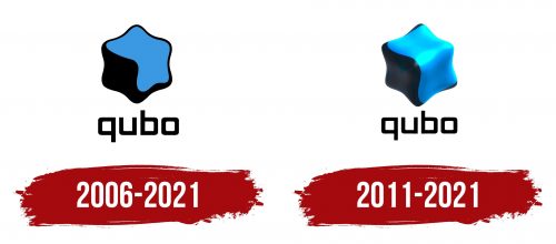
The channel’s emblem includes a visual image and a name, originating from the Spanish word “cube” — cubo. The channel was originally conceived as bilingual, using both English and Spanish. The first letter of the name was transformed into a “Q,” which evokes associations with IQ and highlights the educational focus of the brand’s content. The square-shaped font reinforces the idea of a cubic structure.
The cube, symbolizing the channel, consists of two halves—blue and black, resembling a puzzle. The cube’s edges are wavy, giving the object a sense of comfort as if it were designed to stay securely in hand. This design embodies the active and dynamic combination of entertainment and education, easily perceived by a young audience.
The color scheme, including shades of blue and black, evokes associations with a television or computer screen, emphasizing the channel’s connection to modern technology and digital content.
2011 – 2021
The Qubo logo, updated in a 3D format, is a vibrant and dynamic emblem with a modern look. The main shape of the emblem is a four-pointed star with smooth, rounded corners, creating an effect of fluidity and lightness. The surface’s shine enhances the sense of sleekness and smoothness, hinting at the flexibility and contemporary trends that the studio aims to emphasize.
The shape simultaneously resembles a star and a cube, evoking associations with the multi-dimensional and structured nature of the content. The combination of dark and bright blue colors contrasts the logo, highlighting the channel’s progressive and energetic nature. The dark shade symbolizes professionalism, confidence, and a serious approach to content creation, while the bright blue color is associated with creativity, new ideas, and openness to innovation.
The font of the name “qubo” is executed in a geometric style with straight lines, reinforcing the association with the cubic form. The “q” symbol at the beginning appears original thanks to its extended tail, giving the emblem uniqueness. This font choice emphasizes technological sophistication and simplicity while maintaining the brand’s signature style.
This update of the visual symbol in 3D style aligns with the current trend of volumetric visual elements, which have become popular, especially in children’s content, where spectacle and brightness are important.
