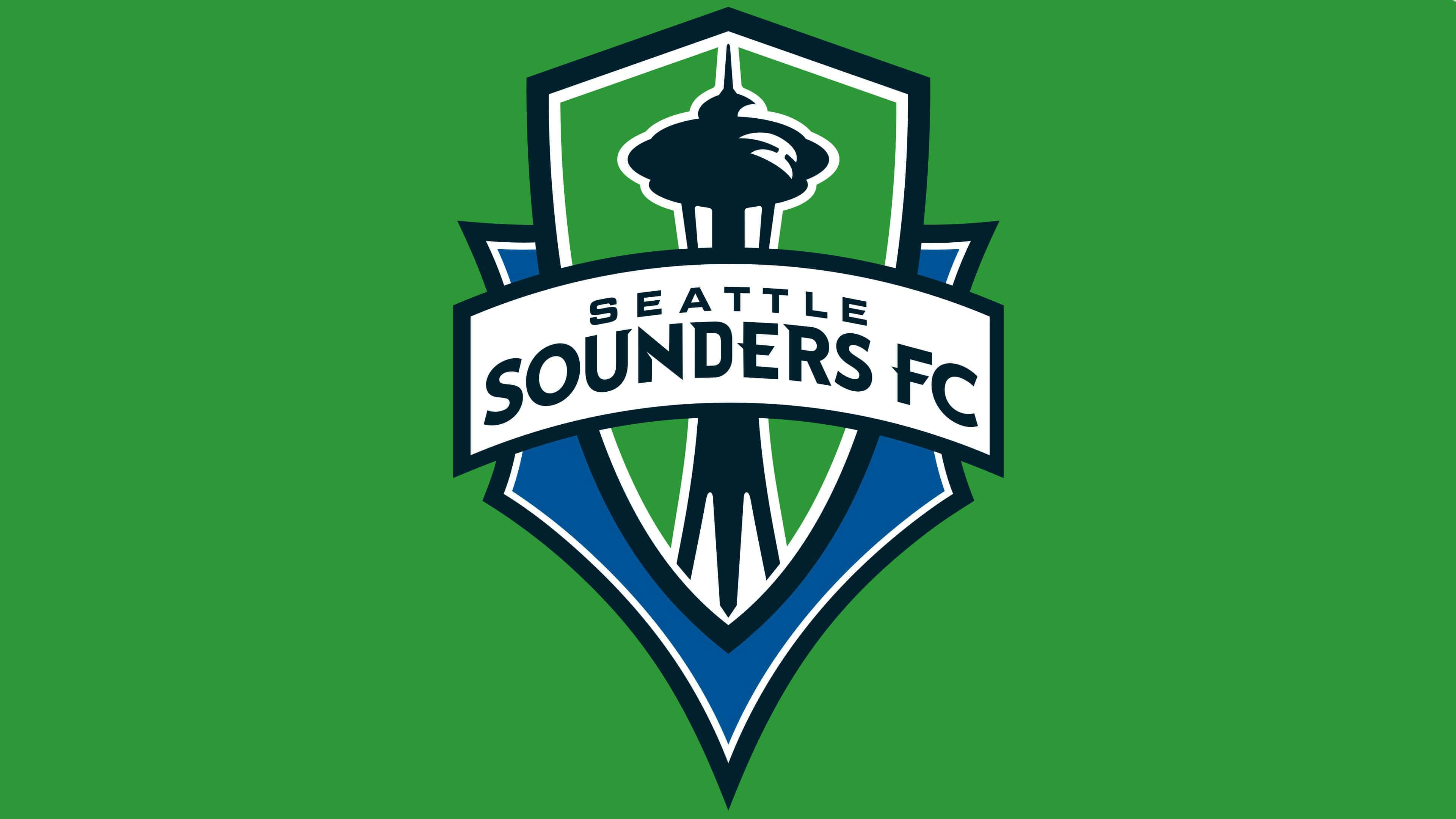
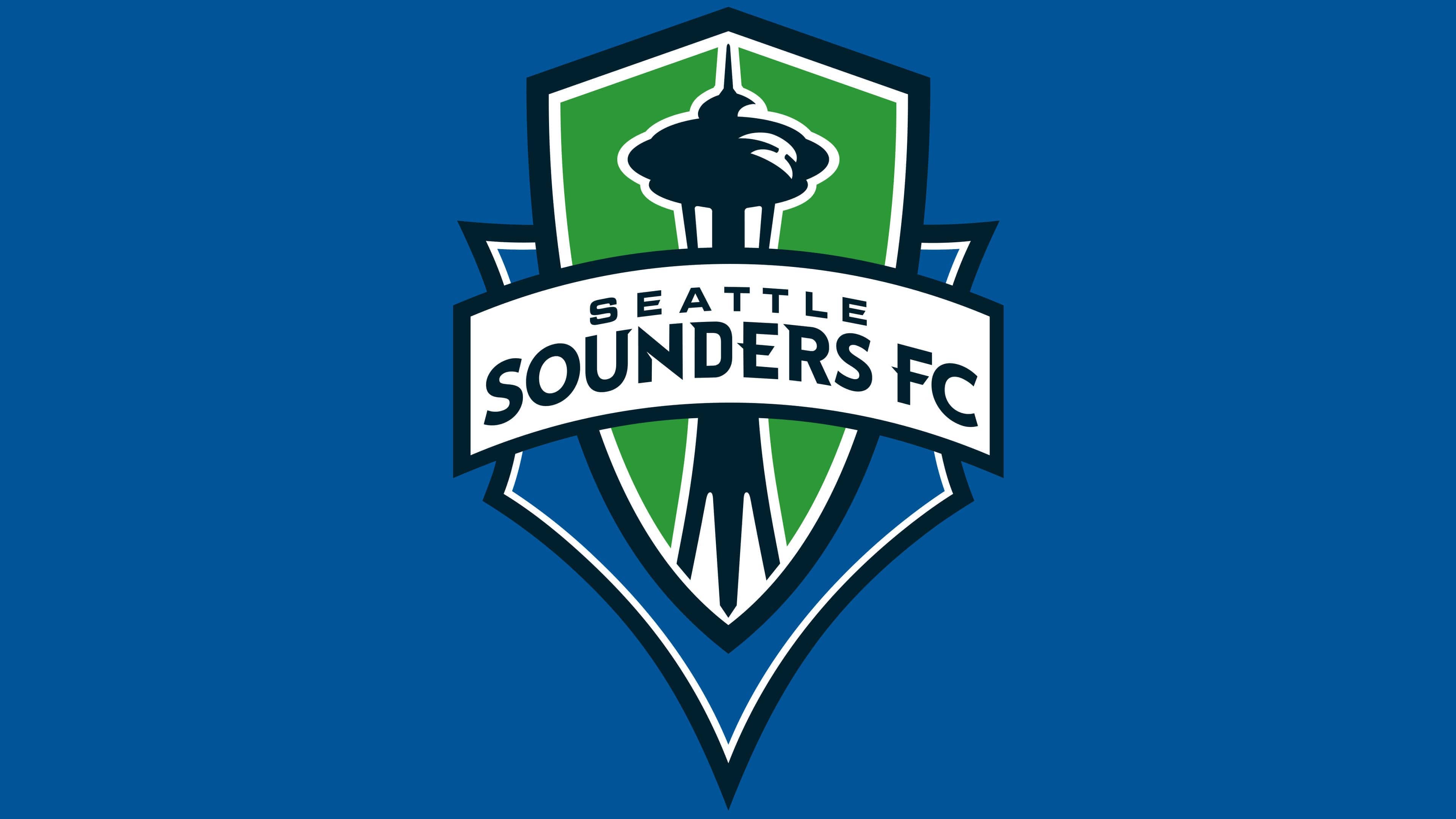
![]() Seattle Sounders FC Logo PNG
Seattle Sounders FC Logo PNG
The emblem of the Seattle Sounders football club, executed in a traditional graphic style, features an important city symbol. The overall symbolism of the emblem demonstrates the close unity of the team, fans, and city. The color palette reflects the natural features of the region.
Seattle Sounders FC: Brand overview
Seattle Sounders FC is a football team from Seattle. It is a member of the Western Conference of the Football League. It is the successor to a North American Football League club of the same name, founded in 1974 and disbanded on September 6, 1983, due to financial problems.
Seattle Sounders was revived in 1994. Seattle joined the United Soccer League with a new franchise owned by former Microsoft executive Scott Oki. In 1997, the team moved to the USL First Division. Paul Allen, one of the decision-makers, tried to promote the team to MLS, but the city didn’t meet soccer standards. He considered the commissioner’s requirements and built Seahawks Stadium but was again denied: since 2000, sports organizations had to be managed by investors, not the league.
In 2002, general manager Adrian Hanauer became the principal owner of the club. The entrepreneur joined forces with strong partners to cover the 30-million-dollar franchise cost: Joe Roth received 35% of the shares, Adrian Hanauer – 32.5%, Paul Allen – 25%, and Drew Carey – 7.5%. On November 13, 2007, the league agreed with them. The “Seattle Sounders” from USL was replaced by a team with a similar name. In 2009, it moved to MLS. It was a “phoenix club” that became the successor to the original NASL club.
Managers organized a survey to determine the club’s name. From March 27 to 31, 2008, fans had to choose between Seattle Alliance, Seattle Republic, and Seattle FC. Organizers intentionally removed “Seattle Sounders” to radically change the brand’s image. This caused a wave of protest among the local population, so the owners were allowed to put forward their names.
Among 14,500 respondents, 49% suggested various forms of the word “Sounders.” It’s connected to Puget Sound, a bay located near Seattle. “FC” stands for Football Club, but the official version contains the abbreviation.
The name belonged to Adrian Hanauer, so there were no problems with transferring rights to MLS. In 2015, Hanauer became the majority investor instead of Joe Roth. In 2019, Roth left the ownership group. His place was taken by the company Eleven Powerful Families New Sounders FC Partners, managed by Microsoft vice president Terry Myerson. The remaining shares were divided among minority shareholders, such as Peter Tomozawa, Jody Allen, Drew Carey, and Paul Allen.
Meaning and History
![]()
The emblem of the Seattle Sounders football club symbolizes the collective spirit of the region, known for its unique combination of traditions and innovations. The emblem serves as a beacon for both casual fans and devoted supporters, representing the team as an organization with roots in history but open to contemporary influences. The logo emphasizes that Seattle Sounders FC is an organization deeply connected with its community and striving for excellence. The team’s role goes beyond the football field, serving as a symbol complementing the cultural fabric of the region.
One of the main symbols of the Seattle Sounders football club is the pointed Space Needle. It’s the main attraction of Seattle, located in the very center of the city. From its top, one can see the nearby islands, Mount Rainier, and the large Cascade Range. Another feature of the tower is its unique architectural style, known as Googie. The emblem creators tried to convey its originality but did so without much detail: they depicted only the general outlines of the Space Needle without details.
What is Seattle Sounders FC?
Seattle Sounders FC is a professional football team from Seattle, Washington, founded in 2007. It entered the league in 2009 as part of the expansion program. The club is a member of the Western Conference, representing it in MLS. The principal owner of the franchise is Adrian Hanauer, with minority owners being Paul Allen and Drew Carey.
1994 – 2008
![]()
After the team’s revival in 1994, a logo featuring “Sounders” and an orca playing football was adopted instead of the letter “O.”
2009 – 2023
![]()
In 2009, the Seattle Sounders logo was changed again. This was related to the club’s transition to MLS. The presentation took place on April 7, 2008, at the Space Needle. This place was chosen for a reason: the famous landmark was once again in focus. The globally recognized symbol of Seattle was drawn inside a complex heraldic shield consisting of two parts. The combination of elements symbolizes cooperation between the team’s owners, players, city, and fans.
The color palette of the “Seattle Sounders” logo is also symbolic. The blue color (Sounder Blue) symbolizes the water around the city, specifically Puget Sound. Green (Rave Green) represents the forests of the Pacific Northwest. The dark gray outline signifies the Cascade Range mountains east of Seattle. The words “Seattle Sounders FC” of the same color are printed inside a curved white rectangle opposite the “Seattle Sounders” logo.
The font matches the style of the illustration: it looks as futuristic as the famous tower. The first word – “SEATTLE” – is written in a rough rectangular font with serifs. Against its background, “SOUNDERS FC” doesn’t seem so strict: the letter “S” here is smoother and rounder than in the previous case. But some letters (“U,” “D,” “E,” “R,” and “F”) have sharp triangular serifs, with “E” and “F” having them in the middle, not at the ends.
The colors were chosen considering their hidden meaning: each shade reflects the bodies of water, mountains, and forests. The designers used Cascade Range (#1D252D) for the outlines and Space Needle, Rave Green (#658D1B) for the triangular heraldic shield, and Sounder Blue (#236192) for the pentagonal geometric figure in the background.
2023 – today
![]()
The emblem of this American football club has a heraldic and historical character. It depicts a famous local landmark – the Space Needle. The iconic structure is illustrated schematically, consisting of lines of different lengths. The sharp tip of the tower points to the highest point of the quadrangular shield, which is framed twice. The team’s founding year is indicated on both the right and left sides, divided in half. The primary colors of the emblem are green (background), blue (main element, year, and inner border), and emerald (outer border).
Green symbolizes growth and renewal, blue symbolizes depth and stability, and emerald symbolizes luxury and elegance. The schematic representation of the Space Needle adds a modern touch to the overall historical-heraldic theme of the logo. The quadrangular shield in a double frame adds complexity to the logo, highlighting the club’s rich history and its pursuit of excellence. Dividing the founding year on both sides of the shield visually balances the design.
Seattle Sounders FC : Interesting Facts
Seattle Sounders FC, a soccer team that started in 2009, is one of the most loved and successful teams in Major League Soccer.
- Lots of Fans: Since they began, the Sounders have had the most people come to watch their games almost every year. Their fans are into soccer and have broken records for how many people attend the games.
- Passionate Supporters: The team has big groups of fans, like the Emerald City Supporters, who make their games exciting and loud, like soccer games in Europe.
- Winning Early On: The Sounders immediately showed they were a great team by winning the U.S. Open Cup their first year and the following two years. Recently, they were the first team to win it three times in a row.
- Championship Wins: They’ve won the big championship, the MLS Cup, a few times, starting in 2016 and again in 2019. This makes them one of the best teams in the league’s history.
- Working with Other Teams: In 2013, they teamed up with Borussia Dortmund, a big team from Germany. This was to help both teams improve at soccer and work together in other ways.
- Fans Have a Say: The Sounders were among the first teams to let their fans help make decisions through the Alliance Council. This includes keeping the General Manager and making other big choices.
- Helping the Community: The team does a lot of good stuff outside of soccer, like helping kids and schools in Seattle through the RAVE Foundation.
- Training Young Players: They focus a lot on training young players in their academy, and some of these players have become very important to the team and have even played for their countries.
- Famous Players: Players like Clint Dempsey and Jordan Morris from the U.S. and Nicolás Lodeiro from Uruguay have played for the Sounders, which shows that the team attracts good players.
- Caring for the Planet: The Sounders work hard to be good to the environment, like making their stadium, Lumen Field, and their team operations greener. This matches Seattle’s focus on being eco-friendly.
The Seattle Sounders FC are known for being good at soccer, having a strong bond with their fans, helping their community, and caring about the environment.
Font and Colors
Seattle Sounders FC color codes
| Medium Electric Blue | Hex color: | #005595 |
|---|---|---|
| RGB: | 0 85 149 | |
| CMYK: | 100 43 0 42 | |
| Pantone: | PMS 301 C |
| Maximum Green | Hex color: | #5d9741 |
|---|---|---|
| RGB: | 93 151 65 | |
| CMYK: | 38 0 57 41 | |
| Pantone: | PMS 7738 C |
| Black | Hex color: | #000000 |
|---|---|---|
| RGB: | 0 0 0 | |
| CMYK: | 0 0 0 100 | |
| Pantone: | PMS Process Black C |