![]() Sporting Kansas City Logo PNG
Sporting Kansas City Logo PNG
The soccer club emphasizes its impeccable image with a simple yet attractive emblem. Designers made the Sporting Kansas City logo stylish to showcase the brand’s modernity, oriented toward the young generation of athletes and fans.
Sporting Kansas City: Brand overview
| Founded: | June 6, 1995 |
| Founder: | Sporting Club |
| Headquarters: | Kansas City, Missouri, U.S. |
| Website: | sportingkc.com |
Sporting Kansas City is a Major League Soccer team representing two cities. It’s located in Kansas City, Missouri, but plays home matches on the other side of the river, in Kansas City, Kansas. The team became a member of the Western Conference after returning from the Eastern Conference in 2010.
On June 6, 1995, the club was introduced as one of the original ten members of MLS. Four months later, the league published its logo and original name – Kansas City Wiz. Franchise founder and owner Lamar Hunt asserted that “Wiz” had nothing to do with “The Wizard of Oz.” However, to Rob Thomson, Executive Vice President of SKC, it was evident that it referred to Dorothy from Kansas.
Due to claims filed by a New York-based electronics retailer, Nobody Beats the Wiz, the team was renamed Kansas City Wizards in 1996. On August 31, 2006, the Hunt Sports Group sold the soccer club to OnGoal LLC – a group of 6 people led by Cliff Illig and Neal Patterson.
In 2010, the businessmen renamed the franchise to “Sporting Kansas City”. This reflects European influence, particularly from Portugal’s “Sporting Lisbon”. The rebranding had been in preparation since 2007. Among the considered names were “Bees” and “Fountains,” but the owners decided on “Sporting.” They wanted to include rugby and lacrosse teams in the sports organization but couldn’t.
The renaming led to a change in the color palette. The official scheme includes plum, dark indigo, and Sporting blue. The latter was proposed by Cliff Illig, who borrowed it from the women’s basketball franchise Kansas Jayhawks.
Now, “Sporting Kansas City” is owned by Sporting Club (formerly OnGoal LLC). It’s managed by Kansas City business community leaders Pat Curran, Greg Maday, Robb Heineman, Cliff Illig, and the Patterson family.
Meaning and History
![]()
Sporting Kansas City had several logos. Initially, the “Sporting Kansas City” logo featured a flying ball, rainbow lines, and the stylish word “Wiz,” replaced with “Wizards” after the team’s renaming. The graphic symbol was updated in 2011 after moving to Children’s Mercy Park. Slant Design Lab developed the current version.
What is Sporting Kansas City?
Sporting Kansas City is an American professional soccer club, an MLS member, and a representative of the Western Conference. The club’s administrative center is located in Kansas City, Missouri, and its training bases are in Kansas City, Kansas. The club was founded in 1995 by businessman Lamar Hunt and began playing the following year.
1996
![]()
In the history of Sporting Kansas City, there was a long period when it was known as “Kansas City Wizards.” At that time, the team had several logos featuring this nickname. The first one was a heraldic shield shaped like an inverted drop with a black and white soccer ball from which four multicolored stripes (yellow, red, green, and purple) radiated. The ball was depicted on a blue background, with the word “WIZ” compressed at the edges below it.
1997 – 2006
![]()
The second version of the emblem looked slightly different. The top part of the shield remained semicircular, but the colors of the stripes changed. Red and green switched places and blue replaced purple. The shape of the bottom half of the emblem was entirely different: it took the form of a pentagon, inside which was the club’s full nickname. The word “WIZARDS” was written in pointed letters of varying sizes.
2007 – 2010
![]()
In 2007, designers removed the blue semicircle with the ball and multicolored lines. Only the bottom half of the shield remained, but it was given a new shape. Now, it wasn’t a simple pentagon but a complex shape with two triangular protrusions at the top. It bore the words “KANSAS CITY WIZARDS”: the first two in blue and the third, as before, in white.
2011 – today
![]()
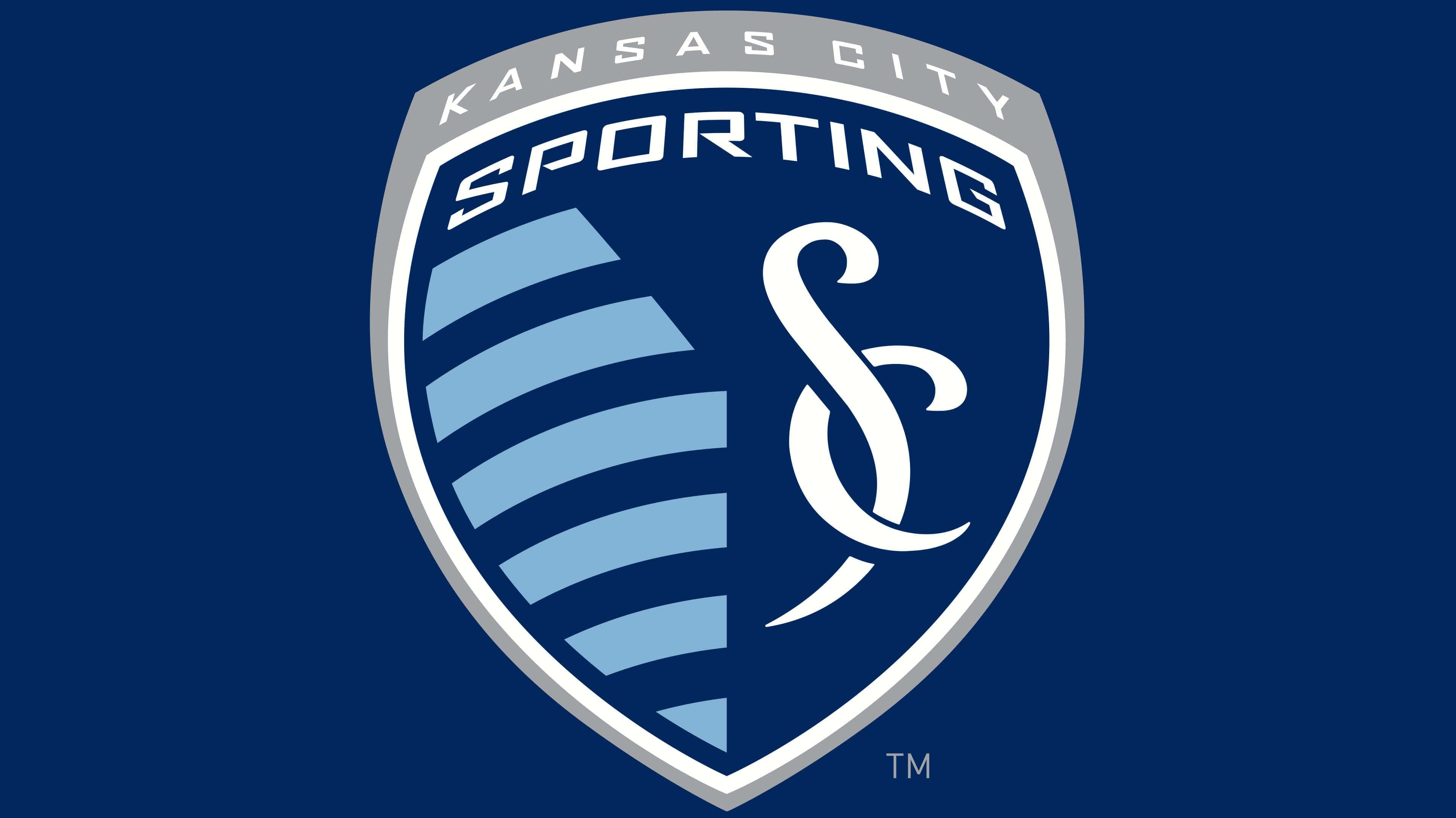
The drop shape of the Sporting Kansas City logo remained unchanged. The triangular heraldic shield with curled edges is outlined with a white border. The outer contour is plum-colored. The left side of the design is occupied by 11 blue and pale blue lines – as many as there are players on the field. The cipher “SC” (from “Sporting Club”) is located on the right on a dark blue background.
The interlaced letters were inspired by the Spanish architecture of the famous Country Club Plaza shopping center, the Hellenic statue of Winged Victory of Samothrace, and the rod of Asclepius. This is a well-known medical symbol of vitality and health. It’s used as a reference because the CEO and Vice President of the medical company Cerner Corporation is one of the club’s co-owners.
The two sides of the Sporting Kansas City logo symbolize the neighboring cities – Kansas from Missouri (right) and Kansas from the eponymous state (left). They are divided by an imaginary line representing the state border between East and West. Two white inscriptions are placed on top – “Kansas City” on the plum border and “Sporting” inside the shield. The stylish sans-serif font with straight and sharp angles was developed for the soccer club by designers at Slant Design Lab.
Sporting Kansas City: Interesting Facts
Sporting Kansas City is a soccer team that stands out in Major League Soccer (MLS). They’re known for their excited fans, smart ways of playing soccer and helping young players and their community.
- Beginning: They started in 1996 as the Kansas City Wiz and changed their name to Sporting Kansas City in 2011. This new name was about being more welcoming and looking up to European soccer clubs.
- Their Stadium: They play at Children’s Mercy Park in Kansas, Kansas. It opened in 2011 and is famous for its modern look and for making fans feel close to the action.
- Winning the MLS Cup: They’ve won the big championship twice, once in 2000 as the Wizards and again in 2013. This shows they’re one of the best teams around.
- S. Open Cup Wins: They’ve won this big soccer tournament four times (2004, 2012, 2015, and 2017), proving they’re always tough competitors.
- Fans: Their main fan group, the “Cauldron,” is super enthusiastic and helps make games exciting. It shows how much Kansas City loves soccer.
- Helping Young Players: They focus on training young players through their academy, one of the best in MLS. This helps grow soccer in the Midwest and finds new soccer stars.
- Smart Owners: Sporting Club owns them, and they’re all about using sports, tech, and fun in smart ways. This makes Sporting KC a team others look up to.
- Using Tech: They were among the first MLS teams to use high-tech sports science and analysis to improve, leading the way for others.
- Helping Out: Through their foundation and community work, they support local charities, kids’ soccer, and health programs, showing they care about Kansas City.
- Rivalries: They have big rivals, like Real Salt Lake. Their games, especially the 2013 MLS Cup Final, are always exciting and memorable.
Sporting Kansas City is more than just a soccer team. It has a rich history and strong connections to its community, and it’s helping make soccer bigger and better in the U.S.
Font and Colors
Until 2010, the team used a word mark, the main advantage of which was the unusual design of the letters. After the redesign in 2011, the players’ jerseys were adorned with an entirely different emblem: a drop-shaped shield (a nod to the first Kansas City Wizards logo) with eleven light and dark blue stripes (as many as people represent the team on the field). An important part of the design became the monogram of intertwined “SC” letters.
Designers specifically developed a font for the Sporting Kansas City emblem, officially related to medicine. This is due to the fact that the vice president and CEO of the American corporation Cerner is part of the club’s ownership group, making the medical theme quite fitting.
The color palette is also not as simple as it seems. For instance, the Sporting Blue color (#93B1D7) was borrowed from another city team playing basketball. To achieve visual harmony, it was combined with dark indigo (#002A5C) and lead (#A0A1A5). The resulting combination is complemented by white color – the basis for inscriptions and crests.
Sporting Kansas City color codes
| Medium Electric Blue | Hex color: | #005595 |
|---|---|---|
| RGB: | 0 85 149 | |
| CMYK: | 100 43 0 42 | |
| Pantone: | PMS 301 C |
| Maximum Green | Hex color: | #5d9741 |
|---|---|---|
| RGB: | 93 151 66 | |
| CMYK: | 38 0 57 41 | |
| Pantone: | PMS 7738 C |
| Dark Gunmetal | Hex color: | #142530 |
|---|---|---|
| RGB: | 20 37 48 | |
| CMYK: | 58 23 0 81 | |
| Pantone: | PMS 5395 C |