![]() Toblerone Logo PNG
Toblerone Logo PNG
Despite the brand’s main symbol being the city’s emblem—the bear—the most crucial element—the triangle—is hidden in the Toblerone logo. This shape reflects an important feature of the chocolate produced—all the products are made in the form of this figure.
Toblerone: Brand overview
Toblerone is the name of chocolate candies produced by the Kraft Foods corporation. Its history began in 1868 when Jean Tobler started selling candies. Seeing the growing demand for treats, the shop owner opened his chocolate factory. He realized this idea 1899 by establishing the chocolate factory “Bern Tobler & Cie” in Bern. Ten years later, Toblerone appeared in the assortment. The original recipe was invented by cousins Theodor Tobler and Emil Baumann.
In 1908, in Bern, Switzerland, Theodor Tobler and his cousin Emil Baumann created a chocolate bar that stood out because of its triangular shape. They named it Toblerone, combining Tobler’s name with “torrone,” the Italian term for nougat.
The next year, 1909, Toblerone was officially registered as a trademark. Its packaging featured a striking design with a red and yellow logo, making it easily recognizable.
During the 1920s and 1930s, Toblerone became a favorite among those who enjoyed the outdoors, offering a high-energy snack in a convenient package. It wasn’t long before the brand expanded its reach beyond Switzerland’s borders, finding fans across Europe.
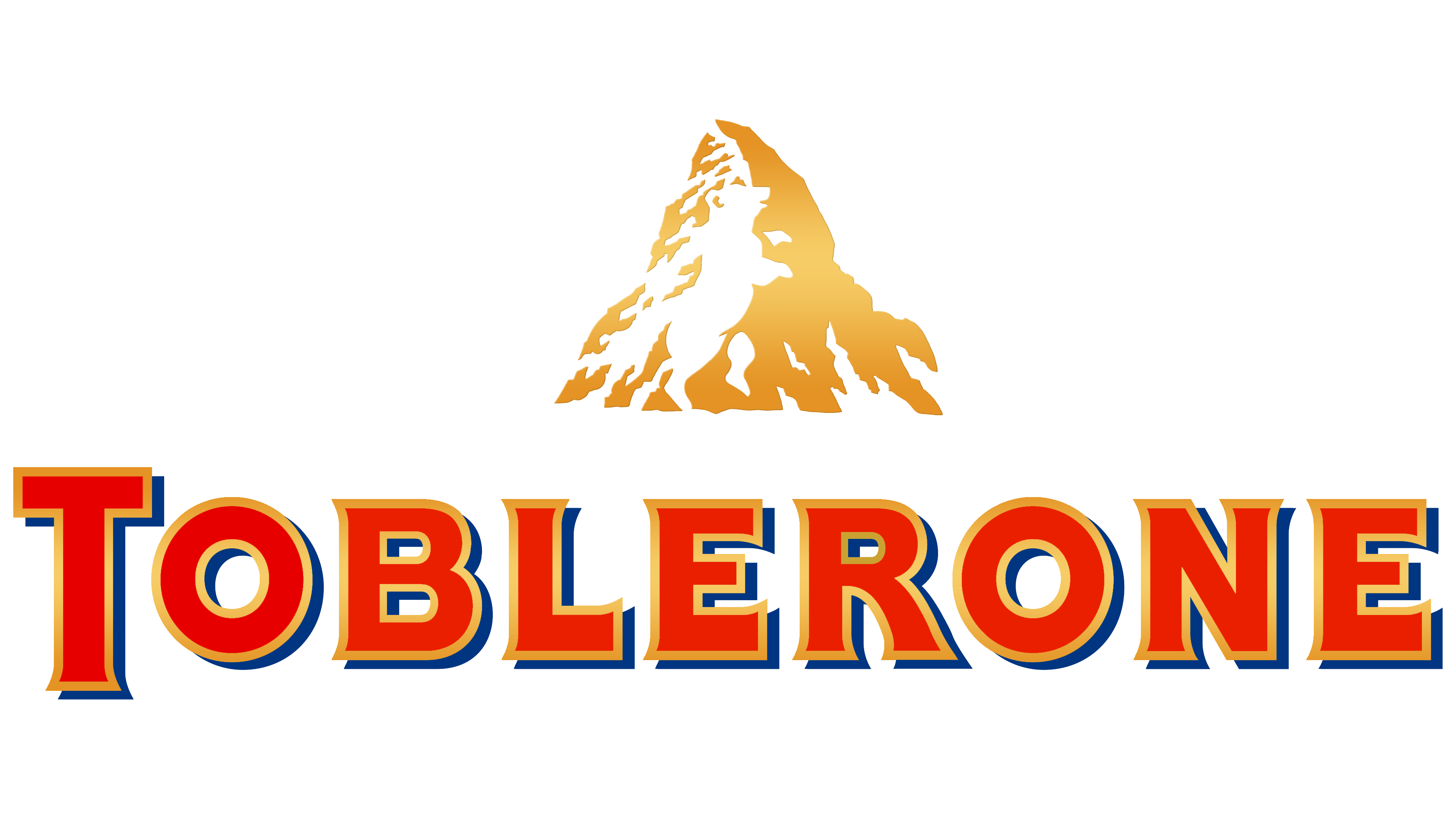
In the 1970s, Toblerone embraced its Swiss heritage even further by incorporating the image of the Matterhorn into its logo. The design cleverly included a silhouette of a bear, a nod to Bern, the city where Toblerone originated.
The brand experienced significant changes in the late 20th century when it became part of Kraft Foods, now known as Mondelez International. This era marked a period of growth, with new flavors and products such as Toblerone Pralines and Crunchy Salad Toblerone enhancing its appeal.
As the new millennium began, Toblerone continued to innovate by introducing flavors like white and dark chocolate, almonds and raisins, and even sugar-free varieties.
However, in 2016, a redesign of Toblerone bars in the UK sparked controversy, which increased the gap between the chocolate peaks. This decision was made in response to the rising costs of ingredients but was met with disappointment from some customers.
Despite the controversy, Toblerone remains a globally cherished brand, available in over 120 countries. Its distinctive shape, quality ingredients, and Swiss heritage have made it a sought-after chocolate experience.
From its early days in Bern to its status as a globally recognized brand, Toblerone’s history is a testament to its innovative spirit, distinctive design, and successful marketing. Its unique triangular shape, combination of ingredients, and memorable branding continue to contribute to its popularity.
Toblerone is expected to keep evolving, maintaining the elements fans love while adapting to new trends. This approach will likely ensure that Toblerone remains a favorite chocolate brand worldwide for years.
Meaning and History
![]()
On the packaging of the triangular chocolate bar is its logo: the snow-covered peak of the Matterhorn mountain and the red inscription “TOBLERONE.” The name comes from the surname Tobler and the Italian word “torrone,” a treat made from roasted nuts, egg whites, sugar, and honey. Similar almond nougat is contained in Toblerone candies. Mondelez International Inc. retains the rights to the brand and visual style.
What is Toblerone?
Toblerone is a popular Swiss chocolate consisting of interconnected pyramids. Besides classic varieties are coconut, almond, and honey bars, individually wrapped pieces, and flat chocolate bars.
1908 – 2022
![]()
The textual logo of Toblerone. The letters are clear and expressive, with pointed ends instead of serifs. The spacing between the symbols is large, making the inscription easy to read. Each glyph is painted red and has a thin yellow stripe along the edge. Additionally, all the signs are complemented by shadows, making the company’s name voluminous. Despite capitalizing all the letters, the first letter, “T,” is much larger than the rest: it protrudes below and above the line. To the left of the word is a mountain, half covered with snow. It’s proportionally smaller than the text and depicted using negative space: white details appear between the yellow spots. The mountain’s peak is pyramid-shaped – just like the chocolate produced by this company.
2022 – today
![]()
The current logo of the Swiss company is less expressive than the first. It doesn’t stand out as much as the debut version since it’s painted brown – the color of chocolate, the main product of Toblerone. However, the style of the letters is very original: they have acquired a streamlined and unusual shape with bulges, mainly concentrated in the lower part. There’s a thin stripe along the edge of the glyphs, but now it’s not yellow but beige. Shadows have also transitioned to another color palette and have become jet black. Designers removed the mountain.
Toblerone: Interesting Facts
Toblerone is a special chocolate from Switzerland that looks like a triangle and tastes yummy.
- How It Started: Theodor Tobler and his cousin Emil Baumann made Toblerone in 1908 in Bern, Switzerland. The name comes from Tobler’s last name and “torrone,” which means nougat in Italian.
- Triangle Shape: Toblerone is famous for its triangle shape. Some people think it’s supposed to look like mountains or maybe pyramids in Switzerland.
- What’s Inside: It’s made with Swiss chocolate, honey, almond nougat, and egg white. The recipe has remained pretty much the same since they started.
- A Hidden Bear: If you look closely at the mountain picture on the Toblerone box, you can find a hidden picture of a bear standing up. This is a fun nod to Bern, where Toblerone was created and called the “City of Bears.”
- Loved Everywhere: Toblerones are available in over 120 countries and come in all sizes, from tiny ones you can snack on to big ones that make great gifts.
- More Than Just Chocolate: Over the years, Toblerone has added new flavors and types, such as white and dark chocolate, ones with fruit and nuts, and even ice cream.
- Huge Chocolates: For its 100th birthday, Toblerone made a chocolate bar weighing over 220 pounds.
- A Big Change: In 2016, they tried making the gaps between the chocolate peaks bigger to make the bars lighter and save money. People didn’t like it, so they changed it back.
- Cool Packaging: Toblerone comes in a unique box that matches its triangle shape, making it easy to spot.
- A Chocolate Star: Toblerone is famous for appearing in movies and TV shows. It is also a favorite thing to buy at airports when traveling.
So, Toblerone is not just chocolate. It’s a piece of Swiss history that looks cool, tastes delicious, and has a fun story behind it.
Font and Colors
The confectionery factory’s trademark contains its name and a graphical element: the white-yellow peak of Alpi Pennine. In most cases, the word is to the left of the image, but there’s also a horizontal version where the inscription is reduced in size and placed below the image. This variant is found on the sides of the packaging.
Everything in Toblerone has a hidden meaning—from the bar’s appearance to the emblem and the symbols encrypted in it. The most important thing in the brand’s concept is the triangle because the chocolate is divided into slices of precisely this shape. As far as we know, the peak of the Matterhorn looks like a four-sided pyramid. It’s depicted on the logo and takes up much space on the packaging.
If you look closely, you can see a white silhouette of a bear on the snow. It stands on its hind legs, its head raised as if trying to climb the mountain. This image didn’t appear by chance: designers intentionally used it to emphasize Toblerone’s connection with its native region.
Bern is the factory where the chocolate bars with almond nougat were first produced. The Swiss capital is known as the City of Bears. Historically, even its coat of arms looks like a heraldic shield with a bear.
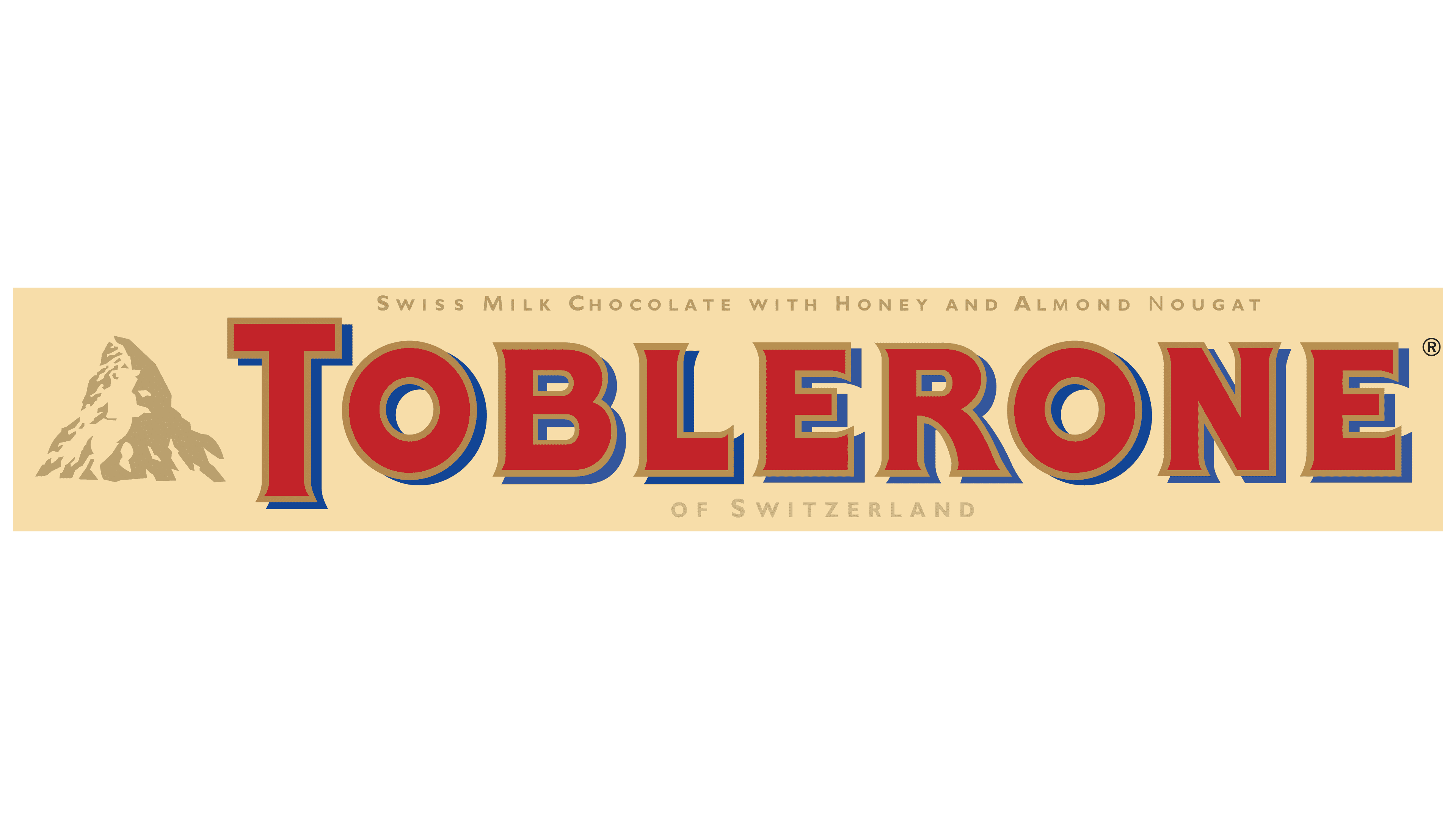
The font for the word “TOBLERONE” was specially developed for Jean Tobler. It vaguely resembles Memo Medium or Serif Gothic Black but is not identical. The emblem’s palette contains blue (#001e62), red (#da291c), white, and gold (#8c714c) colors. The inscription’s color palette is predominantly red, with a small amount of blue and gold.
FAQ
Why is Toblerone removing the logo?
Toblerone is changing its packaging by removing the Matterhorn mountain and other Swiss images. This is because they’re making more chocolate in places outside of Switzerland. Swiss rules are strict about using symbols that make a product seem Swiss. Only products made in Switzerland or meeting certain standards can use these symbols. Toblerone’s expansion means it has to follow these rules, but it still wants to maintain its Swiss quality.
The company, Mondelez International, will keep making Toblerone in Switzerland. However, the company needs to change its packaging to grow globally and sell in more places. This way, they can avoid breaking Swiss laws and keep the brand’s Swiss spirit without suggesting that all their chocolates are made in Switzerland.
Toblerone can still grow and enter new markets without suggesting that all its chocolates come from Switzerland. The new packaging is about staying true to Toblerone’s Swiss roots while respecting laws and reaching more people worldwide.
Why does Toblerone have 11 triangles?
Toblerone’s unique shape with 11 triangles comes from an unexpected place. Theodor Tobler, who created Toblerone, got the idea after watching a show at the Folies Bergères in Paris. There, dancers formed a human pyramid as the finale, and this image stuck with him. He used this pyramid shape as a model for Toblerone’s design.
This story shows how art inspires new ideas in different fields, like chocolate making. Toblerone’s design is a blend of creativity and skill, turning a moment of artistic performance into a famous chocolate bar. The 11 triangles are not just for looks; they represent Theodor Tobler’s innovative spirit and the artistic inspiration behind Toblerone.
Toblerone has 11 triangles unrelated to mountains or anything else you might think of first. It’s all thanks to a creative idea sparked by a dance performance, proving how art can surprisingly influence product design.
What does the Toblerone logo symbolize?
Before 2022, the Toblerone logo was full of symbols showing where the brand originated. People often think the mountain in the logo is the Matterhorn, a famous mountain in Switzerland. However, the logo is about Toblerone’s hometown, Bern, Switzerland, where it started in 1908. Bern has a bear on its coat of arms, and Toblerone’s logo used to have a hidden bear in the mountain image. This was a special way to connect the chocolate to its roots in Bern and show how proud the brand is to be Swiss. This bear wasn’t just for looks; it was about showing the strength and quality people expect from Swiss products.
In 2022, Toblerone changed its logo to a simple brown design. This change was to help the brand grow worldwide and make the logo easy to recognize everywhere. Even with the new look, the old logo’s meaning—a nod to Bern and Swiss quality—stays important to Toblerone.
Why is there a bear on the Toblerone emblem?
The bear on the Toblerone emblem is a tribute to its hometown, Bern, Switzerland. This symbol isn’t just for show; it deeply connects to Bern’s history and identity. Bern’s coat of arms features a bear, an important symbol for the city for a long time. This is meaningful because Toblerone’s first factory was in Bern.
The bear’s presence in the emblem comes from an old story about a count from Bern. Legend has it that he promised to name the city after the first animal he hunted in the nearby forests. That animal happened to be a bear, so he named the city Bern, making the bear a symbol of the city ever since. This symbol was used in the city’s coat of arms and became known throughout the Bern district.
By including the bear in its emblem, Toblerone honors where it came from and respects Bern’s culture and traditions. The bear symbol connects the chocolate brand with its Swiss roots. Toblerone shares a piece of its heritage with the world, reminding people of the rich history and culture of the place where it all started.
What famous mountain is depicted on the Toblerone logo?
The Toblerone logo shows the Matterhorn, a famous mountain in the Swiss Alps known for its unique pyramid shape. This choice highlights Toblerone’s Swiss origins, as the brand started in Bern, Switzerland. Though Bern isn’t close to the Matterhorn, the mountain symbolizes the beauty and nature of Switzerland, which Toblerone wants to reflect.
Some think the Matterhorn’s shape also inspired Toblerone’s triangular chocolate pieces, linking the chocolate directly to the Swiss Alps. Toblerone chocolate symbolizes Swiss quality and the country’s love for the Alps.
Using the Matterhorn logo, Toblerone pays tribute to its Swiss roots and the qualities Switzerland is known for, like purity and adventure. The logo is a key part of Toblerone’s brand, showing off its heritage and quality and connecting with chocolate lovers everywhere by bringing a piece of Switzerland to them.
What is hidden in the Toblerone logo?
The Toblerone logo, used until 2022, cleverly includes a hidden image that some might overlook. Besides the well-known image of the snow-covered Matterhorn mountain, there’s a bear outline visible in the negative space between the mountain’s white peaks and the logo’s golden background.
This bear is placed where the two sides of the mountain peak meet. It stands on its hind legs, head raised and turned to the right, giving the appearance of looking out. Including the bear in the logo is a thoughtful touch that connects deeply with Toblerone’s roots.
The bear in the Toblerone logo is not for show. It honors the brand’s beginning, weaving local culture and history into Toblerone’s global image. This design detail helps share the brand’s Swiss heritage with the world, celebrating the bear that Bern holds dear.
Who designed the Toblerone design?
Theodor Tobler, one of the creators of Toblerone, came up with the idea for its unique design. He got the idea from watching dancers at the Folies Bergère in Paris form a pyramid, similar to a mountain peak, at the end of their show. This led him to make Toblerone’s shape triangular, like the Swiss Alps, highlighting the brand’s Swiss background. Theodor also designed the packaging to show Toblerone’s rich history and Swiss roots.
Over the years, the packaging of Toblerone has changed but still pays tribute to its origins. The logo always features the Matterhorn mountain and includes a bear. These symbols are important to Swiss culture, especially in Bern, where Toblerone was started. This careful design has made Toblerone easy to recognize and has kept its connection to its heritage strong.