Sometimes, company logos can shock with their controversial subtext. Designers don’t always notice the sexual context in their creations, but nothing can be hidden from modern society. Some companies even rebrand completely after logo scandals, while others seem to choose their designs on purpose.
Which old and modern company logos should be hidden from children?
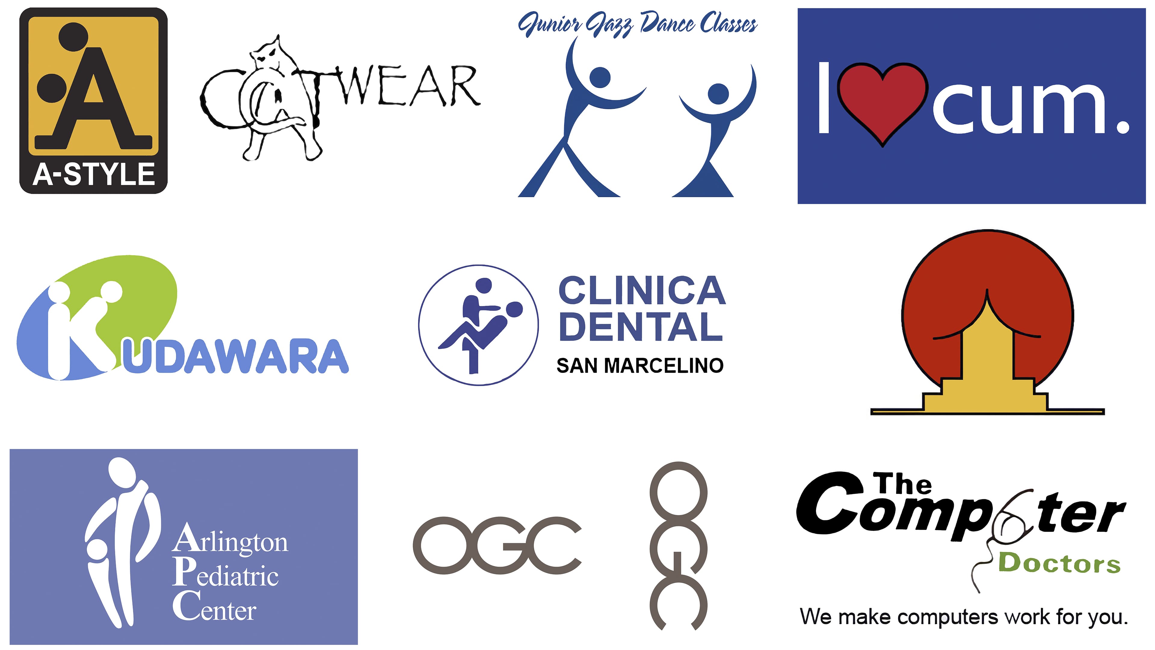
These include logos that have a vulgar connotation. They are used, for example, by satellite dish company Mont-Sat, fashion brand A-Style, women’s clothing store CatWear, dance classes Junior Jazz, pharmaceutical company Kudawara, pediatric center Arlington, and research organization Brazilian Institute of Oriental. Research.
The main image of the company should be concise and accurately reflect the scope of the brand. The logo is the face of the company, and it affects customer loyalty. Customers will not want to use a product with a bad reputation that may cause ridicule.
Mont-Sat
![]()
The Polish company still uses this logo today. It can be seen on the firm’s official website. A very happy satellite dish invites consumers to use the company’s services. Most likely, Mont-Sat is in demand, and the logo does not interfere with the work but, on the contrary, attracts customers.
A-Style
![]()
An example of a logo specifically made with an undertone. In the early 2000s, this image could be seen on almost every traffic light in Milan. The logo became a cause for discussion in Italy, America, and other European countries. Such world publications as GQ and Cosmopolitan joined the discussion.
If you can’t figure out what the problem is, imagine that the dots are heads. The logo worked and, in a few years, brought the company a huge revenue of 20 million euros. According to creator Marco Bruns, the image carries a strong message but was not created to offend sensibilities.
CatWear
![]()
The logo design for a clothing store for independent women got a little out of hand. The image consists of the brand name, but instead of the letter “A,” it features an angry cat. The company has a strange idea of independent women, but the logo turned out poorly. Perhaps CatWear wanted to convey that the fairer sex doesn’t care about other people’s thoughts. In any case, it was necessary to choose a more successful variant.
Junior Jazz Dance Classes
![]()
At first glance, an innocuous, laconic, beautiful logo depicts dancing partners. However, attentive users disassembled part of the female body. Pay attention to the heads and arms of the dancers, which resemble an anatomical silhouette. Using the example of several logos, we can already conclude that it is better not to use tricky dots instead of the heads of figures. They do not bode well.
Kudawara Pharmacy
![]()
Unlike the Polish company Mont-Sat, the logo of Kudawara Pharmacy interfered with the firm’s work. The pharmacy underwent a complete rebranding and even changed its name. On one side, we see the letter “K” on a green and blue background. Everything would have been fine if the designers had not decided to add dots at the top of the letter. The logo took on a sexual connotation, which the audience didn’t like and only led to criticism and a spot on the top of unfortunate images.
Arlington Pediatric Center
![]()
Looking at the Pediatric Center logo raises a few questions. Did anyone even look at this image before posting it on the website and other channels? How did the designer not notice the double implication in his creation? Of course, after a heated discussion, the center changed the logo, but in the minds of customers, the first version remained. According to the designer’s original idea, the image shows a child with one of the parents. The shape of the body and the arrangement of silhouettes in the picture are associated with topics that are forbidden by society.
The Computer Doctors
![]()
This is one of the most unfortunate logos in our selection, and not only because of the sexual connotation. The disharmonious combination of colors and outdated fonts makes the image boring. And, of course, the main detail is a computer mouse instead of the letter “U.” I Agree; the mouse is not depicted. Fortunately, the company reacted to its failure and replaced the logo with an image of a doctor who “cures” the computer. The Computer Doctors also changed the green color to blue and changed the font.
Institute Of Oriental Studies (Instituto de Estudos Orientais)
![]()
The Brazilian Institute introduced a special logo to promote the Center for Oriental Studies. Initially, the logo represents a pagoda against a sunrise background. If you look closely, you can make out all the elements. But at first glance, you immediately see something different. The Institute of Oriental Studies removed the logo after a heated discussion of the additional subtext. The idea of the image is very symbolic; it is only necessary to work out the details and change the forms.
Office of Government Commerce
![]()
Rotate the image 90 degrees to address the main issue. In 2008, The Daily Telegraph published an article quoting the cost of the logo as £14,000. A huge sum for a huge failure. The employees of the organization were the first to notice the suspicious context, though only after they were given pens, mouse pads, and other items. In 2011, the organization was closed down. Perhaps such an unsuccessful rebranding was the reason for the closure.
Locum
![]()
Did the company fail to notice the failure when it first looked at the designer’s work? The iconic idea of using a heart instead of a letter or symbol works for many brands. But in the case of Swedish real estate company Locum, the logo is divided into three separate words. The firm uses a different logo: the company name is written in a plain white font on a blue background.
Clinica Dental San Marcelino
![]()
Another ambiguous logo, which, obviously, in idea, should not be so. The logic of the designer is quite clear: the dentist examines the patient and provides his services, and the name of the clinic is written. The wrong arrangement of the silhouettes of the doctor and the patient suggests other associations with sexual connotations. In addition, it is likely that the clinic has either closed or rebranded.
Modern designers recommend using more concise logos with fewer graphic details. Simple lines can create a light but memorable design and combine them with a beautiful font and harmonious shades.
What are some hidden logos?
Hidden logos are those that contain an encrypted message. For example, the negative space on the logo of The Bronx Zoo looks like the New York skyline, Formula One has a silhouette of the number 1 between the black F and red stripes, a bear is visible against the background of Mount Toblerone, and the space between the letters E and X in FedEx forms a right-pointing arrow.
What is the hidden message in logos?
Many logos have double meanings. The first is obvious to everyone who looks at them. The second is implicit, understandable only to those who know the core values of the company. It is believed that hidden messages subconsciously influence people, even if they are not noticed.
How do you put a hidden message on a logo?
The easiest way to add a hidden message to your logo is to use a negative space effect. You can also arrange elements in a special way to give them new meaning.
What logo has hidden alphabets of its name?
The famous Toyota emblem hides all the letters from its name. Two intersecting ovals form a “T,” and a vertical oval can be interpreted as an “O.” The letters “Y” and “A” are also hidden there.