The Calgary Roughnecks logo is personalized and vibrant. The design reflects a passion for the sport and the game’s intensity. The emblem connects the players’ image with local miners, highlighting a strong team ready for tough battles.
Calgary Roughnecks: Brand overview
The Calgary Roughnecks emerged in 2001, stepping into the National Lacrosse League (NLL) as a fresh expansion team. Entrepreneur Brad Banister founded the franchise and became its first owner.
The team kicked off their inaugural season in 2002, ending with a commendable 4-12 record despite being newcomers. Three years later, in 2004, the franchise clinched their first major victory by winning the NLL’s Champion’s Cup. They triumphed over the Buffalo Bandits 14-11 in the final match, marking a pivotal moment for the organization.
The team maintained a strong performance following this initial victory, regularly securing playoff spots. They became known for their aggressive style of play and robust fan support. In 2009, Calgary secured their second Champion’s Cup by defeating the New York Titans 12-10 in the final, reinforcing their status as a league powerhouse.
In 2011, Brad Banister sold the franchise to a group of local investors led by Daryl Sutter, resulting in a shift in ownership. 2012, the team set a Canadian record for indoor lacrosse attendance, drawing 19,289 fans to a game against the Edmonton Rush.
2014 brought challenges as the organization faced financial difficulties despite its on-field success. However, it navigated this crisis with the support of dedicated fans and the management team’s efforts.
2019 the franchise claimed its third NLL championship, defeating the Buffalo Bandits in the final series. This victory reaffirmed the franchise’s position among the elite teams in the league.
Meaning and History
What is Calgary Roughnecks?
It is a professional lacrosse team based in Calgary, Alberta, Canada. The team competes in the National Lacrosse League (NLL) and plays its home games at the Scotiabank Saddledome. The team is known for its active and dynamic gameplay, which attracts many fans. The team performs highly athletic and participates in various lacrosse championships and tournaments.
2001 – 2021
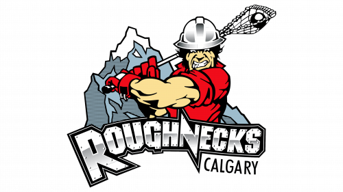
The first emblem depicted a worker fully equipped for oil extraction, holding a lacrosse stick and poised to strike. The character’s face showed tension and anger, matching the name Roughnecks (a professional nickname for drillers).
The player’s muscles were pumped, emphasizing the strength of local players, who originally came from the working environment of drilling rigs. This choice indicated endurance and excellent physical condition. The character’s bright red shirt and gloves enhanced the emotional undertone.
In the emblem’s background, Calgary landscapes with mountain ranges resembling metal ore deposits could be seen. In the foreground, a steel board with the team name was displayed. The sturdy material emphasized the athletes’ resilience and determination.
2021 – today
The history of the Calgary Roughnecks team is closely tied to oil industry workers known for their resilience and hard work. The choice of a driller as a symbol is not accidental: it embodies the strength, diligence, and perseverance needed in sports. The logo, designed with these qualities in mind, highlights the team’s connection to its roots and expresses gratitude to those who work daily for the region’s benefit.
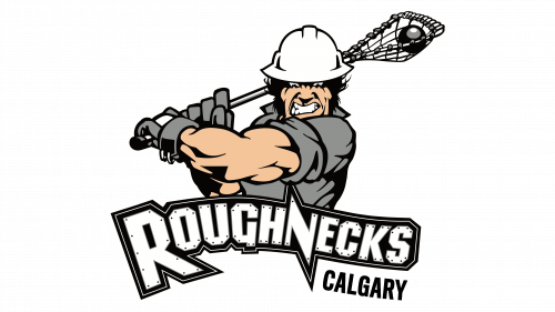
The Calgary Roughnecks logo features a strong lacrosse player ready to strike. Against a white rectangle, a figure in gray clothing and a protective helmet stands out. The player’s face shows determination and aggression, emphasizing the intense moment before a decisive throw. The word “ROUGHNECKS” is written in a large serif font with white letters on a black background, adding solidity and strength to the emblem.
The player’s figure in a helmet symbolizes hard work and perseverance, reminiscent of the oil drillers after whom the team is named. The player’s aggressive expression and tense pose indicate the determination and strength necessary for success in sports.
The emblem reflects the team’s philosophy of unwavering struggle and pursuit of victory. It emphasizes the importance of strength, determination, and team spirit in achieving greatness in athletic competitions.
The logo’s font is bold with serifs, adding stability and significance. White letters on a black background create a contrast that draws attention and emphasizes the team’s name. The overall style of the logo is aggressive and masculine, enhanced by sharp lines and the player’s tense pose.
The logo’s primary colors are black, white, and gray. The white background and white letters symbolize purity and honesty, the gray clothing adds neutrality and restraint, and the black text and helmet highlight strength and determination. These colors create a harmonious image reflecting the team’s professionalism and perseverance.
