The Georgia Swarm logo is sharp and stinging. It showcases the team’s style of play, highlighting the suddenness of their attacks, pinpoint throws, and precise target hits. The emblem conveys unwavering confidence in victory and control on the field.
Georgia Swarm: Brand overview
The Georgia Swarm, hailing from St. Paul, Minnesota, embarked on their journey in 2004 as the Minnesota Swarm. They debuted in the National Lacrosse League (NLL) in the 2005 season.
In Minnesota, the team experienced varied results, frequently making it to the playoffs yet facing challenges in achieving major postseason success. Their peak came in 2008 when they reached the divisional finals.
Financial struggles and low attendance led the Arlotta family, the team’s owners, to relocate the franchise after the 2015 season. The announcement came in the summer of 2015: the team would move to the Atlanta metropolitan area, rebranding as the Georgia Swarm. Their new home became the Infinite Energy Arena (now Gas South Arena) in Duluth, Georgia.
The inaugural season in Georgia in 2016 showed promise. The team finished the regular season with an 8-10 record and made it to the playoffs, although they faced elimination in the first round.
A milestone came in 2017 when the franchise won its first NLL championship by defeating the Saskatchewan Rush in the final series. This victory came just two years after the move to Georgia. The Thompson brothers—Lyle, Miles, and Jerome—played pivotal roles, becoming the first Native American players to win an NLL championship.
After their championship season, the team performed well, regularly appearing in the playoffs. In 2018 and 2019, they reached the divisional finals but did not secure another title.
Known for their fast-paced and dynamic style of play, the company often leads the league in scoring. The team actively promotes lacrosse in Georgia and the southeastern United States, where the sport has traditionally been less prominent.
The organization participates in various community events and youth lacrosse development programs, working to grow the sport in the region. The team’s colors—blue, yellow, and white—reflect its vibrant brand, and its mascot, a bee named Stinger, adds excitement to the games.
They maintain a strong connection with Native American communities, acknowledging the historical significance of lacrosse to Indigenous peoples. Many of their players, including the Thompson brothers, are of Native American descent.
In 2020, the team partnered with the Atlanta Blaze of the Premier Lacrosse League, enhancing their efforts to develop lacrosse in the region.
Meaning and History
What is Georgia Swarm?
It is a professional indoor lacrosse team based in Georgia. It competes in the National Lacrosse League (NLL) and plays its home games at Gas South Arena in Duluth. Georgia Swarm is known for its strong roster and dynamic play. The team enjoys active fan support and maintains a high level of preparation.
2004 – 2015
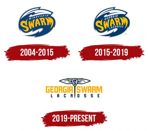
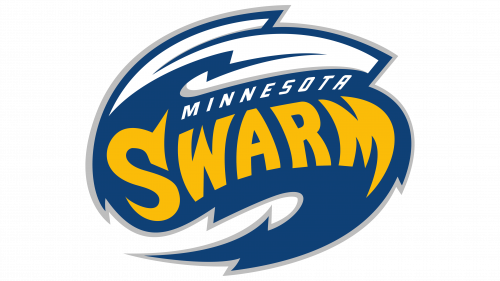
The first emblem reflects the clash of elements—as if water and ice have merged in a tactical dance. The dynamics and collision are evident in the oval composition. The players excel at finding opponents’ weaknesses and filling gaps on the tight field, leaving no chance for recovery.
The team name is written on a volumetric droplet, causing the letters to be distorted as if through a lens. Sharp serifs on the first and last letters complement the zigzags on the edges of the emblem, emphasizing the players’ virtuosity.
The logo uses the team’s original name, Minnesota Swarm.
2015 – 2019
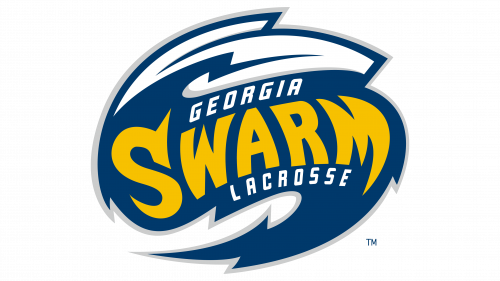
In 2015, the team moved to Georgia and changed its name. Thus, while maintaining the logo’s overall design, the droplet now bears the new name, concerning lacrosse added at the bottom. These elements have made the emblem clearer and more precise.
2019 – today
The Georgia Swarm team logo reflects their drive for leadership and competition victories. Since moving to Georgia, the team has acquired a new identity, represented in their emblem. The new logo symbolizes the team’s renewed spirit, readiness for new challenges and victories, and agile playing style showcased on the field.
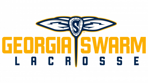
The new Georgia Swarm logo fully represents the club’s name. The theme of a swarm of dangerous, stinging insects inspires the design. At the center of the emblem is a fictional specimen resembling a caduceus, the staff of Hermes, which is created based on a lacrosse stick with wings.
The wings and stinger symbolize the team’s attack’s speed, agility, and suddenness. The wings attached to the top of the stick give the logo a sense of flight and lightness, highlighting the players’ mobility and maneuverability. The stinger pointing towards the field signifies the team’s determination to dominate their opponents and excel in the game.
The long, sharp, thin stinger is directed towards the field to subdue opponents. This element precisely divides the team’s name in half, symbolizing accuracy. The new logo emphasizes the athletes’ skill and the complexity of their game strategy, focusing on dangerous, sudden attacks and lightning speed.
The team name is written in a sleek and modern font, giving the logo a professional and confident look. The font is neatly split by the insect’s stinger, adding dynamics and visual interest.
The logo’s primary colors are yellow and blue. Yellow symbolizes energy, activity, and cheerfulness, while blue symbolizes stability, reliability, and confidence. Together, these colors create a balanced and eye-catching image.
