The Vancouver Warriors logo resembles a lacrosse player’s protective mask. The emblem reflects team play and the camaraderie of strong, brave, and noble athletes. The logo echoes the NLL emblem, emphasizing the drive for victory.
Vancouver Warriors: Brand overview
The Vancouver Warriors, a professional indoor lacrosse team in the National Lacrosse League (NLL), trace their roots to 2014. The Washington Stealth franchise relocated from Everett, Washington, to Langley, British Columbia, a Vancouver suburb, rebranding as the Vancouver Stealth. This marked the return of professional lacrosse to the Vancouver area.
The Vancouver Stealth’s inaugural season 2014 saw home games at the Langley Events Centre. The season ended with a challenging 4-14 record and a last-place finish in the Western Division. The 2015 season showed slight improvement, but the team missed the playoffs, finishing second to last in their division. The struggles continued into the 2016 season without securing a playoff spot.
A breakthrough came in 2017 when the team clinched third place in the Western Division and qualified for the playoffs. However, their postseason run ended with a first-round loss to the Colorado Mammoth.
The 2018 season was particularly tough, with the team finishing last in the league with a 2-16 record. This performance led to significant changes. Canucks Sports & Entertainment, owners of the NHL’s Vancouver Canucks, acquired the franchise. The team underwent a major rebranding following this acquisition, emerging as the Warriors. Home games moved to Rogers Arena, shared with the Vancouver Canucks. The rebranding included a new name, logo, and team colors of black, gold, and white.
The first season under their new identity, 2018-2019, remained challenging, ending with a 5-13 record and another last-place finish in the Western Division. In subsequent seasons, the team focused on improving performance and developing young talent.
Meaning and History
What is Vancouver Warriors?
It is a professional lacrosse team based in Vancouver, Canada. The team competes in the National Lacrosse League (NLL). Home games are held at Rogers Arena. The team is one of the league’s franchises and participates in regular seasons and championships, competing with other teams from various regions of North America.
2009 – 2013
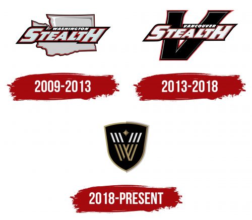
The team started as the Vancouver Stealth, reflected in the logo. The name is displayed against the silhouette of Vancouver, indicating the athletes’ hometown. The first and last letters of the name are enlarged. The letters have a double red and black outline. This design choice conveys the theme of protection. On the field, athletes need strong gear due to the contact nature of the game and its intense clashes.
2013 – 2018
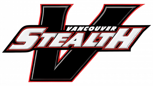
Keeping the inscription and font, the state’s outline has been changed to a large black letter V. The sign looks more stylish and resembles crossed sticks. The letter received white and red outlines in line with the name, creating a unified image.
2018 – today
The logo reflects the team’s evolution and pursuit of excellence. The modern design emphasizes the importance of defense, team spirit, and the drive for victory, making the logo relevant and attention-grabbing. The team’s history and achievements are reflected in every logo element, creating a powerful and memorable symbol.
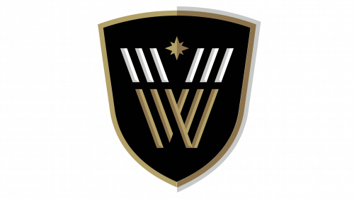
The modern logo looks very noble. The shield shape conveys stability, reliability, and the athletes’ confidence. The large letter “W” consists of numerous individual stripes, hinting at lacrosse sticks and the nature of the game as a team. The symbols resemble opponents ready for a match. The ball is depicted as a bright star between the players. This design was chosen to highlight the object of the game.
The shield shape symbolizes protection and resilience. It is associated with a fortress that protects the players and the team. The stripes forming the letter “W” symbolize lacrosse sticks, emphasizing the sport’s essence and attributes. The star in the center symbolizes the ball and the pursuit of victory, uniting all elements into a cohesive whole.
The emblem highlights team spirit and the fight for victory. The combination of elements reminiscent of lacrosse sticks points to the importance of equipment and technique in the game. The star between the stripes emphasizes the players’ goal of winning. The shield shape adds an element of protection and stability, essential for the team.
The logo’s font is bold and powerful, underscoring the team’s strength and determination. The large letter “W” in the center draws attention and makes the logo memorable. The black, white, and gold colors add a sense of nobility and athletic prowess.
The logo’s color palette includes black, white, and gold, highlighting the players’ nobility and athletic skill. Black symbolizes strength and determination, white represents purity and honesty, and gold signifies the pursuit of victory and top achievements.
The emblem includes a shield, stripes forming the letter “W,” and a star in the center. The shield symbolizes protection and resilience, the stripes represent team spirit and the game’s attributes, and the star signifies the goal and pursuit of victory. All elements are harmoniously combined, creating a unified and powerful image.
