


![]() Vancouver Canucks Logo PNG
Vancouver Canucks Logo PNG
The memorable original logo of the Vancouver Canucks focuses on the hockey club’s mascot and the first letter of its name. The animal symbolizes the ability to achieve goals, intellect, and respect, displaying the cunning and power of a predatory beast.
Professional hockey in Vancouver began in 1911, when Lester and Frank Patrick founded the Pacific Coast Hockey Association and the Vancouver Millionaires. The club won the Stanley Cup in 1915. After the league collapsed in the mid-1920s, the city had no pro team for about twenty years.
In 1945, a new Vancouver Canucks team joined the Pacific Coast Hockey League. The name reflected a common nickname for Canadians. The club won two titles before the league became the Western Hockey League in 1952, then added four more, including consecutive championships in 1969 and 1970.
Vancouver was denied entry in the 1967 NHL expansion. The league later blocked a plan to move the Oakland Seals, but promised a future franchise. In May 1970, the Canucks entered the NHL alongside the Buffalo Sabers, paying $6 million and taking over the WHL roster and the Pacific Coliseum.
The first NHL game on October 9, 1970, ended in a 1:3 loss to the Los Angeles Kings, with Barry Wilkins scoring the club’s first goal. Two days later, Vancouver beat the Toronto Maple Leafs 5:3. The early seasons saw low finishes until Frank Griffiths bought the team in 1974. A year later, the Canucks posted a winning record and took a division title.
In 1982, the team reached the Stanley Cup Final under Stan Smyl, losing to the New York Islanders. Later, the roster added Trevor Linden and Pavel Bure. Bure won the Calder Trophy and scored 60 goals in back-to-back seasons.
The 1994 playoff run ended in Game 7 of the Final against the New York Rangers, followed by riots in Vancouver. In 1999, the club drafted Daniel and Henrik Sedin, who led the team in the 2000s. In 2010, Henrik won the Art Ross Trophy and the Hart Trophy. Vancouver reached the 2011 Final but lost to Boston, after which unrest in the city flared up again.
Meaning and History
![]()
The “Vancouver Canucks” have had five logos, some of which are similar in design and differ only in minor details. In the early years, the hockey stick transformed into a killer whale emerging from the water. This indicates a complete rethinking of style during the redesign process.
What is Vancouver Canucks?
The “Vancouver Canucks” is one of the two oldest teams in the National Hockey League that has never won the Stanley Cup. It debuted in the Pacific Coast Hockey League in 1945 and joined the NHL in 1970. The club is based in Canada and plays home games at Rogers Arena.
1970 – 1978
![]()
The first NHL team emblem is a blue horizontal rectangle with rounded corners. It’s framed in muted green. A white line, curved like a hockey stick, points towards the outer center. It divides the geometric figure and resembles the letter “C,” the first letter of the word Canucks. Known as Stink-in-Rink, this logo was created by graphic designer Joe Borovich from North Vancouver.
1978 – 1992
![]()
In 1978, the hockey club adopted an unofficial emblem called the “Flying V.” It’s named for its round shape and many parallel diagonal stripes. The central element is divided into two semicircles with the inscription CANUCKS, styled like a skate blade. Stretched lines of uneven length create a sense of rapid movement. The palette also changed dramatically: the harmonious combination of blue and white was replaced by a contrasting mix of bright orange, gold, and black.
1992 – 1997
![]()
The Flying V became a symbol of success for the “Vancouver Canucks” in the first half of the 1990s, when the team won several decisive matches. However, this happened after the palette change: in 1992, gold turned into yellow-orange-red.
1997 – 2007
![]()
The logo adopted in 1997 features the club’s main mascot, a killer whale. It’s leaping out of the water, but instead of splashes, there are fragments. The graphic composition forms the letter “C,” which embodies the team’s name. The graphics are associated with the west coast of British Columbia and refer to Orca Bay Sports & Entertainment, which bought the franchise in 1995. The color scheme changed beyond recognition: the emblem now includes dark blue, light blue, gray, white, and burgundy.
2007 – 2019
![]()
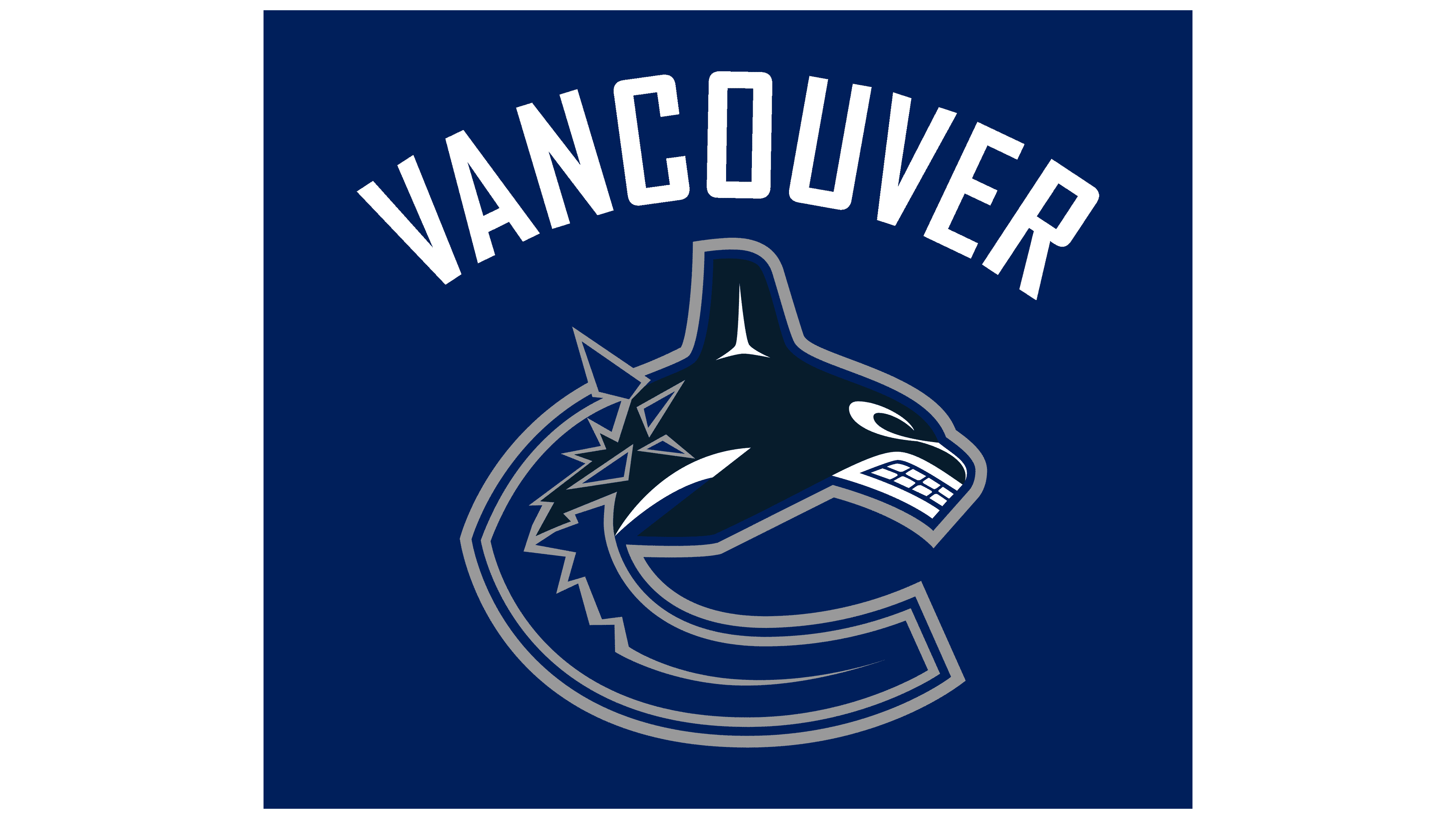
In 2007, the logo’s palette changed again: there were no burgundy stripes around the orca’s outline, and the water took on a more subdued blue. However, the updated colors were not the only novelty: designers added the inscription “VANCOUVER.” The word denoting the club’s hometown is placed at the top in an arched shape.
2019 – today
![]()
The emblem with the inscription was used only until the 2019-2020 season. Then, the developers removed the text to focus on the orca.
Font and Colors

Featuring an animal mascot in logos is a common practice among teams in professional sports, and the Vancouver Canucks are no exception. Its emblem depicts a killer whale leaping out of the water. The composition resembles the letter “C”. This is a nod to the emblem from 1970-1978, where the main element was a hockey rink with a stick resembling the letter “C.”
There are no inscriptions in the modern logo; they were only included in earlier versions of the club’s emblem. For example, from 1978 to 1997, the drawing was supplemented with the word “CANUCKS”, written diagonally in a unique font. All the letters at the bottom were connected by a long line, resembling a skate blade. The second time the inscription appeared, in 2007-2019, it was “VANCOUVER” in sans-serif with many rounded corners.
The current color palette consists of two shades: blue, gray, and white. From 1997 to 2007, burgundy complemented it, and the blue was brighter. From 1987 to 1997, two emblems were used, with a palette dominated by yellow and orange colors. The classic combination is considered blue and green, as in the emblem from 1970 to 1978.
FAQ
Who designed the Canuck logo?
Artist Brent Lynch designed the first version of the logo in 1997, featuring a killer whale bursting out of the letter C. Joe Borovich created the famous emblem introduced in 1970.
Why do the “Canucks” have an emblem with a whale?
The killer whale depicted on the “Vancouver Canucks” emblem is the team’s mascot. It was chosen from many other candidates for this role, outperforming the beaver, a robot goalie, a logger, a camel, and other characters that never became mascots of the hockey club.
What does the “Vancouver Canucks” logo represent?
The team’s logo combines the main elements of its identity: the orca and the first letter of the word “Canucks”. The cetacean predator bursts out of the top half of the letter “C.” This is how the artists depicted the orca leaping out of the water. The color scheme is simple: two shades of blue, white, and gray.
Do the “Canucks” change their logo?
In recent years, the “Vancouver Canucks” logo has changed, but not drastically. For example, in 2019, designers fine-tuned details and updated the colors, making the orca slightly lighter.