The Boston Bruins logo, which accompanies the Boston Hockey Club, founded in 1924, reflects the fighting spirit and commitment to team ideals. Multiple Stanley Cup winners represent their power, strength, and close connection to their history.
Boston Bruins: Brand overview
| Founded: | 1924 |
| Founder: | Delaware North Companies |
| Headquarters: | Boston, Massachusetts, U.S. |
| Website: | nhl.com |
The Boston Bruins are an ice hockey team located in Boston, Massachusetts. The franchise was founded in 1924. These days it is the NHL third-oldest team and the oldest in the USA.
Charles Adams, the owner of the grocery store chain in Boston, became an avid hockey fan after watching the 1924 Stanley Cup. He was burning with a desire to bring his professional hockey team to Boston. Fortunately, Adams managed to convince the NHL officials to expand the League and accept a team from the United States. On November 1, 1924, the Boston Bruins joined the National Hockey League. The Canadian professional hockey player Art Ross was appointed as general manager and coach of the team. The Bruins’ owner, millionaire Charles Adams met him during the trip to Canada searching for players.
When it comes to a group of teams called the Original Six, likes and dislikes tend to fade into the background. The Boston Bruins is the third A-list hockey club after the Montreal Canadiens and Toronto Maple Leafs to maintain its NHL status. Their foundation marked a major turning point in the history of hockey in North America. Indeed, the League, which began play with teams in Ontario and Quebec, embarked on rapid expansion to the USA.
Franchise owner Charles Adams set his heart on introducing a yellow and brown color palette matching the colors of his grocery chain. As for the team’s name, he wished it to signify the power and strength of “Boston.” Thus, Charles Adams made up his mind to hold a name-the-team contest. One of the newly-established team fans thought of the “Bears” nickname since it is perfectly related to “untamed animal embodied with size, strength, agility, ferocity and cunning, while also in the brown color category.” Adams admired this idea, yet he decided to name the team “Bruins,” the word identifying a bear originated from the medieval English fairy-tales and folklore.
Meaning and History
The Boston Bruins are one of the oldest franchises in ice hockey history, as their history dates back to 1924. The NHL team entered the 1924-25 season with a brown and yellow logo, featuring a bear. The seven Boston Bruins logos look different at first glance, but you will notice significant similarities in color if you look closely. The brown palette is present in all variants, albeit with slight shades. The primary choice of the hockey club immediately fell on the brown bear. There were several reasons for this, one of which was the correspondence to the desired scale. Other explanations relate to the animal’s characteristics: it is hardy, powerful, excellent attacking, formidable, and courageous. The Bruins spent many years fine-tuning their logo. They did a great job, as even the slightest change was a colossal advantage. By the way, the circle has nothing to do with the wheel. It implies that Boston is the true center of America, and all roads lead there.
What is Boston Bruins?
This is a professional-grade American ice hockey team. It was formed in 1924 and served in the NHL as a member of the Atlantic Division as part of the Eastern Conference. She is based in Boston, Massachusetts, and plays home games at TD Garden.
1924 – 1926
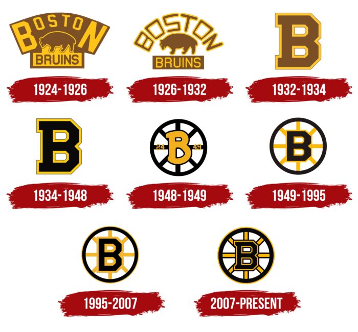
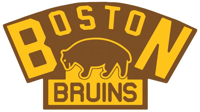
The original Boston Bruins emblem featured a brown bear on the prowl surrounded by a yellow-scripted “Boston” wordmark. The beast seemed to walk on the brown-scripted “Bruins” on a yellow background.
1926 – 1932
The basis for the second logo was the inaugural one, yet with minor changes. The brown bear was still in the center. The font of “Boston” and “Bruins” wordmarks was changed, though they were still in a different font. The yellow elements of the previous logo were changed to brown and vice versa. The background was completely removed. The logo stroke a nice balance between image and text. It was also this logo that celebrated Boston’s first Stanley Cup in 1929.
1932 – 1934
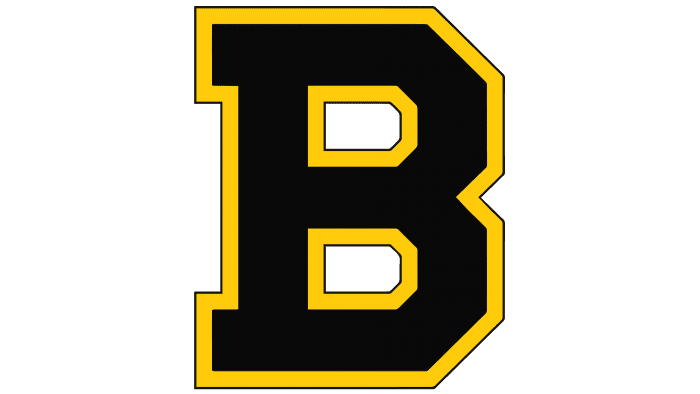
In the mid-1930s, the franchise mothballed its bear-adorned logo and went with a blocky brown “B” with a thick yellow outline as the logo. It was an extremely minimalistic logo. By the way, nobody knows what “B” stood for: Boston or Bruins or both of them.
1934 – 1948
Blocky yellow-outlined “B” remained unchanged, though its main color was switched from brown to black.
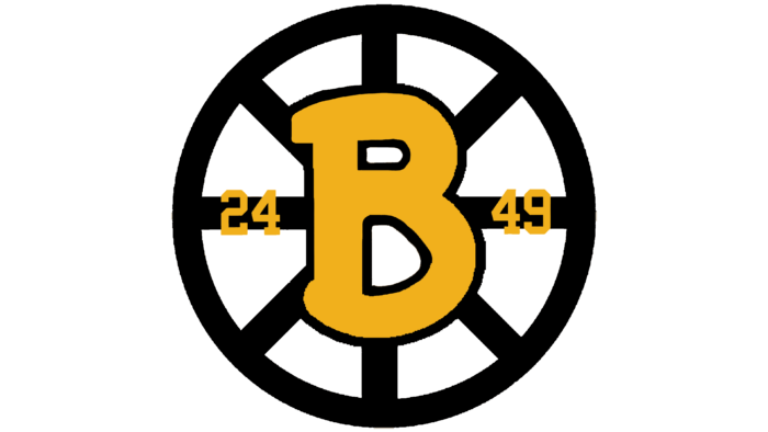
1948 – 1949
This logo appeared on the Boston Bruins anniversary uniform, which the players wore in honor of their 25th season. The celebratory variant was not used for long, but it acquired a recognizable design and was the first attempt to place a “B” in the center of the wheel. The letter was repainted yellow and acquired black outlines. The font has been changed to look like Comic Sans with large serifs. To the left of “B” was the number “24”, and to the right – “49”. One of them marked the year of the team’s debut when the Boston Bruins first entered the stadium. The second number marked the year of the jubilee season. Eight black knitting needles with the same black edging served as the background for the letter.
1949 – 1995
The hub-and-spoke design of the Boston Bruins logo lasted for 45 years. The black “B” with a yellow outline was placed inside a black circle with eight yellow spokes. It still was a relatively simple design, to be sure. However, the circle symbolized Boston as the major transportation hub and center where all roads lead. Subsequently, this wheel underwent several alterations until it took a modern shape.
1995 – 2007
In 1996, the Boston Bruins logo was slightly updated. The “B” was a bit taller, more closely resembling the font used in the original B-logo. The letter looked more contemporary and neat. Most noticeable were the new black trim accents around the B, the spokes, and the border. A thin yellow outline appeared around the black circle.
2007 – today
2008 introduced the Reebok Edge jerseys. With the fresh duds came more alterations to the logo. Its design combines the 1996 and 1933 logos. It features a smaller “B” with a raft of thicker black accents, giving the current logo a more voluminous yet aggressive appearance. The black outline of the spokes has become thicker, as well as the outer yellow border. The spokes are symmetrical now.
Boston Bruins: Interesting Facts
The Boston Bruins are a big deal in ice hockey, being one of the first six teams in the National Hockey League (NHL) and the oldest team in the United States.
- Founding: They’ve been around since 1924, making them the first U.S. team in the NHL.
- Home Arenas: The Bruins played in a few places before moving to their current home, the TD Garden, in 1995. Each place has seen many memorable Bruins moments.
- Colors: They didn’t always wear black and gold. They started with brown and yellow but switched in 1939, a change that stuck and now symbolizes Boston’s tough spirit.
- Stanley Cup Wins: The Bruins have won the Stanley Cup six times: in 1929, 1939, 1941, 1970, 1972, and 2011. Each win has its own unique story.
- Bobby Orr’s Goal: One of the most famous moments in the history of the Bruins and the NHL is Bobby Orr’s flying goal in 1970, which won the Stanley Cup.
- Ray Bourque’s Number Retirement: Ray Bourque, a Bruins legend for 21 seasons, had his number 77 retired in 2001, a tribute to his impact on the team.
- Breaking Records: They’ve had players set records, like Phil Esposito, who was the first to score 100 points in a season in 1970-71.
- The “Big Bad Bruins”: In the 1970s, they were known for their tough playing style, earning them the nickname “The Big Bad Bruins.”
- Developing Talent: The Bruins are good at finding and training young players, as proven by stars like Patrice Bergeron and David Pastrnak.
- Rivalries: Their biggest rivalry is with the Montreal Canadiens, making for some of the most exciting games in NHL history.
The Boston Bruins have a rich history filled with legendary players, big wins, and passionate fans, making them a key part of NHL history.
Font and Colors
Boston hockey players’ logos fall into two categories: before 1932 and after. The opening and following versions are based on a brown bear’s image, which is placed under the arched word “Boston.” Below is the horizontal rectangle; there is a simple inscription “Bruins.” This is the first period in the history of the logo.
The second part of the emblem’s evolution includes the legendary “B” formed from the name of the franchise and the city where it is located. Until 1949, the letter was single; then, it was connected with rays enclosed in a circle. These elements symbolize Boston’s great importance for the country since all lanes (roads) lead to it and the center of the world. Fans call this sign a wheel for the lines’ similarity with the spokes and the circle with the rim.
Now the logo is not textual – it is dominated by graphics, even despite the letter’s presence. But you can still define its typography. It resembles a custom typeface called NHL Bruins. Its creator is Jayde Garrow.
The Boston Bruins emblem uses both of the team’s signature colors, black, and gold. There was originally browner. The outline is preserved in all variants.
FAQ
What is the slogan of the Boston Bruins?
The Boston Bruins’ slogan, “Don’t just do something, stand there!” emphasizes strategy and deliberate action. It suggests that sometimes the best move is to pause and think, highlighting the importance of patience and composure in hockey.
This approach is crucial in high-pressure situations where rash decisions can lead to mistakes. The Bruins encourage players to stay calm and focused, aiming to maintain control and make smart plays.
What were the original colors of the Boston Bruins?
The Boston Bruins’ original colors were brown and gold, which were chosen when the team was founded. Owner Charles F. Adams picked these colors to match those of his First National grocery store chain. Brown and yellow were the primary hues in the team’s uniforms, giving the Bruins a distinct and recognizable look that set them apart from other teams. This color scheme is important to the team’s history and heritage.
Did the Bruins change their logo?
Yes, the brand has changed its logo. For its 100th season, he introduced a new uniform logo. The iconic spoked “B” now features a yellow “B” instead of the traditional black.
The new logo celebrates the team’s centennial, combining tradition and fresh looks. The team will wear this updated emblem on their uniforms throughout the upcoming season, honoring their legacy and looking forward to the future.
What is the meaning of the Boston Bruins logo?
The logo has a deep symbolic meaning connects the team to Boston’s rich heritage. The emblem features a “B” at the center of a circular ring with spokes that look like beams. This design is inspired by Oliver Wendell Holmes Sr., a 19th-century poet and physician who described Boston as the “hub of the solar system,” highlighting the city’s importance.
The logo, “the wheel,” symbolizes unity, strength, and the team’s key role in Boston. This design reflects the team’s historic roots and importance to the city and its fans.
What kind of bear is the Boston Bruins?
The term “Bruin” comes from the Dutch word for “brown,” which means “brown bear” in English. The brand chose this name to symbolize strength and power, qualities of the brown bear. This bear represents the team’s tenacity and fierce spirit on the ice.
Using a brown bear connects to Boston’s rugged and resilient character. The bear embodies the toughness and determination the team aims to show in their gameplay. By choosing a brown bear as their symbol, the brand highlights traits that resonate with the team and the city’s identity.
Why are the Bruins called the Bruins?
The Boston Bruins got their name from the team’s first owner, Charles Adams. He wanted the team to be associated with qualities like reliability, power, and strength. He chose the image of a brown bear, inspired by a medieval fairy tale where the animal shows its wild nature, agility, and speed.
The bear symbolizes these traits, which Adams believed were important for his team. The brand’s mascot, Blades the Bruin, represents these same characteristics. This name and symbol reflect the values and qualities the team strives to embody on the ice.
