The team uses a text emblem. The Montreal Canadiens logo does not have obvious graphic signs, but designers transformed the letters into hand-drawn elements. They harmoniously combined the letters “C” and “H” to make a horseshoe. For this, artists maximally narrowed and widened the letter “C,” making it resemble the most common symbol of luck.
Montreal Canadiens: Brand overview
| Founded: | 1909 |
| Founder: | Molson family |
| Headquarters: | Montreal, Quebec, Canada |
| Website: | nhl.com |
The Montreal Canadiens are the oldest continuously operating team in the NHL. The Canadiens have won more Stanley Cup titles than any other team (an unprecedented 24 trophies), making them the most successful franchise in league history. Over their storied history, the team has appeared in the finals 34 times, winning 24 and losing 9. Their closest rival, the Toronto Maple Leafs, has won 13 Cups and reached 21 finals.
The Canadiens de Montreal club (Fr. Les Canadiens de Montreal) was founded in Montreal, Quebec, in 1909. It predates the NHL, which was formed eight years later in 1917.
The Montreal Canadiens were founded by John Ambrose O’Brien, the founder of the National Hockey Association, the NHL’s predecessor. In 1909, he decided to organize a fully French-speaking club in Quebec’s largest city. At that time, Montreal’s French-speaking population was mostly lower class, so local hockey teams were English-speaking bourgeoisie. O’Brien tried to attract French-speaking Montrealers’ interest in hockey, so the team only accepted French-speaking players. Additionally, he promised to transfer the club to local owners as soon as they appeared. The team’s name was deliberately chosen.
In contrast, it had a specific meaning. The French spelling of “Canadiens” hinted at the team’s affiliation with Montreal’s working class. The name “Montreal” was intended to be truly French from the start. The team’s first season was unsuccessful, so it was sold to sports promoter George Kennedy.
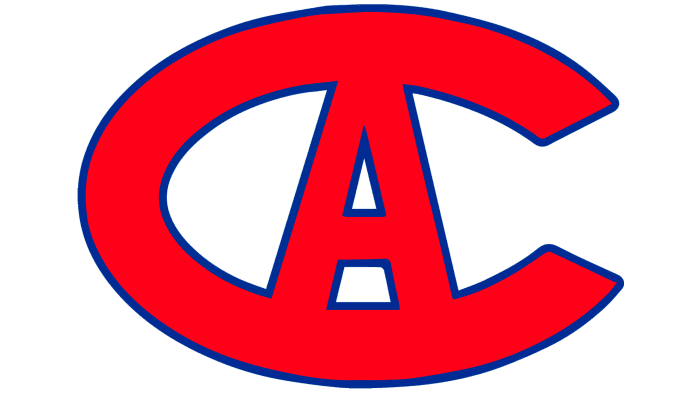
Another version exists as to why George Kennedy became the new owner. Being the owner of the Le Club Athletique Canadien, he claimed his rights to the “Canadiens” name. The dispute was resolved by buying the team from John Ambrose O’Brien for $7,500. The Canadiens joined Kennedy’s club and officially adopted its name. A new logo also appeared: a simple print letter “C” with an “A” inside, signifying Club Athletique.
With the founding of the new league in 1917, the hockey players separated from Club Athletique and became known as Club de Hockey Canadien. That’s the entire history of the brand formation of Quebec’s key hockey club. The team’s official name is still Le Club de Hockey Canadien, although all fans, journalists, and officials call their favorites “Canadiens.”
The franchise also has other nicknames: Le Bleu-Blanc-Rouge, La Sainte-Flanelle, Le Tricolore, and Les Habitants (or Habs), perhaps the most famous. Les Habitants is an unofficial name given to French settlers by Canada’s English-speaking population in the 17th century. The Montreal Canadiens logo features the Latin letters “C” and “H,” signifying “Canadiens” and “Hockey” (Club de Hockey Canadien), respectively. In 1924, Tex Rickard, owner of the New York Rangers, mentioned in an interview that the “H” in the logo on the Canadiens’ jerseys meant “habitants,” which turned out to be false. Thus, the nickname “Habs” resulted from a misconception. Nevertheless, it’s the team’s most famous nickname.
Regarding the further history of the Montreal Canadiens jerseys and logos, they have not undergone significant changes over many years. Changes concerned the narrowing and widening of stripes on the chest and sleeves, as well as the color scheme of the logo (the current version of the emblem with the letter “C” wrapped around the letter “H” was finally established in 1925). The Montreal Canadiens emblem appeared and disappeared on the sleeves.
After winning the Stanley Cup in 1924, the “Habs” introduced a completely new jersey concept for the 1924-25 season. The jersey’s chest featured an image of the globe, signifying that the team had become world champions. But already the next year, the “CH” emblem took its usual place and never left it again. Further changes were quite insignificant and did not cause protests from the conservative public. To this day, the classic form of the “Canadiens” remains one of the most prestigious in hockey.
Although the team was founded almost 100 years ago, the “Canadiens” did not have a mascot until the NHL season of 2004, when they appointed Youppi! as their official mascot. Youppi is the only mascot in the NHL to have switched sports. Previously, Youppi was the mascot of the baseball team Montreal Expos.
Meaning and History
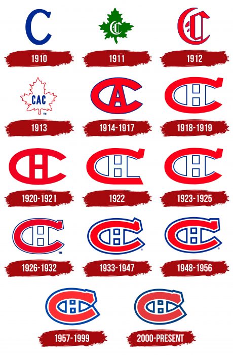
Les Canadiens de Montreal was the first hockey team in the history of this sport, appearing in Montreal, Quebec, in 1909. Diversity and consistency distinguish the fourteen logos of the Montreal Canadiens. On the one hand, there are many, but on the other, they are the same. Rebranding, as well as other changes, hardly affected them. The letter “C” remains the central and only element. The differences are only in minor drawing details, which do not affect the overall picture or concept. The iconic Canadiens logo appeared in 1918. It consisted of just two Latin letters – “C” and “H”. This logo was involved in too many historical NHL moments to be ignored. The letter “H” in the logo stands for “Hockey,” not “Habs,” a common misconception. The Canadiens logo with the letter “C” wrapped around the letter “H” is the oldest and one of the most recognizable and famous logos in NHL history.
What is Montreal Canadiens?
The Montreal Canadiens are the most titled NHL club with 24 Stanley Cups. They play in the Eastern Conference, representing the Atlantic Division. The team is based in Montreal, Quebec, Canada. Its formation year is 1909.
1910
In the first season, the Montreal Canadiens emblem was very simple. It was a blue letter “C,” signifying Canadiens. It was used only in the 1909-1910 seasons.
1911
For the second season, the team adopted a new Montreal Canadiens logo, depicting a green maple leaf with a stylized Old English letter “C,” signifying Canadiens.
1912
A year later, the club’s emblem was changed again. This time, the emblem included the same Old English letter “C” as the previous one, but it was red with a thin blue outline.
1913
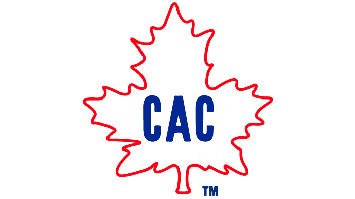
The team’s fourth logo resembled the 1911 emblem. It was a white maple leaf with a thin red border, with “CAC” written in blue, signifying Club Athletique Canadien.
1914 – 1917
The 1914 logo was the first to resemble what we see today. It featured a red letter “A” inside an elongated letter “C” with a blue outline. The logo had three letters: A and double C, signifying Athletique, Club, and Canadiens, respectively.
1918 – 1919
In 1918, a white “H” inscription, standing for “Hockey,” appeared in place of the letter “A.” This change was linked to the team’s purchase by the Club de Hockey Canadien, managed by George Kennedy. The external blue outline of the red “C” was removed, but the internal one remained.
1920 – 1921
The 1920 emblem became the franchise’s most experimental. The bright red color was replaced with a darker shade. The letters “C” and “H” were written without outlines, making the logo more symmetrical.
1922
The seventh logo change occurred in the 1922 season. This time, it was almost identical to the 1918 logo. A spur appeared in the upper right corner of the “C.” The blue outline rounded the inner letter.
1923 – 1925
In 1923, the “Canadiens” returned to the white “H” and red “C” emblem of 1918.
1926 – 1932
The tenth-anniversary logo again featured a thin blue outline around the entire “Montreal Canadiens” emblem. Everything else remained as in the 1923 emblem.
1933 – 1947
The next logo change happened in 1933. The thin blue outline was thickened around the entire perimeter of the logo. Additionally, the entire Montreal Canadiens emblem appeared visually wider, making the “H” seem smaller. This emblem lasted for 12 years until rebranding.
1948 – 1956
Changes included visual enhancements in graphics and color contrast. A thick blue border still surrounded the letters, but the serifs were modified.
1957 – 1999
The “Canadiens” updated their logo in 1957. It lasted nearly half a century. The opening side of the “C” was closed with a thick blue outline, forming an elongated oval with an “H” inside.
2000 – today
The current emblem is a continuation of all previous ones. It features a closed red oval “C.” The top and bottom parts are connected and symmetrically concave. The large “C” and small “H” are merged. All are outlined with a thick blue contour line.
Montreal Canadiens: Interesting Facts
The Montreal Canadiens, or the Habs, are a famous hockey team in the NHL. They’ve been around since 1909, making them one of the oldest sports teams that’s still going.
- Lots of Wins: They’ve won the Stanley Cup 24 times, more than any other team. Their first win was in 1916, and they last won in 1993.
- Original NHL Team: They were among the first teams to join the NHL in 1917 and have played ever since.
- Nickname: “Habs” is short for “Les Habitants,” referring to the early French settlers in Quebec. The name stuck, even though it started from a mix-up.
- Famous Players: They’ve had amazing players like Maurice “Rocket” Richard and Guy Lafleur, who are huge parts of hockey history.
- The Richard Riot: In 1955, a big riot happened in Montreal because Maurice Richard was suspended, showing how passionate their fans were.
- Bell Centre: The team plays its home games at the Bell Centre, which is big and gets super loud during games, especially in the playoffs.
- The “Flying Frenchmen” were called this because of their fast playing style and because many players were from Quebec, showing off their French-Canadian roots.
- Influential Figures: Many of their former players and coaches are very respected in hockey and remembered for their great skills and leadership.
- A Great Season: The 1977-78 team is often called one of the best because it lost only ten games out of 80 and won the Stanley Cup.
- More Than a Team: The Canadiens are important in Quebec and Canada. They’re a big part of French Canadian culture and pride.
The Montreal Canadiens have a rich history, with many championships, famous moments, and players who changed hockey. They’re not just a team but a big part of their community and culture.
Font and Colors
The early version was the simplest, featuring a single “C” that designers transformed many times until reaching the horseshoe-shaped variant – a horizontally extended letter. Initially, it represented “Club Athletique Canadien,” then “Canadien Athletic,” and much later symbolized “Montreal Canadiens.”
From 1911-1913, the emblem acquired an Old English style and a maple leaf – a symbol of Canada. In 1914, an “A” appeared in the middle of the “C,” which was later changed to “H” due to a different name. In 1918, an upper serif was added to the letter. Throughout the remaining period, there was a gradual fusion of the “C”‘s upper and lower ends.
The emblem never had a full inscription, only a fragmentary abbreviation (in 1913) and a single letter. Initially, the symbols were blocky, but from 1918, the “C” had a serif, which is still present today.
The main and unchanged colors in the logo are white, blue PMS 2758 C, and red PMS 187 C with shades. In 1911, green was still used for the maple leaf.
Montreal Canadiens color codes
| Red | Hex color: | #a6192e |
|---|---|---|
| RGB: | 166 25 46 | |
| CMYK: | 7 100 82 26 | |
| Pantone: | PMS 187 C |
| Blue | Hex color: | #001e62 |
|---|---|---|
| RGB: | 0 30 98 | |
| CMYK: | 100 95 5 39 | |
| Pantone: | PMS 2758 C |
FAQ
What does the Montreal logo mean?
The Montreal logo is a heraldic sign consisting of four petals forming the letters V and M. The letters are created from the intersection of lines forming the phrase Ville de Montreal. They are connected at the center, representing the city as a communication hub.
What does the letter H mean in the Montreal Canadiens logo?
The “H” in this team’s logo has several meanings: “Habs” (from “Habitants”) and “Hockey.” The latter is likely related to the fact that the graphical-textual emblem signifies “Canadian hockey.” This letter first appeared in the emblem in the 1918-1919 season.
Why are they called “Habs”?
“Habs” is a nickname for the “Montreal Canadiens,” derived from “Les Habitants” (“The Inhabitants”), who were the first Quebec farmers to adopt the hockey club.
What are the colors of the Montreal Canadiens team?
The Montreal Canadiens team has three official colors, all reflected in the logo: dark red (the letter “C”), blue (the outline lines), and white (the “H” in the negative space).
