


![]() Toronto Maple Leafs Logo PNG
Toronto Maple Leafs Logo PNG
The Toronto Maple Leafs logo accurately reflects the brand’s history and evolution, paying homage to its more than a century-old history and significant events. The Toronto Maple Leafs logo reflects the team’s national identity.
The Toronto Maple Leafs trace their origins to 1911, when the Toronto Blueshirts joined the National Hockey Association. In the 1913–14 season, the club won the Stanley Cup under owner Edward Livingstone, whose conflicts with other owners later influenced league restructuring.
In 1917, the franchise entered the National Hockey League after severing ties with Livingstone. Managed by Arena Gardens, the team competed as the Toronto Arenas and completed its first NHL season under that identity.
In 1919, new ownership renamed the club the Toronto St. Patricks, reflecting the group’s Irish connections. The team continued to operate through the early 1920s but faced ongoing instability and ownership changes.
A major shift came in 1927, when Conn Smythe acquired the franchise after it finished last in the standings. Smythe had previously been linked to the New York Rangers before leaving that organization.
One of his first steps was a rebrand to the Toronto Maple Leafs. The name referenced the maple leaf as a national symbol, a former club called East Maple Leafs, and a Toronto-based regiment associated with the same emblem.
Over time, the franchise became part of the Original Six era and won 13 Stanley Cup titles. The club mascot, Carlton the Bear, was introduced later as part of the modern team presentation.
Meaning and History
![]()
Canadian soldiers wore a maple leaf on their military badges during World War I, symbolizing their homeland. The “Toronto Maple Leafs owner,” Conn Smythe, who served in the artillery during World War I, wanted his team to wear this logo with honor, pride, and courage.
Fourteen logos accurately reflect the franchise’s history and the evolution of its name. Changes in the club’s visual identity convey important events in its career. The rebranding was associated with renaming. The team began its sports journey as the Toronto Arenas, then became the Toronto St. Patricks, and only later received its modern name, under which the Maple Leaf Center still stands.
What is Toronto Maple Leafs?
It is a Canadian NHL team, officially known as the “Toronto Maple Leafs.” It has existed since 1917 and is currently a member of the Atlantic Division. It is known as one of the few league participants to survive the cutback during the Great Depression. The “Toronto Maple Leafs” play their home games at the Scotiabank Arena.
1917
![]()
The team’s first name was “Toronto Arenas,” and its main logo was as plain as day. It featured a capital blue letter “T,” denoting the city of Toronto.
1918 – 1919
![]()
The new logo of the “Toronto Arenas” was updated: the word “Arenas” was highlighted in dark blue behind the letter “T.”
1919 – 1922
![]()
Since the team was renamed “Toronto St. Patricks” in 1920, the club’s main color has been green. The third logo of Toronto St. Patricks included the city’s name in green, set above the letter “StPats.”
1922 – 1925
![]()
From 1922 to 1925, the team’s emblem featured a green, pill-shaped background with the white inscription “St. Pats” inside.
1925 – 1926
![]()
The 1926 emblem returned to the 1920 logo. It featured the words “Toronto” and “St. Pats” at the top and bottom, in a lighter shade of green.
1926 – 1927
![]()
In 1927, Conn Smythe acquired the franchise, and the “Toronto Maple Leafs” era began. Their original logo featured a green maple leaf resembling a tree and the team’s name in white lettering.
1927 – 1938
![]()
Over the next ten years, the team’s primary color changed from green to blue, a return to its origins. Overall, the emblem remained identical to the previous one. The only change was the maple leaf’s color.
1938 – 1963
![]()
The eighth logo of the “Toronto Maple Leafs” served the team for a long time. The concept remained the same: a blue maple leaf with the inscription “Toronto Maple Leafs” in white inside. However, this maple leaf had a different shape and white veins.
1963 – 1967
![]()
In 1964, the logo’s designers added a few details, trying to make it more realistic and three-dimensional. Now, the logo depicted a blue maple leaf with white veins and a white inner outline. The logotype, its color, and design remained unchanged.
1967 – 1970
![]()
In 1968, the “Leafs” logo underwent significant changes. The previous “Leafs” crest was replaced by a solid 11-point maple leaf, identical to the one on the Canadian flag. The new logo looked more minimalist, with a new silhouette and sharper edges.
1971 – 1982
![]()
The 1971 “Toronto Maple Leafs” emblem had sharper edges than its predecessor. The maple leaf itself looked simpler, and the font of the “Toronto Maple Leafs” inscription was changed to a bolder one.
1982 – 1987
![]()
1987 – 2016
![]()
The “Toronto Maple Leafs” emblem still used a dark blue maple leaf as its textual element, but the blue color became darker and deeper. The team’s full name was written in white on the leaf.
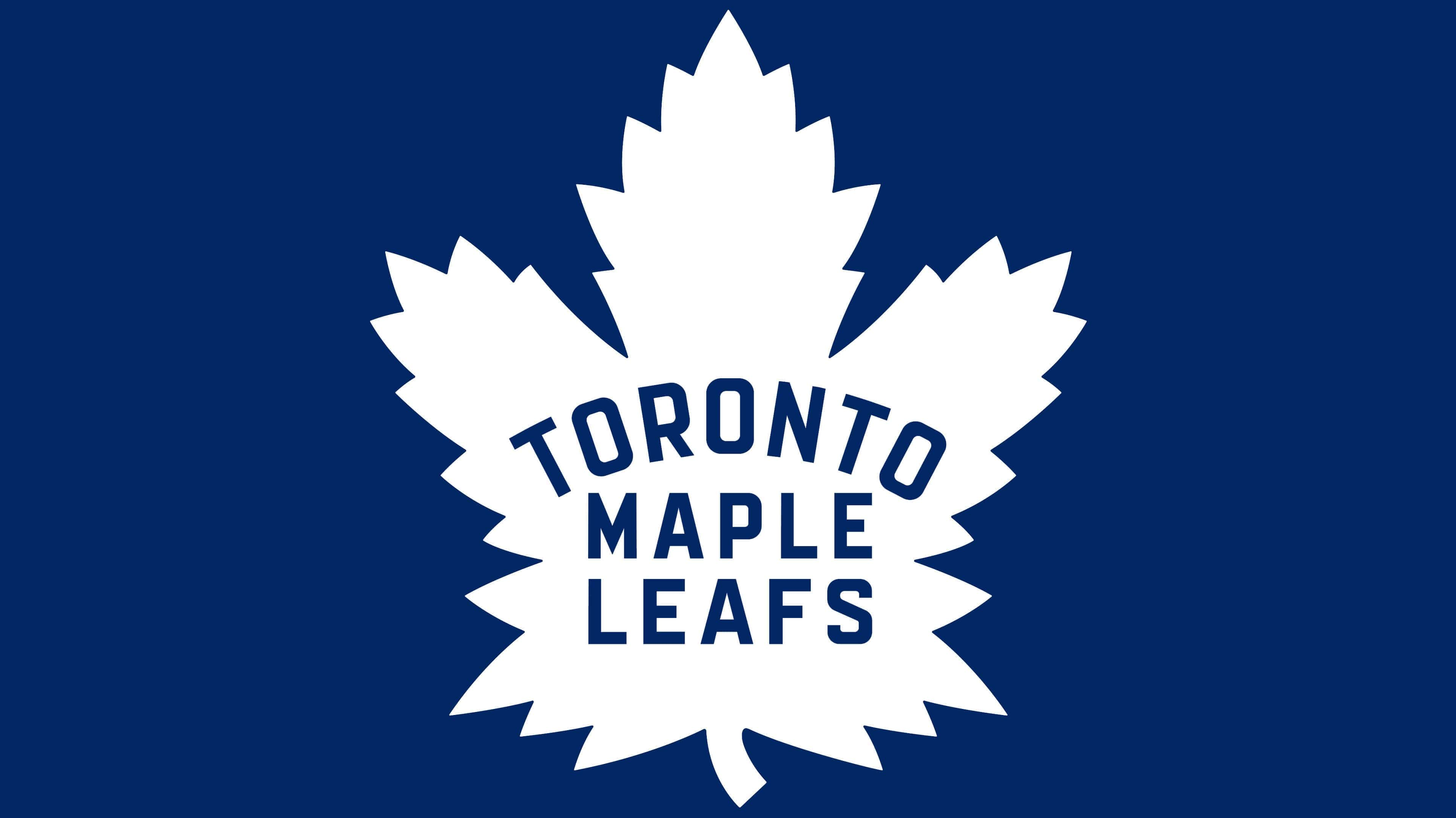
2016 – today
![]()
On February 2, 2016, officials introduced a new logo, the emblem of the Toronto Maple Leafs, for the 2016-2017 season in honor of the franchise. The logo was inspired by the iconic crest worn from the 1940s to the 1960s and combines both completely new and time-tested features. This version has no contour lines, but the shape, color, size, structure, and veins are identical. The distinctive ribbed edges indicate that it is a maple leaf. It was first approved in 1926 by Conn Smythe. He and Canadian soldiers wore it during World War I.
The return to the symbolism’s origins coincided with the club’s centennial, celebrated in 2017. In the current version, the number of ribs and veins on the leaf is very important. They testify to important historical events associated with it. Thirty-one points protruding along the edges symbolize 1931, and the 31st point refers to the opening of Maple Leaf Gardens. The 13 upper stripes symbolize the team’s 13 Stanley Cup titles. And another 17 (13 upper + 4 lower) are dedicated to the year the team was founded, 1917.
Font and Colors
The earliest logo sketches are simple and clear. They represent a large letter “T” and indicate the club’s location: Toronto. From 1917 to 1927, they were purely textual. Then came the legendary maple leaf, which underwent several transformations. Designers changed its size, shape, and style and imbued it with various meanings. The image, most similar to the modern one, was approved in 1938. It differs only in the indentations in the current version; they are more expressive and sharper.
The textual part has always played a huge role in the team’s visual identity, so management never removed the inscription from the logo. Five types of fonts exist in the history of the Toronto Maple Leafs logos. All of them (except for the 1927-1938 version) are smooth, sans-serif, and grotesque. The color palette is simple, consisting only of blue and white.
FAQ
What is the motto of the “Toronto Maple Leafs”?
The team’s old motto was “Play right.” Play fast. Then it was replaced by the phrase “It’s a privilege, not a right,” which the players first saw on the locker-room wall in 2018. It is a tribute to Johnny Bower.
Why did the “Toronto Maple Leafs” change their logo?
The hockey club changed the logo design in 2016 to honor its centennial. Additional serrations were added to the silhouette of the maple leaf. Their number (31) now symbolizes 1931, the year Maple Leaf Gardens was opened.
When did the “Leafs” change their logo?
The last time the “Toronto Maple Leafs” logo was changed was in 2016, shortly before the hockey team’s centennial.
What color is the “Toronto Maple Leafs” home jersey?
The hockey players’ home jerseys are painted dark blue. The number, base of the leaf, and decorative lines are white.