


![]() Chicago Blackhawks Logo PNG
Chicago Blackhawks Logo PNG
The representation of a Native American has always been part of this team’s emblem, and there is no intention to abandon it, as the symbol is a tribute to nationality rather than racial discrimination. Thus, the Chicago Blackhawks’ emblem has maintained its original appearance despite public pressure, with only minor modifications.
The Chicago Blackhawks are one of the NHL’s “original six” teams, based in Chicago, Illinois. The team competes in the Central Division of the NHL’s Western Conference. The team’s history began in 1926 when the Western Canada Hockey League disbanded due to financial problems and growing competition from the NHL. WCHL founders Frank and Lester Patrick were forced to sell players and entire teams to their wealthier NHL competitors to stay afloat. They called Chicago coffee magnate Frederic McLaughlin to negotiate the purchase of the Portland Rosebuds. McLaughlin, a sports enthusiast who preferred more aristocratic sports, was an accomplished horse rider and famous polo player, so he liked the idea. A group of shareholders led by McLaughlin paid Patrick $200,000 to transfer the Rosebuds to Chicago.
The team based in the Windy City could not be called “buds,” “roses,” or any combination of these words. Major Frederic McLaughlin was the commander of the “Blackhawk Division” during World War I, so he didn’t ponder much about the name of his new club. Moreover, McLaughlin loved his homeland and knew its history. He knew that in the 19th century, bloody wars between settlers and Native Americans took place in the Midwest, including Illinois, where Chicago is located. One of the legendary figures of the Indian wars was Chief Black Hawk. That’s why the Chicago club’s logo features not a hawk but the head of a Native American, which has been ironic since the franchise’s founding.
Until 1986, the team’s name was spelled “Black Hawks,” but it is now spelled “Chicago Blackhawks.”
Meaning and History
![]()
Although the team has many logos (ten), this doesn’t mean they differ. No, the history of the Chicago Blackhawks’ emblem is the evolution of a single version across different “faces,” because the main element is the Native American nation known as the Black Hawks. He was a prominent figure in the history of the state of Illinois. This concept was proposed by Irene Castle, wife of the coffee magnate and first franchise owner, Frederic McLaughlin. More than a decade has passed since the debut version, and the same face still looks at hockey club fans as it did at the beginning. Changes were minimal.
In 2008, the Chicago Blackhawks’ logo was voted the best in the NHL in a league fan poll. “It is a very recognizable emblem that carries a special message and inspires countless imitations among competitors. The logo evokes a sense of pride and duty to it and looks great on a T-shirt and cap,” said the poll organizers.
Bright colors were introduced to the logo in 1935. The leader’s face was painted red. However, later, this was considered incorrect about Native Americans, and in 1941, designers made the skin brown.
However, some Native Americans still disapprove of this logo and the idea of using Native American culture for entertainment purposes. Sometimes, this becomes the reason for a serious scandal.
The Chicago Blackhawks were founded in 1926, and their team emblem was created by Irene Castle, the wife of Major Frederic McLaughlin, the team’s founder and a coffee magnate.
The emblem’s hero is a military chief of the Sauk Native American tribe. He participated in the War of 1812 (1812-1815) between the USA and Great Britain on the British side. In 1832, he led the military actions of the Sauks and Foxes against the United States. This man was a notable figure in Illinois history, where the club is based.
In the original version, the Chicago Blackhawks emblem was black-and-white, with the inscription “black hawks,” referring to the team’s nickname. McLaughlin, the commander of the 333rd Machine Gun Battalion of the 86th Division of the U.S. Army during World War I, coined the name. Team members call themselves “Black Hawks.”
What is Chicago Blackhawks?
It is a professional hockey club founded in 1926. It is a member of the NHL, representing the Western Conference and Central Division. Until 1986, the team was named “Black Hawks,” then received its current name. Since 1995, it has trained at the United Center stadium.
1926 – 1935
![]()
Irene Castle, the wife of club owner Frederic McLaughlin, designed the original Chicago Blackhawks logo. It was a side view of a Native American’s head with three feathers and a braid surrounded by the inscription “Chicago Black Hawks.” The emblem’s only colors were black and white.
1935 – 1937
![]()
The 1936 emblem’s palette included two more colors in addition to black and white. The Native American’s head was red, and his hair was light brown. Otherwise, the black circle and the white inscription with the team’s name remained the same.
1937 – 1941
![]()
The version presented in 1937 looked quite similar, except for the background: the black color was replaced with white. The red-skinned Native American and the team name on a black background remained unchanged.
1941 – 1955
![]()
In 1941, the emblem was slightly reworked, still depicting the iconic head of a Native American. A more detailed headshot replaced the thoughtful portrait. Facial features softened, red skin took on a warm yellow hue, and hair turned black with thin green lines. Three red and white feathers appeared in the hair. The black outer ring was outlined in a thin red line.
1955 – 1957
![]()
In 1955, the Blackhawks introduced a new Chicago Blackhawks logo. It was a more detailed drawing of a Native American’s head, with red and white stripes across the face. A red earring on the head and four multicolored feathers in the hair (green, yellow, and red). A white line ran through the hair, adding volume to the image. Two red lines border the black ring with the team name inside.
1957 – 1965
![]()
The sixth emblem of the Chicago Blackhawks underwent minor changes. The black ring with the inscription “Black Hawks Chicago” remained unchanged. The white lines in the Native American’s hair turned yellow. One of the red feathers was replaced with an orange one. The facial features of Native Americans were also changed.
1965 – 1989
![]()
In 1965, changes were made to the Black Hawk’s head, but they were maintained for two decades. The black circle was removed from the emblem, leaving the Native American head as the team’s coat of arms. Facial features became softer and simpler, and the forehead was slightly elongated. The portrait has a neutral expression. The red-and-white stripe on the forehead turned black. To this day, this logo undergoes only minor changes.
1989 – 1996
![]()
By the end of the 1980s, graphics and color were significantly improved. Red and orange feathers in the hair were adorned with white lines, and green and yellow ones with yellow and blue, respectively.
1996 – 1999
![]()
The team initiated another logo redesign. This only slightly changed the color palette: the face became darker, and the outline became a brighter shade of yellow. The feathers’ green, yellow, and blue colors became brighter and sharper.
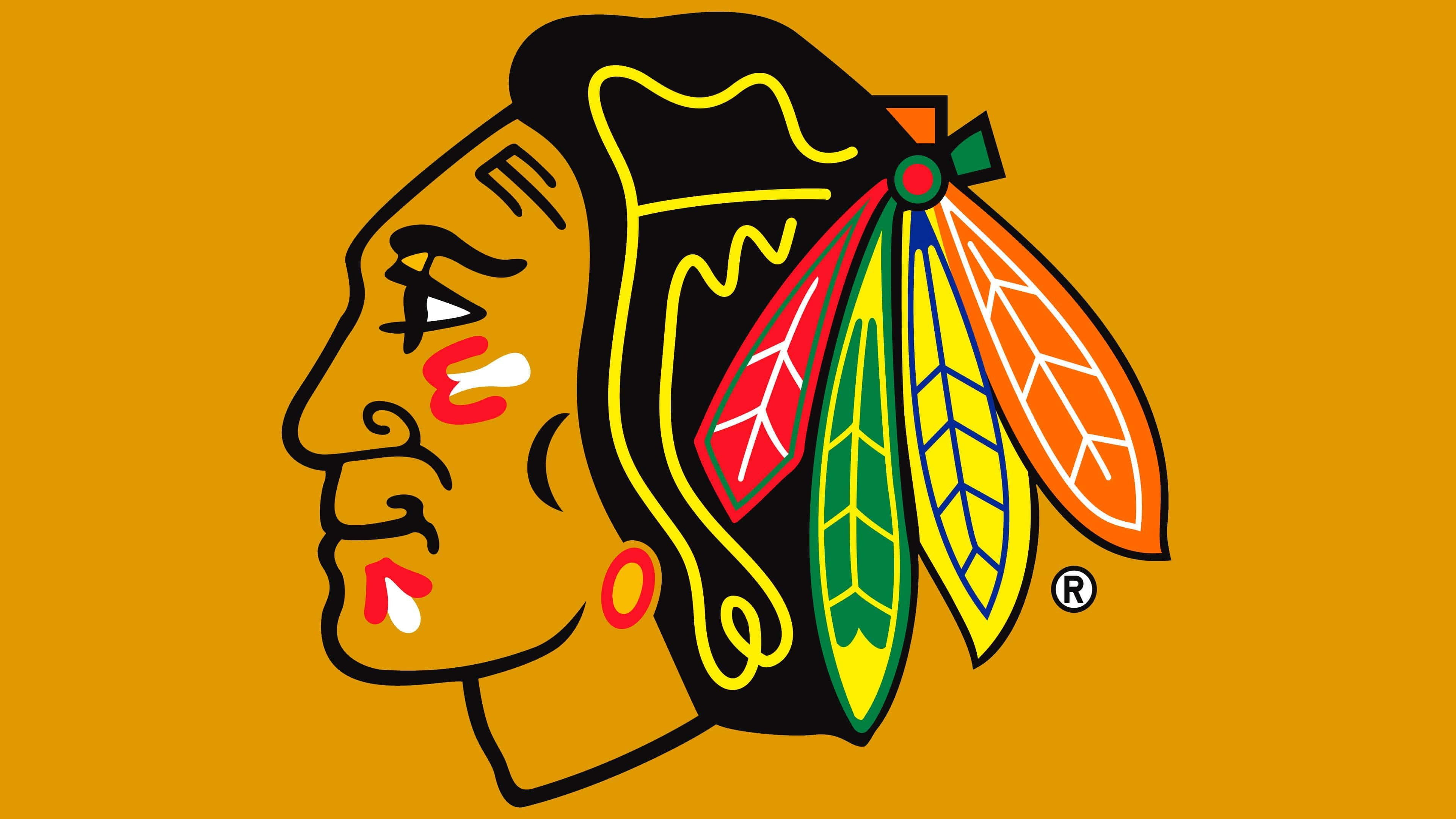
1999 – today
![]()
The emblem, with a smiling representative of the Native American population, went into circulation. It is based on the previous version of a darker shade. Now, the colors, on the contrary, are bright, flashy, and expressive. The character’s face is painted with war paint, indicating that the team is ready for decisive action on the sports field. In the hair, there are four multicolored feathers. They are tied together and fixed at the back of the head.
The Native American’s head is depicted in profile, facing left. Moreover, in this version, it is not as old as it was before 1989. The facial features were slightly adjusted to align more closely with European standards, making the logo more universal.
Font and Colors
The debut logo featured a black-and-white outline of a Native American surrounded by the words “Black Hawks” (at the top) and “Chicago” (at the bottom). It looked like a classic rondel with a central part and a wide border. The stamp’s shape was replaced in 1965 by the image of the Native American, which had previously been centered in the circle.
Throughout the emblem’s existence, the main changes concerned the skin tone, age, facial expression, hairstyle, and the number of feathers in the bunch. Eventually, an image of a young character with war paint appeared.
The textual part was present in the early logos, until 1964, a chopped grotesque font from the sans-serif category.
However, the logo’s palette is very diverse, consisting of bright colors. There are green (feather), black (hair, facial features, and contours), yellow (face, feather, and lines in the hair), red (feather, war paint), and raspberry (feather). White is also among the official colors of the Chicago Blackhawks, along with red and black.
FAQ
What does the “Chicago Blackhawks” logo mean?
The emblem depicts a representative of the Native American population of North America, a former chief and warrior of the Sauk people. The head, adorned with four multicolored feathers, is positioned in profile. The gaze is straight, and the face has a national character.
Will the Chicago Blackhawks change their logo?
The Chicago Blackhawks do not intend to change their logo. The team has officially stated this. They also said that there are no plans to change the name.
Is Blackhawk an Indian tribe?
Blackhawk is not an Indian tribe, but the native name of the Sauk people is Ma-ka-tai-me-she-kia-kiak. They were warriors. He died in 1838. He is also known as the 86th Infantry Division, in which Frederick McLaughlin, the founder of the sports club, served. He named his hockey team in honor of these infantrymen.
What is the name of the Blackhawks mascot?
The Blackhawks mascot is Tommy Hawk. It is an anthropomorphic black hawk in the hockey team’s uniform, with four multicolored feathers on its head. This character first appeared at the beginning of the 2001-2002 season.