


![]() Pittsburgh Penguins Logo PNG
Pittsburgh Penguins Logo PNG
The team’s image is firmly associated with an Arctic bird, as seen in the name and logo. Artists aimed to emphasize the uniqueness of the Pittsburgh Penguins logo. Hence, a penguin has always been featured on the hockey club’s emblem. Additionally, the penguin is directly associated with a cold region and ice.
In 1897, the first amateur hockey team appeared in Pittsburgh, USA, followed by the creation of the first synthetic ice, which had no analogs in North America for a long time. However, the legendary “Pittsburgh Penguin” only existed in 1967, after the NHL expanded from 6 to 12 clubs. Among the newcomers entering the elite was the “Pittsburgh Hornets” from the AHL. The team owners decided that with the change in status, it was time to change the name. “The Hornets were a lower league team. We knew we wouldn’t get the best players in the expansion draft, so we didn’t want to continue to be seen as an AHL-level team,” recalls Peter Block.
The new name had to start with “P,” like “Pittsburgh.” It was coined by the wife of one of the investors, Carol McGregor. Locals had dubbed the “Civic Arena” an “Igloo” for its dome-shaped roof, which means “Eskimo dwelling.” Then she had an idea: igloo ice penguins.
At the same time, the same name was suggested by 700 of 26,000 people who participated in a contest sponsored by the Post-Gazette. Artist Hessner was paid $1,500 to develop six possible Pittsburgh Penguins logo options. Soon, the designers would add a running penguin to the club’s emblem, which in the 90s was replaced by a penguin “postage stamp” but then returned.
At the peak of its existence, the “Pittsburgh Penguins” wore blue and white uniforms but later switched to white club colors – gold and black. These are similar to the “Pirates” color scheme of Pittsburgh’s early-20th-century hockey team, which borrowed the colors from the local police uniform. These colors are also present on the city’s flag. The same tones are found on the coat of arms of British Minister William Pitt the Elder, after whom Pittsburgh was named. The “Golden Triangle” symbolizes the city with its skyscrapers, commercial and office centers, theaters, and bridges. Therefore, the gold color of the Pittsburgh Penguins’ emblem is very significant. The Boston hockey team, the Bruins, whose players wear the same colors, are still angry at the “penguins”: these should be their only colors.
Meaning and History
![]()
In 1968, Pittsburgh, Pennsylvania, became the hometown of the new hockey franchise, the Pittsburgh Penguins, as part of the NHL expansion from six to twelve teams. Seven penguin logos on skates (except for 1992-2002) make up a unique collection amassed by the “Pittsburgh Penguins” over many years. Another important element is the mysterious yellow triangle, which is present on all emblems without exception. The Antarctic bird has transformed from amusing to focused. Designers tried to convey its natural character – aggressive nature, selflessness, and the ability to withstand huge loads even on ice.
What is Pittsburgh Penguins?
It’s the official name of a hockey team known as the Pens in narrow circles. The Pittsburgh Penguins regularly participate in the NHL’s Metropolitan Division and are five-time Stanley Cup winners. The club has existed since 1967 and currently plays at PPG Paints Arena.
1967 – 1968
![]()
The original logo appeared in 1968. It depicted a penguin in white gloves, a scarf, and black skates. In its wings, it held a hockey stick. The image was superimposed on a yellow triangle inside a white circle with the words “Pittsburgh Penguins” in blue font. Bob Hessner designed the “Pittsburgh Penguins” emblem in 1967. The artist was paid $1,500 to create the club’s first logo.
1968 – 1972
![]()
The team’s second logo was slightly modified from the previous one. The penguin lost its scarf and took on a fiercer look, symbolizing the team’s fighting spirit. The image of the penguin on skates and the yellow triangle became smaller, and the dark blue circle expanded. The team name appeared inside the circle, and the wordmark’s font was changed to a more classic white.
1972 – 1992
![]()
The new logo was introduced in 1973. The dark blue circle and the team name disappeared. The penguin above the yellow triangle remained the same as its predecessor: it was still dressed in black skates and held a stick.
1992 – 1999
![]()
In line with new trends, the franchise’s logo adopted a bold, minimalist, abstract look. It was the era of the penguins with a postage stamp. The logo’s focal point became the penguin, and the yellow triangle merged into a single image. One side of the triangle was painted yellow; the other was drawn in black-and-white stripes. They were separated by a white line that smoothly transitioned into the penguin’s head.
1999 – 2002
![]()
The Pittsburgh Penguins logo did not change significantly, with only a slight adjustment to the color tone.
2002 – 2016
![]()
In 2003, the team wanted to return to the original penguin-on-skates concept, but with minor changes. The triangle returned to the “Penguins,” but they chose a different shade of Vegas Gold instead of yellow. The old-school skating penguin with a stick looked the same as it did in 1973.
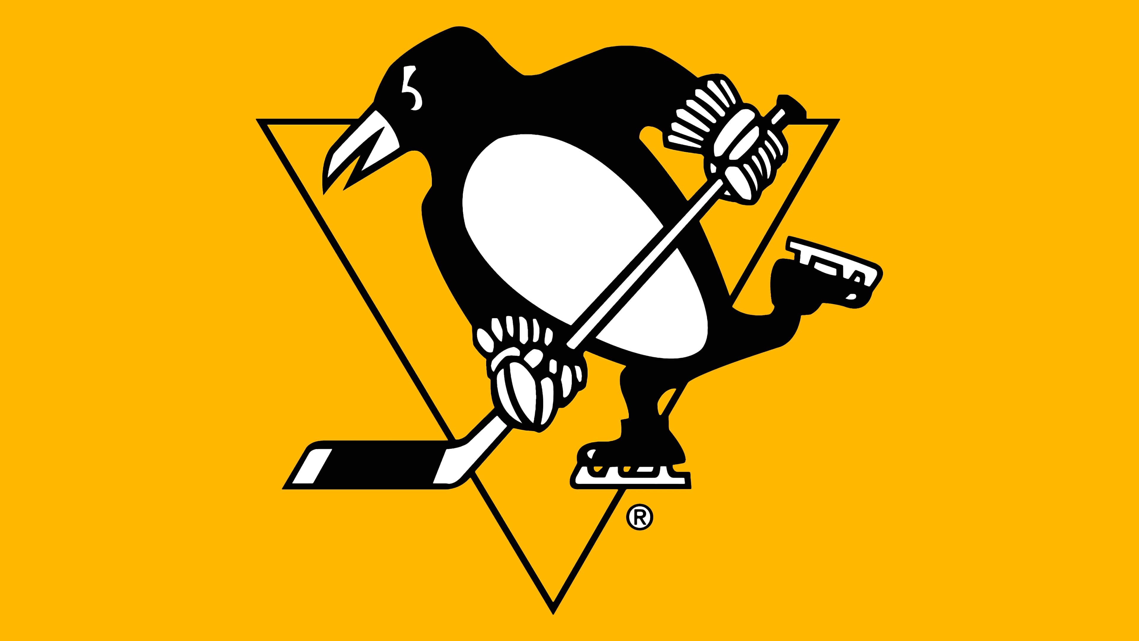
2016 – today
![]()
In 2016, the franchise introduced a new “Pittsburgh Penguins” logo to commemorate the half-century anniversary of its original logo.
Bob Hessner developed the earliest version. Today’s emblem is his artistic reinterpretation, in which the bird became more athletic during the transformation process. This was facilitated by just one stroke – an inverted oval. Therefore, in the first version, the penguin is ordinary and fat, emphasizing the lower body, whereas in the modern version, it is pumped and broad-shouldered.
The anthropomorphic character is depicted against a triangular background. It holds a hockey stick in improvised, gloved hands, imitating a run on an icy field during a match. The bird is standing on skates, which seem to be gliding forward. All this is hockey paraphernalia because the designer’s task from the very beginning was to convey it in the logo.
Font and Colors
The earliest versions feature a circular shape reminiscent of a classic puck. In 1972, the developers removed it, leaving only an inverted isosceles triangle. Then, in 1992, the team reworked the design and ordered a new logo from Vance Wright Adams and Associates. The collaboration resulted in an unusual logo consisting of a triangle and a penguin.
One side of the geometric figure resembled an open bird wing, which acquired realistic features. But twenty-eight years later, the “Pittsburgh Penguins” decided to return to the old image created at the dawn of their sports career. At other times, changes are limited to color.
The emblem itself does not contain any inscription – it is used separately. The upper word is typed in uppercase letters without serifs, and the lowercase is typed in lowercase with serifs.
The team’s palette consists of three colors, each with its place in the emblem. It’s Pittsburgh yellow, white, and black (individually developed).
FAQ
What does the Pittsburgh Penguins logo mean?
The team’s emblem depicts its mascot, a penguin. It is shown on skates, in gloves, and with a stick to demonstrate its connection with hockey. In the background, there is an inverted yellow triangle. This element symbolizes the majestic architecture of Pittsburgh’s tall buildings and bridges.
Why did the “Penguins” change their logo?
In 2016, the hockey club underwent a redesign. This is how its owners marked the upcoming 50th anniversary of the “Pittsburgh Penguins,” Simultaneously, they returned the traditional yellow color to the logo.
When did the “Pittsburgh Penguins” change colors?
The team adopted a black-and-gold palette in January 1980. Before that, it used completely different colors: white and blue, which predominated in sports attire.
What does the triangle on the “Pittsburgh Penguins” jersey mean?
This element of the Pittsburgh Penguins’ identity is a tribute to the Golden Triangle, the name of the city center where the hockey team is based.