The Edmonton Oilers logo has essentially never changed. The careful attitude towards the team’s identity speaks of its consistency and high responsibility. Its emblem has always been a ring with an oil drop on top and the name at the bottom. On the one hand, it is a tribute to the region from which the franchise originates, and on the other, it confirms the proverb, “A drop wears away a stone.” That is, daily practice leads to grandiose results.
Edmonton Oilers: Brand overview
| Founded: | 1971 |
| Founder: | Daryl Katz |
| Headquarters: | Edmonton, Alberta, Canada |
| Website: | nhl.com |
The Edmonton Oilers are a hockey team based in Edmonton, Alberta, Canada. They play in the Pacific Division of the Western Conference of the National Hockey League. Alberta, the Canadian province of prairies and oil fields, cowboys, and oil derricks, was the birthplace of many great players. It couldn’t do without a team from the World Hockey Association. Bill Hunter, owner of the junior team Edmonton Oil Kings, made countless attempts to bring an NHL team to Edmonton, but NHL officials refused to create a new franchise there. Eventually, Bill Hunter managed to create a franchise within the World Hockey Association.
Originally, the WHA intended to place two teams in Alberta – in Edmonton and Calgary. The first team was named “Oilers” in honor of the oil derricks, and the second club was named “Broncos” in honor of the Cowboys. There are no oil derricks in Edmonton (they are all located in the northern part of the province), but this name fits the highly industrial city perfectly. In the 1950s and 1960s, Edmonton was the hometown of the quite popular junior team Oil Kings.
Before the first WHA season, the Calgary team was moved to Ohio and became the “Cleveland Crusaders.” Thus, it was decided to name the team from Edmonton “Alberta Oilers,” as it was supposed to represent the entire province. It was also planned that the club would play half of its home matches in Calgary. The color palette included orange, white, and blue. The logo featured an oil drop above the inscription “OILERS.”
At the beginning of the first season, it became clear that traveling between two cities would be financially costly and tiring. Eventually, the “Oilers” did not play games in Calgary and, mid-season reverted to the name “Edmonton Oilers.”
The orange color in the team’s palette probably irritated many, as two other WHA teams used it. In 1974, blue became the club’s key color. The Edmonton Oilers’ emblem was also changed: a white oil drop appeared on a red field on the home jersey and a blue drop on a white field on the away jersey.
In 1979, the Edmonton Oilers joined the NHL and lost most of their players, except for four “protected” players. One of them was Mark Messier, an obscure 18-year-old guy of Belarusian descent who was later considered one of the greatest hockey players of all time. Over the next few years, the franchise’s owners drafted Glenn Anderson, Jari Kurri, Kevin Lowe, and Grant Fuhr, who played a significant role in the team’s success. As for the uniform, it underwent some changes after joining the NHL. The main changes concerned only the logo.
Meaning and History
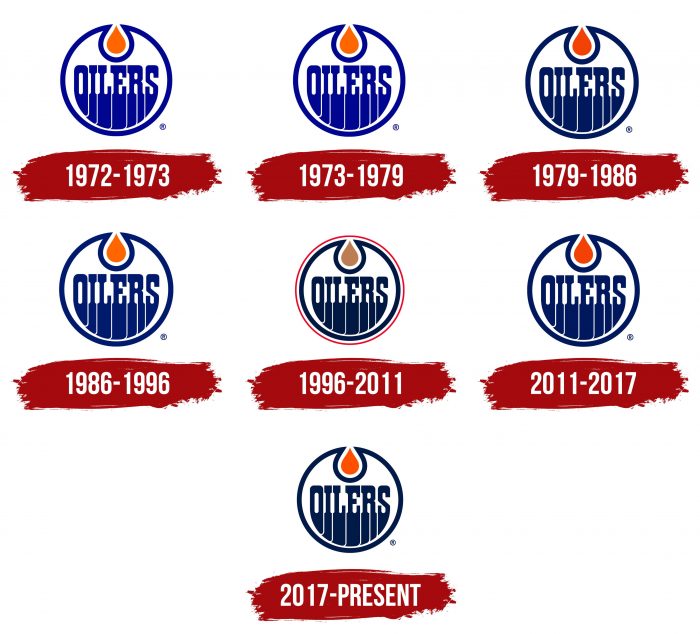
The round “Edmonton Oilers” logo, executed in a classic style, has not changed for the team’s 40 years of existence. Although the team has seven logos, they are all of one type. There have been no serious changes since 1972. Adjustments were only minor nuances: shades of color and edging. Such consistency speaks of the franchise’s stability – that the chosen emblem perfectly matches its concept. Therefore, even after changing the name from Alberta Oilers to Edmonton Oilers, the club remained with its debut version.
What are Edmonton Oilers?
The Edmonton Oilers are a professional hockey team that plays in the NHL as part of the Western Conference. It is also a member of the Pacific Division. The club was founded in 1971 when it played under the name Alberta Oilers. The franchise received its current name in 1973. Since 2016, the team’s home stadium has been Rogers Place.
1972 – 1973
The original Edmonton Oilers logo was introduced in 1972. It featured the word “Oilers” inside a circle, both colors – royal blue. The inscription resembled flowing liquid. At the top, inside the blue circle, was an orange oil drop.
1973 – 1979
The club owners adopted the original logo without any changes. It served as the team’s emblem for six years.
1979 – 1986
In 1980, the overall design of the logo remained unchanged, but it was during this period that the first color change occurred. The team name, circle, and oil drop all became darker.
1986 – 1996
Another modification occurred in 1987. The “Oilers” logo again changed its primary colors: orange became brighter and blue – slightly lighter.
1996 – 2011
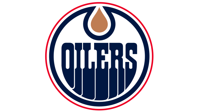
The fifth Edmonton Oilers logo, introduced in 1997, arguably changed the color palette the most. The colors of the team name and main circle became even darker than in previous logos. The blue turned to navy, and the oil drop became copper. A thin red circle frame appeared around the logo.
2011 – 2017
The 2012 Edmonton Oilers logo was a kind of step back, as it was very close to the original version. The blue color became warmer and lighter. The oil drop was replaced from copper to orange. The red ring was removed.
2017 – today
The modern format of the logo is a color repetition of the 1996-2011 inscription. Otherwise, it is different – without a red ring and with a bright oil drop. Meanwhile, the appearance of the letters, “flowing” downwards, corresponds to all other emblems, as the changes mainly concern shades. Thus, the current logo in appearance, size, configuration, and elements corresponds to the debut one, approved in 1972.
Edmonton Oilers: Interesting Facts
The Edmonton Oilers are a famous hockey team in the NHL with a lot of history and some amazing players.
- Starting Out: They began in 1971 in the World Hockey Association and joined the NHL in 1979 when the two leagues merged.
- Golden Years: In the 1980s, they were super good, winning the Stanley Cup five times thanks to incredible players like Wayne Gretzky and Mark Messier.
- Wayne Gretzky: Known as one of the best hockey players ever, Gretzky broke tons of records while playing for the Oilers in the ’80s.
- A Big Trade: In 1988, Gretzky was traded to the Los Angeles Kings in a huge deal that surprised Oilers fans.
- Jersey Numbers: The Oilers have retired several numbers to honor their great players, including Gretzky’s famous #99. No one in the NHL wears it anymore because it’s retired across the league.
- 2006 Stanley Cup Final: Years after big wins, they almost won the Stanley Cup again in 2006 but lost in the final game.
- Helping the Community: The Oilers do a lot of charity work in Northern Alberta, helping with health, education, and hockey programs.
- New Arena: In 2016, they moved to a new arena called Rogers Place, which is modern and has made downtown Edmonton nicer.
- New Stars: Players like Connor McDavid and Leon Draisaitl have been leading the team recently. McDavid is especially known for being one of the best players in the world right now.
- More Than Just a Team: The Oilers helped make Edmonton known as “The City of Champions” in the ’80s and brought great pride to the city.
The Edmonton Oilers have a big place in hockey history with their amazing wins, famous players, and how they’ve helped their community.
Font and Colors
Throughout its existence, the team has not conducted a drastic redesign and preferred the original version. The most radical change occurred in 1996 when the management introduced a version with a red edging line along the entire blue circle. At the same time, the oil drop was repainted beige. The emblem existed in this form until 2011, after which it was replaced by the familiar logo with dark blue “flowing” symbols and a bright oil drop.
All the logos over the years were individually set, with serifs and uppercase letters. To create the illusion of oily viscous liquid, designers proportionally elongated the lower part of the signs. Moreover, since the letters are arranged in a circle, the middle symbols turned out to be the longest, and the side ones – the shortest. This technique helped achieve a density effect and emphasized the connection of the club’s visual identity with its name.
The main colors of the emblem are orange (drop), navy blue (inscription, ring) and white (background). They make up the official palette of the team and are part of the structure of the logo.
Edmonton Oilers color codes
| Orange | Hex color: | #fc4c02 |
|---|---|---|
| RGB: | 252 76 2 | |
| CMYK: | 0 73 98 0 | |
| Pantone: | PMS 1655 C |
| Navy Blue | Hex color: | #041e42 |
|---|---|---|
| RGB: | 4 30 66 | |
| CMYK: | 100 90 13 68 | |
| Pantone: | PMS 282 C |
FAQ
What does the Edmonton Oilers emblem mean?
This hockey club got its name from the oil refining industry – in particular, it is named after the oil derricks. Therefore, the logo features an oil drop and wide dotted stripes coming from the letters. All elements are taken in a ring, which at the top turns into a droplet shape.
Will the “Edmonton Oilers” change their name?
No, the club is not currently planning to change its name. But when the franchise appeared, it was supposed to be called “Alberta” and be one of the WHA teams, along with the “Calgary Broncos.” However, the “Broncos” changed their location and name to the “Cleveland Crusaders,” and this team did the same: they moved and were renamed the “Edmonton Oilers.”
How many Stanley Cups have the “Edmonton Oilers” won?
Despite being a young club, the Edmonton Oilers have achieved tremendous success in hockey, winning five Stanley Cups.
In which city is the “Edmonton Oilers” located?
The Edmonton Oilers are located in Canada. The team is based in the province of Alberta – the city of Edmonton.
