


![]() Los Angeles Kings Logo PNG
Los Angeles Kings Logo PNG
The greatness of the Los Angeles Kings logo is fully emphasized. The crown, clubs, and shield convey much of the imperial status. The team’s name also obliges, referring to its noble roots and aspiration for the highest nobility. This demonstrates the athletes’ focus on victory.
The story begins in 1967, when the NHL expanded from six to twelve teams. Canadian businessman Jack Kent Cooke, owner of the Los Angeles Lakers, paid $2 million for an Los Angeles franchise. He named it the Kings and chose purple and gold, linking the club to a royal theme. The first season was played at The Forum in Inglewood under head coach Red Kelly, who had ties to the Toronto Maple Leafs and the Detroit Red Wings. The team finished second in the West Division.
The 1970s brought regular playoff appearances without deep runs. In 1975, the club acquired Bobby Orr from the Boston Bruins, but injuries kept him off the ice. A turning point came in 1982 with the “Miracle on Manchester,” when the Kings erased a 5–0 deficit to defeat the Edmonton Oilers.
In 1988, Wayne Gretzky arrived from the Edmonton Oilers, raising the club’s profile across the NHL. His presence pushed the team to the 1993 Stanley Cup Final, where they lost to the Montreal Canadiens. After Gretzky’s departure in 1996, financial problems led to bankruptcy in 1995. Edward Roski and Philip Anschutz later bought the franchise for $113.25 million.
During the 2000s, draft picks like Anze Kopitar and Drew Doughty shaped a new core. The Kings returned to the playoffs in 2009. In 2012, they won their first Stanley Cup as the eighth seed, with Jonathan Quick named playoff MVP. In 2014, they secured a second title against the New York Rangers.
Subsequent seasons included missed playoffs and management changes in 2017. The team entered another rebuild, keeping veterans while developing prospects. In 2018, they lost in the first round to the Vegas Golden Knights. By 2020, the club selected Quinton Byfield second overall, while Kopitar signed a long-term deal in 2021, marking continuity during restructuring.
Meaning and History
![]()
The Los Angeles Kings have a standard approach to logo creation. It involves placing the city’s full name or its initials above the crown, a practice seen in nearly every version of the club’s emblem. The only exception was the 2002-2011 version, when designers removed all inscriptions.
What are Los Angeles Kings?
This is a Western Conference hockey team. It plays in the NHL, representing the Pacific Division. The Los Angeles Kings were formed in 1967 and are one of the six teams that began play as part of the National Hockey League’s expansion. Its home stadium is the Staples Center.
1967 – 1975
![]()
The Los Angeles Kings logo, which debuted in the 1967-1968 season, became a true symbol of that era and remains recognizable today. During those years, the team wore purple-and-gold hockey jerseys featuring this iconic logo.
The emblem is designed as a rectangular shield with a pointed base, adding a sense of majesty and formality. Inside the shield is a crown composed of numerous small details: circles, ovals, crosses, and lines. This intricate crown symbolizes the team’s royal authority and status, highlighting its ambitions and drive for victory.
Above the crown is the word “KINGS,” rendered in a serif font that adds a touch of sophistication. The lower diagonal line of the letter “K” is particularly notable, curving smoothly to lend the font a dynamic, unique character. Directly above the “KINGS” inscription is the city name “LOS ANGELES,” set in a standard block font. This makes the visual mark concise and clear, emphasizing its connection to the city and fostering a sense of unity and pride in the team.
The official team colors are purple, gold, and white. They add richness and brightness, underscoring the royal character and making the logo stand out among other emblems of the time.
1975 – 1987
![]()
Eight seasons after a successful start, the team updated its logo for the first time. The main changes concerned the word “KINGS”: designers enlarged it, centered it, italicized the letters, and surrounded it with numerous horizontal strokes to create a sense of motion. They also worked on the font for the phrase “Los Angeles,” reduced the crown, and thickened both the yellow (inner) and purple (outer) contours of the shield.
1987 – 1988
![]()
In the twenty-first season, the hockey club introduced an entirely new emblem, which coincided with the acquisition of Wayne Gretzky. Designers changed the logo’s color palette to match the color scheme of another NHL team, the “Los Angeles Raiders.” As a result, the shield darkened to a dark gray, while the inscriptions and contours turned black. The only element not modernized was the crown, which remained purple-yellow as before.
1988 – 1998
![]()
The purple-yellow crown didn’t last long; just a year later, it was made black-and-white. Changes also affected the shield: developers chose a lighter shade of gray and added a wide white line along the entire contour. In addition, they expanded the shield in the middle, giving it a cross-like shape so that the word “KINGS” didn’t hang in space.
1998 – 2002
![]()
Ten years later, the team introduced a new logo featuring a triangular shield, symbolizing renewal and a new chapter in the club’s history. In the upper left corner of the emblem, a new crown appears, representing the team’s royal status and drive for leadership. The crown continues the theme of grandeur and ambition established in previous emblems.
In the upper-right corner of the shield, a sun is depicted as a circle with rays of varying lengths. This adds dynamism to the emblem and symbolizes the light, warmth, and energy necessary for victories and new achievements on the ice.
The lower part of the shield features an image of a lion holding a hockey stick, underscoring the team’s power and strength. Like the crown, the lion symbolizes royal authority and might, but now embodies readiness for battle and persistence on the hockey rink.
Two crossed hockey sticks on the shield symbolize the team’s hockey essence and readiness for competition, highlighting the players’ unity and fighting spirit.
Above and below the shield, inside two inverted trapezoids, are the inscriptions “LA” and “KINGS.” These words are set in a strict, clear font, which adds confidence to the visual mark and reinforces the team’s status.
This logo features less gray but more black and blue than in previous years. Black symbolizes strength and stability, while blue represents confidence and determination.
2002 – 2011
![]()
In 2002, the Los Angeles Kings’ logo underwent a radical transformation, reflecting a new era in the team’s history. Instead of the traditional shield, inscriptions, and numerous details, the logo became more streamlined and powerful. The main and only element now is a large crown with two crossed hockey sticks at its pointed top.
As a symbol of royal authority, the crown emphasizes the team’s leadership ambitions and drive to be at the top. It appears massive and imposing, giving the emblem a sense of seriousness and significance. In the center of the crown, several circular elements and geometric shapes are visible, adding detail and making the design more recognizable.
The crossed sticks at the top of the crown symbolize the team’s hockey identity and readiness for competition. This element underscores the visual mark’s athletic nature and its strong connection to hockey.
The team’s color palette has changed but remains true to its traditions. The combination of silver, blue, and black creates a sense of strength, confidence, and stability. Silver highlights elegance and high standards, while blue adds dynamism and energy.
The move away from unnecessary details and the shift toward a simpler, more powerful image reflect the changes happening within the team at that time. The new logo symbolized a new era, highlighting their readiness for new challenges and victories.
2011 – 2019
![]()
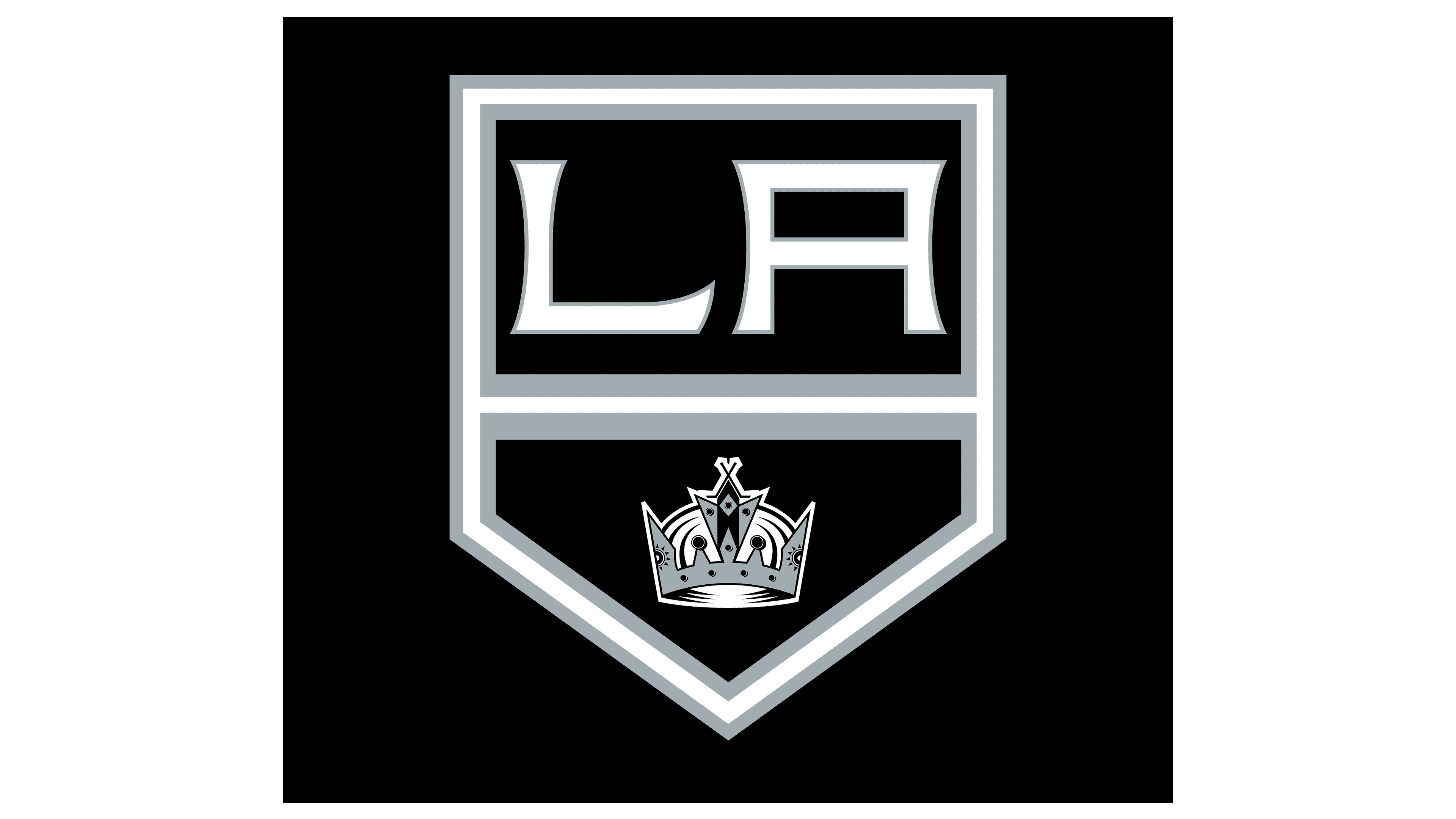
In 2011, the club’s traditional shield returned. Designers divided it into two parts: the upper part contained the city’s abbreviated name, and the lower part the crown. This time, they abandoned blue in favor of black, gray, and white.
2019 – 2024
![]()
In the latest version of the emblem, the colors have changed slightly: black has become more saturated, and an additional silver border has appeared around the shield’s perimeter. As a result of the border expansion, the elements decreased slightly in size.
2024 – today
![]()
The logo resembles the one used from 1988 to 1998 but has undergone several significant changes, making it more modern and expressive. The new version has altered the typography of the word “Kings” and added a small white shadow, giving it depth and dynamism.
House Industries developed the font used in the logo. This typography masterfully recreated the logo, incorporating elements from the hockey team’s entire history. The primary colors remain the same: black, silver, and white continue to symbolize strength, elegance, and purity, reflecting the team’s spirit.
The logo’s overall shape has been expanded by increasing the vertical section. This allowed for larger “LOS ANGELES” text and made the crown more noticeable. In the new emblem, this crown has become more prominent, emphasizing the team’s royal status and drive for leadership.
The horizontal part of the logo has been raised, creating space for the “KINGS” text, which is rendered in a bolder font with added speed lines. Though their number has decreased, these lines have become thicker, and their shapes and lengths now vary, enhancing the sense of movement and speed.
The fonts for “LOS ANGELES” and “KINGS” have been changed to improve readability, and the white shadow on the “KINGS” text now falls from the left, creating an impression of movement from left to right. This element adds dynamism to the logo and underscores the team’s energy and power.
Font and Colors
Over the past half-century, the Los Angeles Kings’ logo has undergone significant changes, while designers have tried to adhere to the classic concept. They retained the quadrangular shield with a sharp base and crown, albeit in a modernized form. They also considered the arrangement of elements: the inscription is traditionally located in the upper part, and the symbol of royal power occupies the lower half of the emblem.
In the modern version of the logo, only the abbreviation “LA” remains from the phrase “Los Angeles Kings.” It is written in an unusual font and was introduced as early as the 1998-1999 season, making it noticeable and self-sufficient. The letters feature an original design: the absence of serifs is offset by pointed, flared edges.
The original palette includes gold and purple colors. In 1987, black and gray were added, and in 1988, they were completely replaced. However, the chosen combination of shades became associated with gangster culture, so in 1998, it was supplemented with dark blue. However, the 2011 redesign returned to the familiar silver-black palette.