


![]() St. Louis Blues Logo PNG
St. Louis Blues Logo PNG
Hockey runs in this team’s blood, so they adapted music to their favorite sport. Indeed, the club uses the unusual St. Louis Blues logo with a stylized note resembling a hockey stick. The players are inspired by such support and gladly take to the ice arena to demonstrate their skills.
The St. Louis Blues entered the NHL in 1967 as part of the league’s expansion from six to twelve teams, alongside the Minnesota North Stars, Los Angeles Kings, Philadelphia Flyers, Pittsburgh Penguins, and California Seals. The name came from W. C. Handy’s song “Saint Louis Blues,” tied to the city’s musical culture. Entry into the league required co-owner Arthur Wirtz to purchase St. Louis Arena, which became the club’s home for 27 years.
In their first season under Scotty Bowman, the Blues reached the 1968 Stanley Cup Final with a roster built largely from veterans and overlooked players. They lost to the Montreal Canadiens in four close games. The pattern repeated in 1969 and 1970, with losses to Montreal and then the Boston Bruins.
The 1970s brought decline, though the arena remained one of the loudest in the NHL. In 1983, Ralston Purina acquired the team and began a rebuilding phase. During the 1980s and 1990s, players like Brett Hull, Adam Oates, Brendan Shanahan, and Al MacInnis led the club to 25 consecutive playoff appearances. In 1995–1996, Mike Keenan traded Shanahan and Curtis Joseph for Wayne Gretzky and Grant Fuhr. That run ended in a Game 7 overtime loss to the Detroit Red Wings.
In 1999–2000, the Blues posted the league’s best record but lost in the first round to the San Jose Sharks. Their deepest run came in 2001, when they lost in the Conference Final to the Colorado Avalanche. After 2004, results declined, with only one playoff appearance by 2009.
A turnaround began in 2011 under coach Ken Hitchcock. The defining moment came in 2018–2019, when the team rose from last place in January to reach the Stanley Cup Final. With Craig Berube as interim coach and rookie goaltender Jordan Binnington, the Blues defeated the Boston Bruins in seven games. Ryan O’Reilly was named playoff MVP.
Meaning and History
![]()
St. Louis is the birthplace of blues and jazz, musical genres intimately linked to the city. Therefore, Sid Salomon Jr., who received the franchise, had no difficulties with the team’s name. He immediately approved the term “St. Louis Blues,” seeing it as an excellent choice for a venue fond of singing.
His reasoning was manifold:
- It’s part of the region where the hockey team is based.
- It connects with the city’s legendary performers and traditions.
- It’s the name of the famous tune Saint Louis Blues, written by W.C. Handy in St. Louis as he reflected on his beloved one morning.
Consequently, a symbolic element for the logo was unequivocally chosen: a winged blue note. Over the years, the club’s emblem has changed seven times, but has always remained linked to the musical theme. Despite redesigns, it accurately conveyed the athletes’ geography.
What is St. Louis Blues?
It’s a professional-level hockey team from St. Louis, Missouri. The team was founded in 1964 and is a member of the NHL, competing in the Central Division and the Western Conference. Its home stadium is the Enterprise Center. In 2019, the club won the Stanley Cup.
1967 – 1978
![]()
The debut version contains just one element: it is clean, precise, and concise. It fully supports the concept of team leadership and reflects the city’s connection to the global blues scene.
The note is depicted with a slanted stem pointing left. It features an improvised wing, a symbol of ascent, achievability of high goals, and career agility. It consists of four feathers, neatly arranged by length: the largest at the top and the shortest at the bottom. The last element has “down” as two miniature protrusions. All lines are straight, strict, and calibrated. The emblem’s figure has a yellow border.
1978 – 1984
![]()
In 1978, the club decided to change. As a result, the emblem gained a circle that enclosed the legendary note. The additional element was made in the same style as the central part. The wide band has a triple border of thinner lines.
At the top of the field, which resembles a vinyl record and a puck, are the inscriptions “St. Louis” and “Blues.” Blue letters on a yellow background are very legible. The wing also changed: a deep notch at the beginning of the top feather was painted yellow.
1984 – 1987
![]()
For a very short time, the hockey players’ emblem consisted of two parts: a graphic and a verbal element. The former contained the musical note, but with a red frame. The latter was located at the top and looked like a semi-arch of the word “Blues.”
1987 – 1989
![]()
A year later, the club administration approved an updated emblem: the famous winged note with two ends. The developers removed the top inscription, leaving “St. Louis” on the first feather. Moreover, in this version, they enlarged the central detail.
1989 – 1998
![]()
In 1989, the team adopted a logo with an exquisite red stripe along its contour. It was used for almost a decade.
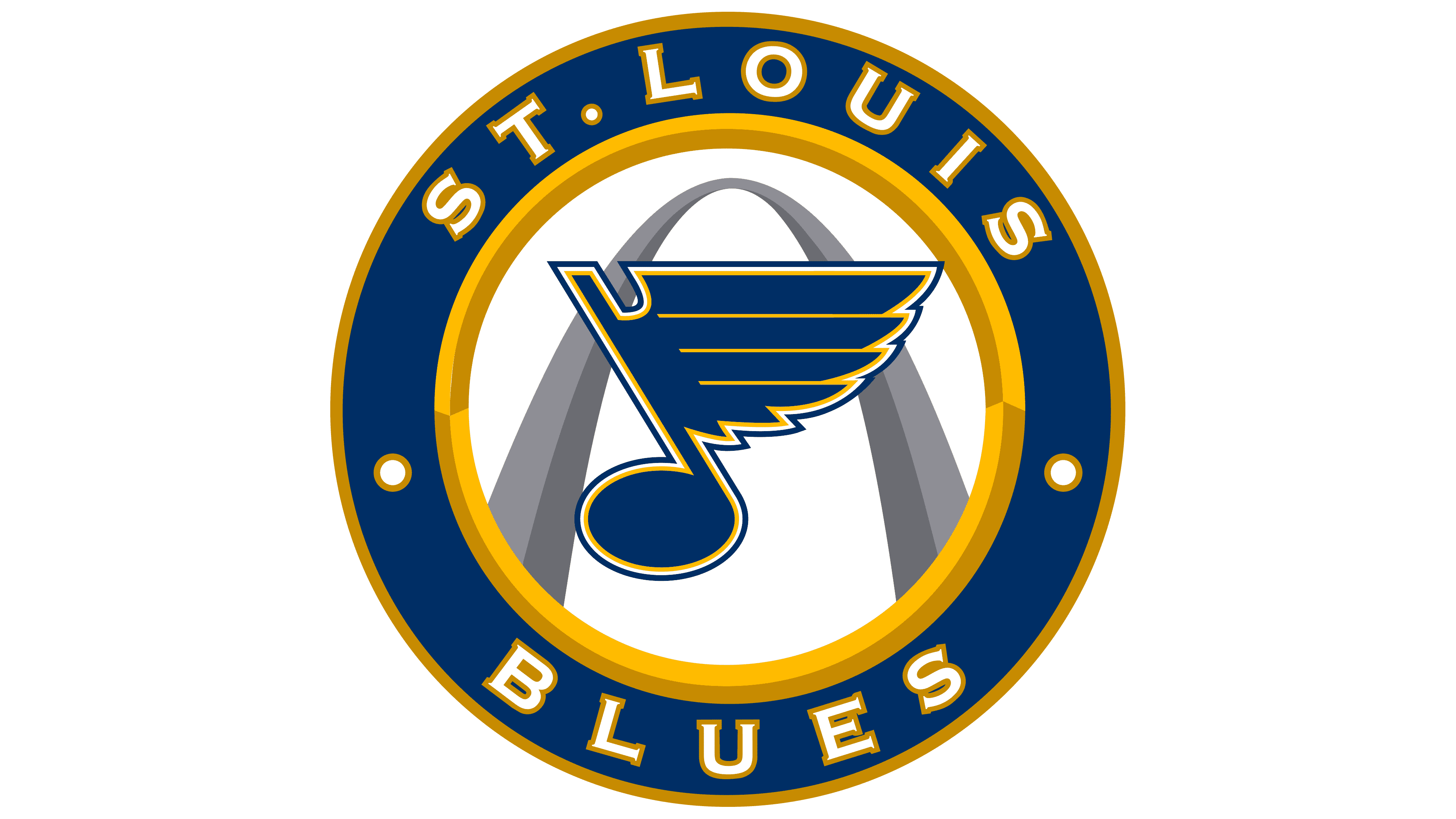
1998 – 2025
![]()
After another redesign, the club returned to the old emblem. The designers then darkened the blue, removed the red outline, removed the “St. Louis” inscription, and sharpened the top of the stem. Moreover, they made all lines clear and even. In 2008, the designers adjusted the yellow color to a golden hue. No other changes followed.
2025 – today
![]()
Font and Colors
Throughout the franchise’s existence, the musical note was considered the logo’s primary element. In the current version, it’s alone, consisting of a head (oval), a stem (a leg slanted to the left), and a flag (a wing with four feathers).
Early versions used two font types: a chopped sans serif from the Sans Serif category and a custom broad serif. All letters were uppercase. In the current version, the text is missing.
The emblem’s corporate palette is associated with the hockey club’s name and the color blue, so blue is considered the primary color. It changed from classic Oxford blue to royal blue. The emblem also features white and Spanish yellow colors.