Hockey players from Pennsylvania chose an unusual logo for the Philadelphia Flyers, featuring a flying puck. Essentially, it’s a black ring with wings and an orange dot in the middle. For them, the ring is an allegory of victory, as such a puck is sure to end up in the opponent’s net and bring the desired win.
Philadelphia Flyers: Brand overview
| Founded: | 1967 |
| Founder: | Comcast Spectacor |
| Headquarters: | Philadelphia, Pennsylvania, U.S. |
| Website: | nhl.com |
The Philadelphia Flyers are a hockey team based in Philadelphia, Pennsylvania. The team plays in the Metropolitan Division of the Eastern Conference of the NHL.
The franchise was founded in 1967. However, before 1967, there was a hockey team in Philadelphia, the “Philadelphia Quakers,” which was dissolved due to the financial difficulties of the Great Depression. Afterward, the city of “brotherly love” repeatedly made unsuccessful attempts to return to the NHL. In 1946, Philadelphia acquired the franchise of the “Montreal Maroons,” which had ceased operations in 1938, and convinced the NHL to transfer the team to Philadelphia. But the NHL repeatedly sent imperative notices of refusal. Not surprisingly, since Philadelphians had nothing but the desire to place another hockey team in their hometown. Good sports facilities were not available until 1967, when the legendary indoor arena Spectrum was built.
The “Philadelphia Flyers” joined the National Hockey League in 1967 as a team of the second six. The 1967 NHL expansion was aimed at adding six new franchises to double the size of the league. Bill Putnam, one of the owners of the “Philadelphia Flyers,” insisted on the team’s color scheme being predominantly his favorite orange color.
After NHL officials chose Philadelphia as the city for one of the new franchises, the team owners announced a competition for the team’s name. There was no doubt about the choice of colors, and the “Flyers” adopted the orange, white, and black colors of the “Quakers.” The prize for the best name was a 21″ (53 cm) color TV. More than 25,000 ballots were submitted, proposing names like “Quakers,” “Ramblers,” “Liberty Bells,” “Keymen,” “Raiders,” etc. However, “Flyers” won because it perfectly alliterates with “Philadelphia.” The winner was 9-year-old Alec Stockard. He and 100 other contestants proposed this name, but he submitted his entry with a spelling error in the word “Fliers.” Then came the time to develop a logo, which turned out to be a real eye-catcher.
Artist Sam Ciccone, a native of Philadelphia, drew the logo. The key concept of the team’s name and logo was to depict speed, as hockey is a fast-paced game. The logo featured four stylized wings attached to a slanted letter P, which, of course, stood for Philadelphia, with an orange dot symbolizing the puck. It was, undoubtedly, the best choice: it was extremely elegant and, at the same time, powerful. The emblem became one of the most recognizable logos in hockey. Over the years, not many changes were made to the logo. The only change to the logo came in 2002 when Ciccone’s creation was outlined in silver to make it three-dimensional. This logo adorned the Flyers’ alternate jerseys until the Reebok Edge redesign.
The Philadelphia Flyers are another team without a mascot.
Meaning and History
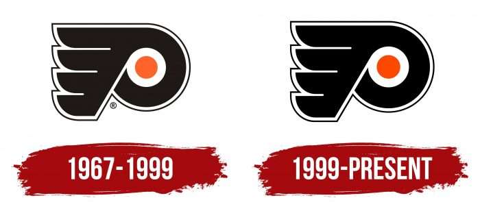
The promising hockey team from Philadelphia, the “Philadelphia Flyers,” was founded in 1967. In the beginning, the team did not always have many logos. Proof of this is the Philadelphia Flyers franchise, which has had only two versions in more than half a century: one for the debut, the other for the present. The differences between them are minimal, almost imperceptible, as the shape, elements, and configuration are completely preserved. The changes mainly concerned the color filling of the logo, so the colors became cleaner, clearer, and brighter.
What is Philadelphia Flyers?
The Philadelphia Flyers are the third highest-scoring hockey club in the NHL. It was founded in 1967 and has since won two Stanley Cups. The team is currently owned by Comcast Spectacor and is a member of the Metropolitan Division.
1967 – 1999
After the “Flyers” were chosen in the team name vote, the franchise owners hired Sam Ciccone to design the logo. Bill Putnam, who owned a stake in the club, chose the official palette. He said that warm colors, such as orange and red, are always more attractive from a marketing perspective. He studied at the University of Texas, where the main colors were orange and white, so the choice was obvious. Black was added as an accent. The logo featured a black, horizontally inverted letter “P,” standing for “Philadelphia,” with four black wings. The orange circle inside the letter symbolizes a hockey puck.
1999 – today
The Philadelphia Hockey Club now uses the same sign for visual identification as before. It consists of a single letter representing the city where the team is based. On the right side of the symbol is a wing formed from four fragments. The improvised feathers are connected at the base, which forms a slightly slanted leg in the shape of the letter “P.” A small shift to the right gives the emblem dynamics – as if the letter is captured in motion, jumping forward. The central wing is replaced by an orange puck, surrounded by a wide white ring.
Philadelphia Flyers: Interesting Facts
The Philadelphia Flyers are a hockey team from Philadelphia, Pennsylvania. They started in 1967 and quickly became good.
- Nickname: People call them the “Broad Street Bullies” because in the 1970s, they played tough hockey. This helped them win the Stanley Cup, the biggest prize in hockey, in 1974 and 1975. They were the first new team to win it.
- Winning the Stanley Cup: They won their first Stanley Cups in 1974 and 1975, showing everyone they were a top team.
- First Home: They played their first games at the Spectrum until 1996. This place was loud and helped them win a lot.
- Current Home: Since 1996, they’ve played at the Wells Fargo Center, a modern arena shared with the Philadelphia 76ers basketball team. This is a big deal for fans.
- Famous Players: Some of their best players include Bobby Clarke, Bernie Parent, Bill Barber, and Eric Lindros. These guys were amazing at hockey.
- Big Win: In 1976, they beat the Soviet Union’s Red Army team, which was a huge deal.
- Funny Mascot: In 2018, they introduced Gritty, a funny and popular mascot that people online love.
- Hall of Famers: They have people in the Hockey Hall of Fame, like founders Ed Snider and Keith Allen, and players like Bobby Clarke and Bernie Parent.
- Big Rivalries: The New York Rangers, Pittsburgh Penguins, and New Jersey Devils have big rivalries, which makes for some exciting games.
- Helping the Community: The Flyers help out in Philadelphia a lot, like supporting kids’ hockey, education, and health through the Flyers Charities.
The Flyers are known for their tough play, great wins, and strong connection with their fans and community.
Font and Colors
The logo was designed by Sam Ciccone from the advertising agency Mel Richman. He is also the author of the sports uniform. Guided by the principle of unity, the specialist harmoniously selected elements so that the emblem looked concise and, at the same time, informative.
For this, the artist took the initial letter of the word “Philadelphia” and played it in a hockey theme. The leg and the lower fragment resemble a stick, the gap in the letter – a puck, the wing personifies speed and the pursuit of new heights. In the end, he achieved his goal: the logo is still used today and is among the top ten in NHL ratings.
There are no inscriptions on the emblem itself (except for the letter “P”), but the club’s name is often used separately. It is set in bold, serif font and has remained so for over fifty years. Each sign has a double outline – a wide white and a thin black one.
The color palette was proposed by one of the team’s founders, Bill Putnam. Instead of the traditional red, which most hockey clubs had, he chose orange to distinguish the franchise from the rest. Therefore, the logo consists of white, black, and orange colors.
Philadelphia Flyers color codes
| Orange | Hex color: | #fa4616 |
|---|---|---|
| RGB: | 250 70 22 | |
| CMYK: | 0 73 87 0 | |
| Pantone: | PMS 172 C |
| Black | Hex color: | #010101 |
|---|---|---|
| RGB: | 1 1 1 | |
| CMYK: | 0 0 0 100 | |
| Pantone: | PMS Process Black C |
FAQ
What does the “Philadelphia Flyers” logo represent?
The club’s logo reflects its name, as it contains a large letter P (for Philadelphia) with a wing, illustrating the word Flyers. The gap in the letter with an orange circle in a white ring depicts a hockey puck. The main part of the image is black, and the outlines are white.
Where did the name “Philadelphia Flyers” come from?
The name was suggested by Phyllis, sister of Ed Snider, who was one of the team’s co-owners. She thought the words “Philadelphia” and “Flyers” went well together. But Phyllis did not participate in the general contest, so the jury chose the closest option from all the submitted ones – “Flyers,” sent by a 9-year-old boy. The winner received a TV and a season ticket.
Why are the “Flyers” orange and black?
Bill Putnam chose this color palette. First, he thought that the combination of orange and black was advantageous from a marketing perspective. Second, at his alma mater, the University of Texas, the official colors were orange and white.
Why do the “Flyers” wear orange?
Bill Putnam wanted the hockey team to have a “hot” color, but red was already associated with Montreal and Chicago. Therefore, the co-owner decided to replace it with orange – also bright and striking. Besides, at the University of Texas, where he once studied, an orange-red palette was used.
