The Colorado Avalanche logo reflects a drive towards the pinnacle of sports and a connection to hockey. It features an icy avalanche cascading down a mountain ridge, triggered by a puck at the forefront of the emblem. The style is abstract, as the mountain is not just a mountain but a large letter “A.”
Colorado Avalanche: Brand overview
| Founded: | 1972 |
| Founder: | Kroenke Sports & Entertainment |
| Headquarters: | Denver, Colorado, U.S. |
| Website: | nhl.com |
The history of the “Colorado Avalanche” began in 1972 in Quebec, Canada, with the birth of the “Quebec Nordiques.” The “Nordiques” existed until 1995. They were the most unique club in the NHL because all announcements in their arena were exclusively in French. Francophone Montreal is quite tolerant of the English language, but the same can’t be said for provincial Quebec. The “Nordiques” were aggressively Francophone.
Interestingly, it took the league’s founders quite some time to consider integrating a Quebec club into the WHA. Initially, they dreamt of Californian sunshine and even reached an agreement to place the team in San Francisco. They also came up with a nickname, but their dream did not materialize. It turned out that Californians ran out of money before the first season started. The club needed a new home, and Quebec was chosen.
Naturally, the most French team among French teams needed an appropriate name. Without much thought, fans named their new favorite club “Nordiques.” This nickname was more than logical, as Quebec was the northernmost city in the NHL and WHA, except for Edmonton, Calgary, Vancouver, and Winnipeg. But it was the north. Very northern.
The club’s emblem was developed – an elephant’s trunk, stylized letter “N,” resembling an “igloo” – an Eskimo dwelling.
Choosing colors was easy: they were the same as the French flag. Blue and red became the primary colors for the Nordiques’ first uniform. A year later, the “fleur de Lys” logo appeared on the sweaters’ shoulders in French, which later became famous. In France, the lily is considered a symbol of royal power, and Quebec residents see this flower as a symbol of independence and connection to France.
These were the 1990s. The Canadian dollar was falling, competition with Montreal was unsustainable, the arena was outdated, and players were not enthusiastic about a provincial town where no one spoke English. Eventually, after the Quebec government refused to provide financial assistance, the “Nordiques” were sold to a group of investors from Denver. This happened right after a playoff defeat in 1995. On June 1, 1995, the team was moved to Denver and renamed “Colorado Avalanche.”
The new owners decided to give the team a new nickname in Denver. Rumors were that it would be “Rocky Mountain Extreme.” Other considered nicknames included Bears, Cougars, Renegades, and Outlaws. However, everyone received a lot of negative feedback. The new nickname was still extravagant – “Colorado Avalanche,” understandable since avalanches in the Rocky Mountains are quite common.
The Colorado Avalanche logo, featuring a bigfoot on the shoulders, was a good fit.
The team’s colors are burgundy, blue, gray, and black, and the uniform features a zigzag pattern in the style of “mountains.”
The fledgling club immediately broke into the NHL elite. Some had to wait decades in vain, but Denverites got lucky as if caught in an avalanche: the team with young superstars came with one Patrick Roy. They won the Stanley Cup in their first year in the new location and organized a parade in Quebec with a foil trophy.
Meaning and History
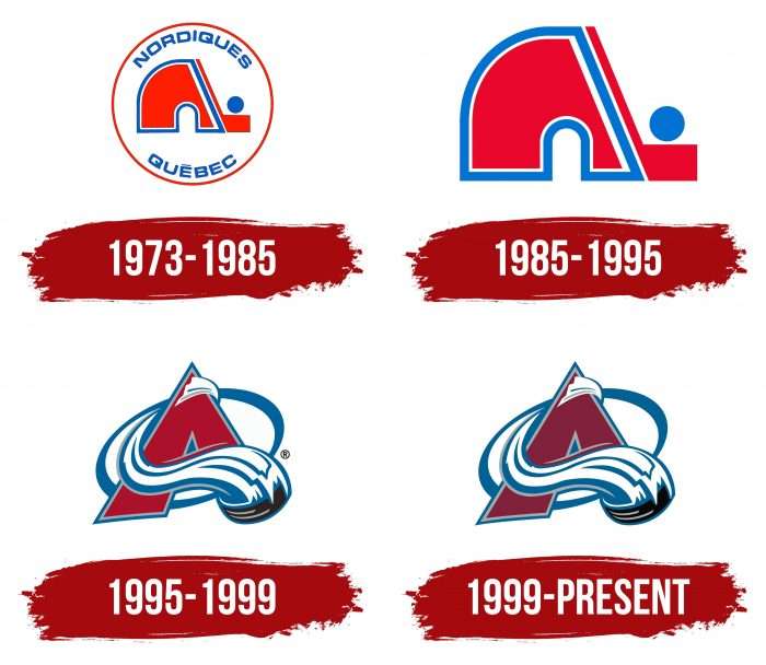
The evolution of the Colorado Avalanche team logo began when they were Quebec Nordiques. This name appears in two early versions. The modern name is also reflected in the emblem but in a completely different format. When the “Nordiques” moved to Denver in the 1995 season, naturally, their logo changed. A person named Michael Beindorff devised part of the logo in the form of the letter “A.” Hence, the idea of the name “Colorado Avalanche” was born. There have been four visual identity marks in the team’s history.
What is Colorado Avalanche?
Colorado Avalanche is a professional hockey club in the NHL. It is a member of the Western Conference and represents the Central Division. The team was formed in 1972 and was initially named “Quebec Nordiques.” In the 1994-1995 season, it was transferred to the COMSAT group, which moved it to Denver, where the franchise remains to this day.
1973 – 1985
The “Nordiques” began their career in 1973 with the famous red “igloo” logo. Half of the igloo was replaced with a stick and puck. The contour of this image was blue. Above was the word “Nordiques” in blue, and below was “Quebec” in blue.
1985 – 1995
Twelve years later, minor changes were made to the “Colorado Avalanche” emblem. The wordmark and red circle were removed. The stick as an entrance to the igloo remained. The colors became more saturated, adding depth to the image.
1995 – 1999
After moving to Colorado, they changed their emblem and nickname to “Colorado Avalanche.” As mentioned, Michael Beindorff developed the concept of a burgundy letter “A,” shaped like a mountain. A blue wave, resembling an avalanche, wraps around it, led by a black puck at the end in the shape of the letter “C.”
1999 – today
Currently, the team uses the version that appeared in 1995. It’s framed as a mountain peak (letter “A”), from which a huge blue and white avalanche flies, formed by a hockey puck. Part of the logo belongs to Michael Beindorff, who proposed the idea.
The emblem directly correlates with the club’s name and conveys its essence: athletes move forward in a powerful flow, unstoppable, sweeping everything in their path. This is the principle of team play.
The modern version is based on its predecessor. The difference is in color: in the first case, the “A” is red, and in the second, it is burgundy. The letter is set against a diagonal oval background instead of a crossbar – an avalanche.
Colorado Avalanche: Interesting Facts
The Colorado Avalanche is a hockey team from Denver, Colorado. They’re part of the NHL and have a lot of fans because they’re good.
- How They Started: They first began as the Quebec Nordiques in 1972, joined the NHL in 1979, and then moved to Denver in 1995 to become the Avalanche.
- Quick to Win: In 1996, the Colorado Avalanche won the Stanley Cup right after moving to Colorado. They’re the only NHL team to win the Cup right after moving to a new city.
- More Championships: They didn’t stop there. They won the Stanley Cup again in 2001 and have remained a strong team.
- Famous Players: Some of the best hockey players, like Joe Sakic and Patrick Roy, played for the Avalanche and are now in the Hockey Hall of Fame.
- Jersey Numbers: They’ve retired several numbers, like #19 for Joe Sakic because those players were important to the team.
- Big Rivalry: They have a huge rivalry with the Detroit Red Wings. Their games were intense in the 1990s and 2000s, with many memorable moments.
- Helping Out: In addition to playing hockey, the Avalanche do a lot for their community, such as hosting charity events and supporting young hockey players.
- Great Coaches: Some smart coaches, like Joel Quenneville, helped them win many games.
- Mascot: Their mascot is a St. Bernard dog named Bernie, popular with fans, especially kids.
- Fans Everywhere: Because they’ve been so good, they have fans worldwide, not just in Denver.
The Colorado Avalanche has come a long way since its start, with many wins, famous players, and fans everywhere. It’s a big part of Denver and has a cool hockey history.
Font and Colors
The Colorado Avalanche logos are divided into two main groups: n and club (1973-1995) and A and avalanche (from 1995 to the present). In the first case, a quarter of the letter is cut off; it’s replaced with a hockey stick. In the second, the emphasis is on the mountain peak, from which the puck rapidly rolls down the slope, leaving behind a trail in the form of an avalanche.
In the debut version, the inscription is made in a thin, chopped font. The letters have a slight curvature and are in uppercase. Now, the text is just one symbol – “A.” It is made in a custom hand-drawn font, where hockey pucks replace serifs and fragments of the avalanche. They also replace the crossbar.
The color palette of the Colorado Avalanche emblem includes black Process Black, gray PMS 428, silver PMS 877, burgundy PMS 202, and blue PMS 647. White is also present, which enhances the contrast well.
Colorado Avalanche color codes
| Blue | Hex color: | #236192 |
|---|---|---|
| RGB: | 35 97 146 | |
| CMYK: | 96 54 5 27 | |
| Pantone: | PMS 647 C |
| Burgundy | Hex color: | #6f263d |
|---|---|---|
| RGB: | 111 38 61 | |
| CMYK: | 9 100 64 48 | |
| Pantone: | PMS 202 C |
| Silver | Hex color: | #a2aaad |
|---|---|---|
| RGB: | 162 170 173 | |
| CMYK: | 45 34 34 0 | |
| Pantone: | PMS 877 C |
| Gray | Hex color: | #c1c6c8 |
|---|---|---|
| RGB: | 193 198 200 | |
| CMYK: | 10 4 4 14 | |
| Pantone: | PMS 428 C |
| Black | Hex color: | #010101 |
|---|---|---|
| RGB: | 1 1 1 | |
| CMYK: | 0 0 0 100 | |
| Pantone: | PMS Process Black C |
FAQ
What does the Nordiques logo mean?
The Quebec Nordiques logo means “igloo” – the traditional winter dwelling of the Eskimos. One part of it is cut off and replaced with a blue stick. The stripe running around the perimeter of the main element is the same shade.
What does the Colorado Avalanche logo represent?
The Colorado Avalanche logo is an avalanche descending from an improvised mountain peak in the shape of the letter “A.” The natural phenomenon is allegorically depicted in the form of semi-circular blue and white lines. They wrap around the letter and end on a puck at the bottom. Thus, the designers combined the club’s name and its logo.
Does “Colorado Avalanche” have a new logo?
The “Colorado Avalanche” got a new emblem in 1995. It was radically changed: instead of the bright red igloo (Eskimo dwelling), a mountain peak in the shape of the letter “A” appeared. The last changes in the emblem occurred in 1999.
What colors does “Colorado Avalanche” have?
The basic colors of the Colorado Avalanche hockey team are blue, silver (gray), black, burgundy, and white. They make up its official palette.
