


![]() Minnesota Wild Logo PNG
Minnesota Wild Logo PNG
A landscape painting can also become an element of a sports style. The legendary hockey team has proven this perfectly. Although the Minnesota Wild logo has natural beauty, it resembles a bear’s head. This is emphasized by the beige edging along the landscape’s edge. Everything in it is symbolic, from the starry eye to the mouth of the river.
Minnesota lost NHL hockey in 1993 when the Minnesota North Stars relocated as the Dallas Stars. Attempts to relocate the Winnipeg Jets failed due to arena issues, and the franchise instead moved to Phoenix. The NHL then approved expansion to 30 teams.
On June 25, 1997, Minnesota received a new franchise for the 2000–2001 season. In January 1998, the name Wild was selected from six finalists during an event at Aldrich Arena. The identity referenced local wilderness and the legacy of the North Stars.
Jacques Lemaire became the first head coach. At the 2000 NHL Draft, Marian Gaborik was selected third overall and scored the team’s first goal on October 6, 2000. The home opener on October 11 ended 3:3 against the Philadelphia Flyers. A 6:0 win over Dallas marked the first emotional milestone.
After two weak seasons, the 2002–2003 campaign changed perception. Minnesota overturned a 0:3 series against the Colorado Avalanche, then eliminated the Vancouver Canucks and reached the Western Conference Final, losing to the Anaheim Mighty Ducks.
In 2008, the club won the Northwest Division but was eliminated early by Colorado. Ownership shifted to Craig Leipold that year. Mikko Koivu became the first permanent captain in 2009 after years of rotation. The team missed the playoffs in 2010 and 2011.
On July 4, 2012, Minnesota signed Zach Parise and Ryan Suter to identical 13-year deals. The team reached the playoffs for six consecutive seasons but did not advance past the second round. Contracts were bought out in 2021.
A new phase began with Kirill Kaprizov, drafted in 2015 and debuting in January 2021 with an overtime winner, later becoming the franchise’s leading scorer.
Meaning and History
![]()
Although this hockey team was formed in the late 1990s, it did not begin competing until much later. The athletes played their first season in 2000, so this date is considered the team’s official emergence. Currently, it is owned by Craig Leipold and managed by Bill Guerin. Dean Evason temporarily coaches the hockey players.
Since its inception, the franchise has not relocated and has rarely revisited its concept, reflected in the brand’s symbolism. The emblem has remained virtually unchanged, except for rare instances when modern adaptations to various media were required. Good visibility, artistry, and ease of perception are the main requirements, as reflected in the current logo. Overall, the club has changed its logo design only once throughout its existence.
What is Minnesota Wild?
The Minnesota Wild is a professional-level hockey club based in St. Paul, Minnesota. It participates in the NHL, representing the Western Conference and playing in the Central Division. The team holds home competitions at the Xcel Energy Center. Although the franchise was founded in 1997, it did not begin playing until the 2000-2001 season.
2000 – 2013
![]()
Between these seasons, the franchise used the debut version. As it is called “Wild” and Minnesota is rich in forests, the emblem was based on a landscape with coniferous trees. The tall firs, with triangular silhouettes, emphasize the athletes’ sharpness and pursuit of victory.
The emblem depicts intertwined trees: green at the bottom and red at the top. They are combined to form two background spaces: a raspberry mountain ridge and a wild green forest. Although the elements do not merge in color, they form a unified picture where everything is inextricably linked.
The logo is a landscape drawing that acts as a visual deception, an illusion. It seems like a round yellow moon, but it’s the ear of a beast. Above is a bright falling star, but it turns out to be the animal’s eye. You look at a stream receding into the distance but realize it’s the gaping mouth of a predator.
Camouflage is present in everything, even in the outlines. The emblem depicts the head of a huge bear with medium-width beige edging. Right above it is the phrase “Minnesota Wild,” formed in an arc.
2013 – today
![]()
The hockey club’s first and only logo redesign was carried out in 2013. The club is satisfied with everything: mystery, originality, artistry, and double meaning. The latter implies diversity in the brand’s symbolism.
The first thing that catches your eye is the landscape, reflecting the expansive forests of Minnesota. But the second is much more important, the contour element in the form of a wild beast encountered in the local slums. All this remained unchanged after the logo revision. Only the inscription at the top disappeared because the team decided to focus on the drawing, enlarging the main symbol – the head of an enraged bear.
Font and Colors
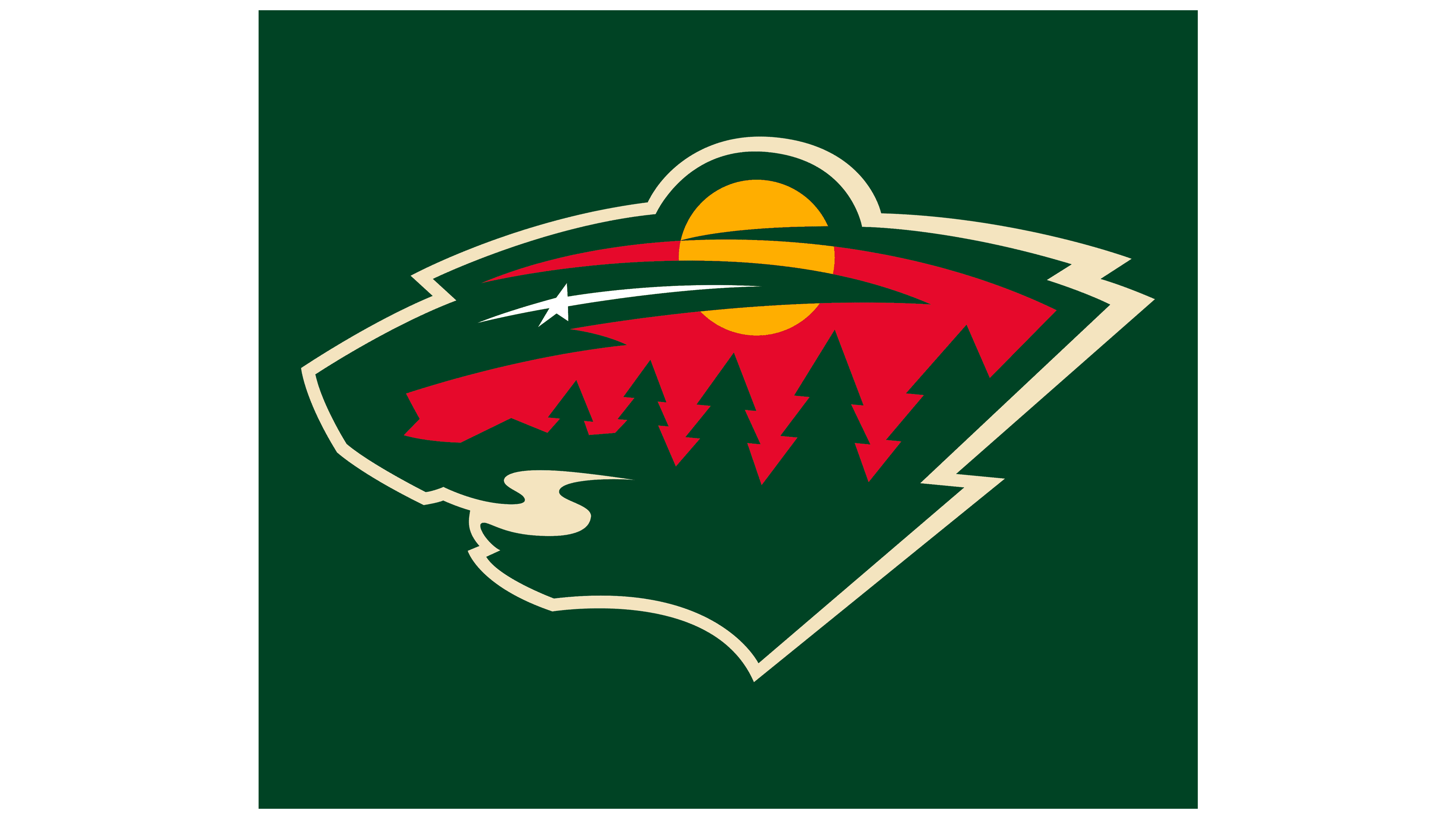
The logo depicts a beautiful row of trees and the silhouette of a wild animal. The role of the eye is played by the North Star, which always shines brightly in the sky. The athletes’ recognition is a tribute to the Minnesota North Stars hockey club, which later moved to Dallas and became the Dallas Stars. The star on the emblem reflects the athletes’ motto, “L’Étoile du Nord,” which translates from French as “The Star of the North.” This means that their team is the only star in the northern region.
Despite the style and ostentation, experts consider the logo complex and unclear for North American professional sports. They claim that the sharp-edged trees, round moon, five-pointed star with elongated rays, and winding stream poorly reveal the team’s audacity, conveyed in the unclear outlines of an ambiguous wild beast.
The modern version of the logo has no text because the main emphasis is on the image. But in the previous version, there was an inscription. It was executed in uppercase with a block sans-serif font. Additional written symbols can vary, including being handwritten with a slight tilt.
The franchise’s official colors include four shades: yellow, gold (Minnesota Wheat and Harvest Gold), green (Forest Green), and red (Iron Range Red). There’s also white, which serves as the background.
FAQ
What should the Minnesota Wild logo be?
The Minnesota Wild emblem is a contour of a wild animal’s head with an open mouth (presumably a bear). It features a coniferous forest (larches or firs), a round moon, a falling star, a winding river, and a red sunset. The white dot with a long ray is the North Star, a tribute to the club “Minnesota North Stars.”
Is the Minnesota Wild logo a bear or a wolf?
The club’s administration does not explain this question, emphasizing that it is “wild nature.” However, judging by the outlines of a round ear, wide neck, and blunt front part of the muzzle, the logo seems to trace the contours of a bear rather than a wolf or a cat family member.
What animal is the Minnesota Wild’s mascot?
Recently, the Minnesota Wild’s mascot became a red panda. His name is Nordy, and he was introduced in 2008. He is also called a cat bear and a little panda, so the question of which animal is depicted in their logo sparks a lot of debate.
Who designed the MN Wild logo?
Graphic designer Steven O’Lafin created the MN Wild hockey team logo. He drew it while working at the SME Branding company in New York, where he created the logo.