The Calgary Flames hockey club uses a fiery emblem. The Calgary Flames emblem has several meanings: it refers to the team’s origins, symbolizes its inner energy, and represents burning oil. The flaming letter perfectly combines all three concepts and represents the name of the sports organization. The emblem style is abstract.
Calgary Flames: Brand overview
| Founded: | 1972 |
| Founder: | Calgary Sports and Entertainment |
| Headquarters: | Calgary, Alberta |
| Website: | nhl.com |
The Calgary Flames is a hockey club that moved to Calgary, Canada, in 1980. It first played in the 1972-1973 season under the name Atlanta Flames. This pseudonym glorifies the historical past of its native city and reflects the events of the Civil War when Atlanta was engulfed in flames.
The team’s emergence is associated with the NHL expansion, which tried to outmaneuver the World Hockey Association. The club played in Georgia for a total of eight seasons. Then, Tom Cousins sold it to a new group of owners led by Nelson Skalbania. He explained this decision as an irreparable financial loss.
Meaning and History
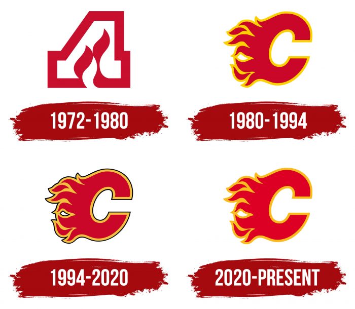
Changing logos, the Calgary Flames team has never deviated from the original concept. It continues the line that started in Atlanta, so the design of its old and new signs doesn’t differ much, except for radical experiments with black color.
What is Calgary Flames?
This is the name of an NHL hockey club previously known as “Atlanta Flames.” It moved to Calgary in 1980 and has since won two President’s Trophies, one Stanley Cup, and three conference championships. Since 1983, its home arena has been the Scotiabank Saddledome.
1972 – 1980
For eight seasons, the hockey club was called “Atlanta Flames” and boasted an unusual emblem in the form of a blazing letter “A.” The inner part of the letter was white, and the main part was dark red. The flame was in the center and stretched upwards. At the same time, the left diagonal stroke of “A” looked like an arrow pointing downward.
1980 – 1994
After moving to Calgary, the team kept the nickname Flames, but now it was associated with the oil extracted in the Canadian province of Alberta. The style of the emblem was preserved: it was adapted to the new city by replacing “A” with “C.”
The color palette turned out quite bright: the orange center of the letter combined with a yellow border, which looked more interesting than in the monochrome version. The flame on the left gave the image dynamism. This logo, widely known as Flaming “C,” was created by graphic designer Patricia Redditt.
1994 – 2020
The Calgary Flames emblem has a thin black line around the edges. It was adopted in the mid-1990s when a trend for dark uniforms and black logos appeared in the world of sports. It was believed that they scared off opponents, so the team, without hesitation, created a daunting image for itself.
At the same time, another version of the stylized letter “C” appeared – this time entirely black, with a wide white outline and a barely noticeable yellow stroke on the outer edge. It adorned the red jerseys of the hockey players and became one of the most global changes in the history of the “Flames.”
2020 – today
With the players transitioning to a full retro in the 2020-2021 season, the team’s management revisited the emblem, returning to the original 1980 version. As a result of the redesign, the emblem received minor changes that did not affect its concept and structure. It remained the same: thanks to the red color and flames, it also contained powerful dynamics and an oil mining theme. The main changes were to the color and borders. The developers removed the thin black line around the flaming letter “C,” kept the orange, and changed the dark red color to pale scarlet. They did not use saturated colors, as in the debut logo, choosing an alternative to the old and new.
Calgary Flames: Interesting Facts
The Calgary Flames are a professional ice hockey team from Calgary, Alberta, Canada. They play in a big league called the National Hockey League (NHL). The team has a lot of fans because they’ve been around for a while and have done some cool things.
- Starting in Atlanta: Before they moved to Calgary in 1980, the Flames started in Atlanta, Georgia, in 1972. Moving to Calgary made them a big part of the local area and hockey in Canada.
- Winning Big in 1989: The best moment for the Flames was winning the Stanley Cup in 1989, a huge deal in hockey. They beat the Montreal Canadiens, and that win is still a big deal for the team.
- Playing Outside: The Flames played in a special game called the NHL Heritage Classic in 2011. It was outdoors, which is different and fun, and they won against the Montreal Canadiens again.
- Big Rivalry: They have a big rivalry with the Edmonton Oilers, another team from Alberta. This rivalry is known as the “Battle of Alberta,” it’s intense with lots of exciting games.
- The Red Mile: During the playoffs, especially in 2004, a street in Calgary turns into the “Red Mile,” where fans in red clothes cheer for the Flames. It’s a big party that gets attention all over the country.
- Jarome Iginla: He’s one of the best players the Flames ever had. He scored the most goals and points for the team and played many games from 1996 to 2013.
- Lanny McDonald’s Mustache: Lanny McDonald helped the Flames win in 1989 and is famous for his big mustache. People also remember him as a great leader and player.
- Helping the Community: The Flames have a group called the Flames Foundation for Life. They donate money to good causes and help with health, education, and sports in Calgary.
- Olympic Arena: Their home, the Scotiabank Saddledome, was used for figure skating and hockey in the 1988 Winter Olympics.
- Honoring Players: The Flames have retired the numbers of some of their best players, like Lanny McDonald, Mike Vernon, Jarome Iginla, and Al MacInnis, to show how much they appreciate their hard work and talent.
The Calgary Flames are a big part of hockey in Canada. They have a lot of fans and a history of winning, and they do many good things for people in Calgary.
Font and Colors
The “Calgary Flames” have a simple but memorable red-orange “C” icon with a yellow border and a thin black outline. However, the letter without the dark border is considered traditional: many fans are accustomed to it. But the black version has further deviated from the classics, so the unique multicolored “C,” outlined by a black line, seems to be the closest to the original version.
Regardless of the modification, the team’s logo reflects its history. There is a bit of Atlanta Flames in it: the owners tried to preserve the old concept in the new design. And it’s obvious because the logo, as before, depicts the first letter of the city’s name, engulfed in flames. The only difference is that with “A,” the fire is inside and stretches upwards, while with “C,” it’s on the side and directed left.
Regarding the font, it doesn’t exist because it’s not written but drawn. Artists thoroughly worked on the “C,” making it unique and recognizable. The standard italic sans serif was used as the basis.
As for the color palette, it’s much more complicated. Officially, there are two versions of the Calgary Flames emblem: regular and dark. The first is used on a light background and is as close to the classic as possible. The second adorns the red jerseys of the hockey players, so the usual red color in it is completely replaced by black.
The only thing that remains unchanged is the yellow frame around the letter. It can be called one of the main distinctions of the “Calgary Flames,” as teams from the world of professional sports are not too keen to use yellow in their logos.
Calgary Flames color codes
| Red | Hex color: | #ce1126 |
|---|---|---|
| RGB: | 206 17 38 | |
| CMYK: | 2 100 85 6 | |
| Pantone: | PMS 186 C |
| Yellow | Hex color: | #f3bc52 |
|---|---|---|
| RGB: | 243 188 82 | |
| CMYK: | 0 22 77 0 | |
| Pantone: | PMS 2006 C |
| Black | Hex color: | #111111 |
|---|---|---|
| RGB: | 17 17 17 | |
| CMYK: | 0 0 0 100 | |
| Pantone: | PMS Process Black C |
FAQ
What does the Calgary Flames team logo represent?
The Calgary Flames logo represents a tortured letter C, which itself looks like a continuation of the fire. This symbol is called Flaming C. The red shape of the letter C is slightly tilted to the right. Flames are depicted on the left side. The outline is traced with a thick orange stripe.
Where did the Calgary Flames team come from?
Originally, the city where the “Calgary Flames” was located was Georgia, Atlanta. The team appeared there in 1972, and eight years later, it moved to Canada – to Calgary. Now, it is one of the two National Hockey League franchises in the province of Alberta.
Who owns the “Calgary Flames”?
The Calgary Sports and Entertainment Corporation owns the hockey club. This is a private organization based in Alberta that manages four sports franchises from Calgary. Its chairman is Canadian financier and billionaire Norman Murray Edwards.
When was the Calgary Flames team founded?
The Calgary Flames team was founded in 1972 under the name Atlanta Flames. It got its current name in 1980.


