The Mumbai Indians logo unites athletes and fans in a shared pursuit of triumph. Every line of the emblem reflects the team’s continuous movement toward new heights, while the central image symbolizes an unwavering thirst for achieving set goals.
Mumbai Indians: Brand overview
The Board of Control for Cricket in India (BCCI) established the Indian Premier League (IPL) in 2008, marking the start of the Mumbai Indians’ history. The Mumbai franchise was the most expensive team in the inaugural IPL season when it was purchased for $111.9 million by Reliance Industries, the biggest private enterprise in India under Mukesh Ambani’s leadership.
The team’s moniker, “,” alludes to its ties to Mumbai and its mission to represent the Indian subcontinent. The squad’s official colors are blue and gold, representing Mumbai’s opulence and richness.
The team finished fifth in the league rankings during the inaugural Indian Premier League season 2008. Although the team did not succeed, its all-star lineup—which included the late cricket great Sachin Tendulkar, who rose to prominence as the team’s captain and icon—drew notice.
The squad had more fortune in 2009, placing eighth overall, although they could still not qualify for the postseason. During this season, the team invested in the growth of local talent and established itself as a team with a solid youth academy.
For the club, 2010 was a breakthrough year. After winning its group, the team qualified for the playoffs for the first time. Even though the Chennai Super Kings defeated them in the championship game, this season set the stage for their future achievements.
The team resumed their ascent in 2011 and returned to the postseason. This year, the squad defeated the Royal Challengers Bangalore in the championship match to win their maiden Champions League Twenty20 title.
The franchise had a historic year in 2013. The squad defeated the Chennai Super Kings in the final to win their maiden IPL trophy under new skipper Rohit Sharma’s direction. The team started to dominate the league with this accomplishment.
The club won its second IPL championship in 2015, continuing its winning streak. After a dismal start to the season, the team won nine of its final ten games, demonstrating an incredible recovery.
The team won its third IPL championship in 2017. In an intense championship game, the squad narrowly overcame Rising Pune Supergiant by one run, cementing the franchise’s reputation as one of the most successful teams in IPL history.
The team won its fourth IPL championship in 2019, a historic feat. Its victory over the Chennai Super Kings in the championship game confirmed its rule over the league.
The group is renowned for its charitable endeavors. In 2010, it started the “Education For All” project to assist Mumbai’s impoverished youngsters with their schooling.
The franchise has continuously invested in the construction of training facilities and infrastructure. The squad established a cricket academy in 2015 to develop young players.
The team won their fifth championship trophy in 2020 and carried on with their IPL supremacy. Throughout the competition, which took place in the United Arab Emirates, the squad performed admirably. The team, captained by Rohit Sharma, won nine of their fourteen group-stage games and comfortably won the championship. They defeated the Delhi Capitals handily in the first qualifier of the playoffs, and when they met them again in the championship game, they prevailed by five wickets. This victory strengthened the franchise’s reputation as the most successful team in IPL history.
Because of outside events, the 2021 season had two halves. The team had a decent start to the season but couldn’t duplicate their outstanding effort from the previous year. With 14 points from 14 games, the squad ended sixth in the standings and missed the playoffs. Despite this, the group displayed several strong individual performances. Ishan Kishan, a young batter, made an impression and finished the season as the team’s leading scorer.
2022 was a difficult year for the team. The squad finished last in the standings, having the poorest season in IPL history. The fact that they only emerged victorious from 14 games surprised many observers and experts alike. The management supported the coaching staff and important players despite the dismal outcomes. Several young players made their team debuts this season, another sign of the franchise’s dedication to growth and rejuvenation.
The franchise saw a major roster reorganization in 2023. At the auction, the squad bought several important players, including Australian all-rounder Cameron Green, for an unprecedented amount of money. The team improved performance due to these adjustments, placing fourth in the standings and qualifying for the postseason. Their tournament run ended after losing to the Lucknow Super Giants in the eliminator. Despite this, the season was viewed as a positive development over the prior one, indicating that the squad was becoming competitive again.
Meaning and History
What is Mumbai Indians?
It is a professional cricket team based in Mumbai, India, and plays in the Indian Premier League (IPL). The team is one of the most successful franchises in the IPL, having won several championships. Owned by Reliance Industries through its subsidiary IndiaWin Sports, the team is known for its strong roster of domestic and foreign players. The team plays its home matches at the Wankhede Stadium in Mumbai. It is known for its performances, leadership, and loyal fan base, making it one of the most popular and dominant teams in the IPL.
2008 – 2010
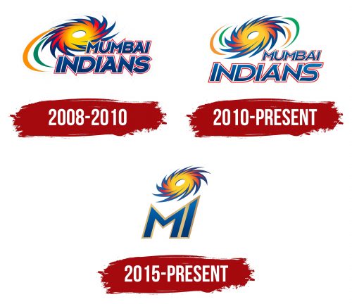
In 2008, the Mumbai Indians team introduced their debut logo, symbolizing their ambitions and aspirations during the first season of the Indian Premier League (IPL). This emblem was meant to represent the athletes and their unique spirit, energy, and connection to the culture of Mumbai, India’s largest metropolis.
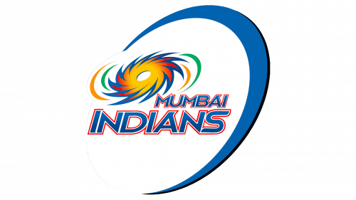
The cricket club’s name is at the bottom of the logo, split into two lines and aligned to the right. The large, bold, and dynamic font creates a sense of strength and confidence, reflecting the players’ determination to win every tournament despite the challenges faced in the early seasons. The bold letters symbolize resilience, while their slanted shape makes the text visually dynamic. The two lines differ slightly:
– The word “MUMBAI” appears compressed, emphasizing its seriousness and importance.
– “INDIANS” is much larger and takes up more space, signifying the team’s great potential.
The blue text represents the club’s essence, modern spirit, and drive to achieve its goals. A thin red outline around the letters adds contrast and emphasis, while a small white gap between the letters and the vibrant outline gives a sense of lightness. This visually embodies the ease with which the athletes throw and bat the ball to score points.
Some glyphs feature sharp, well-defined angles, adding more energy to the text. They resemble spikes that extend beyond the lettering, most noticeably in the “M” and “N,” whose sharp edges stretch upward and downward, like blades ready to slice through space.
Another intriguing detail is the triangular serifs on both “A” s. They resemble sharpened arrowheads, giving the logo an aggressive accent. These elements may seem minor, but they symbolize the team’s determination to stay ahead of its opponents.
In the upper left corner, a swirl appears, fiery in appearance due to its yellow-red-orange gradient. Two arcs, one orange and one green, trail behind it. These are speed lines that create the illusion of movement. The sharp lines and bright colors convey the athletes’ energy, as cricket demands strength, speed, and agility. A dark blue outline tempers the intense emotions, keeping them controlled, as both stamina and precise strategy are crucial in the game.
The swirl has a hollow oval center, and eleven pointed tips that curve counterclockwise. Its shape resembles a shuriken, the traditional Japanese weapon. However, the emblem’s meaning runs deeper and is rooted in India’s cultural context.
What may appear to be a flying shuriken is a Sudarshana Chakra. This term refers to the fiery disc used by the Hindu god Vishnu to fight evil. The blazing Sudarshana flies, striking down all demons in its path. In the same way, the Mumbai Indians move swiftly forward, defeating their opponents.
2010 – today
The overall appearance of the logo remained the same, but designers made a few adjustments to give it a cleaner and more modern look. These changes affected both the text and the graphic element.
- The triangular serifs on the two “A” s now point to the right instead of the left. This better aligns with the slant of the letters, making them appear as if they are flying forward. Continuous movement best captures the essence of cricket and other sports.
- The tall, sharp points remain only on the first “M” in “MUMBAI,” while they’ve been trimmed from the other “N” s and “M” s. This doesn’t affect the visual dynamism, as the glyphs have become thinner and more refined.
- The letter “S” underwent the most significant change: it now features distinct horizontal lines connected by curves. This shape gives the impression of sharp turns and hints at the team’s agility, which persists even during intense play.
- The thin red outline along the edge of the text is now broken in several places. This serves as a reminder that not everything is perfect—sometimes, effort is required to achieve the desired outcome.
- The text’s blue color now has a gradient, with the top slightly lighter than the bottom. This smooth transition of shades reflects the Mumbai Indians’ progressive nature as the athletes continually refine their skills.
The most significant change, however, is in the graphic symbol resembling a flying shuriken—a stylized Sudarshana Chakra. The designers removed the symbol from the cricket club’s name, creating more open space in the logo. The pointed tips now face right instead of left, making it appear that the disc is spinning clockwise. Four-speed green and orange lines arranged in pairs on either side of the Sudarshana also enhance the sense of motion.
2015 – today
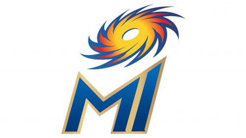
2015, a logo featuring the Mumbai Indians’ shortened name was created. Unlike the 2010 version, this one is easier to integrate across various branding elements, including merchandise, tickets, and promotional materials. The simplified emblem looks sleek and modern, symbolizing a new era in the cricket team’s history and reflecting its ambitious goals and drive to become one of the top teams in the IPL.
As before, the logo embodies strength, energy, and passion, but these qualities are now expressed through entirely different artistic elements. The abstract image of a spinning vortex is placed at the top. Designers had to scale it down to achieve balanced proportions.
The Sudarshana Chakra still resembles a shuriken with an oval hole in the center and eleven sharp blades. The flame smoothly transitions from bright yellow to red, representing the players’ fire and passion, while blue symbolizes calmness and stability—qualities essential to champions.
The vortex hovers above the large letters “MI,” like a guiding star leading the team to victory. Using the abbreviation Mumbai Indians instead of the full name highlights the brand’s strength, signifying that the cricket club has become so well-known that it’s recognized even by its initials.
The “I” blends naturally with the “M” because its top is cut at the right angle. The letters are tightly spaced and separated only by a golden outline surrounding them. The gold border appears shiny due to a soft gradient. Its texture evokes associations with leadership, prestige, grandeur, and valuable prizes. It reflects the pride in a successful team that has won numerous IPL titles. The blue color of the letters provides a pleasing contrast, giving the inscription a refined and polished look. A gradient is also used here, as the cricket club wanted to showcase its modernity.
The logo’s smooth font and clean lines add simplicity and elegance. Although the abbreviation is tilted to the right, it still exudes an aura of strength and stability, perfectly capturing the grandeur of the Mumbai Indians. The combination of bright colors and dynamic shapes symbolizes athletic prowess and the pursuit of triumph, as this is one of the most successful clubs in IPL history. Even the Sudarshana Chakra resembles a victorious vortex, which the team carries onto the field as they defeat their opponents.
