


![]() RCB Logo PNG
RCB Logo PNG
The RCB logo plays on the full name “Royal Challengers Bangalore”. It has royalty, grandeur, and pride in its heritage. The elitist emblem symbolizes the cricket team’s special position and high status. It also reflects the energy of a team sport.
Royal Challengers Bangalore, known as RCB, entered the Indian Premier League in 2008 as one of its eight original city franchises. United Spirits Limited, part of Vijay Mallya’s UB Group, bought the team for about $111.6 million. The name came from Royal Challenge whisky, a major United Spirits brand, while “Bangalore” referred to the club’s home city. The team’s home ground became M. Chinnaswamy Stadium in central Bengaluru.
RCB’s early years brought attention, but not a title. The team reached the 2009 final and lost to Deccan Chargers, then returned to the final in 2011, where they lost to Chennai Super Kings. A defining figure was Virat Kohli, selected in the 2008 first draft. He stayed with the franchise, became captain in 2013, and led the side until 2021, turning the red-and-gold shirt into one of the league’s most recognizable images.
The club’s strongest identity formed around Kohli, AB de Villiers, and Chris Gayle. De Villiers joined in 2011 and remained until 2021, building one of the league’s most productive batting partnerships with Kohli. Gayle left a separate mark in 2013, scoring 175 runs off 66 balls against Pune Warriors, which remains the highest individual score in tournament history.
Around 2012-2014, Diageo acquired control of United Spirits, becoming an indirect owner of RCB. The rivalry with Reliance Industries’ Mumbai Indians became one of Indian cricket’s major fixtures. Mumbai Indians won five IPL titles, while RCB’s missing championship stayed part of its story. In 2016, Kohli scored a record 973 runs in one season. Still, RCB lost the final to Sunrisers Hyderabad, adding a third final defeat to the club’s history.
Meaning and History
![]()
RCB is quite an unusual team. In its entire history, it has never won the IPL (Indian Premier League). But, at the same time, the club is not an outsider. Royal Challengers Bangalore consistently performs well and often ranks among the top five teams. At such moments, a stylish logo featuring a lion crowned appears in the ratings.
This strong visual concept depicts the players’ drive to win championships. The “royal” style is complemented by an elegant color scheme that combines elitism and energy.
2008 – 2015
![]()
The creation of the popular Indian cricket club was made possible by a 2007 announcement from the Cricket Control Board. It was about creating the Indian Premier League and planning the next year’s competition. As early as February 2008, the teams for the game, including Bangalore, were put up for auction. Her franchise was bought by a well-known businessman who owns United Spirits. From that moment on, the history of Royal Challengers Bangalore began.
The team received a visual identity and a stylish uniform. In the same year, the first logo was created. It was based on an elegant round medallion complemented by stylish inscriptions. In the center of the badge was an exquisite yet laconic monogram. A thin frame in the form of a small dotted line surrounded it. Outside the frame was a wordmark of the club’s name.
All letters were made in capital style. Above the medallion was a miniature team coat of arms, decorated with a chic crown. Compared to other teams’ logos, the badge presented was quite complex. But this reflected the essence of Royal Challengers Bangalore. It was a strong team composed of players with different temperaments and playing styles. Together, they complemented each other and adhered to a single strategy.
In addition, cohesion and the desire for success were manifested in perfectly matched colors. Shades of gold, bright red, expressive white, strict black, and tints of silver were chosen for decoration. The central part was made of gold and red, a combination that evoked associations with the elite, energy, and vitality. The black letters made a successful accent to the name, the white dotted line slightly refreshed the logo, and the silver tones adorned the miniature crown.
2016 – 2019
![]()
In 2016, the RCB team continued its journey in cricket, pleasing fans with excellent results. The internal structure changed several times throughout the period as new players joined the Royal Challengers Bangalore. In addition, the changes affected the corporate emblem. In 2016, management decided to update the logo design. The new version retained the same base in a medallion but made some modifications.
Dark shades appeared in the inner filling. They favorably distinguished the inner monogram from the word mark as an inscription. The clearer demarcation made the logo more modern and extravagant. The monogram itself has become lighter. Light beige colors replaced the golden hues. The red did not disappear anywhere; it remained only along the edges and within the central circle.
A powerful upright lion has replaced the coat of arms with a crown atop the logo. Such an animal pose signaled an attack and conveyed the team’s mood. The players were determined to defeat their opponent. A new font was also used to supplement the picture. The lines became bolder, and the name was set in a stricter, more direct serif font.
2020 – today
![]()
In 2020, there was another renewal of the composition. The team includes promising players who are determined to succeed (Chris Morris, Aaron Finch, Isuru Udana, and many others). Changes in the team and style of play contributed to the change in visual concept. The round medallion used by the predecessors was removed from the logo, and the lion figure was enlarged.
The changes confirmed the team’s fighting spirit and its commitment to improving its game strategy. The emblem emphasized that the Royal Challengers Bangalore are a team of real “predators” confidently moving towards their goal. The colors of the logo have also changed. It retained black, red, light gold, and basic white shades.
Font and Colors
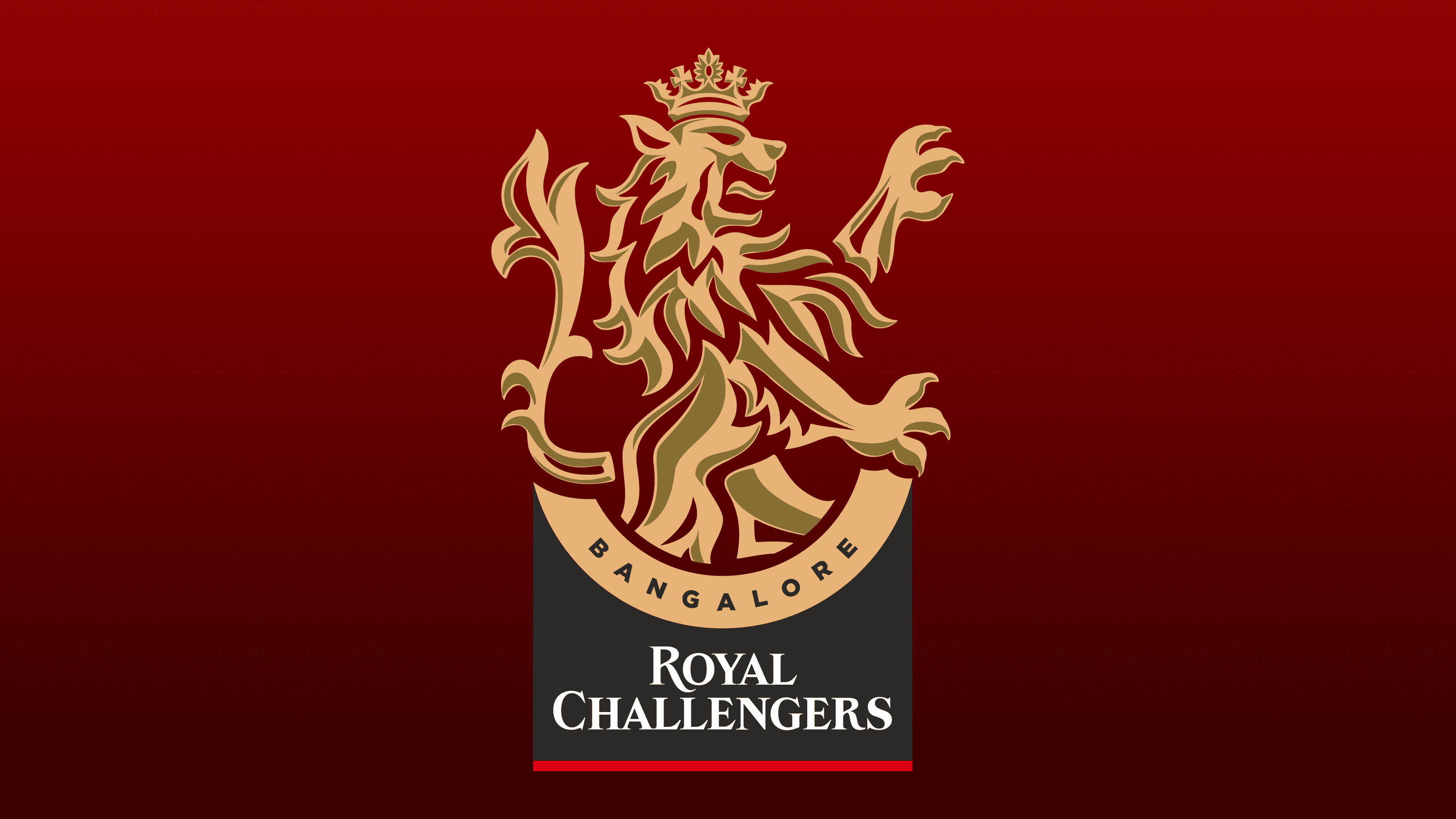
The modern Indian RCB team uses the 2020 logo. This is a vertically oriented icon depicting a lion. The animal stands on two hind legs, with the two front legs in the air. Below it is a semicircle with a black inscription of the city where the gaming club is based, and even lower is the inscription “Royal Challengers,” in white.
The title is underlined with a thin red line at the bottom. For the lion’s design, a light gold color was chosen to symbolize flourishing and luxury. The two-level inscription is made in different fonts. The city’s name is written in capital letters, and the lower part is made in the same style but with serifs. A chic color palette and a stylish font demonstrate a new level of the team’s development and a desire to meet modern standards in sports.