


![]() Accenture Logo PNG
Accenture Logo PNG
The Accenture logo, from the Dublin-based consulting firm of the same name, is an example of succinct information. The identity symbolizes accessibility, openness, the resolve to break away from stereotypes, and the pursuit of new horizons.
The roots of Accenture go back to 1953, when Arthur Andersen created an administrative consulting unit focused on implementing computing in business. In 1954, the team installed a UNIVAC I system for General Electric in Louisville, one of the earliest commercial uses of computers. This work shaped technology consulting as a standalone business.
Through the 1960s and 1970s, the unit expanded alongside the adoption of corporate IT. By the 1980s, consulting generated a large share of Arthur Andersen’s revenue, leading to conflicts between auditors and consultants over control and strategy.
In 1989, the division became Andersen Consulting within Andersen Worldwide, operating with growing independence. Disputes with Arthur Andersen escalated into a lengthy arbitration. In 2000, the ruling required a payment of about $1 billion to effect a full separation.
The split forced a rebrand. After an internal naming process, the company adopted the name Accenture from “Accent” and “future”, effective January 1, 2001. That same year, it launched an IPO on the New York Stock Exchange.
In 2002, Arthur Andersen collapsed after the Enron scandal, while Accenture remained unaffected due to prior separation. In 2009, the company moved its legal base from Bermuda to Ireland.
In later years, Accenture expanded through acquisitions, focusing on digital services, cloud, cybersecurity, and AI. Its main competitors include McKinsey & Company and Deloitte, both of which have models centered on implementation, systems integration, and outsourcing.
Meaning and History
![]()
For nearly three months, the administration contemplated a name for the company until business consultant Kim Petersen suggested the option Accenture. According to the management’s plan, it conveys a determination to break away from stereotypes and to pursue new horizons that the consulting service guarantees. The group’s name was officially approved in 2001, after which it immediately became an emblem. It symbolizes the intention to help clients improve their future.
What is Accenture?
Accenture is a consulting company for the organization, optimization, and planning of businesses, providing human resources consulting services. It is registered in Bermuda, but its office is located in New York.
2000 – 2001
2001 – 2017
![]()
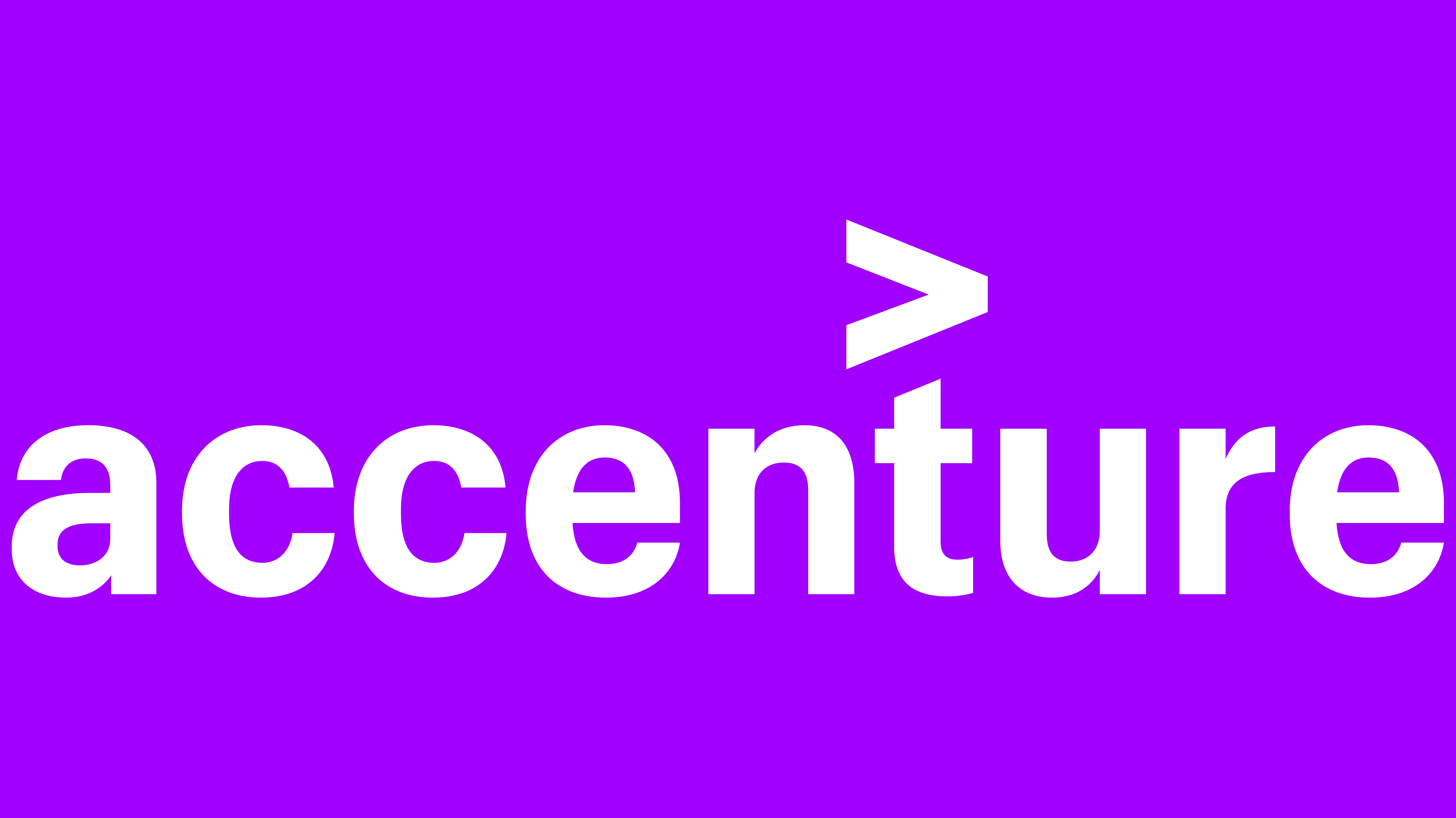
The brand name contains only the textual component, the company’s name. All letters are lowercase, long, and sans-serif, with minimal spacing between characters. The lowercase ‘c’ and ‘e’ have an original design: their lower element is extended, making them appear open. Above the ‘t’ is the mathematical symbol ‘>’, meaning ‘greater than.’
2017 – 2018
![]()
In 2017, the management decided to change the logo’s structure, making minor modifications. As a result, the characters became wider and more classic, and the accent mark became more expressive. The letters ‘c’ and ‘e’ received a traditional design.
2018 – 2020
![]()
The redesign of the consulting company’s logo involved changing the color of the ‘>’ (greater-than) sign above the ‘t.’ The developers, without touching anything around, changed its palette from brown to light blue.
2020 – today
![]()
In 2020, the modifications to the mathematical symbol ‘>’ continued. After a series of experiments, it became purple. No other transformations were made.
Font and Colors

The simple design accurately conveys the company’s direction of activity and work style. For example, the lowercase letter “a” emphasizes the accessibility of services. The ‘greater than’ sign indicates the forward movement vector. The strict letters indicate a pursuit of perfection.
The logo uses a standard sans-serif font. The color scheme is monochromatic, consisting of black (text) and red (accented mathematical symbol).
In the new logo, the font was not adjusted – it remained the same as in the 2017 version. The main focus was on the color of the mathematical sign. Thus, after red, it turned sky blue and then light purple.
Accenture Logo Color Codes:
- purple: Hex #A100FF; RGB 161, 0, 255; CMYK 37, 100, 0, 0; Pantone 2592 C
- black: Hex #000000; RGB 0, 0, 0; CMYK 0, 0, 0, 100; Pantone Black 6 C
FAQ
What does the Accenture logo mean?
The Accenture logo signifies accessibility (the word begins with a lowercase letter), openness (sleek symbols with wide inner space), and continuous growth (the mathematical ‘greater than’ sign at the top). There are no other elements besides the name.
Is Accenture’s strategy different from Accenture’s?
The Accenture company has several divisions, including Accenture Strategy and Accenture Technology. They differ in function: the former plans the strategy for management and business development, while the latter implements and uses it.
What is Accenture’s strategy?
It combines industry expertise, design, and analysis under human guidance. This allows clients to learn to act confidently and quickly.
What is Accenture’s company slogan?
Accenture’s motto is “Let there be change.” It adopted this in the second half of 2020 and added it to the website. Its logo also uses the slogan “High performance. Delivered.”