The strength and vibrancy of the oval are used in Henkel’s corporate style, whose logo features this shape. Its horizontal position symbolizes the financial success and business development of the brand. At the same time, it demonstrates the enterprise’s success, stability, and charisma.
Henkel: Brand overview
| Founded: | 1876 |
| Founder: | Friedrich Karl Henkel |
| Headquarters: | Düsseldorf, Germany |
| Website: | henkel.com |
Meaning and History
The debut logo of the future industrial giant featured a lion lying against a backdrop of a gear wheel. This version was used until 1907, when the idea of a geometrically precise red oval emerged. In 1920, the company’s name, consisting of the founder’s surname, was added.
A radical design review dates back to 2002, when the corporation underwent a complete rebranding. The next change occurred in 2011.
What is Henkel?
Henkel is a German company that manufactures more than 25,000 different products for home and industrial use. It owns many well-known brands, such as Fa, Dial, Loctite, Persil, and Syoss. The company also owns Schwarzkopf, the best-selling shampoo in Europe. In addition, Henkel is a leader in the production of sealants and adhesives intended for the construction industry, transportation production, and electronics.
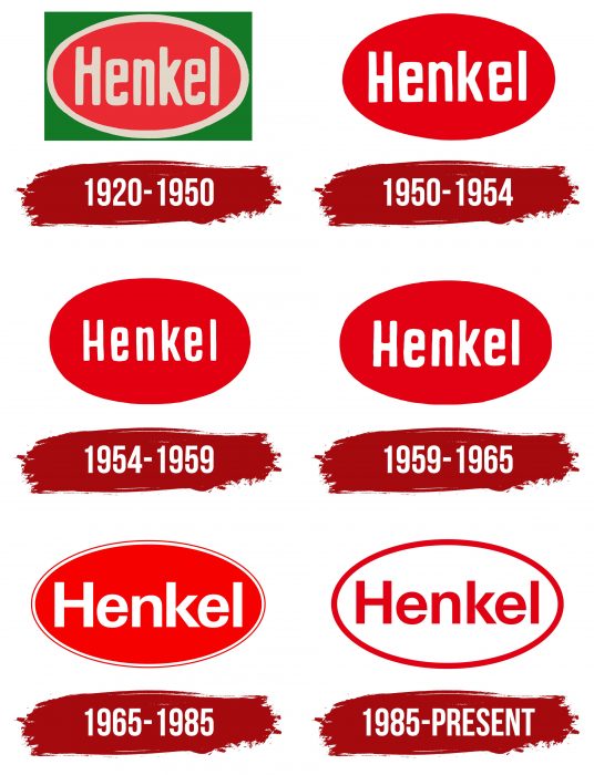
1920 – 1950
The debut logo consisted of three equal parts:
- Name
- Ellipse
- Rectangle
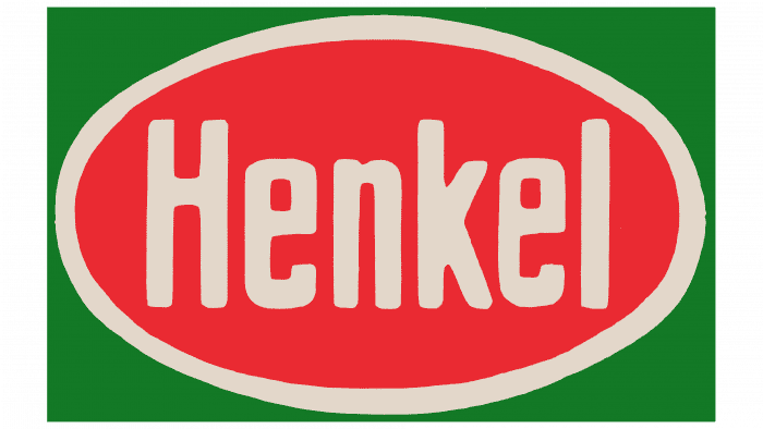
The central element was the text. The word “Henkel” was executed in elongated, upward-stretched letters of a grotesque font. Their size precisely matched the width of the oval frame. The primary background was a green rectangle reminiscent of a label.
1950 – 1954
In 1950, the brand owners abandoned the rectangle. Therefore, designers left only the central part of the emblem – a red oval with an outline and an inner inscription.
1954 – 1959
The next redesign brought minor changes. The developers flattened the ellipse on the sides and gave it a rounded shape, and the word “Henkel” was reduced, leaving a lot of empty space around.
1959 – 1965
After the 1959 reconstruction, the inscription on the emblem became larger, and the oval became more elongated.
1965 – 1985
During this period, there was a significant transformation of the logo: designers elongated the oval, added two outlining stripes to it, and changed the font of the inscription.
1985 – today
The current version of the logo looks completely opposite to all previous versions. The developers simply swapped the colors for this: red became white and vice versa. They also removed the double frame and drew one wide stripe around the oval.
Henkel: Interesting Facts
Henkel is a big company from Düsseldorf, Germany that makes things like glue, beauty products, and stuff to clean your clothes and house. It started in 1876 when a guy named Fritz Henkel decided to make a special soap.
- Starting with Soap: In 1876, Henkel’s first big idea was a soap that could clean all sorts of things.
- Persil, a Famous Soap: In 1907, they made a new kind of soap called Persil that cleans clothes by itself, which was a big deal and is still popular today.
- All Over the World: Henkel sells its products in more than 120 countries and has many places where it makes and invents new products.
- More than Soap: Henkel doesn’t just make soap anymore. They also make beauty stuff like hair products and super strong glues that can hold things together.
- Buying Other Companies: Henkel expanded by buying other companies, such as Schwarzkopf for hair products, Dial Corporation for soaps, and Sun Products Corporation for cleaning products.
- Leader in Glue: Henkel is good at making glues used in cars, phones, and space.
- Caring for the Planet: Henkel tries to ensure that its products don’t harm the planet by making them easy to recycle and not wasting materials.
- Investing in New Ideas: Henkel also invests in small companies with new ideas to help them continue inventing cool new things.
- Still a Family Business: Even though anyone can buy a part of Henkel, the family still has a big say in how things are done.
Henkel has been around for a long time. It is always coming up with new ideas, caring for the planet, and keeping its customers happy.
Font and Colors
The current label of the globally renowned corporation appeared in 2011 and has not yet undergone modernization. It represents a clear oval outlined by a bright red stripe. The company’s name is painted in the same color, located inside the oval on a light background.
The main idea of the logo is modernity, relevance, and novelty. Therefore, it has a simple visual sequence, a dynamic color scheme, and a clear reference to purity. The fonts are simple, sans serif, giving the word the necessary clarity and stability.
Henkel color codes
| Marvel Red | Hex color: | #ec1b23 |
|---|---|---|
| RGB: | 236 27 35 | |
| CMYK: | 0 89 85 7 | |
| Pantone: | PMS Bright Red C |

