Movement, speed, accuracy, and efficiency, along with safety guarantees and high-quality service, reflect the uniqueness of the logistics company DHL. The DHL logo is one of the most recognizable brands, and its modern visual appearance signifies that the company is moving forward in all directions.
DHL: Brand overview
| Founded: | September 25, 1969 |
| Founder: | Adrian Dalsey, Larry Hillblom, Robert Lynn |
| Headquarters: | Bonn, Germany |
| Website: | dhl.com |
Meaning and History
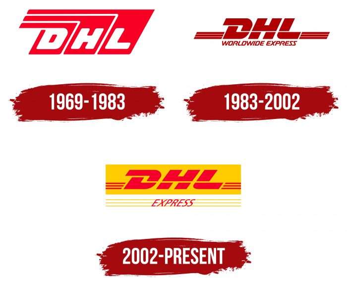
The history of the DHL logo is a journey from a white script on a red background to a complex graphic composition. Although the brand name has retained its original style, there have been noticeable changes in the design of individual elements and color selection.
What is DHL?
DHL is a German logistics company originally from the USA. It was founded in 1969 in San Francisco for courier delivery of parcels and express transportation of various correspondence. Since then, the company has expanded its activities around the world. The company’s head office is located in Bonn, Germany.
1969 – 1983
In the original emblem, a special place is given to the company name: each letter is in its own polygon. The geometric shapes vary in height and are slightly tilted to the right. At the top, three wide lines add dynamics to the image.
1983 – 2002
In 1983, the company entered the US domestic market, opening a delivery service in this North American country. This expansion coincided with a logo update. The designers transformed the font, adorning the letter “D” with a wide serif. The term “WORLDWIDE EXPRESS” was placed under the DHL abbreviation to denote the company’s specialization. The large rectangles were removed, and the top stripes were duplicated and placed to the right and left of the inscription.
2002 – today
In 2002, the logistics company was acquired by Deutsche Post AG. As a division of DHL Express, it introduced a logo designed by the branding studio Nitsch Design. The designers retained the main part of the previous logo but made it red and placed it inside a yellow rectangle. At the bottom, the red word “EXPRESS” is written in italics and superimposed on three yellow lines.
DHL: Interesting Facts
DHL Express is part of a big company from Germany called Deutsche Post DHL Group. It helps people send packages to different places around the world.
- How It Started: Adrian Dalsey, Larry Hillblom, and Robert Lynn started DHL in 1969. The company’s name comes from their last names. They started by flying papers between San Francisco and Honolulu to speed up shipping.
- First to Deliver Worldwide: DHL was the first to send packages quickly across countries, which was a big deal because, before them, only regular mail services could do international shipping.
- Growing Big: By the late 1970s, DHL could send things worldwide. This was pretty special at the time.
- Tracking Packages: DHL was one of the first to let people check where their packages were and how they were doing while being shipped.
- More Than Shipping: DHL doesn’t just deliver packages; they also offer special services like storing stuff, managing how goods move, and sending things by air, sea, train, and truck.
- Helping the Planet: DHL tries to be good to the environment. They want not to harm the planet and have set a big goal to not add to pollution by 2050.
- Helping After Disasters: DHL has a team that helps for free when natural disasters happen. They make sure aid gets to where it’s needed fast.
- Working with Formula 1: Since 2004, DHL has been helping Formula 1 races happen by moving the cars, equipment, and fuel worldwide.
- A Big Company: DHL’s parent company is the biggest logistics company in the world, with operations in over 220 places and more than 380,000 people.
- Trying New Things: DHL is trying new ways to deliver packages, like using drones for hard-to-reach places and electric vehicles in cities to be nicer to the environment.
DHL has played a big role in sending and receiving live packages worldwide. It always looks for new ways to improve and care for the planet.
Font and Colors
The company’s trademark carries its name. These are the first letters of the founders’ surnames – Adrian Dalsey, Larry Hillblom, and Robert Lynn. The inscription is combined with long horizontal stripes, which create a sense of speed. After all, DHL positions itself as an international delivery service and has specialized in express transportation since 1969.
The designers made the letters bold to emphasize them and italicized them to give the emblem dynamism. They used a font specifically developed for DHL based on the Minion and Frutiger font groups. It combines wide serifs (“D”), strong geometric symmetry (“H”), and rounded corners (“L”).
Two yellow lines cross the abbreviation. The substrate is also bright yellow (Pantone 116), as are the three stripes behind the word “EXPRESS.” All inscriptions are red (Pantone 200), which allowed them to stand out against other elements. This color combination was not always used. From 1983 to 2002, the logo was burgundy, and the earliest version was red and white.
DHL color codes
| Rosso Corsa | Hex color: | #d40511 |
|---|---|---|
| RGB: | 212 5 17 | |
| CMYK: | 0 98 92 17 | |
| Pantone: | PMS Bright Red C |
| Tangerine Yellow | Hex color: | #ffcc00 |
|---|---|---|
| RGB: | 255 204 0 | |
| CMYK: | 0 20 100 0 | |
| Pantone: | PMS 7549 C |
