The style of the Endesa logo is unique and unmistakable. It is filled with energy, movement, and dynamics: each glyph appears as a movable element, working in precise tandem with the environment. The brand’s color palette conveys purity, flexibility, and ease of adaptation.
Endesa: Brand overview
| Founded: | 18 November 1944 |
| Founder: | National Institute of Industry |
| Headquarters: | Madrid, Spain |
| Website: | endesa.com |
Meaning and History
The company was founded in 1944; the original name was Empresa Nacional de Electricidad, S.A., and in 1988, it was decided to rename it to Endesa, S.A.
German and American corporations repeatedly attempted to buy the energy giant valued at over 30 billion euros, but the Spanish government rejected all offers.
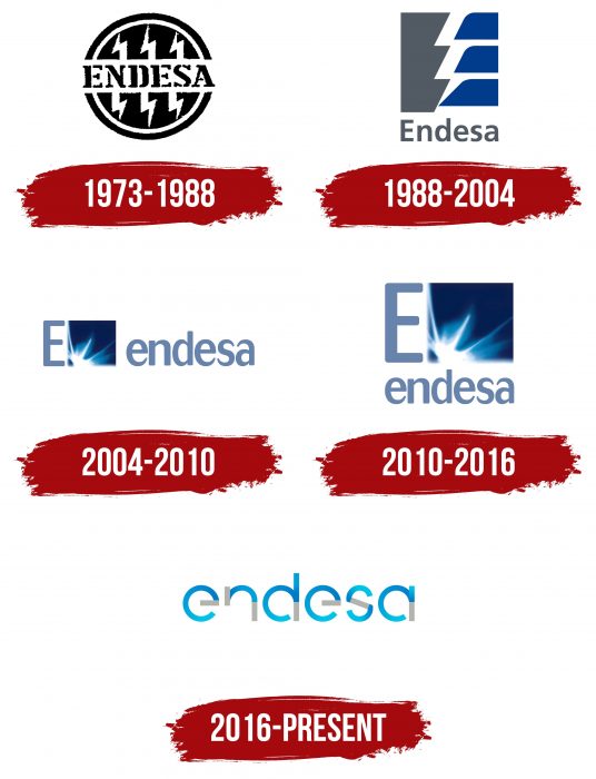
Over its long history, the Endesa logo has changed several times, both in imagery and color.
What is Endesa?
Endesa is one of Europe’s largest energy companies, engaged in producing and supplying electricity for residential homes, offices, industrial facilities, and other sites. The company serves over 20 million customers in various countries, including Spain, Italy, France, and Portugal. Founded in 1944 and owned by Enel since 2009, Endesa has recently been actively working on developing renewable energy sources.
1973 – 1988
From the very beginning, the emblem of the energy company was based on its name. In turn, it originates from the phrase “Empresa Nacional de Electricidad, S. A.”. The name of the joint-stock company was initially its abbreviation, but then it became a permanent name, the meaning of which was even forgotten. The involvement in the electrotechnical industry can be traced by the six zigzag lightning bolts: three on top and three below. They surround the word “Endesa,” written in capital letters. The letters consist of individual fragments. The inscription is divided by black and white outlining lines on both sides.
1988 – 2004
The company management approved a logo with a radically different design. Only the triple zigzag lightning bolt remained from the previous one. Two white lines extend to the right from its sides, dividing the space into three rectangles with a truncated left part. The left tongues of the lightning form a solid letter “E.” The developers shifted the word “Endesa” down and made it lowercase, except for the first symbol – which was left uppercase according to grammar rules.
2004 – 2010
In 2004, the company expanded beyond Spain and actively entered the South American energy market. For three years, it occupied leading positions in Brazil and Argentina. The logo was slightly changed, but overall, it retained its recognizable design. The square next to the letter E became lighter, the ray significantly larger – almost half of the image, and received a tonal stretch – from white through blue to light blue. The word Endesa was written both next to the square and under it. Both options were considered official.
2010 – 2016
In 2010, the largest shareholder became the corporation Enel, the main supplier of gas and fuel in Spain; the company’s policy changed, and the focus was on “green,” environmentally friendly energy. The new slogan sounded as follows: “Light, gas, and people.”
The logo also underwent rebranding; it was executed in the same style as Enel. The base is round letters of the Talbot Type font, from which parts are sometimes removed, and sometimes blue and gray are added; the letters are framed in white, with white gradient halos on the edges, as a symbol of energy. The background of the plate is bright blue.
The new image was compared to the new reality in which the company immersed itself at this stage of development. Energy became more accessible and friendly to people. The predominant light tones speak of the transparency of the renewed Endesa, and the rich blue symbolizes the high efficiency of new technologies.
2016 – today
In 2016, the logo underwent another minor improvement and acquired its current appearance. The letters remained the same – round and dynamic, in the same color, but the blue background of the plate was abandoned. Two colors were chosen – gray and black, on which the brand name reads more clearly. This symbolizes openness to innovations and continuous movement towards new digital technologies.
Now, the logos of all three companies – Enel, Enel Green Power, and Endesa, part of the energy group, are united by one idea and image, differing only in color and name. A palette of 8 primary colors was used, 5 of which are present in each logo.
The Endesa logo is a bright example of the company’s evolution in all directions – technology, the openness of policy, and visual perception.
Endesa: Interesting Facts
Endesa is a big company in Spain that works with electricity and gas. It started in 1944 to help Spain use more electricity as the country grew.
- How It Started: Endesa began in 1944 to help build up Spain’s electricity use. It was part of the government’s plan to make more energy for everyone.
- Becoming Its Own Boss: In the late 1990s, the government sold Endesa, which allowed it to start working in other countries besides Spain.
- Biggest in Spain: Endesa is Spain’s number one electricity company. It supplies electricity to many homes and businesses.
- Working in Other Places: Besides Spain, Endesa works in Latin America, Chile, Brazil, and Colombia, doing similar things like making and selling electricity.
- Smart Energy: Endesa works on cool projects to improve energy use. These include using more sun and wind power, making electricity grids smarter, and helping cars that run on batteries.
- Charging Stations for Electric Cars: Endesa wants to help the environment by setting up charging stations for electric cars all over Spain.
- Saving Energy: The company teaches people how to use less electricity and helps make homes and buildings more energy-efficient.
- Helping Communities: Endesa tries to do good things for people and the planet, such as helping communities grow, protecting nature, and ensuring good business practices.
- Part of a Bigger Family: Endesa is owned by Enel Group, a huge company that works with electricity and gas worldwide. This helps Endesa do even more cool stuff with energy.
So, Endesa has been around for a long time, helping people get electricity and gas, working on making energy cleaner and smarter, and doing good things for the community and the environment.
Font and Colors
For the debut emblem, the developers chose a segmented font with serifs. In subsequent versions, a font from the Sans Serif series is used – without serifs, smooth, with rounded edges (almost without corners).
The color scheme is neutral – not bright, consisting of blue, gray, and white. But only black and white colors were used in the first logo. Now, the colors are combined in a gradient transition.
Endesa color codes
| Navy Blue | Hex color: | #007ec8 |
|---|---|---|
| RGB: | 0 126 200 | |
| CMYK: | 100 37 0 22 | |
| Pantone: | PMS 3005 C |
| Deep Sky Blue | Hex color: | #00c2e8 |
|---|---|---|
| RGB: | 0 194 232 | |
| CMYK: | 100 16 0 9 | |
| Pantone: | PMS 3125 C |
| Beryl Green | Hex color: | #b3b4ae |
|---|---|---|
| RGB: | 179 180 174 | |
| CMYK: | 1 0 3 29 | |
| Pantone: | PMS 413 C |

