


![]() Duracell Logo PNG
Duracell Logo PNG
The Duracell logo is strict and serious. This is its main characteristic. In this way, it conveys the company’s reliability, business orientation, and high-quality products. The simple lines depicted in the logo provide a foundation for continuous innovation and confident progress. The sign also reflects internal energy.
Duracell dates back to the early 1920s, when inventor Samuel Ruben approached P.R. Mallory, a tungsten wire manufacturer, seeking equipment. Philip Rogers Mallory saw potential in collaboration and combined Ruben’s experimental work with his company’s production base.
In 1944, Ruben and Mallory developed the first mercury battery, a precursor to alkaline technology. During World War II, the U.S. military adopted it to replace zinc-carbon batteries in equipment, securing contracts that funded further research.
By the early 1960s, the company introduced alkaline AA and AAA batteries as consumer electronics expanded. In 1964, the Duracell brand name was formally adopted, and by the early 1970s, the copper-and-black packaging became a recognizable market standard.
After Philip Mallory died in 1975, the business changed ownership. In 1978, Dart Industries acquired it and later merged with Kraft, placing a battery maker inside a food conglomerate.
In the late 1980s, Kohlberg Kravis Roberts carried out a leveraged buyout and took Duracell public. At that point, Duracell and Eveready controlled about 80 percent of the global alkaline battery market.
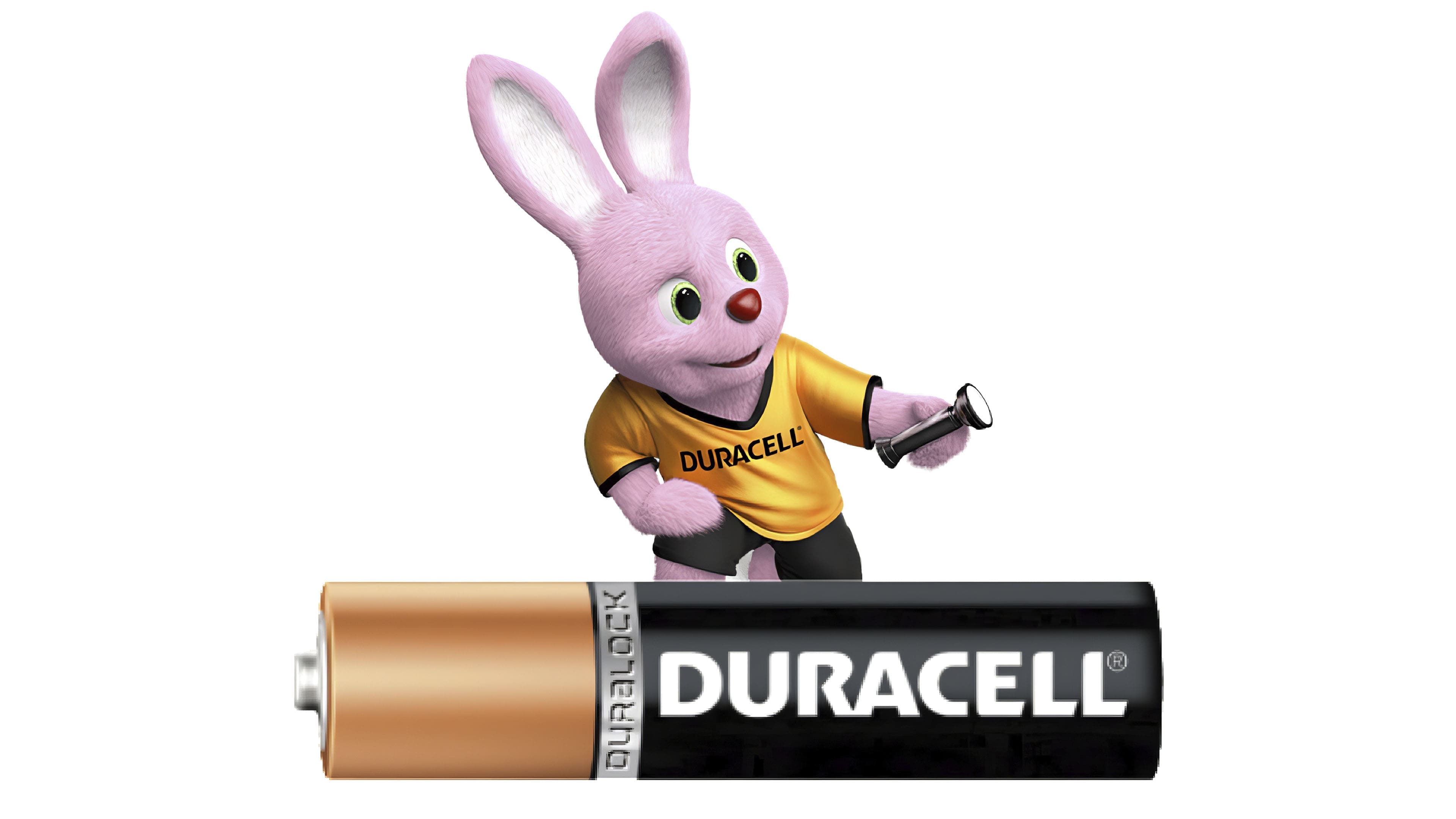
In 1996, Gillette acquired Duracell for $7 billion, expanding beyond razors into everyday consumer goods. Under Gillette, the brand strengthened international distribution and reinforced its identity through the Duracell Bunny, introduced in the 1970s.
In 2005, Procter & Gamble purchased Gillette for $57 billion, adding Duracell to its portfolio and scaling distribution across global markets.
In November 2014, Procter & Gamble agreed to transfer Duracell to Berkshire Hathaway in a $4.2 billion stock deal. On March 1, 2016, the brand officially became part of Warren Buffett’s conglomerate.
Meaning and History
![]()
This logo has two inception dates: the first is associated with its discovery, and the second with its official registration. The difference between them is over 30 years. The final visual identity appeared even later, in 1971, when the color palette was approved. The brand’s mascot (the bunny) has been used since 1973.
What is Duracell?
Duracell is a manufacturer of alkaline, lithium, and nickel-metal hydride batteries and accumulators of various sizes. The company was founded in the USA in 1924, and in 1996, it was acquired by the conglomerate Procter & Gamble. In 2014, it was acquired by the American multinational holding Berkshire Hathaway. Among Duracell’s innovative products are Power Pix rechargeable batteries for high-energy-consuming devices and CopperTop (Plus) batteries designed for digital devices.
1964 – 1977
![]()
The emblem consists of several words: it indicates the manufacturer and the type of batteries produced (alkaline).
1977 – 1985
![]()
Having expanded the range, the developers left only Duracell in the black box.
1985 – 1988
![]()
Designers changed the word’s color and size. They removed the dark background. The letters became uppercase, and the corners were rounded.
1988 – 1999
![]()
This year saw the introduction of the current font with wide, sans-serif characters.
1999 – 2013
![]()
The word’s spelling was changed: the characters became bold.
2013 – today
![]()
In 2013, the current version of the logo, in lowercase, was introduced.
Font and Colors
The brand name originates from the term “durable cell.” The brand’s symbolism is the name, which over the years has been rendered in different fonts.
As the emblem’s emphasis is on the text, its evolution is reflected in changes in the inscription’s style. As a result, the first versions of the logo are dominated by the Futura font. In the second, on the contrary, Delta Bold dominates with a distinctive curved “R.” These fonts share the trait of being grotesque and sans-serif. The color palette is monochrome, consisting of the classic combination of black (letters) and white (background).
The absence of sharp corners symbolizes the batteries’ safety, while the black, white, and copper colors convey their strength, reliability, and superiority.