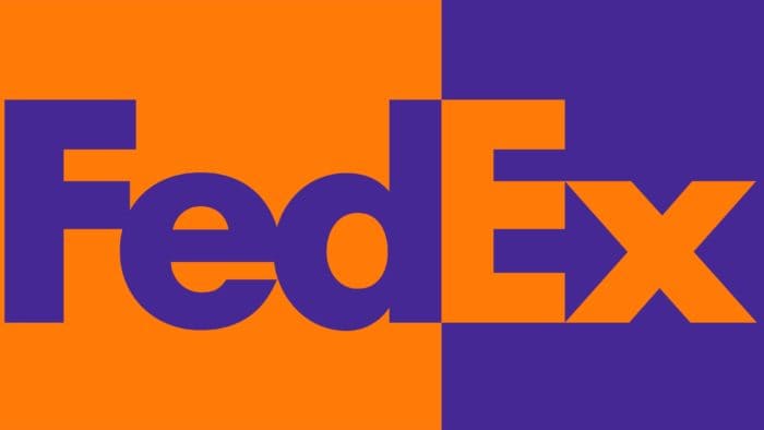
The FedEx logo is the epitome of negative space usage. It harbors potent energy, movement, and marketing magic as the brand markets itself. The emblem is distinguished by a perfect balance of elements against a pleasant backdrop, which, in this case, is also active and conveys the company’s conceptual stance. Designers have successfully blended visual imagery with traditional details.
FedEx: Brand overview
| Founded: | May 5, 1971 |
| Founder: | Frederick W. Smith |
| Headquarters: | Memphis, Tennessee, US |
| Website: | fedex.com |
Meaning and History
The company’s debut logo is recognized as one of the most commercially successful examples of negative space usage, where every detail, even the hidden ones, contributes to the idea. This subtle concept has garnered high praise from experts.
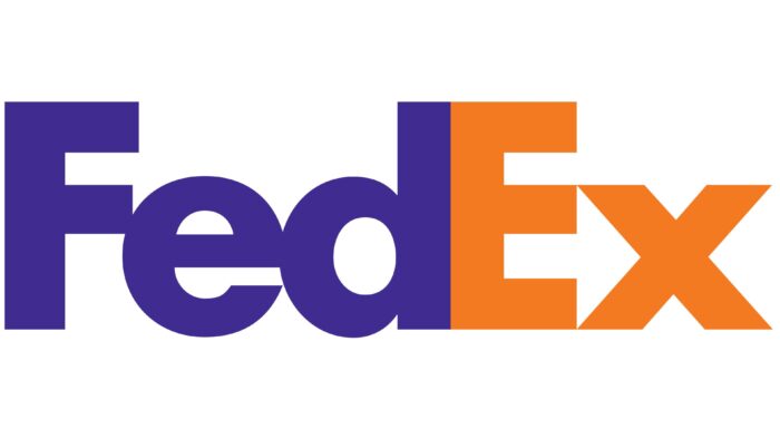
As a result, the emblem has received over 40 design awards and has been ranked among the top ten by Rolling Stone magazine. This is all thanks to the white arrow concealed within the logo. It runs along the border of the vertically arranged words “Federal” and “Express,” culminating in a point between the letters “E” and “X.” This symbolizes speed, movement, and forward momentum.
What is FedEx?
FedEx is an American company specializing in postal and courier delivery across the country and worldwide. It also offers logistical services. Founded in 1971, the service was initially called Federal Express.
1973 – 1994
The company was known as Federal Express in its early years, which is reflected in its debut logo. The phrase is situated in a blue and white rectangle and is slanted upward as if in ascent. “Federal” is in white set against a blue background, and “Express” is in red on the lower tier of white. All letters are uppercase, with “CC” stylized and elongated, and “A” without an internal crossbar.
1991 – 1994
Alongside the first logo, a second, simpler, and more understandable design was introduced during rebranding, naturally reflected in the branding redesign. Its basis is a shortened version of the name Fed + Ex. The updated version’s creator is Lindon Leader, a leading design specialist from the consulting group Landor Associates. Admiring the so-called “negative space” and its hidden possibilities, he preferred clear and elegant things, adhering to a concept promoted in the 1980s by the company Smith & Hawken.
Hence, Lindon chose the Northwest Orient Airlines logo, where “N” and “W” look beautiful, as his benchmark. Interested in this approach, he proposed a new design for the logo. It served as an additional logo, not used in advertising like the first, but in business papers. Thanks to its graphic simplicity, it was easily legible, with both parts distinguished by color: the first three letters in dark purple or blue and the last two in red.
1994 – today
The modern version consists of two bases, each starting with a capital letter. Like the previous logo, it consists of two words. Only the color has changed: light lilac and pastel orange are used instead of the old colors. Moreover, the letters “d” and “E” are now written together.
FedEx: Interesting Facts
FedEx, which stands for Federal Express, is a big company in the United States that sends packages quickly worldwide. They were the first to let people know where their packages were at any time.
- How It Started: Frederick W. Smith, a Yale University student, thought of FedEx when he wanted to create a system for sending packages overnight.
- First Day: FedEx started on April 17, 1973, by sending 186 packages to 25 places in the U.S. using 14 planes from Memphis. Now, they have thousands of flights every day.
- Tracking Packages: FedEx was the first company to let people watch their packages move in real-time, which was a big deal for customer service.
- Big Fleet of Planes: FedEx has many planes, making it one of the biggest air fleets in the world. This helps them keep their promise to deliver things fast.
- Caring for the Planet: FedEx tries to be good to the environment. They use electric and hybrid vehicles and are researching alternative fuels and more efficient planes.
- Panda Express: FedEx offers a special service called “FedEx Panda Express” for moving pandas safely between zoos worldwide.
- More Than Just Packages: FedEx does more than just send packages. They also help with freight, supply chains, online shopping, and business services.
- All Over the World: FedEx works in more than 220 countries and territories, making it one of the biggest networks for sending things fast.
- FedEx Cup: They sponsor the FedEx Cup in golf to show they care about communities and excellence.
- Helping in Disasters: FedEx helps during big emergencies like natural disasters. They send supplies, help with medicine, and support relief groups.
FedEx changed how we send and track packages, making a big difference in global trade and online shopping. They keep trying to improve their work, especially in being fast, reliable, and green.
Font and Colors
CEO Fred Smith considered renaming the brand even when the company was called Federal Express. Three teams worked on the branding and offered over 200 variants. Some were depicted as arrows, but none were camouflaged. However, one day, the company head and brand manager noticed a hidden arrow when selecting the right logo.
The inscription is a unique combination of two fonts, Futura Bold and Univers 67, resulting from Lindon Leader’s work. To advantageously present them, the designer experimented extensively: measuring the distance between letters, changing uppercase and lowercase, and aligning symbols by height.
At one point, he noticed a faint arrow between the top and bottom words. After reviewing numerous working versions, the designer mixed two fonts: Univers 67 for “X” and Futura Bold for “E,” creating an entirely new font.
The logo’s color palette varies depending on the specific application. However, it always comprises bright, appealing combinations that catch the eye and draw attention. For instance, the logo with an orange part pertains to FedEx Express, green to FedEx Ground, and red to FedEx Freight. There’s also a corporate version with a blue “Ex” and a commercial and trading version with a yellow end.
FedEx color codes
| American Violet | Hex color: | #4d148c |
|---|---|---|
| RGB: | 77 20 140 | |
| CMYK: | 45 86 0 45 | |
| Pantone: | PMS 2597 C |
| Safety Orange | Hex color: | #ff6600 |
|---|---|---|
| RGB: | 255 102 0 | |
| CMYK: | 0 60 100 0 | |
| Pantone: | PMS Bright Orange C |
FAQ
What does the FedEx logo signify?
The FedEx logo signifies forward movement, commitment, precision, and speed, all conveyed by the arrow camouflaged in the negative space between the uppercase E and lowercase x. Its conceptual creator is designer Lindon Leader.
What symbol is hidden in the FedEx logo?
An arrow pointing right is hidden in the FedEx logo, formed from the negative space between the last two letters – the lower half of “E” and the middle of “x.”
What do the FedEx colors mean?
FedEx has several color codes distributed among its operational departments. For example, FedEx Ground uses green in its logo, FedEx Freight red, and FedEx Express orange.
What type of logo is FedEx?
It is a text logo with a custom font. Designer Lindon Leader used a combination of Futura Bold and Univers 67 (Bold Condensed) fonts for it.

