The LEGO logo, a Danish manufacturer of children’s toys and iconic construction sets, was first introduced in 1934, and its graphics are eye-catching and inviting to play. The emblem is built on focusing on the brand name, which is an abbreviation of two words – Leg and Godt.
LEGO: Brand overview
LEGO is a Danish company that manufactures toys for children and a brand of construction sets for assembling various objects. The founder of the company is Ole Kirk Christiansen. The manufacturer appeared in 1932, and the brand of “bricks” for modeling has existed since 1949. The difference in years is easy to explain. At first, the entrepreneur was manufacturing wooden toys, and then he focused on mini-blocks from which you can assemble anything.
Back in 1932, in a small Danish town called Billund, Ole Kirk Christiansen, a carpenter with big ideas, started something that would transform how we think about play. He named his company Lego, from the Danish “leg godt,” meaning “play well,” setting the stage for a mission to fuel joy and creativity.
Lego made a big shift in the 1940s to plastic, starting with wooden toys like ducks and cars, and introduced the first interlocking bricks in 1949. These bricks were simple and didn’t stick together well, but they were just the beginning. In 1958, Lego changed the game with a new brick design that allowed endless creative possibilities, connecting the bricks better and letting imaginations run wild.
Over the years, Lego expanded its range with new colors, figures, and themes like Lego City and Lego Castle, and it even went international with a factory in Switzerland. The 1970s saw Lego innovate with space and robotics sets amid growing competition. The 1980s and 90s were booming with growth, new lines like Lego Pirates and Technic, and the opening of Legoland parks. However, financial challenges in the late 1990s and early 2000s forced Lego to cut back and refocus.
Under CEO Jørgen Vig Knudstorp, Lego bounced back, focusing on core themes and licensing hits like Star Wars and Harry Potter. Today, Lego is a powerhouse of creativity, with a wide range of products that inspire builders of all ages. From Lego Mindstorms to Lego Architecture, the company continues to innovate, blending learning and fun.
From its modest start nearly 90 years ago, Lego has built a worldwide empire on the joy of building and playing. Its iconic bricks have created countless memories and inspired generations, securing its place as a cherished brand in homes and hearts worldwide.
Meaning and History
LEGO’s iconic brand name, a fusion of the Danish words “Leg” and “Godt,” meaning “play well,” is a philosophy that has been intricately woven into every facet of its identity. From its inception in the early 1930s as a creator of wooden toys to its present-day status as the purveyor of the quintessential colorful building blocks, LEGO’s name has always stood in bold capitals, a strong declaration of its commitment to quality and fun.
This commitment to joyful play has been the heartbeat of LEGO’s brand story, a story told through the evolving face of its logo. Despite the myriad of redesigns over the decades—embracing a variety of shapes, styles, and hues—the steadfast capital letters remain the one constant, a visual anchor in the shifting sands of design trends and consumer preferences. Each iteration of the LEGO logo has been a chapter in a larger narrative, reflecting the company’s growth, innovation, and unwavering dedication to bringing good play into the lives of children and the child-hearted all around the globe.
What is Lego?
Lego is a Danish brand of building blocks and the company that manufactures them. It was first mentioned in 1934 when carpenter Ole Kirk Christiansen named his company as an abbreviation of “leg godt” (meaning “play well” in Danish). By that time, he had already been producing children’s toys for two years. In 1947, the company switched to using plastic materials, and in 1949, it introduced the familiar line of “locking bricks.” The brand’s headquarters is located in Billund.
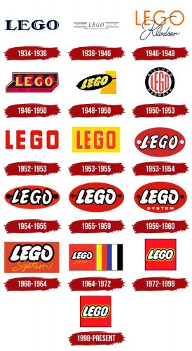
1934 – 1936
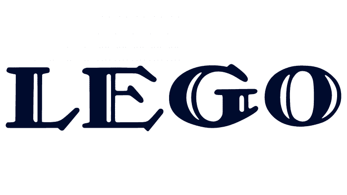
In the 1930s, LEGO presented its very first logo. It was a bold design with capital letters in a dark color that looked serious but had a bit of elegance. The letters had fancy ends and thick lines that showed LEGO was a fun toy company, but it was also serious about its work. This logo reflects the company’s origins, hinting at the meticulous craftsmanship that has been a hallmark of LEGO since it was a small Danish carpentry workshop.
This logo was made for papers and official stuff, showing LEGO’s early days as it became well-known. Its strong letters made it clear that LEGO was here to stay. Even though this logo didn’t last long, it was important because it showed LEGO as a strong, creative, and high-quality brand right from the start.
1936 – 1946
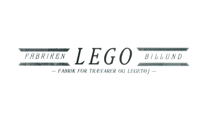
The early LEGO logo dates back to when the company became a toy industry leader. The logo is classic and clean, with the word “LEGO” in the center, flanked by the words “FABRIKEN” and “BILLUND,” which highlight the company’s origins as a factory in Billund, Denmark. Below, a phrase in Danish—”FABRIK FOR TRÆVARER OG LEGETØJ”—translates to “factory for wooden products and toys,” signifying the brand’s original specialty in wooden toys. The design elements on either side of the text in the form of two parallel lines were seen as a stylized representation of the brand’s versatility and attention to detail, alluding to the principle of interconnectivity that would later become synonymous with LEGO. This logo encapsulated a moment when LEGO was defining itself and laying down the values of quality and playfulness that would define its global legacy.
1946 – 1948
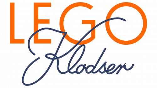
In the 1940s, LEGO showcased a logo that showed great craftsmanship. It showcases the iconic LEGO lettering in bold, bright orange, with a prominent G looping over to underline the rest of the name. Beneath the main logo is what seems to be a signature or a tagline in a cursive font that reads “Klodser,” which is Danish for “blocks” or “bricks.” This reflects the brand’s origins and emphasizes the core product that LEGO has become world-famous for. The color contrast and the combination of uppercase block letters with the flowing cursive script create a striking visual that is playful and refined, embodying the LEGO brand’s appeal to children and adults. Even when LEGO began producing plastic toys, this logo kept the connection to its wooden toy past. It honored where LEGO came from as the company moved toward the future.
1946 – 1950
A bright new LEGO logo from the late 1940s. The dimensional design gives the illusion of depth, with the letters of “LEGO” boldly popping out against a contrasting shadow. Below the main title, “BILLUND DENMARK” proudly declares the brand’s heritage. Using striking colors, such as the rich yellows and reds against the darker outline, captures the brand’s energy and creativity during that era. It’s a visually captivating logo that reflects LEGO’s commitment to quality and innovation, elements that have remained central to the brand as it grew into the toy giant it is today.
1948 – 1950
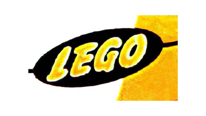
In parallel, a version was developed for plastic prefabricated blocks and launched into mass production in 1948. The company’s name is taken in a black oval positioned slightly diagonally. The LEGO logo seems to jump off the page with its bold, yellow letters, set against an elliptical background. This logo style harks back to the late 1940s, a period of great significance for LEGO as the company began to shift towards the plastic interlocking bricks we know today. The contrast of the bright yellow against the black gives this logo a dynamic and energetic look, symbolizing LEGO’s innovation and excitement in the world of toys.
1950 – 1953
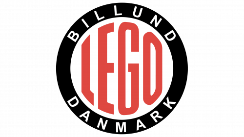
In the early 1950s, as LEGO embraced plastic bricks, they introduced a new logo to celebrate this shift. The image is another LEGO logo, encapsulating the brand’s name within a striking circular emblem. The bold, red letters of “LEGO” are front and center, set against a clean, white background, making them stand out. Framing the brand name are “BILLUND” at the top and “DANMARK” at the bottom, curved along the edge to honor the company’s hometown and Danish heritage. The stark contrast of the colors and the simplicity of the design convey a clear and powerful brand identity grounded in its origins and confident in its global appeal. This logo design salutes LEGO’s roots and status as a staple of creative play worldwide. This logo symbolized LEGO’s move from wooden to plastic toys and hinted at a fun, imaginative future. The solid black border showed LEGO’s strength, while the red name expressed the company’s love for creating and designing. This emblem showed LEGO’s promise to inspire kids and adults worldwide.
1952 – 1953
The logo of that time looked like a stylized circle made up of several words: LEGO (center), Billund (top), and Danmark (bottom). The first was figured and was on a round white background, and the other two were on the surrounding black stripe.
Until 1953, another version was in use – a rectangle with its name, with a white border surrounding each letter. The background is colorful.
1953 – 1955
At the end of the multivariate period, a yellow rectangular emblem appeared with red letters inside. The word “LEGO” is elongated and does not contain serifs.
1953 – 1954
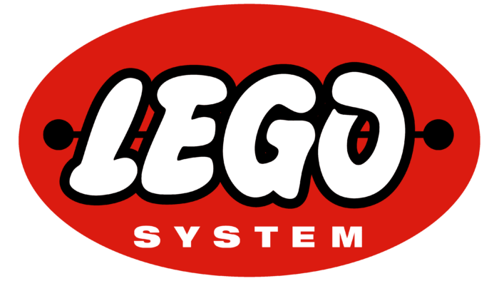
In 1954, the toy manufacturer got the so-called “sausage logo.” Customers first saw it in the LEGO Mursten catalog. The image contains a dark red vertical oval. Inside is the name of the company, written in an original children’s style bubble font. All letters are capitalized and slightly italicized. To create a contrast, the designers made them white and outlined each edge with a wide black stripe. Behind the word, a horizontal white line is drawn, which ends on both sides with medium-sized round dots.
1954 – 1955
The company introduced this logo in 1955 at the world’s largest international toy fair, Toy Fair Nürnberg. The structure is not much different from the previous version. But the letters have become bolder, and their outlines are now so wide that they touch in some areas. The rear stripe and side circles have been repainted black and markedly enlarged in diameter. The size of the background oval has also changed: it has turned into a narrow ellipse. At the same time, the red color of the base acquired a scarlet hue.
1955 – 1959
This was a time of searching when the developers turned to the logo’s oval shape, trying to find the optimal modification. They experimented with the lettering’s appearance, changing the font, border thickness, and the size of the background element. The letters were italicized and white, with a black line at the edge and a red horizontal ellipse.
1959 – 1960
In 1959, the LEGO logo, already recognizable and beloved, received a subtle yet meaningful update. Retaining its classic form, the logo was embellished with the addition of “System” written in white, capitalized letters beneath the main “LEGO” name. This new element was rendered in a clean, geometric sans-serif typeface that complemented the logo’s simplicity and focus. This small change signified something much bigger: it represented the comprehensive and interconnected nature of the LEGO play system. This system promised individual toys and a whole world of construction and creativity. The term “System” underlined LEGO’s commitment to a play experience that could be expanded and combined in limitless ways, much like the bricks themselves.
1960 – 1964
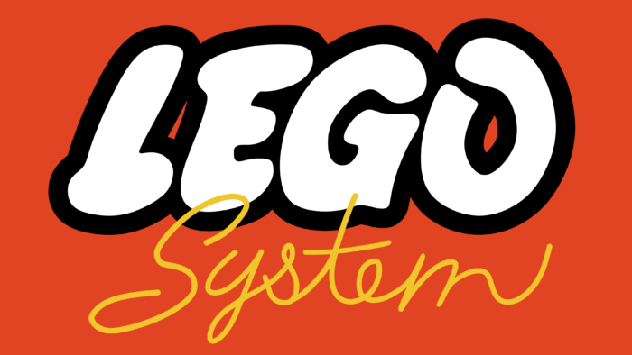
In 1960, a modernized version of the previous logo appeared, where instead of an oval – a rectangle, and instead of crimson letters – white. “System” is written in yellow italics.
1964 – 1972
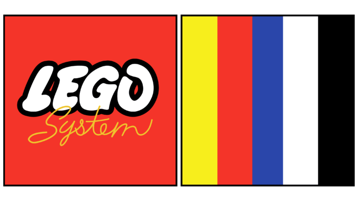
The emblem of that period contained several vertical stripes of different colors. They were on a separate square to the left. On the other was the phrase “LEGO System.”
1972 – 1998
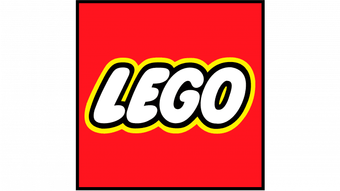
The designers removed the striped cube, leaving only one – with the brand name. The result is a minimalistic sign: white lettering with a double yellow and black outline on a red background.
1998 – today
In 1998, the letters were slightly corrected, making them denser. The free intersymbol space was also painted black.
LEGO: Interesting Facts
LEGO, known for sparking creativity and imagination, has a rich history and a significant impact worldwide.
- Start: Founded in 1932 by Ole Kirk Christiansen in Denmark, LEGO initially made wooden toys before creating the famous plastic bricks in 1949. The name comes from “leg godt,” Danish for “play well,” and also ties to a Latin phrase meaning “I put together.”
- Brick Design: The LEGO brick design patented in 1958 hasn’t changed, allowing bricks from then and now to fit together perfectly, enabling endless creativity.
- Production: Over 600 billion LEGO bricks have been made, showcasing the brand’s global popularity and the extensive creative options it provides.
- Minifigures: Since 1978, LEGO minifigures have added character to LEGO sets. Over 4 billion have been made, populating countless LEGO worlds.
- For All Ages: LEGO makes sets for both children and adults, including detailed models of landmarks, vehicles, and scenes from films, appealing to advanced builders.
- Educational Use: LEGO is widely used to promote learning through play, especially in STEM subjects. LEGO Education and Mindstorms set introduces kids to coding and robotics.
- Sustainability: LEGO aims to use sustainable materials for all its products by 2030, reducing carbon emissions and introducing plant-based bricks.
- Cultural Impact: LEGO influences popular culture through movies, games, and theme parks, showcasing its vast cultural footprint.
- World Records: LEGO enthusiasts have used bricks to set records for the largest and tallest LEGO constructions and the largest LEGO mosaic, highlighting the brand’s versatility.
- Fan Community: Many LEGO fans share creations and ideas online and at events. LEGO Ideas even allows fans to submit designs for potential new sets.
LEGO goes beyond toys, promoting imagination, learning, and sustainability, appealing to people of all ages globally.
Font and Colors
It has undergone many transformations throughout its existence but has always been associated with the company’s name, bright red color, and geometric shapes. Gradually, the rectangle used as the background turned into a square.
The text part has also been constantly evolving. As a result, thin, elongated letters have become more magnificent and friendlier. This style first appeared in 1954. The combination of red, white, black, and yellow has existed since 1960. It brings the logo to life and fulfills its main function – it draws attention to itself and invites it to the game.
FAQ
What font is Lego font?
LEGO is known for its distinctive logo font, which isn’t sold in stores because it was made just for them. However, their websites and apps use a font called Open Sans that’s easy to read and modern. Open Sans is popular and free to use.
In the realm of fan creations, enthusiasts have crafted a typeface known as LegoThick. This typeface draws inspiration from the iconic LEGO logo and is used by fans for various projects. LegoThick captures the playful and bold look of the original logo’s lettering, making it popular among the fan community for LEGO-themed designs and personal projects. It’s important to note that while LegoThick mimics the style of the LEGO logo, it is not an official font released by the LEGO Group but rather a tribute created by and for fans.
Is there a Lego font on Cricut?
While you won’t find an official LEGO font on Cricut due to trademark laws, many LEGO-style fonts are available. These fonts mimic LEGO’s fun, blocky look, and you can use them with a Cricut to cut designs from vinyl, paper, and other materials.
These Bold, Brick-like fonts are perfect for personal projects like party invites or decorations that need a playful LEGO feel.
You can find these fonts in the Cricut Design Space or on font websites. However, unless you have permission, you should use them only for fun and not to sell. This will ensure that you respect LEGO’s brand and copyright.
What do the colors in the LEGO logo mean?
The LEGO logo’s colors are full of meaning and key to its brand image. The red, white, and black mix is recognizable and is chosen to mirror what LEGO stands for and its fun experience.
Red brings the logo to life with its energy, symbolizing the excitement and passion LEGO injects into its products. This color catches the eye, much like how LEGO toys draw attention on shelves and in homes globally, embodying joy and the push for creativity and learning through play.
White in the logo stands for clarity and infinite possibility, suggesting how LEGO’s simple bricks can unlock limitless imagination. It also hints at the brand as a blank slate for builders of every age to fill with their ideas.
Black adds a striking contrast, making the LEGO name pop and easy to read while suggesting precision and quality, two of LEGO’s hallmarks.
In essence, the LEGO logo’s colors do more than just attract; they represent the brand’s core: the joy of building, fostering imagination, and a commitment to innovation and education, all meant to make you smile, just like playing with LEGO bricks does.
Why does LEGO use red in its logo?
LEGO chose red for its logo because red grabs attention and stands out, which is perfect for catching the eyes of kids and parents. This color is linked to excitement and creativity, matching LEGO’s goal to get people to think, build, and play. Red also feels warm and welcoming, adding to the fun and friendly vibe LEGO wants to give. So, using red isn’t just about looking good; it’s a key part of how LEGO shows who they are and what they stand for creativity, fun, and a positive play experience.
