The taxi service was founded in San Francisco in 2009. It features an online application for convenient ordering. The brand presents a modern and succinct Uber logo, demonstrating friendliness and ease of use, reflecting the business’s direction.
Uber: Brand overview
| Founded: | March 2009 |
| Founder: | Garrett Camp, Travis Kalanick |
| Headquarters: | San Francisco, California, U.S. |
| Website: | uber.com |
Meaning and History
Despite its youth, Uber has undergone several transformations, resulting in a friendly and intuitive interface and logo that accurately reflects its business direction. Its function is to demonstrate the ability to track the ordered car with a driver. However, before this, the logo was in the form of the composite word UberCab.
What is Uber?
Uber (or Uber Technologies) is an American company providing taxi, courier, freight transportation, food, and parcel delivery services. It is also a mobile application through which users can request these services. The platform was founded in 2009 by Garrett Camp and Travis Kalanick. The company’s headquarters is in San Francisco, California.
2009 – 2010
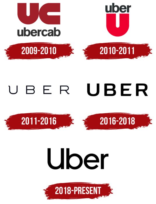
Earlier, the Uber brand was called UberCab, which was reflected in its original logo. The black inscription, consisting only of lowercase letters, was at the bottom. Above it was a stylized “UC” monogram in burgundy color. The “U” and “C” had the same shape, differing only in their orientation in space. All glyphs were bold and sans-serif except for the “a,” which had a small triangular protrusion at the bottom.
2010 – 2011
The debut version, comprising a capital letter (graphic part) and the company name (textual part), conveyed the service’s close connection to the road. For this, designers created a sign in the form of a semi-circle of a highway and placed the word “Uber” in lowercase above it. This signified the starting and ending points of a sequence.
Additionally, the designers interestingly played with the style of the logo, combining two uppercase letters into one. They specifically used the word UberCab, taking “U” and “C” from it. The first symbol was left as is, while the second was rotated 90 degrees. As a result, an original sign of the transport service was created.
2011 – 2016
During this period, an updated version appeared based on a word form. The company name was written in a thin, even sans-serif font in uppercase. The only difference from the classical appearance was a miniature curved protrusion at the top of the “U” and on the lower leg of the “R.” The word “Cab” completely disappeared from the name.
2016 – 2018
In 2016, the service owners decided to revise the logo design and chose a smooth sans-serif font without protrusions. All letters were uppercase, with an emphasis on the slanted parts of “E.”
2018 – today
The current emblem features the word “Uber” in an elongated form. Now, all characters are lowercase, except the first. The font is bold, making the black letters visible against a white background.
Uber: Interesting Facts
Uber, a big name in getting rides and delivering food, started changing how we travel and deliver things since it was founded in 2009.
- How Uber Started: Garrett Camp and Travis Kalanick came up with the idea for Uber one snowy night in Paris in 2009 because they couldn’t find a cab. They considered making a luxury car service you could book with an app.
- The First Ride: The first Uber ride happened in San Francisco in July 2010. After that, Uber grew fast and now operates in thousands of cities worldwide.
- A New Way to Ride: Uber invented ride-sharing, which means using an app to find a ride with someone driving their car. This idea changed the taxi business and started the gig economy.
- More Than Just Rides: Uber isn’t just for getting rides. They also deliver food with Uber Eats, help move goods with Uber Freight, and even work on self-driving cars with their Advanced Technologies Group.
- Uber Everywhere: Uber is in more than 10,000 cities in 69 countries, making it a very well-known company around the globe.
- Facing Challenges: Uber has dealt with many legal issues and rules in different places. Some problems were whether drivers were their bosses or Uber employees and how to ensure everyone was safe using Uber.
- Keeping People Safe: To address safety concerns, Uber added features like an emergency button in the app, tracking where rides go, and checking drivers’ backgrounds.
- Going Green: Uber wants to be all-electric and not harm the environment by 2040. They’re planning to use more electric cars and invest in clean energy.
- Flying Taxis: Uber was working on an Uber Elevate project to make taxis that could fly around cities. They sold this project in 2020, which shows they’re always thinking about new ways to move around.
Uber has changed how we think about getting from place to place and getting things delivered, and it has greatly influenced transportation, technology, and jobs where people work for themselves.
Font and Colors
The most serious period in the emblem’s history was in 2011-2012 when a radical redesign was conducted. Although the new version did not resemble its predecessor, it retained the connection to the automotive and road theme. The visual center became the letter “U” with inwardly curved upper ends. The icon was placed in a rectangle.
The writing of the name also changed. The letter “U” looked unusual and differed from the one in the graphic symbol. Designers elongated and curved the left end. All other characters were made normal and smooth, removing serifs. The dominant colors became silver-white and grayish-blue. A year later, the service owners also changed the design of the mobile application and desktop site.
The passenger symbol became round, and the driver’s – hexagonal. The icons are located inside a square shape, distinctly highlighting them on the map. Color schemes and patterns depend on the country. For example, the Chinese version predominantly features a red palette, the Indian – turquoise, and those using Uber in the USA see a dark turquoise logo.
The font of the emblem changed over the years, shifting from wide and lowercase letters to narrow and uppercase. Unique elements included the letters “U,” “R” (in one version, they have curved ends), and “E,” which had slanted side cuts.
The Uber logo’s palette is very diverse because the design team presented 65 color variants for local use. As a result, each country has its recognizable style. Therefore, instead of the traditional corporate palette of black, white, and blue, there are now many other combinations. Standard icons contain white and two shades of blue or a combination of white with brown and orange.
Uber color codes
| Black | Hex color: | #000000 |
|---|---|---|
| RGB: | 0 0 0 | |
| CMYK: | 0 0 0 100 | |
| Pantone: | PMS Process Black C |
